Introducing probability calculus and conditional probability
Overview
Teaching: 40 min
Exercises: 40 minQuestions
How do we calculate with probabilities, taking account of whether some event is dependent on the occurrence of another?
Objectives
Learn the key definitions of probability theory: events, sample spaces, conditional probability and independence.
Learn how to use the probability calculus to calculate the probabilities of events or combinations of events, which may be conditional on each other.
In this episode we will be using numpy. You can set this up as follows:
import numpy as np
Probability, and frequentist vs. Bayesian approaches
Correct statistical inference requires an understanding of probability and how to work with it. We can do this using the language of mathematics and probability theory.
First let us consider what a probability is. There are two approaches to this, famously known as the frequentist and Bayesian approaches:
- A frequentist approach considers that the probability \(P\) of a random event occuring is equivalent to the frequency such an event would occur at, in an infinite number of repeating trials which have that event as one of the outcomes. \(P\) is expressed as the fractional number of occurrences, relative to the total number. For example, consider the flip of a coin (which is perfect so it cannot land on it’s edge, only on one of its two sides). If the coin is fair (unbiased to one side or the other), it will land on the ‘heads’ side (denoted by \(H\)) exactly half the time in an infinite number of trials, i.e. the probability \(P(H)=0.5\).
- A Bayesian approach considers the idea of an infinite number of trials to be somewhat abstract: instead the Bayesian considers the probability \(P\) to represent the belief that we have that the event will occur. In this case we can again state that \(P(H)=0.5\) if the coin is fair, since this is what we expect. However, the approach also explicitly allows the experimenter’s prior belief in a hypothesis (e.g. ‘The coin is fair?’) to factor in to the assessment of probability. This turns out to be crucial to assessing the probability that a given hypothesis is true.
Some years ago these approaches were seen as being in conflict, but the value of ‘Bayesianism’ in answering scientific questions, as well as in the rapidly expanding field of Machine Learning, means it is now seen as the best approach to statistical inference. We can still get useful insights and methods from frequentism however, so what we present here will focus on what is practically useful and may reflect a mix of both approaches. Although, at heart, we are all Bayesians now.
We will consder the details of Bayes’ theorem later on. But first, we must introduce probability theory, in terms of the concepts of sample space and events, conditional probability, probability calculus, and (in the next episodes) probability distributions.
Sample space and conditional events
Imagine a sample space, \(\Omega\) which contains the set of all possible and mutially exclusive outcomes of some random process (also known as elements or elementary outcomes of the set). In statistical terminology, an event is a set containing one or more outcomes. The event occurs if the outcome of a draw (or sample) of that process is in that set. Events do not have to be mutually exclusive and may also share outcomes, so that events may also be considered as combinations or subsets of other events.
For example, we can denote the sample space of the results (Heads, Tails) of two successive coin flips as \(\Omega = \{HH, HT, TH, TT\}\). Each of the four outcomes of coin flips can be seen as a separate event, but we can also can also consider new events, such as, for example, the event where the first flip is heads \(\{HH, HT\}\), or the event where both flips are the same \(\{HH, TT\}\).
Now consider two events \(A\) and \(B\), whose probability is conditional on one another. I.e. the chance of one event occurring is dependent on whether the other event also occurs. The occurrence of conditional events can be represented by Venn diagrams where the entire area of the diagram represents the sample space of all possible events (i.e. probability \(P(\Omega)=1\)) and the probability of a given event or combination of events is represented by its area on the diagram. The diagram below shows four of the possible combinations of events, where the area highlighted in orange shows the event (or combination) being described in the notation below.
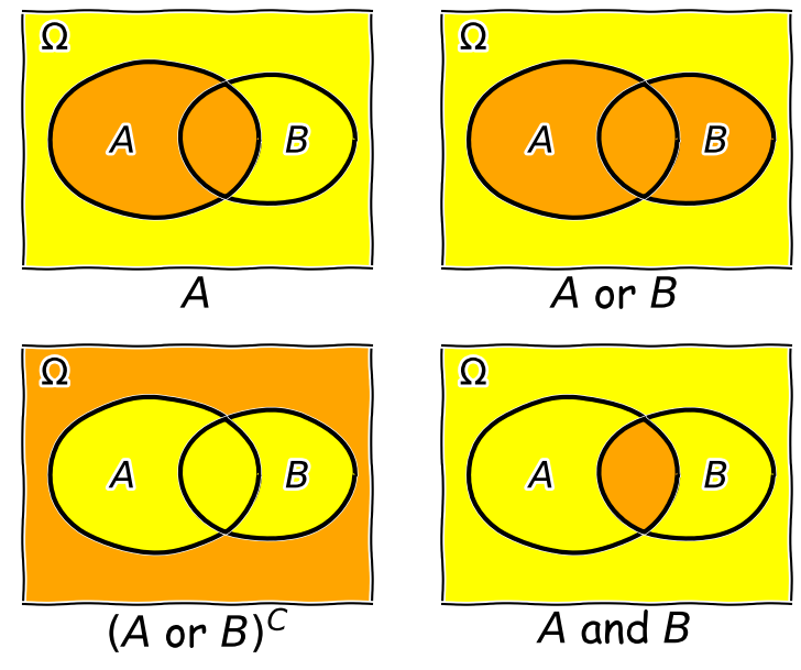
We’ll now decribe these combinations and do the equivalent calculation for the coin flip case where event \(A=\{HH, HT\}\) and event \(B=\{HH, TT\}\) (the probabilities are equal to 0.5 for these two events, so the example diagram is not to scale).
- Event \(A\) occurs (regardless of whether \(B\) also occurs), with probability \(P(A)\) given by the area of the enclosed shape relative to the total area.
- Event \((A \mbox{ or } B)\) occurs (in set notation this is the union of sets, \(A \cup B\)). Note that the formal ‘\(\mbox{or}\)’ here is the same as in programming logic, i.e. it corresponds to ‘either or both’ events occurring. The total probability is not \(P(A)+P(B)\) however, because that would double-count the intersecting region. In fact you can see from the diagram that \(P(A \mbox{ or } B) = P(A)+P(B)-P(A \mbox{ and } B)\). Note that if \(P(A \mbox{ or } B) = P(A)+P(B)\) we say that the two events are mutually exclusive (since \(P(A \mbox{ and } B)=0\)).
- Event \((A \mbox{ or } B)^{C}\) occurs and is the complement of \((A \mbox{ or } B)\) which is everything excluding \((A \mbox{ or } B)\), i.e. \(\mbox{not }(A \mbox{ or } B)\).
- Event \((A \mbox{ and } B)\) occurs (in set notation this is the intersection of sets, \(A\cap B\)). The probability of \((A \mbox{ and } B)\) corresponds to the area of the overlapping region.
Now in our coin flip example, we know the total sample space is \(\Omega = \{HH, HT, TH, TT\}\) and for a fair coin each of the four outcomes \(X\), has a probability \(P(X)=0.25\). Therefore:
- \(A\) consists of 2 outcomes, so \(P(A) = 0.5\)
- \((A \mbox{ or } B)\) consists of 3 outcomes (since \(TH\) is not included), \(P(A \mbox{ or } B) = 0.75\)
- \((A \mbox{ or } B)^{C}\) corresponds to \(\{TH\}\) only, so \(P(A \mbox{ or } B)^{C}=0.25\)
- \((A \mbox{ and } B)\) corresponds to the overlap of the two sets, i.e. \(HH\), so \(P(A \mbox{ and } B)=0.25\).
Trials and samples
In the language of statistics a trial is a single ‘experiment’ to produce a set of one or more measurements, or in purely statistical terms, a single realisation of a sampling process, e.g. the random draw of one or more outcomes from a sample space. The result of a trial is to produce a sample. It is important not to confuse the sample size, which is the number of outcomes in a sample (i.e. produced by a single trial) with the number of trials. An important aspect of a trial is that the outcome is independent of that of any of the other trials. This need not be the case for the measurements in a sample which may or may not be independent.
Some examples are:
- A roll of a pair of dice would be a single trial. The sample size is 2 and the sample would be the numbers on the dice. It is also possible to consider that a roll of a pair of dice is two separate trials for a sample of a single dice (since the outcome of each is presumably independent of the other roll).
- A single sample of fake data (e.g. from random numbers) generated by a computer would be a trial. By simulating many trials, the distribution of data expected from complex models could be generated.
- A full deal of a deck of cards (to all players) would be a single trial. The sample would be the hands that are dealt to all the players, and the sample size would be the number of players. Note that individual players’ hands cannot themselves be seen as trials as they are clearly not independent of one another (since dealing from a shuffled deck of cards is sampling without replacement).
Test yourself: dice roll sample space
Write out as a grid the sample space of the roll of two six-sided dice (one after the other), e.g. a roll of 1 followed by 3 is denoted by the element 13. You can neglect commas for clarity. For example, the top row and start of the next row will be:
\[11\:21\:31\:41\:51\:61\] \[12\:22\:...........\]Now highlight the regions corresponding to:
- Event \(A\): the numbers on both dice add up to be \(>\)8.
- Event \(B\): both dice roll the same number (e.g. two ones, two twos etc.).
Finally use your grid to calculate the probabilities of \((A \mbox{ and } B)\) and \((A \mbox{ or } B)\), assuming that the dice are fair, so that all the outcomes of a roll of two dice are equally probable.
Solution
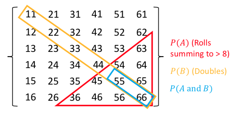
There are 36 possible outcomes, so assuming they are equally probable, a single outcome has a probability of 1/36 (\(\simeq\)0.028). We can see that the region corresponding to \(A \mbox{ and } B\) contains 2 outcomes, so \(P(A \mbox{ and } B)=2/36\). Region \(A\) contains 10 outcomes while region \(B\) contains 6. \(P(A \mbox{ or } B)\), which here corresponds to the number of unique outcomes, is given by: \(P(A)+P(B)-P(A \mbox{ and } B)=(10+6-2)/36=7/18\).
Conditional probability
We can also ask the question, what is the probability that an event \(A\) occurs if we know that the other event \(B\) occurs? We write this as the probability of \(A\) conditional on \(B\), i.e. \(P(A\vert B)\). We often also state this is the ‘probability of A given B’.
To calculate this, we can see from the Venn diagram that if \(B\) occurs (i.e. we now have \(P(B)=1\)), the probability of \(A\) also occurring is equal to the fraction of the area of \(B\) covered by \(A\). I.e. in the case where outcomes have equal probability, it is the fraction of outcomes in set \(B\) which are also contained in set \(A\).
This gives us the equation for conditional probability:
[P(A\vert B) = \frac{P(A \mbox{ and } B)}{P(B)}]
So, for our coin flip example, \(P(A\vert B) = 0.25/0.5 = 0.5\). This makes sense because only one of the two outcomes in \(B\) (\(HH\)) is contained in \(A\).
In our simple coin flip example, the sets \(A\) and \(B\) contain an equal number of equal-probability outcomes, and the symmetry of the situation means that \(P(B\vert A)=P(A\vert B)\). However, this is not normally the case.
For example, consider the set \(A\) of people taking this class, and the set of all students \(B\). Clearly the probability of someone being a student, given that they are taking this class, is very high, but the probability of someone taking this class, given that they are a student, is not. In general \(P(B\vert A)\neq P(A\vert B)\).
Note that events \(A\) and \(B\) are independent if \(P(A\vert B) = P(A) \Rightarrow P(A \mbox{ and } B) = P(A)P(B)\). The latter equation is the one for calculating combined probabilities of events that many people are familiar with, but it only holds if the events are independent! For example, the probability that you ate a cheese sandwich for lunch is (generally) independent of the probability that you flip two heads in a row. Clearly, independent events do not belong on the same Venn diagram since they have no relation to one another! However, if you are flipping the coin in order to narrow down what sandwich filling to use, the coin flip and sandwich choice can be classed as outcomes on the same Venn diagram and their combination can become an event with an associated probability.
Test yourself: conditional probability for a dice roll
Use the solution to the dice question above to calculate:
- The probability of rolling doubles given that the total rolled is greater than 8.
- The probability of rolling a total greater than 8, given that you rolled doubles.
Solution
- \(P(B\vert A) = \frac{P(B \mbox{ and } A)}{P(A)}\) (note that the names of the events are arbitrary so we can simply swap them around!). Since \(P(B \mbox{ and } A)=P(A \mbox{ and } B)\) we have \(P(B\vert A) =(2/36)/(10/36)=1/5\).
- \(P(A\vert B) = \frac{P(A \mbox{ and } B)}{P(B)}\) so we have \(P(A\vert B)=(2/36)/(6/36)=1/3\).
Rules of probability calculus
We can now write down the rules of probability calculus and their extensions:
- The convexity rule sets some defining limits: \(0 \leq P(A\vert B) \leq 1 \mbox{ and } P(A\vert A)=1\)
- The addition rule: \(P(A \mbox{ or } B) = P(A)+P(B)-P(A \mbox{ and } B)\)
- The multiplication rule is derived from the equation for conditional probability: \(P(A \mbox{ and } B) = P(A\vert B) P(B)\)
\(A\) and \(B\) are independent if \(P(A\vert B) = P(A) \Rightarrow P(A \mbox{ and } B) = P(A)P(B)\).
We can also ‘extend the conversation’ to consider the probability of \(B\) in terms of probabilities with \(A\):
\[\begin{align} P(B) & = P\left((B \mbox{ and } A) \mbox{ or } (B \mbox{ and } A^{C})\right) \\ & = P(B \mbox{ and } A) + P(B \mbox{ and } A^{C}) \\ & = P(B\vert A)P(A)+P(B\vert A^{C})P(A^{C}) \end{align}\]The 2nd line comes from applying the addition rule and because the events \((B \mbox{ and } A)\) and \((B \mbox{ and } A^{C})\) are mutually exclusive. The final result then follows from applying the multiplication rule.
Finally we can use the ‘extension of the conversation’ rule to derive the law of total probability. Consider a set of all possible mutually exclusive events \(\Omega = \{A_{1},A_{2},...A_{n}\}\), we can start with the first two steps of the extension to the conversion, then express the results using sums of probabilities:
\[P(B) = P(B \mbox{ and } \Omega) = P(B \mbox{ and } A_{1}) + P(B \mbox{ and } A_{2})+...P(B \mbox{ and } A_{n})\] \[= \sum\limits_{i=1}^{n} P(B \mbox{ and } A_{i})\] \[= \sum\limits_{i=1}^{n} P(B\vert A_{i}) P(A_{i})\]This summation to eliminate the conditional terms is called marginalisation. We can say that we obtain the marginal distribution of \(B\) by marginalising over \(A\) (\(A\) is ‘marginalised out’).
Test yourself: conditional probabilities and GW counterparts
You are an astronomer who is looking for radio counterparts of binary neutron star mergers that are detected via gravitational wave events. Assume that there are three types of binary merger: binary neutron stars (\(NN\)), binary black holes (\(BB\)) and neutron-star-black-hole binaries (\(NB\)). For a hypothetical gravitational wave detector, the probabilities for a detected event to correspond to \(NN\), \(BB\), \(NB\) are 0.05, 0.75, 0.2 respectively. Radio emission is detected only from mergers involving a neutron star, with probabilities 0.72 and 0.2 respectively.
Assume that you follow up a gravitational wave event with a radio observation, without knowing what type of event you are looking at. Using \(D\) to denote radio detection, express each probability given above as a conditional probability (e.g. \(P(D\vert NN)\)), or otherwise (e.g. \(P(BB)\)). Then use the rules of probability calculus (or their extensions) to calculate the probability that you will detect a radio counterpart.
Solution
We first write down all the probabilities and the terms they correspond to. First the radio detections, which we denote using \(D\):
\(P(D\vert NN) = 0.72\), \(P(D\vert NB) = 0.2\), \(P(D\vert BB) = 0\)
and: \(P(NN)=0.05\), \(P(NB) = 0.2\), \(P(BB)=0.75\)
We need to obtain the probability of a detection, regardless of the type of merger, i.e. we need \(P(D)\). However, since the probabilities of a radio detection are conditional on the merger type, we need to marginalise over the different merger types, i.e.:
\(P(D) = P(D\vert NN)P(NN) + P(D\vert NB)P(NB) + P(D\vert BB)P(BB)\) \(= (0.72\times 0.05) + (0.2\times 0.2) + 0 = 0.076\)
You may be able to do this simple calculation without explicitly using the law of total probability, by using the ‘intuitive’ probability calculation approach that you may have learned in the past. However, learning to write down the probability terms, and use the probability calculus, will help you to think systematically about these kinds of problems, and solve more difficult ones (e.g. using Bayes theorem, which we will come to later).
Setting up a random event generator in Numpy
It’s often useful to generate your own random outcomes in a program, e.g. to simulate a random process or calculate a probability for some random event which is difficult or even impossible to calculate analytically. In this episode we will consider how to select a non-numerical outcome from a sample space. In the following episodes we will introduce examples of random number generation from different probability distributions.
Common to all these methods is the need for the program to generate random bits which are then used with a method to generate a given type of outcome. This is done in Numpy by setting up a generator object. A generic feature of computer random number generators is that they must be initialised using a random number seed which is an integer value that sets up the sequence of random numbers. Note that the numbers generated are not truly random: the sequence is the same if the same seed is used. However they are random with respect to one another.
E.g.:
rng = np.random.default_rng(331)
will set up a generator with the seed=331. We can use this generator to produce, e.g. random integers to simulate five repeated rolls of a 6-sided dice:
print(rng.integers(1,7,5))
print(rng.integers(1,7,5))
where the first two arguments are the low and high (exclusive, i.e. 1 more than the maximum integer in the sample space) values of the range of contiguous integers to be sampled from, while the third argument is the size of the resulting array of random integers, i.e. how many outcomes to draw from the sample.
[1 3 5 3 6]
[2 3 2 2 6]
Note that repeating the command yields a different sample. This will be the case every time we repeat the integers function call, because the generator starts from a new point in the sequence. If we want to repeat the same ‘random’ sample we have to reset the generator to the same seed:
print(rng.integers(1,7,5))
rng = np.random.default_rng(331)
print(rng.integers(1,7,5))
[4 3 2 5 4]
[1 3 5 3 6]
For many uses of random number generators you may not care about being able to repeat the same sequence of numbers. In these cases you can set initialise the generator with the default seed using np.random.default_rng(), which obtains a seed from system information (usually contained in a continuously updated folder on your computer, specially for provide random information to any applications that need it). However, if you want to do a statistical test or simulate a random process that is exactly repeatable, you should consider specifying the seed. But do not initialise the same seed unless you want to repeat the same sequence!
Random sampling of items in a list or array
If you want to simulate random sampling of non-numerical or non-sequential elements in a sample space, a simple way to do this is to set up a list or array containing the elements and then apply the numpy method choice to the generator to select from the list. As a default, sampling probabilities are assumed to be \(1/n\) for a list with \(n\) items, but they may be set using the p argument to give an array of p-values for each element in the sample space. The replace argument sets whether the sampling should be done with or without replacement.
For example, to set up 10 repeated flips of a coin, for an unbiased and a biased coin:
rng = np.random.default_rng()  # Set up the generator with the default system seed
coin = ['h','t']
# Uses the defaults (uniform probability, replacement=True)
print("Unbiased coin: ",rng.choice(coin, size=10))
# Now specify probabilities to strongly weight towards heads:
prob = [0.9,0.1]
print("Biased coin: ",rng.choice(coin, size=10, p=prob))
Unbiased coin:  ['h' 'h' 't' 'h' 'h' 't' 'h' 't' 't' 'h']
Biased coin:  ['h' 'h' 't' 'h' 'h' 't' 'h' 'h' 'h' 'h']
Remember that your own results will differ from these because your random number generator seed will be different!
Programming challenge: simulating hands in 3-card poker
A normal deck of 52 playing cards, used for playing poker, consists of 4 ‘suits’ (in English, these are clubs, spades, diamonds and hearts) each with 13 cards. The cards are also ranked by the number or letter on them: in normal poker the rank ordering is first the number cards 2-10, followed by - for English cards - J(ack), Q(ueen), K(ing), A(ce). However, for our purposes we can just consider numbers 1 to 13 with 13 being the highest rank.
In a game of three-card poker you are dealt a ‘hand’ of 3 cards from the deck (you are the first player to be dealt cards). If your three cards can be arranged in sequential numerical order (the suit doesn’t matter), e.g. 7, 8, 9 or 11, 12, 13, your hand is called a straight. If you are dealt three cards from the same suit, that is called a flush. You can also be dealt a straight flush where your hand is both a straight and a flush. Note that these three hands are mutually exclusive (because a straight and a flush in the same hand is always classified as a straight flush)!
Write some Python code that simulates randomly being dealt 3 cards from the deck of 52 and determines whether or not your hand is a straight, flush or straight flush (or none of those). Then simulate a large number of hands (at least \(10^{6}\)!) and from this simulation, calculate the probability that your hand will be a straight, a flush or a straight flush. Use your simulation to see what happens if you are the last player to be dealt cards after 12 other players are dealt their cards from the same deck. Does this change the probability of getting each type of hand?
Hint
To sample cards from the deck you can set up a list of tuples which each represent the suit and the rank of a single card in the deck, e.g.
(1,3)for suit 1, card rank 3 in the suit. The exact matching of numbers to suits or cards does not matter!
Key Points
Probability can be thought of in terms of hypothetical frequencies of outcomes over an infinite number of trials (Frequentist), or as a belief in the likelihood of a given outcome (Bayesian).
A sample space contains all possible mutually exclusive outcomes of an experiment or trial.
Events consist of sets of outcomes which may overlap, leading to conditional dependence of the occurrence of one event on another. The conditional dependence of events can be described graphically using Venn diagrams.
Two events are independent if their probability does not depend on the occurrence (or not) of the other event. Events are mutually exclusive if the probability of one event is zero given that the other event occurs.
The probability of an event A occurring, given that B occurs, is in general not equal to the probability of B occurring, given that A occurs.
Calculations with conditional probabilities can be made using the probability calculus, including the addition rule, multiplication rule and extensions such as the law of total probability.
Discrete random variables and their probability distributions
Overview
Teaching: 60 min
Exercises: 60 minQuestions
How do we describe discrete random variables and what are their common probability distributions?
How do I calculate the means, variances and other statistical quantities for numbers drawn from probability distributions?
Objectives
Learn how discrete random variables are defined and how the Bernoulli, binomial and Poisson distributions are derived from them.
Learn how the expected means and variances of discrete random variables (and functions of them) can be calculated from their probability distributions.
Plot, and carry out probability calculations with the binomial and Poisson distributions.
Carry out simple simulations using random variables drawn from the binomial and Poisson distributions
In this episode we will be using numpy, as well as matplotlib’s plotting library. Scipy contains an extensive range of probability distributions in its ‘scipy.stats’ module, so we will also need to import it. Remember: scipy modules should be installed separately as required - they cannot be called if only scipy is imported.
import numpy as np
import matplotlib.pyplot as plt
import scipy.stats as sps
Discrete random variables
Often, we want to map a sample space \(\Omega\) (denoted with curly brackets) of possible outcomes on to a set of corresponding probabilities. The sample space may consist of non-numerical elements or numerical elements, but in all cases the elements of the sample space represent possible outcomes of a random ‘draw’ from a set of probabilities which can be used to form a discrete probability distribution.
For example, when flipping an ideal coin (which cannot land on its edge!) there are two outcomes, heads (\(H\)) or tails (\(T\)) so we have the sample space \(\Omega = \{H, T\}\). We can also represent the possible outcomes of 2 successive coin flips as the sample space \(\Omega = \{HH, HT, TH, TT\}\). A roll of a 6-sided dice would give \(\Omega = \{1, 2, 3, 4, 5, 6\}\). However, a Poisson process corresponds to the sample space \(\Omega = \mathbb{Z}^{0+}\), i.e. the set of all positive and integers and zero, even if the probability for most elements of that sample space is infinitesimal (it is still \(> 0\)).
In the case of a Poisson process or the roll of a dice, our sample space already consists of a set of contiguous (i.e. next to one another in sequence) numbers which correspond to discrete random variables. Where the sample space is categorical, such as heads or tails on a coin, or perhaps a set of discrete but non-integer values (e.g. a pre-defined set of measurements to be randomly drawn from), it is useful to map the elements of the sample space on to a set of integers which then become our discrete random variables. For example, when flipping a coin, we can define the possible values taken by the random variable, known as the variates \(X\), to be:
[X=
\begin{cases}
0 \quad \mbox{if tails}
1 \quad \mbox{if heads}
\end{cases}]
By defining the values taken by a random variable in this way, we can mathematically define a probability distribution for how likely it is for a given event or outcome to be obtained in a single trial (i.e. a draw - a random selection - from the sample space).
Probability distributions of discrete random variables
Random variables do not just take on any value - they are drawn from some probability distribution. In probability theory, a random measurement (or even a set of measurements) is an event which occurs (is ‘drawn’) with a fixed probability, assuming that the experiment is fixed and the underlying distribution being measured does not change over time (statistically we say that the random process is stationary).
We can write the probability that the variate \(X\) has a value \(x\) as \(p(x) = P(X=x)\), so for the example of flipping a coin, assuming the coin is fair, we have \(p(0) = p(1) = 0.5\). Our definition of mapping events on to random variables therefore allows us to map discrete but non-integer outcomes on to numerically ordered integers \(X\) for which we can construct a probability distribution. Using this approach we can define the cumulative distribution function or cdf for discrete random variables as:
[F(x) = P(X\leq x) = \sum\limits_{x_{i}\leq x} p(x_{i})]
where the subscript \(i\) corresponds to the numerical ordering of a given outcome, i.e. of an element in the sample space. For convenience we can also define the survival function, which is equal to \(P(X\gt x)\). I.e. the survival function is equal to \(1-F(x)\).
The function \(p(x)\) is specified for a given distribution and for the case of discrete random variables, is known as the probability mass function or pmf.
Properties of discrete random variates: mean and variance
Consider a set of repeated samples or draws of a random variable which are independent, which means that the outcome of one does not affect the probability of the outcome of another. A random variate is the quantity that is generated by sampling once from the probability distribution, while a random variable is the notional object able to assume different numerical values, i.e. the distinction is similar to the distinction in python between x=15 and the object to which the number is assigned x (the variable).
The expectation \(E(X)\) is equal to the arithmetic mean of the random variates as the number of sampled variates increases \(\rightarrow \infty\). For a discrete probability distribution it is given by the mean of the distribution function, i.e. the pmf, which is equal to the sum of the product of all possible values of the variable with the associated probabilities:
[E[X] = \mu = \sum\limits_{i=1}^{n} x_{i}p(x_{i})]
This quantity \(\mu\) is often just called the mean of the distribution, or the population mean to distinguish it from the sample mean of data, which we will come to later on.
More generally, we can obtain the expectation of some function of \(X\), \(f(X)\):
[E[f(X)] = \sum\limits_{i=1}^{n} f(x_{i})p(x_{i})]
It follows that the expectation is a linear operator. So we can also consider the expectation of a scaled sum of variables \(X_{1}\) and \(X_{2}\) (which may themselves have different distributions):
[E[a_{1}X_{1}+a_{2}X_{2}] = a_{1}E[X_{1}]+a_{2}E[X_{2}]]
and more generally for a scaled sum of variables \(Y=\sum\limits_{i=1}^{n} a_{i}X_{i}\):
[E[Y] = \sum\limits_{i=1}^{n} a_{i}E[X_{i}] = \sum\limits_{i=1}^{n} a_{i}\mu_{i}]
i.e. the expectation for a scaled sum of variates is the scaled sum of their distribution means.
It is also useful to consider the variance, which is a measure of the squared ‘spread’ of the values of the variates around the mean, i.e. it is related to the weighted width of the probability distribution. It is a squared quantity because deviations from the mean may be positive (above the mean) or negative (below the mean). The (population) variance of discrete random variates \(X\) with (population) mean \(\mu\), is the expectation of the function that gives the squared difference from the mean:
[V[X] = \sigma^{2} = \sum\limits_{i=1}^{n} (x_{i}-\mu)^{2} p(x_{i})]
It is possible to rearrange things:
[V[X] = E[(X-\mu)^{2}] = E[X^{2}-2X\mu+\mu^{2}]]
[\rightarrow V[X] = E[X^{2}] - E[2X\mu] + E[\mu^{2}] = E[X^{2}] - 2\mu^{2} + \mu^{2}]
[\rightarrow V[X] = E[X^{2}] - \mu^{2} = E[X^{2}] - E[X]^{2}]
In other words, the variance is the expectation of squares - square of expectations. Therefore, for a function of \(X\):
[V[f(X)] = E[f(X)^{2}] - E[f(X)]^{2}]
For a sum of independent, scaled random variables, the expected variance is equal to the sum of the individual variances multiplied by their squared scaling factors:
[V[Y] = \sum\limits_{i=1}^{n} a_{i}^{2} \sigma_{i}^{2}]
We will consider the case where the variables are correlated (and not independent) in a later Episode.
Test yourself: mean and variance of dice rolls
Starting with the probability distribution of the score (i.e. from 1 to 6) obtained from a roll of a single, fair, 6-sided dice, use equations given above to calculate the expected mean and variance of the total obtained from summing the scores from a roll of three 6-sided dice. You should not need to explicitly work out the probability distribution of the total from the roll of three dice!
Solution
We require \(E[Y]\) and \(V[Y]\), where \(Y=X+X+X\), with \(X\) the variate produced by a roll of one dice. The dice are fair so \(p(x)=P(X=x)=1/6\) for all \(X\) from 1 to 6. Therefore the expectation for one dice is \(E[X]=\frac{1}{6}\sum\limits_{i=1}^{6} i = 21/6 = 7/2\).
The variance is \(V[X]=E[X^{2}]-\left(E[X]\right)^{2} = \frac{1}{6}\sum\limits_{i=1}^{6} i^{2} - (7/2)^{2} = 91/6 - 49/4 = 35/12 \simeq 2.92\) .
The mean and variance for a roll of three six sided dice, since they are equally weighted is equal to the sums of mean and variance, i.e. \(E[Y]=21/2\) and \(V[Y]=35/4\).
Probability distributions: Bernoulli and Binomial
A Bernoulli trial is a draw from a sample with only two possibilities (e.g. the colour of sweets drawn, with replacement, from a bag of red and green sweets). The outcomes are mapped on to integer variates \(X=1\) or \(0\), assuming probability of one of the outcomes \(\theta\), so the probability \(p(x)=P(X=x)\) is:
[p(x)=
\begin{cases}
\theta & \mbox{for }x=1
1-\theta & \mbox{for }x=0
\end{cases}]
and the corresponding Bernoulli distribution function (the pmf) can be written as:
[p(x\vert \theta) = \theta^{x}(1-\theta)^{1-x} \quad \mbox{for }x=0,1]
where the notation \(p(x\vert \theta)\) means ‘probability of obtaining x, conditional on model parameter \(\theta\)‘. The vertical line \(\vert\) meaning ‘conditional on’ (i.e. ‘given these existing conditions’) is the usual notation from probability theory, which we use often in this course. A variate drawn from this distribution is denoted as \(X\sim \mathrm{Bern}(\theta)\) (the ‘tilde’ symbol \(\sim\) here means ‘distributed as’). It has \(E[X]=\theta\) and \(V[X]=\theta(1-\theta)\) (which can be calculated using the equations for discrete random variables above).
We can go on to consider what happens if we have repeated Bernoulli trials. For example, if we draw sweets with replacement (i.e. we put the drawn sweet back before drawing again, so as not to change \(\theta\)), and denote a ‘success’ (with \(X=1\)) as drawing a red sweet, we expect the probability of drawing \(red, red, green\) (in that order) to be \(\theta^{2}(1-\theta)\).
However, what if we don’t care about the order and would just like to know the probability of getting a certain number of successes from \(n\) draws or trials (since we count each draw as a sampling of a single variate)? The resulting distribution for the number of successes (\(x\)) as a function of \(n\) and \(\theta\) is called the binomial distribution:
[p(x\vert n,\theta) = \begin{pmatrix} n \ x \end{pmatrix} \theta^{x}(1-\theta)^{n-x} = \frac{n!}{(n-x)!x!} \theta^{x}(1-\theta)^{n-x} \quad \mbox{for }x=0,1,2,…,n.]
Note that the matrix term in brackets is the binomial coefficient to account for the permutations of the ordering of the \(x\) successes. For variates distributed as \(X\sim \mathrm{Binom}(n,\theta)\), we have \(E[X]=n\theta\) and \(V[X]=n\theta(1-\theta)\).
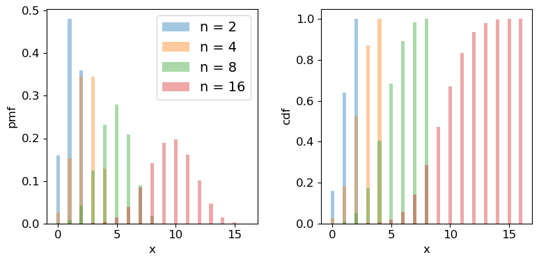
Scipy has the binomial distribution, binom in its stats module. Different properties of the distribution can be accessed via appending the appropriate method to the function call, e.g. sps.binom.pmf, or sps.binom.cdf. Below we plot the pmf and cdf of the distribution for different numbers of trials \(n\). It is formally correct to plot discrete distributions using separated bars, to indicate single discrete values, rather than bins over multiple or continuous values, but sometimes stepped line plots (or even histograms) can be clearer, provided you explain what they show.
## Define theta
theta = 0.6
## Plot as a bar plot
fig, (ax1, ax2) = plt.subplots(1,2, figsize=(9,4))
fig.subplots_adjust(wspace=0.3)
for n in [2,4,8,16]:
    x = np.arange(0,n+1)
    ## Plot the pmf
    ax1.bar(x, sps.binom.pmf(x,n,p=theta), width=0.3, alpha=0.4, label='n = '+str(n))
    ## and the cumulative distribution function:
    ax2.bar(x, sps.binom.cdf(x,n,p=theta), width=0.3, alpha=0.4, label='n = '+str(n))
for ax in (ax1,ax2):
    ax.tick_params(labelsize=12)
    ax.set_xlabel("x", fontsize=12)
    ax.tick_params(axis='x', labelsize=12)
    ax.tick_params(axis='y', labelsize=12)
ax1.set_ylabel("pmf", fontsize=12)
ax2.set_ylabel("cdf", fontsize=12)
ax1.legend(fontsize=14)
plt.show()
Programming example: how many observations do I need?
Imagine that you are developing a research project to study the radio-emitting counterparts of binary neutron star mergers that are detected by a gravitational wave detector. Due to relativistic beaming effects however, radio counterparts are not always detectable (they may be beamed away from us). You know from previous observations and theory that the probability of detecting a radio counterpart from a binary neutron star merger detected by gravitational waves is 0.72. For simplicity you can assume that you know from the gravitational wave signal whether the merger is a binary neutron star system or not, with no false positives.
You need to request a set of observations in advance from a sensitive radio telescope to try to detect the counterparts for each binary merger detected in gravitational waves. You need 10 successful detections of radio emission in different mergers, in order to test a hypothesis about the origin of the radio emission. Observing time is expensive however, so you need to minimise the number of observations of different binary neutron star mergers requested, while maintaining a good chance of success. What is the minimum number of observations of different mergers that you need to request, in order to have a better than 95% chance of being able to test your hypothesis?
(Note: all the numbers here are hypothetical, and are intended just to make an interesting problem!)
Hint
We would like to know the chance of getting at least 10 detections, but the cdf is defined as \(F(x) = P(X\leq x)\). So it would be more useful (and more accurate than calculating 1-cdf for cases with cdf\(\rightarrow 1\)) to use the survival function method (
sps.binom.sf).Solution
We want to know the number of trials \(n\) for which we have a 95% probability of getting at least 10 detections. Remember that the cdf is defined as \(F(x) = P(X\leq x)\), so we need to use the survival function (1-cdf) but for \(x=9\), so that we calculate what we need, which is \(P(X\geq 10)\). We also need to step over increasing values of \(n\) to find the smallest value for which our survival function exceeds 0.95. We will look at the range \(n=\)10-25 (there is no point in going below 10!).
theta = 0.72
for n in range(10,26):
    print("For",n,"observations, chance of 10 or more detections =",sps.binom.sf(9,n,p=theta))
For 10 observations, chance of 10 or more detections = 0.03743906242624486 For 11 observations, chance of 10 or more detections = 0.14226843721973037 For 12 observations, chance of 10 or more detections = 0.3037056744016985 For 13 observations, chance of 10 or more detections = 0.48451538004550243 For 14 observations, chance of 10 or more detections = 0.649052212181364 For 15 observations, chance of 10 or more detections = 0.7780490885758796 For 16 observations, chance of 10 or more detections = 0.8683469020520406 For 17 observations, chance of 10 or more detections = 0.9261375026767835 For 18 observations, chance of 10 or more detections = 0.9605229100485057 For 19 observations, chance of 10 or more detections = 0.9797787381766699 For 20 observations, chance of 10 or more detections = 0.9900228387408534 For 21 observations, chance of 10 or more detections = 0.9952380172098922 For 22 observations, chance of 10 or more detections = 0.9977934546597212 For 23 observations, chance of 10 or more detections = 0.9990043388667172 For 24 observations, chance of 10 or more detections = 0.9995613456019353 For 25 observations, chance of 10 or more detections = 0.999810884619313So we conclude that we need 18 observations of different binary neutron star mergers, to get a better than 95% chance of obtaining 10 radio detections.
Probability distributions: Poisson
Imagine that we are running a particle detection experiment, e.g. to detect radioactive decays. The particles are detected at random intervals such that the expected mean rate per time interval (i.e. defined over an infinite number of intervals) is \(\lambda\). To work out the distribution of the number of particles \(x\) detected in the time interval, we can imagine splitting the interval into \(n\) equal sub-intervals. Then, if the expected rate \(\lambda\) is constant and the detections are independent of one another, the probability of a detection in any given time interval is the same: \(\lambda/n\). We can think of the sub-intervals as a set of \(n\) repeated Bernoulli trials, so that the number of particles detected in the overall time-interval follows a binomial distribution with \(\theta = \lambda/n\):
[p(x \vert \, n,\lambda/n) = \frac{n!}{(n-x)!x!} \frac{\lambda^{x}}{n^{x}} \left(1-\frac{\lambda}{n}\right)^{n-x}.]
In reality the distribution of possible arrival times in an interval is continuous and so we should make the sub-intervals infinitesimally small, otherwise the number of possible detections would be artificially limited to the finite and arbitrary number of sub-intervals. If we take the limit \(n\rightarrow \infty\) we obtain the follow useful results:
\(\frac{n!}{(n-x)!} = \prod\limits_{i=0}^{x-1} (n-i) \rightarrow n^{x}\) and \(\lim\limits_{n\rightarrow \infty} (1-\lambda/n)^{n-x} = e^{-\lambda}\)
where the second limit arises from the result that \(e^{x} = \lim\limits_{n\rightarrow \infty} (1+x/n)^{n}\). Substituting these terms into the expression from the binomial distribution we obtain:
[p(x \vert \lambda) = \frac{\lambda^{x}e^{-\lambda}}{x!}]
This is the Poisson distribution, one of the most important distributions in observational science, because it describes counting statistics, i.e. the distribution of the numbers of counts in bins. For example, although we formally derived it here as being the distribution of the number of counts in a fixed interval with mean rate \(\lambda\) (known as a rate parameter), the interval can refer to any kind of binning of counts where individual counts are independent and \(\lambda\) gives the expected number of counts in the bin.
For a random variate distributed as a Poisson distribution, \(X\sim \mathrm{Pois}(\lambda)\), \(E[X] = \lambda\) and \(V[X] = \lambda\). The expected variance leads to the expression that the standard deviation of the counts in a bin is equal to \(\sqrt{\lambda}\), i.e. the square root of the expected value. We will see later on that for a Poisson distributed likelihood, the observed number of counts is an estimator for the expected value. From this, we obtain the famous \(\sqrt{counts}\) error due to counting statistics.
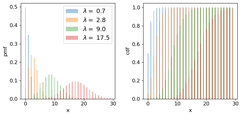
We can plot the Poisson pmf and cdf in a similar way to how we plotted the binomial distribution functions. An important point to bear in mind is that the rate parameter \(\lambda\) does not itself have to be an integer: the underlying rate is likely to be real-valued, but the Poisson distribution produces integer variates drawn from the distribution that is unique to \(\lambda\).
## Plot as a bar plot
fig, (ax1, ax2) = plt.subplots(1,2, figsize=(9,4))
fig.subplots_adjust(wspace=0.3)
## Step through lambda, note that to avoid Python confusion with lambda functions, we make sure we choose
## a different variable name!
for lam in [0.7,2.8,9.0,17.5]:
    x = np.arange(0,30)
    ## Plot the pmf, note that perhaps confusingly, the rate parameter is defined as mu
    ax1.bar(x, sps.poisson.pmf(x,mu=lam), width=0.3, alpha=0.4, label='$\lambda =$ '+str(lam))
    ## and the cumulative distribution function:
    ax2.bar(x, sps.poisson.cdf(x,mu=lam), width=0.3, alpha=0.4, label='$\lambda =$ '+str(lam))
for ax in (ax1,ax2):
    ax.tick_params(labelsize=12)
    ax.set_xlabel("x", fontsize=12)
    ax.tick_params(axis='x', labelsize=12)
    ax.tick_params(axis='y', labelsize=12)
ax1.set_ylabel("pmf", fontsize=12)
ax2.set_ylabel("cdf", fontsize=12)
ax1.legend(fontsize=14)
plt.show()
Programming example: how long until the data are complete?
Following your successful proposal for observing time, you’ve been awarded 18 radio observations of neutron star binary mergers (detected via gravitational wave emission) in order to search for radio emitting counterparts. The expected detection rate for gravitational wave events from binary neutron star mergers is 9.5 per year. Assume that you require all 18 observations to complete your proposed research. According to the time award rules for so-called ‘Target of opportunity (ToO)’ observations like this, you will need to resubmit your proposal if it isn’t completed within 3 years. What is the probability that you will need to resubmit your proposal?
Solution
Since binary mergers are independent random events and their mean detection rate (at least for a fixed detector sensitivity and on the time-scale of the experiment!) should be constant in time, the number of merger events in a fixed time interval should follow a Poisson distribution.
Given that we require the full 18 observations, the proposal will need to be resubmitted if there are fewer than 18 gravitational wave events (from binary neutron stars) in 3 years. For this we can use the cdf, remember again that for the cdf \(F(x) = P(X\leq x)\), so we need the cdf for 17 events. The interval we are considering is 3 years not 1 year, so we should multiply the annual detection rate by 3 to get the correct \(\lambda\):
lam = 9.5*3
print("Probability that < 18 observations have been carried out in 3 years =",sps.poisson.cdf(17,lam))
Probability that < 18 observations have been carried out in 3 years = 0.014388006538141204So there is only a 1.4% chance that we will need to resubmit our proposal.
Test yourself: is this a surprising detection?
Meanwhile, one of your colleagues is part of a team using a sensitive neutrino detector to search for bursts of neutrinos associated with neutron star mergers detected from gravitational wave events. The detector has a constant background rate of 0.03 count/s. In a 1 s interval following a gravitational wave event, the detector detects a two neutrinos. Without using Python (i.e. by hand, with a calculator), calculate the probability that you would detect less than two neutrinos in that 1 s interval. Assuming that the neutrinos are background detections, should you be suprised about your detection of two neutrinos?
Solution
The probability that you would detect less than two neutrinos is equal to the summed probability that you would detect 0 or 1 neutrino (note that we can sum their probabilities because they are mutually exclusive outcomes). Assuming these are background detections, the rate parameter is given by the background rate \(\lambda=0.03\). Applying the Poisson distribution formula (assuming the random Poisson variable \(x\) is the number of background detections \(N_{\nu}\)) we obtain:
\(P(N_{\nu}<2)=P(N_{\nu}=0)+P(N_{\nu}=1)=\frac{0.03^{0}e^{-0.03}}{0!}+\frac{0.03^{1}e^{-0.03}}{1!}=(1+0.03)e^{-0.03}=0.99956\) to 5 significant figures.
We should be surprised if the detections are just due to the background, because the chance we would see 2 (or more) background neutrinos in the 1-second interval after the GW event is less than one in two thousand! Having answered the question ‘the slow way’, you can also check your result for the probability using the
scipy.statsPoisson cdf for \(x=1\).Note that it is crucial here that the neutrinos arrive within 1 s of the GW event. This is because GW events are rare and the background rate is low enough that it would be unusual to see two background neutrinos appear within 1 s of the rare event which triggers our search. If we had seen two neutrinos only within 100 s of the GW event, we would be much less surprised (the rate expected is 3 count/100 s). We will consider these points in more detail in a later episode, after we have discussed Bayes’ theorem.
Generating random variates drawn from discrete probability distributions
So far we have discussed random variables in an abstract sense, in terms of the population, i.e. the continuous probability distribution. But real data is in the form of samples: individual measurements or collections of measurements, so we can get a lot more insight if we can generate ‘fake’ samples from a given distribution.
The scipy.stats distribution functions have a method rvs for generating random variates that are drawn from the distribution (with the given parameter values). You can either freeze the distribution or specify the parameters when you call it. The number of variates generated is set by the size argument and the results are returned to a numpy array. The default seed is the system seed, but if you initialise your own generator (e.g. using rng = np.random.default_rng()) you can pass this to the rvs method using the random_state parameter.
# Generate 10 variates from Binom(10,0.4)
bn_vars = print(sps.binom.rvs(n=4,p=0.4,size=10))
print("Binomial variates generated:",bn_vars)

# Generate 10 variates from Pois(2.7)
pois_vars = sps.poisson.rvs(mu=2.7,size=10)
print("Poisson variates generated:",pois_vars)
Binomial variates generated: [1 2 0 2 3 2 2 1 2 3]
Poisson variates generated: [6 4 2 2 5 2 2 0 3 5]
Remember that these numbers depend on the starting seed which is almost certainly unique to your computer (unless you pre-select it by passing a bit generator initialised by a specific seed as the argument for the random_state parameter). They will also change each time you run the code cell.
How random number generation works
Random number generators use algorithms which are strictly pseudo-random since (at least until quantum-computers become mainstream) no algorithm can produce genuinely random numbers. However, the non-randomness of the algorithms that exist is impossible to detect, even in very large samples.
For any distribution, the starting point is to generate uniform random variates in the interval \([0,1]\) (often the interval is half-open \([0,1)\), i.e. exactly 1 is excluded). \(U(0,1)\) is the same distribution as the distribution of percentiles - a fixed range quantile has the same probability of occurring wherever it is in the distribution, i.e. the range 0.9-0.91 has the same probability of occuring as 0.14-0.15. This means that by drawing a \(U(0,1)\) random variate to generate a quantile and putting that in the ppf of the distribution of choice, the generator can produce random variates from that distribution. All this work is done ‘under the hood’ within the
scipy.statsdistribution function.It’s important to bear in mind that random variates work by starting from a ‘seed’ (usually an integer) and then each call to the function will generate a new (pseudo-)independent variate but the sequence of variates is replicated if you start with the same seed. However, seeds are generated by starting from a system seed set using random and continuously updated data in a special file in your computer, so they will differ each time you run the code.
Programming challenge: distributions of discrete measurements
It often happens that we want to take measurements for a sample of objects in order to classify them. E.g. we might observe photons from a particle detector and use them to identify the particle that caused the photon trigger. Or we measure spectra for a sample of astronomical sources, and use them to classify and count the number of each type of object in the sample. In these situations it is useful to know how the number of objects with a given classification - which is a random variate - is distributed.
For this challenge, consider the following simple situation. We use X-ray data to classify a sample of \(n_{\rm samp}\) X-ray sources in an old star cluster as either black holes or neutron stars. Assume that the probability of an X-ray source being classified as a black hole is \(\theta=0.7\) and the classification for any source is independent of any other. Then, for a given sample size the number of X-ray sources classified as black holes is a random variable \(X\), with \(X\sim \mathrm{Binom}(n_{\rm samp},\theta)\).
Now imagine two situations for constructing your sample of X-ray sources:
- a. You consider only a fixed, pre-selected sample size \(n_{\rm samp}=10\). E.g. perhaps you consider only the 10 brightest X-ray sources, or the 10 that are closest to the cluster centre (for simplicity, you can assume that the sample selection criterion does not affect the probability that a source is classified as a black hole).
- b. You consider a random sample size of X-ray sources such that \(n_{\rm samp}\) is Poisson distributed with \(n_{\rm samp}\sim \mathrm{Pois}(\lambda=10)\). I.e. the expectation of the sample size is the same as for the fixed sample size, but the sample itself can randomly vary in size, following a Poisson distribution.
Now use Scipy to simulate a set of \(10^{6}\) samples of measurements of \(X\) for each of these two situations. I.e. first keeping the sample size fixed (then randomly generated) for a million trials, generate binomially distributed variates. Plot the probability mass function of your simulated measurements of \(X\) (this is just a histogram of the number of trials producing each value of \(X\), divided by the number of trials to give a probability for each value of \(X\)) and compare your simulated distributions with the pmfs for binomial and Poisson distributions to see what matches best for each of the two cases of sample size (fixed or Poisson-distributed) considered.
To help you, you should make a plot which looks like this:
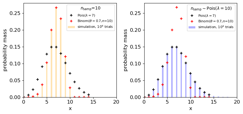
The plot shows that the distribution of the measured number of black holes depends on whether the sample size was fixed or not!
Finally, explain why the distribution of \(X\) for the random Poisson-distributed sample size follows the Poisson distribution for \(\lambda=7\).
Hints
- Instead of using a for loop to generate a million random variates, you can use the
sizeargument with the.rvsmethod to generate a single array of a million variates.- For counting the frequency of each value of a random variate, you can use e.g.
np.histogramorplt.hist(the latter will plot the histogram directly) but when the values are integers it is simplest to count the numbers of each value usingnp.bincount. Look it up to see how it is used.- Use
plt.scatterto plot pmf values using markers.
Key Points
Discrete probability distributions map a sample space of discrete outcomes (categorical or numerical) on to their probabilities.
By assigning an outcome to an ordered sequence of integers corresponding to the discrete variates, functional forms for probability distributions (the pmf or probability mass function) can be defined.
Random variables are drawn from probability distributions. The expectation value (arithmetic mean for an infinite number of sampled variates) is equal to the mean of the distribution function (pmf or pdf).
The expectation of the variance of a random variable is equal to the expectation of the squared variable minus the squared expectation of the variable.
Sums of scaled random variables have expectation values equal to the sum of scaled expectations of the individual variables, and variances equal to the sum of scaled individual variances.
Bernoulli trials correspond to a single binary outcome (success/fail) while the number of successes in repeated Bernoulli trials is given by the binomial distribution.
The Poisson distribution can be derived as a limiting case of the binomial distribution and corresponds to the probability of obtaining a certain number of counts in a fixed interval, from a random process with a constant rate.
Random variates can be sampled from Scipy probability distributions using the
.rvsmethod.The probability distribution of numbers of objects for a given bin/classification depends on whether the original sample size was fixed at a pre-determined value or not.
Continuous random variables and their probability distributions
Overview
Teaching: 60 min
Exercises: 60 minQuestions
How are continuous probability distributions defined and described?
What happens to the distributions of sums or means of random data?
Objectives
Learn how the pdf, cdf, quantiles, ppf are defined and how to plot them using
scipy.statsdistribution functions and methods.Learn how the expected means and variances of continuous random variables (and functions of them) can be calculated from their probability distributions.
Understand how the shapes of distributions can be described parametrically and empirically.
Learn how to carry out Monte Carlo simulations to demonstrate key statistical results and theorems.
In this episode we will be using numpy, as well as matplotlib’s plotting library. Scipy contains an extensive range of distributions in its ‘scipy.stats’ module, so we will also need to import it. Remember: scipy modules should be installed separately as required - they cannot be called if only scipy is imported.
import numpy as np
import matplotlib.pyplot as plt
import scipy.stats as sps
The cdf and pdf of a continuous probability distribution
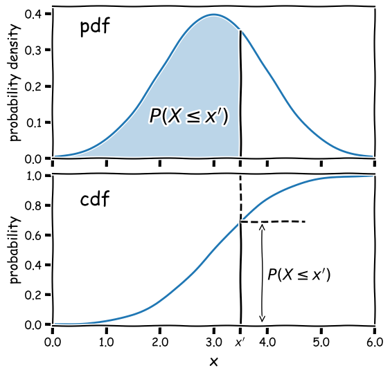
Consider a continuous random variable \(x\), which follows a fixed, continuous probability distribution. A random variate \(X\) (e.g. a single experimental measurement) is drawn from the distribution. We can define the probability \(P\) that \(X\leq x\) as being the cumulative distribution function (or cdf), \(F(x)\):
[F(x) = P(X\leq x)]
We can choose the limiting values of our distribution, but since \(X\) must take on some value (i.e. the definition of an ‘event’ is that something must happen) the distribution must satisfy:
\(\lim\limits_{x\rightarrow -\infty} F(x) = 0\) and \(\lim\limits_{x\rightarrow +\infty} F(x) = 1\)
From these definitions we find that the probability that \(X\) lies in the closed interval \([a,b]\) (note: a closed interval, denoted by square brackets, means that we include the endpoints \(a\) and \(b\)) is:
[P(a \leq X \leq b) = F(b) - F(a)]
We can then take the limit of a very small interval \([x,x+\delta x]\) to define the probability density function (or pdf), \(p(x)\):
[\frac{P(x\leq X \leq x+\delta x)}{\delta x} = \frac{F(x+\delta x)-F(x)}{\delta x}]
[p(x) = \lim\limits_{\delta x \rightarrow 0} \frac{P(x\leq X \leq x+\delta x)}{\delta x} = \frac{\mathrm{d}F(x)}{\mathrm{d}x}]
This means that the cdf is the integral of the pdf, e.g.:
[P(X \leq x) = F(x) = \int^{x}_{-\infty} p(x^{\prime})\mathrm{d}x^{\prime}]
where \(x^{\prime}\) is a dummy variable. The probability that \(X\) lies in the interval \([a,b]\) is:
[P(a \leq X \leq b) = F(b) - F(a) = \int_{a}^{b} p(x)\mathrm{d}x]
and \(\int_{-\infty}^{\infty} p(x)\mathrm{d}x = 1\).
Note that the pdf is in some sense the continuous equivalent of the pmf of discrete distributions, but for continuous distributions the function must be expressed as a probability density for a given value of the continuous random variable, instead of the probability used by the pmf. A discrete distribution always shows a finite (or exactly zero) probability for a given value of the discrete random variable, hence the different definitions of the pdf and pmf.
Why use the pdf?
By definition, the cdf can be used to directly calculate probabilities (which is very useful in statistical assessments of data), while the pdf only gives us the probability density for a specific value of \(X\). So why use the pdf? One of the main reasons is that it is generally much easier to calculate the pdf for a particular probability distribution, than it is to calculate the cdf, which requires integration (which may be analytically impossible in some cases!).
Also, the pdf gives the relative probabilities (or likelihoods) for particular values of \(X\) and the model parameters, allowing us to compare the relative likelihood of hypotheses where the model parameters are different. This principle is a cornerstone of statistical inference which we will come to later on.
Properties of continuous random variates: mean and variance
As with variates drawn from discrete distributions, the expectation \(E(X)\) (also known as the mean for continuous random variates is equal to their arithmetic mean as the number of sampled variates increases \(\rightarrow \infty\). For a continuous probability distribution it is given by the mean of the distribution function, i.e. the pdf:
[E[X] = \mu = \int_{-\infty}^{+\infty} xp(x)\mathrm{d}x]
And we can obtain the expectation of some function of \(X\), \(f(X)\):
[E[f(X)] = \int_{-\infty}^{+\infty} f(x)p(x)\mathrm{d}x]
while the variance is:
[V[X] = \sigma^{2} = E[(X-\mu)^{2})] = \int_{-\infty}^{+\infty} (x-\mu)^{2} p(x)\mathrm{d}x]
and the results for scaled linear combinations of continuous random variates are the same as for discrete random variates, i.e. for a scaled sum of random variates \(Y=\sum\limits_{i=1}^{n} a_{i}X_{i}\):
[E[Y] = \sum\limits_{i=1}^{n} a_{i}E[X_{i}]]
[V[Y] = \sum\limits_{i=1}^{n} a_{i}^{2} \sigma_{i}^{2}]
Taking averages: sample means vs. population means
As an example of summing scaled random variates, it is often necessary to calculate an average quantity rather than the summed value, i.e.:
\[\bar{X} = \frac{1}{n} \sum\limits_{i=1}^{n} X_{i}\]Where \(\bar{X}\) is also known as the sample mean. In this case the scaling factors \(a_{i}=\frac{1}{n}\) for all \(i\) and we obtain:
\[E[\bar{X}] = \frac{1}{n} \sum\limits_{i=1}^{n} \mu_{i}\] \[V[\bar{X}] = \frac{1}{n^{2}} \sum\limits_{i=1}^{n} \sigma_{i}^{2}\]and in the special case where the variates are all drawn from the same distribution with mean \(\mu\) and variance \(\sigma^{2}\):
\(E[\bar{X}] = \mu\) and \(V[\bar{X}] = \frac{\sigma^{2}}{n}\),
which leads to the so-called standard error on the sample mean (the standard deviation of the sample mean):
\[\sigma_{\bar{X}} = \sigma/\sqrt{n}\]It is important to make a distinction between the sample mean for a sample of random variates (\(\bar{X}\)) and the expectation value, also known as the population mean of the distribution the variates are drawn from, in this case \(\mu\). In frequentist statistics, expectation values are the limiting average values for an infinitely sized sample (the ‘population’) drawn from a given distribution, while in Bayesian terms they simply represent the mean of the probability distribution.
Probability distributions: Uniform
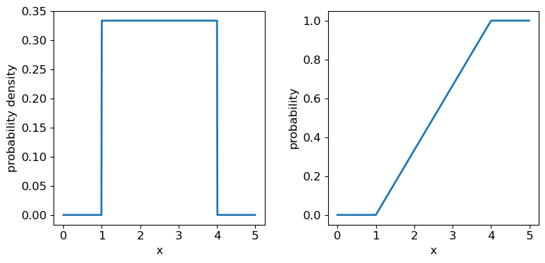
Now we’ll introduce two common probability distributions, and see how to use them in your Python data analysis. We start with the uniform distribution, which has equal probability values defined over some finite interval \([a,b]\) (and zero elsewhere). The pdf is given by:
[p(x\vert a,b) = 1/(b-a) \quad \mathrm{for} \quad a \leq x \leq b]
where the notation \(p(x\vert a,b)\) means ‘probability density at x, conditional on model parameters \(a\) and \(b\)‘. For \(X\) drawn from a uniform distribution over the interval \([a,b]\), we write \(X\sim \mathrm{U}(a,b)\). We can use the approach given above to calculate the mean \(E[X] = (b+a)/2\) and variance \(V[X] = (b-a)^{2}/12\).
Distribution parameters: location, scale and shape
When working with probability distributions in Python, it is often useful to ‘freeze’ a distribution by fixing its parameters and defining the frozen distribution as a new function, which saves repeating the parameters each time. The common format for arguments of scipy statistical distributions which represent distribution parameters, corresponds to statistical terminology for the parameters:
- A location parameter (the
locargument in the scipy function) determines the location of the distribution on the \(x\)-axis. Changing the location parameter just shifts the distribution along the \(x\)-axis.- A scale parameter (the
scaleargument in the scipy function) determines the width or (more formally) the statistical dispersion of the distribution. Changing the scale parameter just stretches or shrinks the distribution along the \(x\)-axis but does not otherwise alter its shape.- There may be one or more shape parameters (scipy function arguments may have different names specific to the distribution). These are parameters which do something other than shifting, or stretching/shrinking the distribution, i.e. they change the shape in some way.
Distributions may have all or just one of these parameters, depending on their form. For example, normal distributions are completely described by their location (the mean) and scale (the standard deviation), while exponential distributions (and the related discrete Poisson distribution) may be defined by a single parameter which sets their location as well as width. Some distributions use a rate parameter which is the reciprocal of the scale parameter (exponential/Poisson distributions are an example of this).
Now let’s freeze a uniform distribution with parameters \(a=1\) and \(b=4\):
## define parameters for our uniform distribution
a = 1
b = 4
print("Uniform distribution with limits",a,"and",b,":")
## freeze the distribution for a given a and b
ud = sps.uniform(loc=a, scale=b-a) # The 2nd parameter is added to a to obtain the upper limit = b
The uniform distribution has a scale parameter \(\lvert b-a \rvert\). This statistical distribution’s location parameter is formally the centre of the distribution, \((a+b)/2\), but for convenience the scipy uniform function uses \(a\) to place a bound on one side of the distribution. We can obtain and plot the pdf and cdf by applying those named methods to the scipy function. Note that we must also use a suitable function (e.g. numpy.arange) to create a sufficiently dense range of \(x\)-values to make the plots over.
## You can plot the probability density function
fig, (ax1, ax2) = plt.subplots(1,2, figsize=(9,4))
# change the separation between the sub-plots:
fig.subplots_adjust(wspace=0.3)
x = np.arange(0., 5.0, 0.01)
ax1.plot(x, ud.pdf(x), lw=2)
## or you can plot the cumulative distribution function:
ax2.plot(x, ud.cdf(x), lw=2)
for ax in (ax1,ax2):
    ax.tick_params(labelsize=12)
    ax.set_xlabel("x", fontsize=12)
    ax.tick_params(axis='x', labelsize=12)
    ax.tick_params(axis='y', labelsize=12)
ax1.set_ylabel("probability density", fontsize=12)
ax2.set_ylabel("probability", fontsize=12)
plt.show()
Probability distributions: Normal
The normal distribution is one of the most important in statistical data analysis (for reasons which will become clear) and is also known to physicists and engineers as the Gaussian distribution. The distribution is defined by location parameter \(\mu\) (often just called the mean, but not to be confused with the mean of a statistical sample) and scale parameter \(\sigma\) (also called the standard deviation, but again not to be confused with the sample standard deviation). The pdf is given by:
[p(x\vert \mu,\sigma)=\frac{1}{\sigma \sqrt{2\pi}} e^{-(x-\mu)^{2}/(2\sigma^{2})}]
For normally-distributed variates (\(X\sim \mathrm{N}(\mu,\sigma)\)) we obtain the simple results that \(E[X]=\mu\) and \(V[X]=\sigma^{2}\).
It is also common to refer to the standard normal distribution which is the normal distribution with \(\mu=0\) and \(\sigma=1\):
[p(z\vert 0,1) = \frac{1}{\sqrt{2\pi}} e^{-z^{2}/2}]
The standard normal is important for many statistical results, including the approach of defining statistical significance in terms of the number of ‘sigmas’ which refers to the probability contained within a range \(\pm z\) on the standard normal distribution (we will discuss this in more detail when we discuss statistical significance testing).
Programming example: plotting the normal distribution
Now that you have seen the example of a uniform distribution, use the appropriate
scipy.statsfunction to plot the pdf and cdf of the normal distribution, for a mean and standard deviation of your choice (you can freeze the distribution first if you wish, but it is not essential).Solution
## Define mu and sigma:
mu = 2.0
sigma = 0.7
## Plot the probability density function
fig, (ax1, ax2) = plt.subplots(1,2, figsize=(9,4))
fig.subplots_adjust(wspace=0.3)
## we will plot +/- 3 sigma on either side of the mean
x = np.arange(-1.0, 5.0, 0.01)
ax1.plot(x, sps.norm.pdf(x,loc=mu,scale=sigma), lw=2)
## and the cumulative distribution function:
ax2.plot(x, sps.norm.cdf(x,loc=mu,scale=sigma), lw=2)
for ax in (ax1,ax2):
    ax.tick_params(labelsize=12)
    ax.set_xlabel("x", fontsize=12)
    ax.tick_params(axis='x', labelsize=12)
    ax.tick_params(axis='y', labelsize=12)
ax1.set_ylabel("probability density", fontsize=12)
ax2.set_ylabel("probability", fontsize=12)
plt.show()
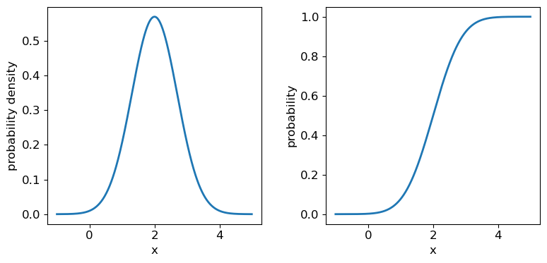
It’s useful to note that the pdf is much more distinctive for different functions than the cdf, which (because of how it is defined) always takes on a similar, slanted ‘S’-shape, hence there is some similarity in the form of cdf between the normal and uniform distributions, although their pdfs look radically different.
Probability distributions: Lognormal
Another important continuous distribution is the lognormal distribution. If random variates \(X\) are lognormally distributed, then the variates \(Y=\ln(X)\) are normally distributed.
[p(x\vert \theta,m,s) = \frac{1}{(x-\theta)s\sqrt{2\pi}}\exp \left(\frac{-\left(\ln [(x-\theta)/m] \right)^{2}}{2s^{2}}\right) \quad x > \theta \mbox{ ; } m, s > 0]
Here \(\theta\) is the location parameter, \(m\) the scale parameter and \(s\) is the shape parameter. The case for \(\theta=0\) is known as the 2-parameter lognormal distribution while the standard lognormal occurs when \(\theta=0\) and \(m=1\). For the 2-parameter lognormal (with location parameter \(\theta=0\)), \(X\sim \mathrm{Lognormal}(m,s)\) and we find \(E[X]=m\exp(s^{2}/2)\) and \(V[X]=m^{2}[\exp(s^{2})-1]\exp(s^{2})\).
Moments: mean, variance, skew, kurtosis
The mean and variance of a distribution of random variates are examples of statistical moments. The first raw moment is the mean \(\mu=E[X]\). By subtracting the mean when calculating expectations and taking higher integer powers, we obtain the central moments:
\[\mu_{n} = E[(X-\mu)^{n}]\]Which for a continuous probability distribution may be calculated as:
\[\mu_{n} = \int_{-\infty}^{+\infty} (x-\mu)^{n} p(x)\mathrm{d}x\]The central moments may sometimes be standardised by dividing by \(\sigma^{n}\), to obtain a dimensionless quantity. The first central moment is zero by definition. The second central moment is the variance (\(\sigma^{2}\)). Although the mean and variance are by far the most common, you will sometimes encounter the third and fourth central moments, known respectively as the skewness and kurtosis.
Skewness measures how skewed (asymmetric) the distribution is around the mean. Positively skewed (or ‘right-skewed’) distributions are more extended to larger values of \(x\), while negatively skewed (‘left-skewed’) distributions are more extended to smaller (or more negative) values of \(x\). For a symmetric distribution such as the normal or uniform distributions, the skewness is zero. Kurtosis measures how `heavy-tailed’ the distribution is, i.e. how strong the tail is relative to the peak of the distribution. The excess kurtosis, equal to kurtosis minus 3 is often used, so that the standard normal distribution has excess kurtosis equal to zero by definition.
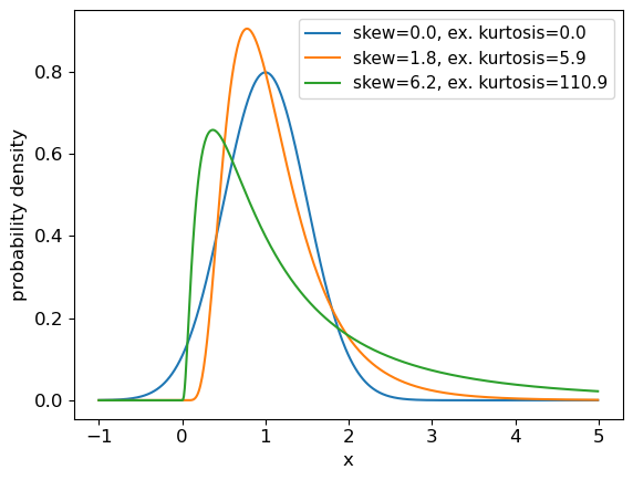
Programming example: skewness and kurtosis
We can return the moments of a Scipy distribution using the
statsmethod with the argumentmoments='sk'to return only the skew and excess kurtosis. In a single plot panel, plot the pdfs of the following distributions and give the skew and kurtosis of the distributions as labels in the legend.
- A normal distribution with \(\mu=1\) and \(\sigma=0.5\).
- A 2-parameter lognormal distribution with \(s=0.5\) and \(m=1\).
- A 2-parameter lognormal distribution with \(s=1\) and \(m=1\).
Solution
# First set up the frozen distributions:
ndist = sps.norm(loc=1,scale=0.5)
lndist1 = sps.lognorm(loc=0,scale=1,s=0.5)
lndist2 = sps.lognorm(loc=0,scale=1,s=1)

x = np.arange(-1.0, 5.0, 0.01) # x-values to plot the pdfs over
plt.figure()
for dist in [ndist,lndist1,lndist2]:
    skvals = dist.stats(moments='sk') # The stats method outputs an array with the corresponding moments
    label_txt = r"skew="+str(np.round(skvals[0],1))+", ex. kurtosis="+str(np.round(skvals[1],1))
    plt.plot(x,dist.pdf(x),label=label_txt)
plt.xlabel("x", fontsize=12)
plt.ylabel("probability density", fontsize=12)
plt.tick_params(axis='x', labelsize=12)
plt.tick_params(axis='y', labelsize=12)
plt.legend(fontsize=11)
plt.show()
Quantiles and median values
It is often useful to be able to calculate the quantiles (such as percentiles or quartiles) of a distribution, that is, what value of \(x\) corresponds to a fixed interval of integrated probability? We can obtain these from the inverse function of the cdf (\(F(x)\)). E.g. for the quantile \(\alpha\):
[F(x_{\alpha}) = \int^{x_{\alpha}}{-\infty} p(x)\mathrm{d}x = \alpha \Longleftrightarrow x{\alpha} = F^{-1}(\alpha)]
The value of \(x\) corresponding to $\alpha=0.5$, i.e. the fiftieth percentile value, which contains half the total probability below it, is known as the median. Note that positively skewed distributions always show mean values that exceed the median, while negatively skewed distributions show mean values which are less than the median (for symmetric distributions the mean and median are the same).
Note that \(F^{-1}\) denotes the inverse function of \(F\), not \(1/F\)! This is called the percent point function (or ppf). To obtain a given quantile for a distribution we can use the scipy.stats method ppf applied to the distribution function. For example:
## Print the 30th percentile of a normal distribution with mu = 3.5 and sigma=0.3
print("30th percentile:",sps.norm.ppf(0.3,loc=3.5,scale=0.3))
## Print the median (50th percentile) of the distribution
print("Median (via ppf):",sps.norm.ppf(0.5,loc=3.5,scale=0.3))
## There is also a median method to quickly return the median for a distribution:
print("Median (via median method):",sps.norm.median(loc=3.5,scale=0.3))
30th percentile: 3.342679846187588
Median (via ppf): 3.5
Median (via median method): 3.5
Intervals
It is sometimes useful to be able to quote an interval, containing some fraction of the probability (and usually centred on the median) as a ‘typical’ range expected for the random variable \(X\). We will discuss intervals on probability distributions further when we discuss confidence intervals on parameters. For now, we note that the
.intervalmethod can be used to obtain a given interval centred on the median. For example, the Interquartile Range (IQR) is often quoted as it marks the interval containing half the probability, between the upper and lower quartiles (i.e. from 0.25 to 0.75):## Print the IQR for a normal distribution with mu = 3.5 and sigma=0.3 print("IQR:",sps.norm.interval(0.5,loc=3.5,scale=0.3))IQR: (3.2976530749411754, 3.7023469250588246)So for the normal distribution, with \(\mu=3.5\) and \(\sigma=0.3\), half of the probability is contained in the range \(3.5\pm0.202\) (to 3 decimal places).
The distributions of random numbers
In the previous episode we saw how to use Python to generate random numbers and calculate statistics or do simple statistical experiments with them (e.g. looking at the covariance as a function of sample size). We can also generate a larger number of random variates and compare the resulting sample distribution with the pdf of the distribution which generated them. We show this for the uniform and normal distributions below:
mu = 1
sigma = 2
## freeze the distribution for the given mean and standard deviation
nd = sps.norm(mu, sigma)

## Generate a large and a small sample
sizes=[100,10000]
x = np.arange(-5.0, 8.0, 0.01)
fig, (ax1, ax2) = plt.subplots(1,2, figsize=(9,4))
fig.subplots_adjust(wspace=0.3)
for i, ax in enumerate([ax1,ax2]):
    nd_rand = nd.rvs(size=sizes[i])
    # Make the histogram semi-transparent
    ax.hist(nd_rand, bins=20, density=True, alpha=0.5)
    ax.plot(x,nd.pdf(x))
    ax.tick_params(labelsize=12)
    ax.set_xlabel("x", fontsize=12)
    ax.tick_params(axis='x', labelsize=12)
    ax.tick_params(axis='y', labelsize=12)
    ax.set_ylabel("probability density", fontsize=12)
    ax.set_xlim(-5,7.5)
    ax.set_ylim(0,0.3)
    ax.text(2.5,0.25,
            "$\mu=$"+str(mu)+", $\sigma=$"+str(sigma)+"\n n = "+str(sizes[i]),fontsize=14)
plt.show()

## Repeat for the uniform distribution
a = 1
b = 4
## freeze the distribution for given a and b
ud = sps.uniform(loc=a, scale=b-a)
sizes=[100,10000]
x = np.arange(0.0, 5.0, 0.01)
fig, (ax1, ax2) = plt.subplots(1,2, figsize=(9,4))
fig.subplots_adjust(wspace=0.3)
for i, ax in enumerate([ax1,ax2]):
    ud_rand = ud.rvs(size=sizes[i])
    ax.hist(ud_rand, bins=20, density=True, alpha=0.5)
    ax.plot(x,ud.pdf(x))
    ax.tick_params(labelsize=12)
    ax.set_xlabel("x", fontsize=12)
    ax.tick_params(axis='x', labelsize=12)
    ax.tick_params(axis='y', labelsize=12)
    ax.set_ylabel("probability density", fontsize=12)
    ax.set_xlim(0,5)
    ax.set_ylim(0,0.8)
    ax.text(3.0,0.65,
            "$a=$"+str(a)+", $b=$"+str(b)+"\n n = "+str(sizes[i]),fontsize=14)
plt.show()
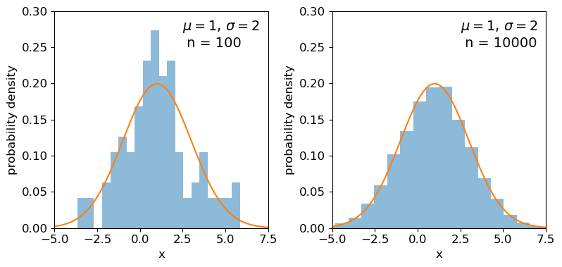
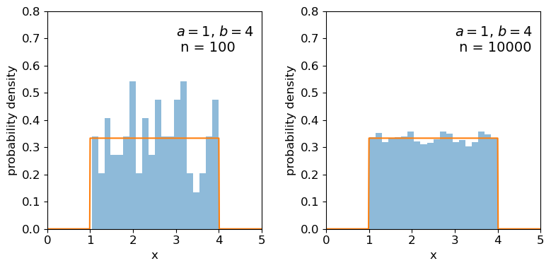
Clearly the sample distributions for 100 random variates are much more scattered compared to the 10000 random variates case (and the ‘true’ distribution).
The distributions of sums of uniform random numbers
Now we will go a step further and run a similar experiment but plot the histograms of sums of random numbers instead of the random numbers themselves. We will start with sums of uniform random numbers which are all drawn from the same, uniform distribution. To plot the histogram we need to generate a large number (ntrials) of samples of size given by nsamp, and step through a range of nsamp to make a histogram of the distribution of summed sample variates. Since we know the mean and variance of the distribution our variates are drawn from, we can calculate the expected variance and mean of our sum using the approach for sums of random variables described in the previous episode.
# Set ntrials to be large to keep the histogram from being noisy
ntrials = 100000
# Set the list of sample sizes for the sets of variates generated and summed
nsamp = [2,4,8,16,32,64,128,256,512]
# Set the parameters for the uniform distribution and freeze it
a = 0.5
b = 1.5
ud = sps.uniform(loc=a,scale=b-a)
# Calculate variance and mean of our uniform distribution
ud_var = ud.var()
ud_mean = ud.mean()
# Now set up and plot our figure, looping through each nsamp to produce a grid of subplots
n = 0  # Keeps track of where we are in our list of nsamp
fig, ax = plt.subplots(3,3, figsize=(9,4))
fig.subplots_adjust(wspace=0.3,hspace=0.3) # Include some spacing between subplots
# Subplots ax have indices i,j to specify location on the grid
for i in range(3):
    for j in range(3):
        # Generate an array of ntrials samples with size nsamp[n]
        ud_rand = ud.rvs(size=(ntrials,nsamp[n]))
        # Calculate expected mean and variance for our sum of variates
        exp_var = nsamp[n]*ud_var
        exp_mean = nsamp[n]*ud_mean
        # Define a plot range to cover adequately the range of values around the mean
        plot_range = (exp_mean-4*np.sqrt(exp_var),exp_mean+4*np.sqrt(exp_var))
        # Define xvalues to calculate normal pdf over
        xvals = np.linspace(plot_range[0],plot_range[1],200)
        # Calculate histogram of our sums
        ax[i,j].hist(np.sum(ud_rand,axis=1), bins=50, range=plot_range,
                                              density=True, alpha=0.5)
        # Also plot the normal distribution pdf for the calculated sum mean and variance
        ax[i,j].plot(xvals,sps.norm.pdf(xvals,loc=exp_mean,scale=np.sqrt(exp_var)))
        # The 'transform' argument allows us to locate the text in relative plot coordinates
        ax[i,j].text(0.1,0.8,"$n=$"+str(nsamp[n]),transform=ax[i,j].transAxes)
        n = n + 1
        # Only include axis labels at the left and lower edges of the grid:
        if j == 0:
            ax[i,j].set_ylabel('prob. density')
        if i == 2:
            ax[i,j].set_xlabel("sum of $n$ $U($"+str(a)+","+str(b)+"$)$ variates")
plt.show()
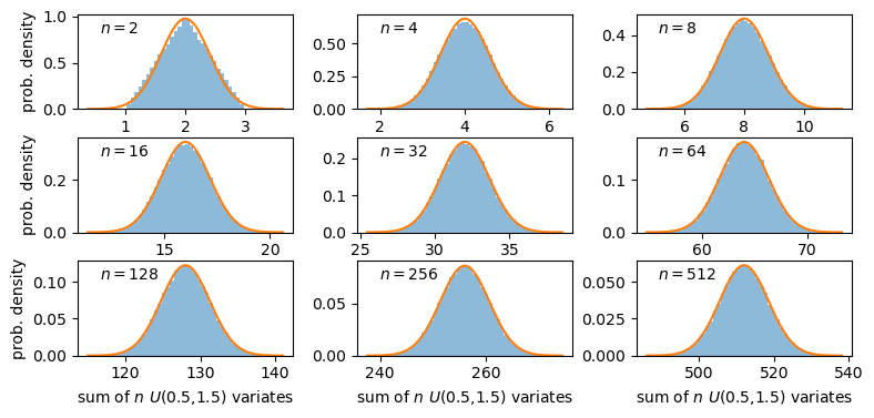
A sum of two uniform variates follows a triangular probability distribution, but as we add more variates we see that the distribution starts to approach the shape of the normal distribution for the same (calculated) mean and variance! Let’s show this explicitly by calculating the ratio of the ‘observed’ histograms for our sums to the values from the corresponding normal distribution.
To do this correctly we should calculate the average probability density of the normal pdf in bins which are the same as in the histogram. We can calculate this by integrating the pdf over each bin, using the difference in cdfs at the upper and lower bin edge (which corresponds to the integrated probability in the normal pdf over the bin). Then if we normalise by the bin width, we get the probability density expected from a normal distribution with the same mean and variance as the expected values for our sums of variates.
# For better precision we will make ntrials 10 times larger than before, but you
# can reduce this if it takes longer than a minute or two to run.
ntrials = 1000000
nsamp = [2,4,8,16,32,64,128,256,512]
a = 0.5
b = 1.5
ud = sps.uniform(loc=a,scale=b-a)
ud_var = ud.var()
ud_mean = ud.mean()
n = 0
fig, ax = plt.subplots(3,3, figsize=(9,4))
fig.subplots_adjust(wspace=0.3,hspace=0.3)
for i in range(3):
    for j in range(3):
        ud_rand = ud.rvs(size=(ntrials,nsamp[n]))
        exp_var = nsamp[n]*ud_var
        exp_mean = nsamp[n]*ud_mean
        nd = sps.norm(loc=exp_mean,scale=np.sqrt(exp_var))
        plot_range = (exp_mean-4*np.sqrt(exp_var),exp_mean+4*np.sqrt(exp_var))
        # Since we no longer want to plot the histogram itself, we will use the numpy function instead
        dens, edges = np.histogram(np.sum(ud_rand,axis=1), bins=50, range=plot_range,
                                              density=True)
        # To get the pdf in the same bins as the histogram, we calculate the differences in cdfs at the bin
        # edges and normalise them by the bin widths.
        norm_pdf = (nd.cdf(edges[1:])-nd.cdf(edges[:-1]))/np.diff(edges)
        # We can now plot the ratio as a pre-calculated histogram using this trick:
        ax[i,j].hist((edges[1:]+edges[:-1])/2,bins=edges,weights=dens/norm_pdf,density=False,
                     histtype='step')
        ax[i,j].text(0.05,0.8,"$n=$"+str(nsamp[n]),transform=ax[i,j].transAxes)
        n = n + 1
        ax[i,j].set_ylim(0.5,1.5)
        if j == 0:
            ax[i,j].set_ylabel('ratio')
        if i == 2:
            ax[i,j].set_xlabel("sum of $n$ $U($"+str(a)+","+str(b)+"$)$ variates")
plt.show()
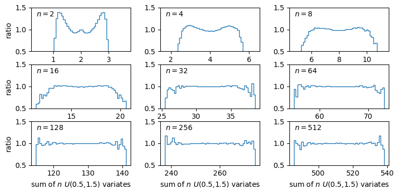
The plots show the ratio between the distributions of our sums of \(n\) uniform variates, and the normal distribution with the same mean and variance expected from the distribution of summed variates. There is still some scatter at the edges of the distributions, where there are only relatively few counts in the histograms of sums, but the ratio plots still demonstrate a couple of important points:
- As the number of summed uniform variates increases, the distribution of the sums gets closer to a normal distribution (with mean and variance the same as the values expected for the summed variable).
- The distribution of summed variates is closer to normal in the centre, and deviates more strongly in the ‘wings’ of the distribution.
It’s also useful to note that a normally distributed variate added to another normally distributed variate, produces another normally distributed variate (with mean and variance equal to the sums of mean and variance for the added variables). The normal distribution is a limiting distribution, which sums of random variates will always approach, leading us to one of the most important theorems in statistics…
The Central Limit Theorem
The Central Limit Theorem (CLT) states that under certain general conditions (e.g. distributions with finite mean and variance), a sum of \(n\) random variates drawn from distributions with mean \(\mu_{i}\) and variance \(\sigma_{i}^{2}\) will tend towards being normally distributed for large \(n\), with the distribution having mean \(\mu = \sum\limits_{i=1}^{n} \mu_{i}\) and variance \(\sigma^{2} = \sum\limits_{i=1}^{n} \sigma_{i}^{2}\) (and if we instead take the mean rather than the sum of variates, we find \(\mu = \frac{1}{n} \sum\limits_{i=1}^{n} \mu_{i}\) and \(\sigma^{2} = \frac{1}{n^{2}} \sum\limits_{i=1}^{n} \sigma_{i}^{2}\)).
It is important to note that the limit is approached asymptotically with increasing \(n\), and the rate at which it is approached depends on the shape of the distribution(s) of variates being summed, with more asymmetric distributions requiring larger \(n\) to approach the normal distribution to a given accuracy. The CLT also applies to mixtures of variates drawn from different types of distribution or variates drawn from the same type of distribution but with different parameters. Note also that summed normally distributed variables are always distributed normally, whatever the combination of normal distribution parameters.
Finally, we should bear in mind that, as with other distributions, in the large sample limit the binomial and Poisson distributions both approach the normal distribution, with mean and standard deviation given by the expected values for the discrete distributions (i.e. \(\mu=n\theta\) and \(\sigma=\sqrt{n\theta(1-\theta)}\) for the binomial distribution and \(\mu = \lambda\) and \(\sigma = \sqrt{\lambda}\) for the Poisson distribution). It’s easy to do a simple comparison yourself, by overplotting the Poisson or binomial pdfs on those for the normal distribution.
Programming challenge: the central limit theorem applied to skewed distributions
We used Monte Carlo simulations above to show that the sum of \(n\) random uniform variates converges on a normal distribution for large \(n\). Now we will investigate what happens when the variates being summed are drawn from a skewed distribution, such as the lognormal distribution. Repeat the exercise above to show the ratio compared to a normal distribution for multiple values of \(n\), but for a sum of lognormally distributed variates instead of the uniformly distributed variates used above. You should try this for the following lognormal distribution parameters:
- \(s=0.5\) and \(m=1\).
- \(s=1\) and \(m=1\).
Also, use the functions
scipy.stats.skewandscipy.stats.kurtosisto calculate the sample skew and kurtosis of your sums of simulated variates for each value of \(n\) and include the calculated values in the legends of your plots. Besides giving the simulated data array, you can use the default arguments for each function. These functions calculate the sample equivalents (i.e. for actual data) of the standardised skew and excess kurtosis.Based on your plots and your measurements of the sample skew and kurtosis for each \(n\) considered, comment on what effect the skewness of the initial lognormal distribution has on how quickly a normal distribution is reached by summing variates.
Key Points
Probability distributions show how random variables are distributed. Three common continuous distributions are the uniform, normal and lognormal distributions.
The probability density function (pdf) and cumulative distribution function (cdf) can be accessed for scipy statistical distributions via the
cdfmethods.Probability distributions are defined by common types of parameter such as the location and scale parameters. Some distributions also include shape parameters.
The shape of a distribution can be empirically quantified using its statistical moments, such as the mean, variance, skewness (asymmetry) and kurtosis (strength of the tails).
Quantiles such as percentiles and quartiles give the values of the random variable which correspond to fixed probability intervals (e.g. of 1 per cent and 25 per cent respectively). They can be calculated for a distribution in scipy using the
percentileorintervalmethods.The percent point function (ppf) (
ppfmethod) is the inverse function of the cdf and shows the value of the random variable corresponding to a given quantile in its distribution.The means and variances of summed random variables lead to the calculation of the standard error (the standard deviation) of the mean.
Sums of samples of random variates from non-normal distributions with finite mean and variance, become asymptotically normally distributed as their sample size increases. The speed at which a normal distribution is approached depends on the shape/symmetry of the variate’s distribution.
Distributions of means (or other types of sum) of non-normal random data are closer to normal in their centres than in the tails of the distribution, so the normal assumption is most reliable for data that are closer to the mean.
Joint probability distributions
Overview
Teaching: 60 min
Exercises: 60 minQuestions
How do we define and describe the joint probability distributions of two or more random variables?
Objectives
Learn how the pdf and cdf are defined for joint bivariate probability distributions and how to plot them using 3-D and contour plots.
Learn how the univariate probability distribution for each variable can be obtained from the joint probability distribution by marginalisation.
Understand the meaning of the covariance and correlation coefficient between two variables, and how they can be applied to define a multivariate normal distribution in Scipy.
In this episode we will be using numpy, as well as matplotlib’s plotting library. Scipy contains an extensive range of distributions in its ‘scipy.stats’ module, so we will also need to import it. Remember: scipy modules should be installed separately as required - they cannot be called if only scipy is imported.
import numpy as np
import matplotlib.pyplot as plt
import scipy.stats as sps
Joint probability distributions
So far we have considered probability distributions that describe the probability of sampling a single variable. These are known as univariate probability distributions. Now we will consider joint probability distributions which describe the probability of sampling a given combination of multiple variables, where we must make use of our understanding of conditional probability. Such distributions can be multivariate, considering multiple variables, but for simplicity we will focus on the bivariate case, with only two variables \(x\) and \(y.\)
Now consider that each variable is sampled by measurement, to return variates \(X\) and \(Y\). Any combination of variates can be considered as an event, with probability given by \(P(X \mbox{ and } Y)\). For discrete variables, we can simply write the joint probability mass function as:
[p(x,y) = P(X=x \mbox{ and } Y=y)]
and so the equivalent for the cdf is:
[F(x,y) = P(X\leq x \mbox{ and } Y\leq y) = \sum\limits_{x_{i}\leq x, y_{j}\leq y} p(x_{i},y_{j})]
For continuous variables we need to consider the joint probability over an infinitesimal range in \(x\) and \(y\). The joint probability density function for jointly sampling variates with values \(X\) and \(Y\) is defined as:
[p(x,y) = \lim\limits_{\delta x, \delta y\rightarrow 0} \frac{P(x \leq X \leq x+\delta x \mbox{ and } y \leq Y \leq y+\delta y)}{\delta x \delta y}]
I.e. this is the probability that a given measurement of two variables finds them both in the ranges \(x \leq X \leq x+\delta x\), \(y \leq Y \leq y+\delta y\). For the cdf we have:
[F(x,y) = P(X\leq x \mbox{ and } Y\leq y) = \int^{x}{-\infty} \int^{y}{-\infty} p(x’,y’)\mathrm{d}x’ \mathrm{d}y’]
where \(x'\) and \(y'\) are dummy variables.
In general the probability of variates \(X\) and \(Y\) having values in some region \(R\) is:
[P(X \mbox{ and } Y \mbox{ in }R) = \int \int_{R} p(x,y)\mathrm{d}x\mathrm{d}y]
Conditional probability and marginalisation
Let’s now recall the multiplication rule of probability calculus for the variates \(X\) and \(Y\) occuring together:
[p(x,y) = P(X=x \mbox{ and } Y=y) = p(x\vert y)p(y)]
I.e. we can understand the joint probability \(p(x,y)\) in terms of the probability for a particular \(x\) to occur given that a particular \(y\) also occurs. The probability for a given pair of \(x\) and \(y\) is the same whether we consider \(x\) or \(y\) as the conditional variable. We can then write the multiplication rule as:
[p(x,y)=p(y,x) = p(x\vert y)p(y) = p(y\vert x)p(x)]
From this we have the law of total probability:
[p(x) = \int_{-\infty}^{+\infty} p(x,y)dy = \int_{-\infty}^{+\infty} p(x\vert y)p(y)\mathrm{d}y]
i.e. we marginalise over \(y\) to find the marginal pdf of \(x\), giving the distribution of \(x\) only.
We can also use the equation for conditional probability to obtain the probability for \(x\) conditional on the variable \(y\) taking on a fixed value (e.g. a drawn variate \(Y\)) equal to \(y_{0}\):
[p(x\vert y_{0}) = \frac{p(x,y=y_{0})}{p(y_{0})} = \frac{p(x,y=y_{0})}{\int_{-\infty}^{+\infty} p(x,y=y_{0})\mathrm{d}x}]
Note that we obtain the probability density \(p(y_{0})\) by integrating the joint probability over \(x\).
Bivariate probability distributions can be visualised using 3-D plots (where the height of the surface shown by the ‘wireframe’ shows the joint probability density) or contour plots (where contours show lines of equal joint probability density). The figures below show the same probability distribution plotted in this way, where the distribution shown is a bivariate normal distribution. Besides showing the joint probability distributions, the figures also show, as black and red solid curves on the side panels, the univariate marginal distributions which correspond to the probability distribution for each (\(x\) and \(y\)) variable, marginalised over the other variable.
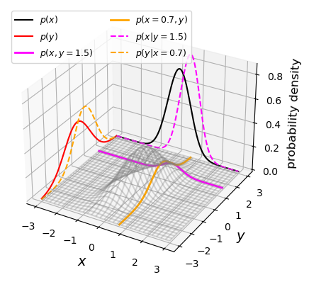
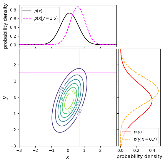
The two coloured (orange and magenta) lines or curves plotted on the joint probability distributions shown above each show a ‘slice’ through the joint distribution which corresponds to the conditional joint probability density at a fixed value of \(y\) or \(x\) (i.e. they correspond to the cases \(p(x\vert y_{0})\) and \(p(y\vert x_{0})\)). The dashed lines with the same colours on the side panels show the univariate probability distributions corresponding to these conditional probability densities. They have the same shape as the joint probability density but are correctly normalised, so that the integrated probability is 1. Since the \(x\) and \(y\) variables are covariant (correlated) with one another (see below), the position of the conditional distribution changes according to the fixed value \(x_{0}\) or \(y_{0}\), so the centre of the curves do not match the centres of the marginal distributions. The curves of conditional probability are also narrower than those of the marginal distributions, since the covariance between \(x\) and \(y\) also broadens both marginal distributions, but not the conditional probability distributions, which correspond to a fixed value on one axis so the covariance does not come into play.
Properties of bivariate distributions: mean, variance, covariance
We can use our result for the marginal pdf to derive the mean and variance of variates of one variable that are drawn from a bivariate joint probability distribution. Here we quote the results for \(x\), but the results are interchangeable with the other variable, \(y\).
Firstly, the expectation (mean) is given by:
[\mu_{x} = E[X] = \int^{+\infty}{-\infty} xp(x)\mathrm{d}x = \int^{+\infty}{-\infty} x \int^{+\infty}_{-\infty} p(x,y)\mathrm{d}y\;\mathrm{d}x]
I.e. we first marginalise (integrate) the joint distribution over the variable \(y\) to obtain \(p(x)\), and then the mean is calculated in the usual way. Note that since the distribution is bivariate we use the subscript \(x\) to denote which variable we are quoting the mean for.
The same procedure is used for the variance:
[\sigma^{2}{x} = V[X] = E[(X-\mu{x})^{2}] = \int^{+\infty}{-\infty} (x-\mu{x})^{2} \int^{+\infty}_{-\infty} p(x,y)\mathrm{d}y\;\mathrm{d}x]
So far, we have only considered how to convert a bivariate joint probability distribution into the univariate distribution for one of its variables, i.e. by marginalising over the other variable. But joint distributions also have a special property which is linked to the conditional relationship between its variables. This is known as the covariance
The covariance of variates \(X\) and \(Y\) is given by:
[\mathrm{Cov}(X,Y)=\sigma_{xy} = E[(X-\mu_{x})(Y-\mu_{y})] = E[XY]-\mu_{x}\mu_{y}]
We can obtain the term \(E[XY]\) by using the joint distribution:
[E[XY] = \int^{+\infty}{-\infty} \int^{+\infty}{-\infty} x y p(x,y)\mathrm{d}y\;\mathrm{d}x = \int^{+\infty}{-\infty} \int^{+\infty}{-\infty} x y p(x\vert y)p(y) \mathrm{d}y\;\mathrm{d}x]
In the case where \(X\) and \(Y\) are independent variables, \(p(x\vert y)=p(x)\) and we obtain:
[E[XY] = \int^{+\infty}{-\infty} xp(x)\mathrm{d}x \int^{+\infty}{-\infty} y p(y)\mathrm{d}y = \mu_{x}\mu_{y}]
I.e. for independent variables the covariance \(\sigma_{xy}=0\). The covariance is a measure of how dependent two variables are on one another, in terms of their linear correlation. An important mathematical result known as the Cauchy-Schwarz inequality implies that \(\lvert \mathrm{Cov}(X,Y)\rvert \leq \sqrt{V[X]V[Y]}\). This means that we can define a correlation coefficient which measures the degree of linear dependence between the two variables:
[\rho(X,Y)=\frac{\sigma_{xy}}{\sigma_{x}\sigma_{y}}]
where \(-1\leq \rho(X,Y) \leq 1\). Note that variables with positive (non-zero) \(\rho\) are known as correlated variables, while variables with negative \(\rho\) are anticorrelated. For independent variables the correlation coefficient is clearly zero, but it is important to note that the covariance (and hence the correlation coefficient) can also be zero for non-independent variables. E.g. consider the relation between random variate \(X\) and the variate \(Y\) calculated directly from \(X\), \(Y=X^{2}\), for \(X\sim U[-1,1]\):
[\sigma_{xy}=E[XY]-\mu_{X}\mu_{Y} = E[X.X^{2}]-E[X]E[X^{2}] = 0 - 0.E[X^{2}] = 0]
The covariance (and correlation) is zero even though the variables \(X\) and \(Y\) are completely dependent on one another. This result arises because the covariance measures the linear relationship between two variables, but if the relationship between two variables is non-linear, it can result in a low (or zero) covariance and correlation coefficient.
An example of a joint probability density for two independent variables is shown below, along with the marginal distributions and conditional probability distributions. This distribution uses the same means and variances as the covariant case shown above, but covariance between \(x\) and \(y\) is set to zero. We can immediately see that the marginal and conditional probability distributions (which have the same fixed values of \(x_{0}\) and \(y_{0}\) as in the covariant example above) are identical for each variable. This is as expected for independent variables, where \(p(x)=p(x\vert y)\) and vice versa.
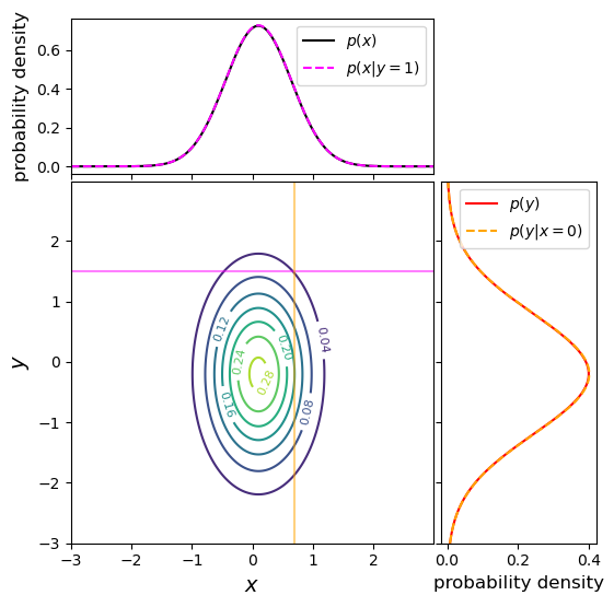
Finally we note that these approaches can be generalised to multivariate joint probability distributions, by marginalising over multiple variables. Since the covariance can be obtained between any pair of variables, it is common to define a covariance matrix, e.g.:
[\mathbf{\Sigma} =
\begin{pmatrix}
\sigma_{xx} & \sigma_{xy} & \sigma_{xz}
\sigma_{yx} & \sigma_{yy} & \sigma_{yz}
\sigma_{zx} & \sigma_{zy} & \sigma_{zz}
\end{pmatrix}]
The diagonal elements correspond to the variances of each variable (since the covariance of a variable with itself is simply the variance), while off-diagonal elements correspond to the covariance between pairs of variables. Note that in terms of numerical values, the matrix is symmetric about the diagonal, since by definition \(\sigma_{xy}=\sigma_{yx}\).
Programming example: plotting joint probability distributions
It is useful to be able to plot bivariate pdfs and their marginal and conditional pdfs yourself, so that you can develop more intuition for how conditional probability works, e.g. by changing the covariance matrix of the distribution. We made the plots above using the following code, first to generate the pdfs:
import scipy.integrate as spint
# Freeze the parameters of the bivariate normal distribution: means and covariance matrix for x and y
bvn = sps.multivariate_normal([0.1, -0.2], [[0.3, 0.3], [0.3, 1.0]])
# Next we must set up a grid of x and y values to calculate the bivariate normal for, on each axis the
# grid ranges from -3 to 3, with step size 0.01
x, y = np.mgrid[-3:3:0.01, -3:3:0.01]
xypos = np.dstack((x, y))
# Calculate the bivariate joint pdf and for each variable marginalise (integrate) the joint pdf over the
# other variable to obtain marginal pdfs for x and y
xypdf = bvn.pdf(xypos)
xpdf = spint.simpson(xypdf,y,axis=1)
ypdf = spint.simpson(xypdf,x,axis=0)
# Now define x and y ranges to calculate a 'slice' of the joint pdf, corresponding to the conditional pdfs
# for given x_0 and y_0
xrange = np.arange(-3,3,0.01)
yrange = np.arange(-3,3,0.01)
# We must create corresponding ranges of fixed x and y
xfix = np.full(len(yrange),0.7)
yfix = np.full(len(xrange),1.5)
# And define our arrays for the pdf to be calculated
xfix_pos = np.dstack((xfix, yrange))
yfix_pos = np.dstack((xrange, yfix))
# Now we calculate the conditional pdfs for each case, remembering to normalise by the integral of the
# conditional pdf so the integrated probability = 1
bvny_xfix = bvn.pdf(xfix_pos)/spint.simpson(bvn.pdf(xfix_pos),yrange)
bvnx_yfix = bvn.pdf(yfix_pos)/spint.simpson(bvn.pdf(yfix_pos),xrange)
Next we made the 3D plot as follows. You should run the iPython magic command
%matplotlib notebooksomewhere in your notebook (e.g. in the first cell, with the import commands) in order to make the plot interactive, which allows you to rotate it with the mouse cursor and really benefit from the 3-D plotting style.fig = plt.figure() ax = fig.add_subplot(projection='3d') # Plot the marginal pdfs on the sides of the 3D box (corresponding to y=3 and x=-3) ax.plot3D(x[:,0],np.full(len(xpdf),3.0),xpdf,color='black',label=r'$p(x)$') ax.plot3D(np.full(len(ypdf),-3.0),y[0,:],ypdf,color='red',label=r'$p(y)$') # Plot the slices through the joint pdf corresponding to the conditional pdfs: ax.plot3D(xrange,yfix,bvn.pdf(yfix_pos),color='magenta',linewidth=2,label=r'$p(x,y=1.5)$') ax.plot3D(xfix,yrange,bvn.pdf(xfix_pos),color='orange',linewidth=2,label=r'$p(x=0.7,y)$') # Plot the normalised conditional pdf on the same box-sides as the marginal pdfs ax.plot3D(xrange,np.full(len(xrange),3.0),bvnx_yfix,color='magenta',linestyle='dashed',label=r'$p(x\vert y=1.5)$') ax.plot3D(np.full(len(yrange),-3.0),yrange,bvny_xfix,color='orange',linestyle='dashed',label=r'$p(y\vert x=0.7)$') # Plot the joint pdf as a wireframe: ax.plot_wireframe(x, y, xypdf, rstride=20, cstride=20, alpha=0.3, color='gray') # Plot labels and the legend ax.set_xlabel(r'$x$',fontsize=14) ax.set_ylabel(r'$y$',fontsize=14) ax.set_zlabel(r'probability density',fontsize=12) ax.legend(fontsize=9,ncol=2) plt.show()Look at the online documentation for the
scipy.stats.multivariate_normalfunction to find out what the parameters do. Change the covariance and variance values to see what happens to the joint pdf and the marginal and conditional pdfs. Remember that the variances correspond to diagonal elements of the covariance matrix, i..e to the elements [0,0] and [1,1] of the array with the covariance matrix values. The amount of diagonal ‘tilt’ of the joint pdf will depend on the magnitude of the covariant elements compared to the variances. You should also bear in mind that since the integration is numerical, based on the calculated joint pdf values, the marginal and conditional pdfs will lose accuracy if your joint pdf contains significant probability outside of the calculated region. You could fix this by e.g. making the calculated region larger, while setting thexandylimits to show the same zoom in of the plot.We chose
plot_wireframe()to show the joint pdf, so that the other pdfs (and the slices through the joint pdf to show the conditional pdfs), are easily visible. But you could use other versions of the 3D surface plot such asplot_surface()also including a colour map and colour bar if you wish. If you use a coloured surface plot you can set the transparency (alpha) to be less than one, in order to see through the joint pdf surface more easily.Finally, if you want to make a traditional contour plot, you could use the following code:
# We set the figsize so that we get a square plot with x and y axes units having equal dimension
# (so the contours are not artificially stretched)
fig = plt.figure(figsize=(6,6))
# Add a gridspec with two rows and two columns and a ratio of 3 to 7 between
# the size of the marginal axes and the main axes in both directions.
# We also adjust the subplot parameters to obtain a square plot.
gs = fig.add_gridspec(2, 2,  width_ratios=(7, 3), height_ratios=(3, 7), left=0.1, right=0.9,
                          bottom=0.1, top=0.9, wspace=0.03, hspace=0.03)
# Set up the subplots and their shared axes
ax = fig.add_subplot(gs[1, 0])
ax_xpdfs = fig.add_subplot(gs[0, 0], sharex=ax)
ax_ypdfs = fig.add_subplot(gs[1, 1], sharey=ax)
# Turn off the tickmark values where necessary
ax_xpdfs.tick_params(axis="x", labelbottom=False)
ax_ypdfs.tick_params(axis="y", labelleft=False)
con = ax.contour(x, y, xypdf)  # The contour plot
# Marginal and conditional pdfs plotted in the side/top panel
ax_xpdfs.plot(x[:,0],xpdf,color='black',label=r'$p(x)$')
ax_ypdfs.plot(ypdf,y[0,:],color='red',label=r'$p(y)$')
ax_xpdfs.plot(xrange,bvnx_yfix,color='magenta',linestyle='dashed',label=r'$p(x\vert y=1.5)$')
ax_ypdfs.plot(bvny_xfix,yrange,color='orange',linestyle='dashed',label=r'$p(y\vert x=0.7)$')
# Lines on the contour show the slices used for the conditional pdfs
ax.axhline(1.5,color='magenta',alpha=0.5)
ax.axvline(0.7,color='orange',alpha=0.5)
# Plot labels and legend
ax.set_xlabel(r'$x$',fontsize=14)
ax.set_ylabel(r'$y$',fontsize=14)
ax_xpdfs.set_ylabel(r'probability density',fontsize=12)
ax_ypdfs.set_xlabel(r'probability density',fontsize=12)
ax.clabel(con, inline=1, fontsize=8) # This adds labels to show the value of each contour level
ax_xpdfs.legend()
ax_ypdfs.legend()
#plt.savefig('2d_joint_prob.png',bbox_inches='tight')
plt.show()
Probability distributions: multivariate normal
scipy.stats contains a number of multivariate probability distributions, with the most commonly used being multivariate_normal considered above, which models the multivariate normal pdf:
[p(\mathbf{x}\vert \boldsymbol{\mu}, \mathbf{\Sigma}) = \frac{\exp\left(-\frac{1}{2}(\mathbf{x}-\boldsymbol{\mu})^{\mathrm{T}} \mathbf{\Sigma}^{-1}(\mathbf{x}-\boldsymbol{\mu})\right)}{\sqrt{(2\pi)^{k}\lvert\mathbf{\Sigma}\rvert}}]
where bold symbols denote vectors and matrices: \(\mathbf{x}\) is a real \(k\)-dimensional column vector of variables \([x_{1}\,x_{2}\, ...\,x_{k}]^{\mathrm{T}}\), \(\boldsymbol{\mu} = \left[E[X_{1}]\,E[X_{2}]\,...\,E[X_{k}]\right]^{\mathrm{T}}\) and \(\mathbf{\Sigma}\) is the \(k\times k\) covariance matrix of elements:
[\Sigma_{i,j}=E[(X_{i}-\mu_{i})(X_{j}-\mu_{j})]=\mathrm{Cov}[X_{i},X_{j}]]
Note that \(\mathrm{T}\) denotes the transpose of the vector (to convert a row-vector to a column-vector and vice versa) while \(\lvert\mathbf{\Sigma}\rvert\) and \(\mathbf{\Sigma}^{-1}\) are the determinant and inverse of the covariance matrix respectively. A single sampling of the distribution produces variates \(\mathbf{X}=[X_{1}\,X_{2}\, ...\,X_{k}]^{\mathrm{T}}\) and we describe their distribution with \(\mathbf{X} \sim N_{k}(\boldsymbol{\mu},\mathbf{\Sigma})\).
Scipy’s multivariate_normal comes with the usual pdf and cdf methods although its general functionality is more limited than for the univariate distributions. Examples of the pdf plotted for a bivariate normal are given above for the 3D and contour plotting examples. The rvs method can also be used to generate random data drawn from a multivariate distribution, which can be especially useful when simulating data with correlated (but normally distributed) errors, provided that the covariance matrix of the data is known.
Programming example: multivariate normal random variates
You are simulating measurements of a sample of gamma-ray spectra which are described by a power-law model, at energy \(E\) (in GeV) the photon flux density (in photons/GeV) is given by \(N(E)=N_{0}E^{-\alpha}\) where \(N_{0}\) is the flux density at 1 GeV. Based on the statistical errors in the expected data, you calculate that your measured values of \(N_{0}\) and \(\alpha\) should be covariant with means \(\mu_{N_{0}}=630\), \(\mu_{\alpha}=1.62\), standard deviations \(\sigma_{N_{0}}=100\), \(\sigma_{\alpha}=0.12\) and covariance \(\sigma_{N_{0}\alpha}=8.3\). Assuming that the paired measurements of \(N_{0}\) and \(\alpha\) are drawn from a bivariate normal distribution, simulate a set of 20 measured pairs of these quantities and plot them as a scatter diagram, along with the confidence contours of the underlying distribution.
Solution
# Set up the parameters:
means = [630, 1.62]
sigmas = [100, 0.12]
covar = 8.3
# Freeze the distribution:
bvn = sps.multivariate_normal(means, [[sigmas[0]**2, covar], [covar, sigmas[1]**2]])
# Next we must set up a grid of x and y values to calculate the bivariate normal for. We choose a range that
# covers roughly 3-sigma around the means
N0_grid, alpha_grid = np.mgrid[300:1000:10, 1.3:2.0:0.01]
xypos = np.dstack((N0_grid, alpha_grid))
# Make a random set of 20 measurements. For reproducibility we set a seed first:
rng = np.random.default_rng(38700)
xyvals = bvn.rvs(size=20, random_state=rng)
# The output is an array of shape (20,2), for clarity we will assign each column to the corresponding variable:
N0_vals = xyvals[:,0]
alpha_vals = xyvals[:,1]
# Now make the plot
plt.figure()
con = plt.contour(N0_grid, alpha_grid, bvn.pdf(xypos))
plt.scatter(N0_vals, alpha_vals)
plt.xlabel(r'$N_{0}$',fontsize=12)
plt.ylabel(r'$\alpha$',fontsize=12)
plt.clabel(con, inline=1, fontsize=8)
plt.show()
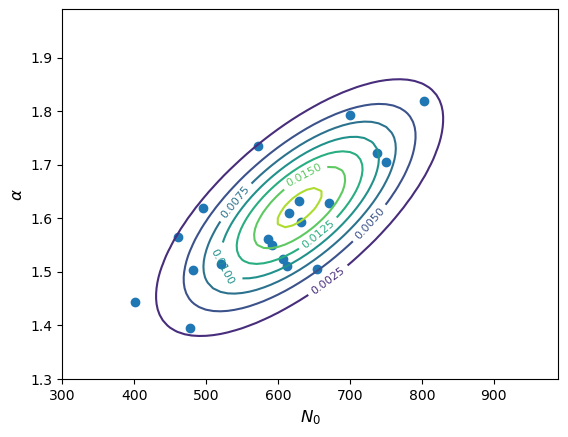
Simulating correlated data from mathematical and physical models
Many measurements will result in simultaneous data for multiple variables which will often be correlated, and many physical situations will also naturally produce correlations between random variables. E.g. the temperature of a star depends on its surface area and luminosity, which both depend on the mass, metallicity and stellar age (and corresponding stage in the stellar life-cycle). Such variables are often easier to relate using mathematical models with one or more variables being drawn independently from appropriate statistical distributions, and the correlations between them being produced by their mathematical relationship. In general, the resulting distributions will not be multivariate normal, unless they are related to multivariate normal variates by simple linear transformations.
Programming example: calculating fluxes from power-law spectra
Now imagine you want to use your measurements of gamma ray spectra from the previous programming example, to predict the integrated photon flux \(F_{\rm 0.1-1 TeV}\) in the energy range \(10^{2}\)-\(10^{3}\) GeV. Starting from your simulated measurements of \(N_{0}\) and \(\alpha\), make a scatter plot of the photon flux in this range vs. the index \(\alpha\). Does the joint probability distribution of \(\alpha\) and \(F_{\rm 0.1-1 TeV}\) remain a multivariate normal? Check your answer by repeating the simulation for \(10^{6}\) measurements of \(N_{0}\) and \(\alpha\) and also plotting a histogram of the calculated fluxes.
Hint
The integrated photon flux is equal to \(\int^{1000}_{100} N_{0} E^{-\alpha}\mathrm{d}E\)
Solution
The integrated photon flux is \(\int^{1000}_{100} N_{0} E^{-\alpha}\mathrm{d}E = \frac{N_{0}}{1-\alpha}\left(1000^{(1-\alpha)}-100^{(1-\alpha)}\right)\). We can apply this to our simulated data:
flux_vals = (N0_vals/(1-alpha_vals))*(1000**(1-alpha_vals)-100**(1-alpha_vals))
plt.figure()
plt.scatter(flux_vals, alpha_vals)
plt.xlabel(r'$F_{\rm 0.1-1 TeV}$',fontsize=12)
plt.ylabel(r'$\alpha$',fontsize=12)
plt.show()
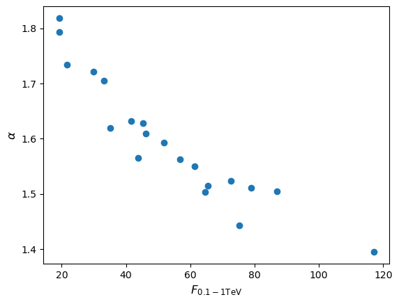
Since a power-law (i.e. non-linear) transformation is applied to the measurements we would not expect the flux distribution to remain normal, although the joint distribution of \(\alpha\) (i.e. marginalised over flux) should of course remain normal. Repeating the simulation for a million pairs of \(N_{0}\) and \(\alpha\) we obtain (setting marker size
s=0.01for the scatter plot and usingbins=1000anddensity=Truefor the histogram):
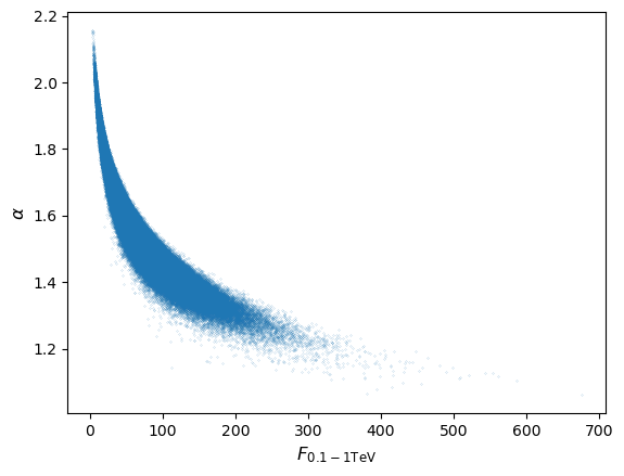
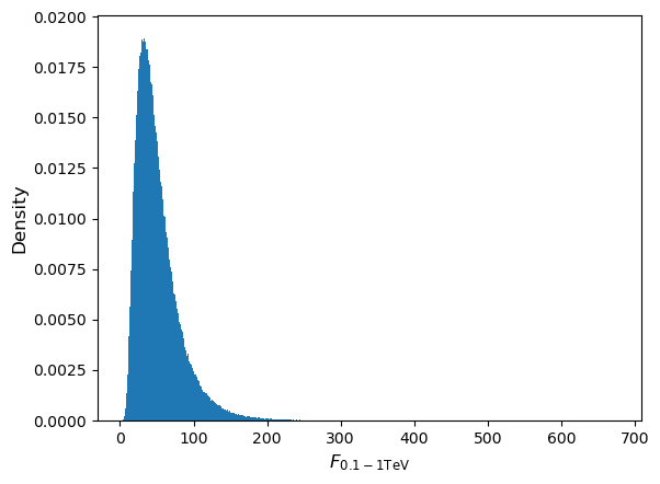
As expected, the flux distribution is clearly not normally distributed, it is positively skewed to high fluxes, resulting in the curvature of the joint distribution.
Sums of multivariate random variables and the multivariate Central Limit Theorem
Consider two \(m\)-dimensional multivariate random variates, \(\mathbf{X}=[X_{1}, X_{2},..., X_{m}]\) and \(\mathbf{Y}=[Y_{1}, Y_{2},..., Y_{m}]\), which are drawn from different distributions with mean vectors \(\boldsymbol{\mu}_{x}\), \(\boldsymbol{\mu}_{y}\) and covariance matrices \(\boldsymbol{\Sigma}_{x}\), \(\boldsymbol{\Sigma}_{y}\). The sum of these variates, \(\mathbf{Z}=\mathbf{X}+\mathbf{Y}\) follows a multivariate distribution with mean \(\boldsymbol{\mu}_{z}=\boldsymbol{\mu}_{x}+\boldsymbol{\mu}_{y}\) and covariance \(\boldsymbol{\Sigma}_{z}=\boldsymbol{\Sigma}_{x}+\boldsymbol{\Sigma}_{y}\). I.e. analogous to the univariate case, the result of summing variates drawn from multivariate distributions is to produce a variate with mean vector equal to the sum of the mean vectors and covariance matrix equal to the sum of the covariance matrices.
The analogy with univariate distributions also extends to the Central Limit Theorem, so that the sum of \(n\) random variates drawn from multivariate distributions, \(\mathbf{Y}=\sum\limits_{i=1}^{n} \mathbf{X}_{i}\) is drawn from a distribution which for large \(n\) becomes asymptotically multivariate normal, with mean vector equal to the sum of mean vectors and covariance matrix equal to the sum of covariance matrices. This also means that for averages of \(n\) random variates drawn from multivariate distributions \(\bar{\mathbf{X}} = \frac{1}{n} \sum\limits_{i=1}^{n} \mathbf{X}_{i}\), the mean vector is equal to the average of mean vectors while the covariance matrix is equal to the sum of covariance matrices divided by \(n^{2}\):
[\boldsymbol{\mu}{\bar{\mathbf{X}}} = \frac{1}{n} \sum\limits{i=1}^{n} \boldsymbol{\mu}_{i}]
[\boldsymbol{\Sigma}{\bar{\mathbf{X}}} = \frac{1}{n^{2}} \sum\limits{i=1}^{n} \boldsymbol{\Sigma}_{i}]
Programming challenge: demonstrating the multivariate Central Limit Theorem with a 3D plot
For this challenge we will use correlated random variates
xandywhich are generated by the following Python code:x = sps.lognorm.rvs(loc=1,s=0.5,size=nsamp) y = np.sqrt(x)+sps.norm.rvs(scale=0.3,size=nsamp)First, generate a large sample (e.g. \(10^{6}\)) of random variates from these distributions and plot a scatter plot and histograms of
xandy, to show visually that the distribution is not a multivariate normal (you should also explain in words why not). Also measure the means and covariance of your variates (you can usenp.meanandnp.covto measure means and covariances of arrays of data).Next, using many trials (at least \(10^{6}\)), generate random variates from these distributions and take the means of
xandyfor samples of \(n\) pairs (where \(n\) is at least 100) of the variates for each trial. Then, use a 2D histogram (in probability density units, i.e. similar to a pdf) together with 3D wireframe or surface plots to show that the distribution of the means is close to a multivariate normal pdf, with mean and covariance matrix expected for the sum. It will be useful to compare both the histogram and pdf on the same plot, and make a separate plot to show the difference between the histogram of mean values and the expected multivariate normal pdf.Finally show what happens when you significantly increase or decrease the sample size \(n\) (and explain what is happening).
Hints
The following numpy function will calculate a 2D histogram (in units of probability density) of the arrays
xmeansandymeans, with 100 bins on the x and y axes, with bin edges given byxedgesandyedges.densities, xedges, yedges = np.histogram2d(xmeans,ymeans,bins=100,density=True)The examples given above for plotting joint probability distributions will be very useful to make your 3D plots. You can use the edges of the bins to define a meshgrid of the bin centres, which you can use to evalute the multivariate normal pdf and to plot the densities using a 3D plotting method, e.g.:
# To evaluate the points in the right order (similar to mgrid) we need to specify matrix 'ij' indexing rather than cartesian:
xgrid, ygrid = np.meshgrid((xedges[1:]+xedges[:-1])/2,(yedges[1:]+yedges[:-1])/2,indexing='ij')
Key Points
Joint probability distributions show the joint probability of two or more variables occuring with given values.
The univariate pdf of one of the variables can be obtained by marginalising (integrating) the joint pdf over the other variable(s).
If the probability of a variable taking on a value is conditional on the value of the other variable (i.e. the variables are not independent), the joint pdf will appear tilted.
The covariance describes the linear relationship between two variables, when normalised by their standard deviations it gives the correlation coefficient between the variables.
Zero covariance and correlation coefficient arises when the two variables are independent and may also occur when the variables are non-linearly related.
The covariance matrix gives the covariances between different variables as off-diagonal elements, with their variances given along the diagonal of the matrix.
The distributions of sums of multivariate random variates have vectors of means and covariance matrices equal to the sum of the vectors of means and covariance matrices of the individual distributions.
The sums of multivariate random variates also follow the (multivariate) central limit theorem, asymptotically following multivariate normal distributions for sums of large samples.
Bayes' Theorem
Overview
Teaching: 60 min
Exercises: 60 minQuestions
What is Bayes’ theorem and how can we use it to answer scientific questions?
Objectives
Learn how Bayes’ theorem is derived and how it applies to simple probability problems.
Learn how to derive posterior probability distributions for simple hypotheses, both analytically and using a Monte Carlo approach.
In this episode we will be using numpy, as well as matplotlib’s plotting library. Scipy contains an extensive range of distributions in its scipy.stats module, so we will also need to import it. We will also make use of the scipy.integrate integration functions module in this episode. Remember: scipy modules should be installed separately as required - they cannot be called if only scipy is imported.
import numpy as np
import matplotlib.pyplot as plt
import scipy.stats as sps
import scipy.integrate as spint
When considering two events \(A\) and \(B\), we have previously seen how the equation for conditional probability gives us the multiplication rule:
[P(A \mbox{ and } B) = P(A\vert B) P(B)]
It should be clear that we can invert the ordering of \(A\) and \(B\) here and the probability of both happening should still be the same, i.e.:
[P(A\vert B) P(B) = P(B\vert A) P(A)]
This simple extension of probability calculus leads us to Bayes’ theorem, one of the most important results in statistics and probability theory:
[P(A\vert B) = \frac{P(B\vert A) P(A)}{P(B)}]
Bayes’ theorem, named after clergyman Rev. Thomas Bayes who proposed it in the middle of the 18th century, is in its simplest form, a method to swap the conditional dependence of two events, i.e. to obtain the probability of \(A\) conditional on \(B\), when you only know the probability of \(B\) conditional on \(A\), and the probabilities of \(A\) and \(B\) (i.e. each marginalised over the conditional term).
To show the inclusion of marginalisation, we can generalise from two events to a set of mutually exclusive exhaustive (i.e. covering every possible outcome) events \(\{A_{1},A_{2},...,A_{n}\}\):
[P(A_{i}\vert B) = \frac{P(B\vert A_{i}) P(A_{i})}{P(B)} = \frac{P(B\vert A_{i}) P(A_{i})}{\sum^{n}{i=1} P(B\vert A{i}) P(A_{i})}]
Test yourself: what kind of binary merger is it?
Returning to our hypothetical problem of detecting radio counterparts from gravitational wave events corresponding to binary mergers of binary neutron stars (NN), binary black holes (BB) and neutron star-black hole binaries (NB), recall that the probabilities of radio detection (event denoted with \(D\)) are:
\(P(D\vert NN) = 0.72\), \(P(D\vert NB) = 0.2\), \(P(D\vert BB) = 0\)
and for any given merger event the probability of being a particular type of binary is:
\(P(NN)=0.05\), \(P(NB) = 0.2\), \(P(BB)=0.75\)
Calculate the following:
- Assuming that you detect a radio counterpart, what is the probability that the event is a binary neutron star (\(NN\))?
- Assuming that you \(don't\) detect a radio counterpart, what is the probability that the merger includes a black hole (either \(BB\) or \(NB\))?
Hint
Remember that if you need a total probability for an event for which you only have the conditional probabilities, you can use the law of total probability and marginalise over the conditional terms.
Solution
We require \(P(NN\vert D)\). Using Bayes’ theorem: \(P(NN\vert D) = \frac{P(D\vert NN)P(NN)}{P(D)}\) We must marginalise over the conditionals to obtain \(P(D)\), so that:
\(P(NN\vert D) = \frac{P(D\vert NN)P(NN)}{(P(D\vert NN)P(NN)+P(D\vert NB)P(NB)} = \frac{0.72\times 0.05}{(0.72\times 0.05)+(0.2\times 0.2)}\) \(= \frac{0.036}{0.076} = 0.474 \mbox{ (to 3 s.f.)}\)
We require \(P(BB \vert D^{C}) + P(NB \vert D^{C})\), since radio non-detection is the complement of \(D\) and the \(BB\) and \(NB\) events are mutually exclusive. Therefore, using Bayes’ theorem we should calculate:
\[P(BB \vert D^{C}) = \frac{P(D^{C} \vert BB)P(BB)}{P(D^{C})} = \frac{1\times 0.75}{0.924} = 0.81169\] \[P(NB \vert D^{C}) = \frac{P(D^{C} \vert NB)P(NB)}{P(D^{C})} = \frac{0.8\times 0.2}{0.924} = 0.17316\]So our final result is: \(P(BB \vert D^{C}) + P(NB \vert D^{C}) = 0.985 \mbox{ (to 3 s.f.)}\)
Here we used the fact that \(P(D^{C})=1-P(D)\), along with the value of \(P(D)\) that we already calculated in part 1.
There are a few interesting points to note about the calculations:
- Firstly, in the absence of any information from the radio data, our prior expectation was that a merger would most likely be a black hole binary (with 75% chance). As soon as we obtained a radio detection, this chance went down to zero.
- Then, although the prior expectation that the merger would be of a binary neutron star system was 4 times smaller than that for a neutron star-black hole binary, the fact that a binary neutron star was almost 4 times more likely to be detected in radio almost balanced the difference, so that we had a slightly less than 50/50 chance that the system would be a binary neutron star.
- Finally, it’s worth noting that the non-detection case weighted the probability that the source would be a black hole binary to slightly more than the prior expectation of \(P(BB)=0.75\), and correspondingly reduced the expectation that the system would be a neutron star-black hole system, because there is a moderate chance that such a system would produce radio emission, which we did not see.
Bayes’ theorem for continuous probability distributions
From the multiplication rule for continuous probability distributions, we can obtain the continuous equivalent of Bayes’ theorem:
[p(y\vert x) = \frac{p(x\vert y)p(y)}{p(x)} = \frac{p(x\vert y)p(y)}{\int^{\infty}_{-\infty} p(x\vert y)p(y)\mathrm{d}y}]
Bayes’ billiards game
This problem is taken from the useful article Frequentism and Bayesianism: A Python-driven Primer by Jake VanderPlas, and is there adapted from a problem discussed by Sean J. Eddy.
Carol rolls a billiard ball down the table, marking where it stops. Then she starts rolling balls down the table. If the ball lands to the left of the mark, Alice gets a point, to the right and Bob gets a point. First to 6 points wins. After some time, Alice has 5 points and Bob has 3. What is the probability that Bob wins the game (\(P(B)\))?
Defining a success as a roll for Alice (so that she scores a point) and assuming the probability \(p\) of success does not change with each roll, the relevant distribution is binomial. For Bob to win, he needs the next three rolls to fail (i.e. the points go to him). A simple approach is to estimate \(p\) using the number of rolls and successes, since the expectation for \(X\sim \mathrm{Binom}(n,p)\) is \(E[X]=np\), so taking the number of successes as an unbiased estimator, our estimate for \(p\), \(\hat{p}=5/8\). Then the probability of failing for three successive rolls is:
\[(1-\hat{p})^{3} \simeq 0.053\]However, this approach does not take into account our uncertainty about Alice’s true success rate!
Let’s use Bayes’ theorem. We want the probability that Bob wins given the data already in hand (\(D\)), i.e. the \((5,3)\) scoring. We don’t know the value of \(p\), so we need to consider the marginal probability of \(B\) with respect to \(p\):
\[P(B\vert D) \equiv \int P(B,p \vert D) \mathrm{d}p\]We can use the multiplication rule \(P(A \mbox{ and } B) = P(A\vert B) P(B)\), since \(P(B,p \vert D) \equiv P(B \mbox{ and } p \vert D)\):
\[P(B\vert D) = \int P(B\vert p, D) P(p\vert D) \mathrm{d}p\]Now we can calculate \(P(D\vert p)\) from the binomial distribution, so to get there we use Bayes’ theorem:
\[P(B\vert D) = \int P(B\vert p, D) \frac{P(D\vert p)P(p)}{P(D)} \mathrm{d}p\] \[= \frac{\int P(B\vert p, D) P(D\vert p)P(p) \mathrm{d}p}{\int P(D\vert p)P(p)\mathrm{d}p}\]where we first take \(P(D)\) outside the integral (since it has no explicit \(p\) dependence) and then express it as the marginal probability over \(p\). Now:
- The term \(P(B\vert p,D)\) is just the binomial probability of 3 failures for a given \(p\), i.e. \(P(B\vert p,D) = (1-p)^{3}\) (conditionality on \(D\) is implicit, since we know the number of consecutive failures required).
- \(P(D\vert p)\) is just the binomial probability from 5 successes and 3 failures, \(P(D\vert p) \propto p^{5}(1-p)^{3}\). We ignore the term accounting for permutations and combinations since it is constant for a fixed number of trials and successes, and cancels from the numerator and denominator.
- Finally we need to consider the distribution of the chance of a success, \(P(p)\). This is presumably based on Carol’s initial roll and success rate, which we have no prior expectation of, so the simplest assumption is to assume a uniform distribution (i.e. a uniform prior): \(P(p)= constant\), which also cancels from the numerator and denominator.
Finally, we solve:
\[P(B\vert D) = \frac{\int_{0}^{1} (1-p)^{6}p^{5}}{\int_{0}^{1} (1-p)^{3}p^{5}} \simeq 0.091\]The probability of success for Bob is still low, but has increased compared to our initial, simple estimate. The reason for this is that our choice of prior suggests the possibility that \(\hat{p}\) overestimated the success rate for Alice, since the median \(\hat{p}\) suggested by the prior is 0.5, which weights the success rate for Alice down, increasing the chances for Bob.
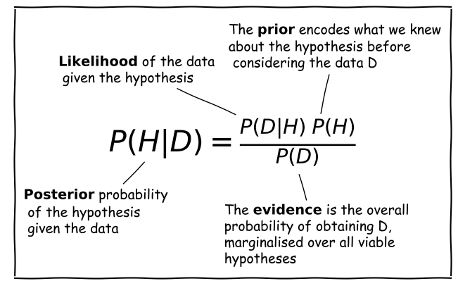
The components of Bayes’ Theorem
Consider a hypothesis \(H\) that we want to test with some data \(D\). The hypothesis may, for example be about the true value of a model parameter or its distribution.
Scientific questions usually revolve around whether we should favour a particular hypothesis, given the data we have in hand. In probabilistic terms we want to know \(P(H\vert D)\), which is known as the posterior probability or sometimes just ‘the posterior’.
However, you have already seen that the statistical tests we can apply to assess probability work the other way around. We know how to calculate how likely a particular set of data is to occur (e.g. using a test statistic), given a particular hypothesis (e.g. the value of a population mean) and associated assumptions (e.g. that the data are normally distributed).
Therefore we usually know \(P(D\vert H)\), a term which is called the likelihood since it refers to the likelihood of obtaining the data (or some statistic calculated from it), given our hypothesis. Note that there is a subtle but important difference between the likelihood and the pdf. The pdf gives the probability distribution of the variate(s) (the data or test statistic) for a given hypothesis and its (fixed) parameters. The likelihood gives the probability for fixed variate(s) as a function of the hypothesis parameters.
We also need the prior probability or just ‘the prior’, \(P(H)\) which represents our prior knowledge or belief about whether the given hypothesis is likely or not, or what we consider plausible parameter values. The prior is one of the most famous aspects of Bayes’ theorem and explicit use of prior probabilities is a key difference between Bayesian or Frequentist approaches to statistics.
Finally, we need to normalise our prior-weighted likelihood by the so-called evidence, \(P(D)\), a term corresponding to the probability of obtaining the given data, regardless of the hypothesis or its parameters. This term can be calculated by marginalising over the possible parameter values and (in principle) whatever viable, alternate hypotheses can account for the data. In practice, unless the situation is simple or very well constrained, this term is the hardest to calculate. For this reason, many calculations of the posterior probability make use of Monte Carlo methods (i.e. simulations with random variates), or assume simplifications that allow \(P(D)\) to be simplified or cancelled in some way (e.g. uniform priors). The evidence is the same for different hypotheses that explain the same data, so it can also be ignored when comparing the relative probabilities of different hypotheses.
Is this a fair coin?
Your friend gives you a coin which they took from a Las Vegas casino. They think the coin may be biased, but they don’t know for sure and they don’t know which way it may be biased (e.g. is a coin-flip getting heads more or less likely than a flip getting tails). You suggest that if you parameterise \(P(heads)=\theta\), you can find out the probability distribution of \(\theta\) by repeated flips of the coin. So how do we do this using Bayes’ theorem?
Firstly, we must build a hypothesis which we can test using the theorem. In this case it is clear what this must include. The coin flips are independent. Therefore, counting heads as successes, the number (\(x\)) of heads obtained in \(n\) flips of the coin is given by the binomial probability distribution:
[p(x\vert n,\theta) = \begin{pmatrix} n \ x \end{pmatrix} \theta^{x}(1-\theta)^{n-x} = \frac{n!}{(n-x)!x!} \theta^{x}(1-\theta)^{n-x} \quad \mbox{for }x=0,1,2,…,n.]
We would like to know what the probability distribution of \(\theta\) is, given the data (\(x\)) and number of flips \(n\), so we can use Bayes’ theorem:
[p(\theta \vert x, n) = \frac{p(x\vert n,\theta) p(\theta)}{p(x)} = \frac{p(x\vert n,\theta) p(\theta)}{\int^{1}_{0} p(x\vert n,\theta) p(\theta)\mathrm{d}\theta}]
where we obtained the evidence \(p(x)\) by marginalising out the conditional dependence on \(\theta\) from the numerator of the equation (and note that by definition \(0\leq\theta\leq1\)). The likelihood is obtained from our binomial probability distribution, but by fixing \(x\) to match what is obtained from the \(n\) coin flips, and varying \(\theta\). I..e. we measure the likelihood as a function of \(\theta\), rather than the pmf as a function of \(x\).
What should the prior, \(p(\theta)\), be? Well, our friend has no idea about whether the coin is biased or not, or which way. So we can start with the simple assumption that given our limited knowledge, the coin is equally likely to have any given bias, i.e. we assume a uniform prior \(p(\theta)=1\). Here we can calculate the constant given that \(\int^{1}_{0} constant. \mathrm{d}\theta=1\), but note that for a uniform prior, the constant value of \(p(\theta)\) cancels from both the numerator and denominator of our equation. This is a general property of uniform priors in Bayes’ theorem, which makes them easier to calculate with than non-uniform priors.
Let’s now run a simulation to show how the posterior calculation works after repeated flips of the coin. We will assume that the coin is intrinsically biased towards tails, with the true \(\theta\) value, \(\theta_{\rm true}=0.25\). We will start by calculating for the sequence \(HHTT\) and afterwards generate the results randomly using binomial variates for the given \(\theta\), doubling the number of flips \(n\) each time. The code below will carry out this simulation 15 times, starting with no coin-flips (so we will just have the prior distribution as our posterior distribution for \(\theta\), since we have not started the experiment yet), then carrying out our initial sequence before doubling each time until we reach 4096 coin flips.
rng = np.random.default_rng(80662) # Set random number generator seed to allow repeatability
true_theta = 0.25 # The true value of theta use to generate binomial variates
theta_vals = np.linspace(0,1,1000) # Set theta values to calculate posterior for
u_prior = 1.0 # Constant uniform prior for theta
x_start = [0,1,2,2,2] # For demo purposes we start with a selected sequence of coin flips (HHTT)
labels_list = [r'0 flips',r'H',r'HH',r'HHT',r'HHTT'] # Labels for the initial sequence of plots

fig, ax = plt.subplots(5,3, figsize=(9,9)) # Create subplot grid with 5 rows and 3 columns
fig.subplots_adjust(wspace=0.3,hspace=0.4) # Include some spacing between subplots
# Subplots ax[i,j] have indices i,j to specify location on the grid
nplot = 0 # Track how many plots we have made
for i in range(5):
    for j in range(3):
        nplot = nplot + 1 # Update number of plots (we start at 1)
        if nplot < 6: # For the 1st 5 plots we start with n=0 and increment by 1 each time,
                      # using specified values for x and the label
            n_flips = nplot-1
            x = x_start[nplot-1]
            label_txt=labels_list[nplot-1]
        else:  # After 5 plots we double n each time and generate binomial random variates to
               # obtain x, adding 2 for the 4 we specified ourselves.
            n_flips = n_flips*2
            x = x_start[-1]+sps.binom.rvs(n=n_flips-4,p=true_theta,random_state=rng)
            label_txt=r'$n=$'+str(n_flips)+'$, x=$'+str(x)
        # Now calculate the posterior, first multiply the pmf (our likelihood) by the prior
        ptheta = sps.binom.pmf(k=x,n=n_flips,p=theta_vals)*u_prior
        # Then normalise by integral over ptheta
        int_ptheta = spint.simpson(ptheta,theta_vals)
        ptheta_norm = ptheta/int_ptheta
        ax[i,j].plot(theta_vals,ptheta_norm) # Plot the posterior distribution
        # Add a label at the top - the 'transform' argument allows us to locate the text in
        # relative plot coordinates
        ax[i,j].text(0.1,1.03,label_txt,transform=ax[i,j].transAxes) # Add a label to the top
        ax[i,j].set_ylim(bottom=0) # Force the minimum of y-range to be zero.
        # Only include axis labels at the left and lower edges of the grid:
        if j == 0:
            ax[i,j].set_ylabel('prob. density')
        if i == 4:
            ax[i,j].set_xlabel(r'$\theta$')
plt.show()
Running this code produces the following figure, showing the results of our simulation. On top of each panel, the sequence of heads and tails is shown initially, followed by the number of coin flips and number of heads flipped (\(n\) and \(x\)):
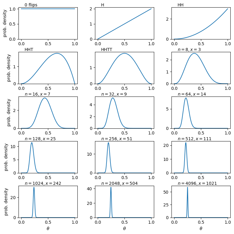
The effect of our sequence of coin flips is quite easy to follow. Firstly, after plotting the prior, we see the effect of the first flip being heads is to immediately set \(p(\theta=0)=0\). This is because we now know that the coin can flip heads, even if we were just very lucky the first time, so the probability of the coin only flipping tails (\(\theta=0\)) is zero. Flipping heads again weights the posterior further towards higher \(\theta\). But as soon as we flip tails we immediately set \(p(\theta=1)\) to zero, since we now know that flipping tails is also possible. Getting tails again makes the posterior symmetric - we have no indication that the coin is biased either way, and it seems unlikely that it is highly biased one way or another, since we flipped two of each side. And so we continue, and as we keep flipping the coin our distribution eventually narrows and converges around the true value of \(\theta\). The fraction of coin flips getting heads matches the value of \(\theta_{\rm true}\) ever more closely, as we would expect since \(E[X]=n\theta\) for the binomial distribution with given \(\theta\).
Now let’s see what happens when we change the prior, while keeping everything else the same (including \(\theta_{\rm true}\)!). Besides the uniform prior, we will try two additonal functional forms for the prior, corresponding to two different prior beliefs about the coin:
- We think the coin is fair or only slightly biased. We represent this with a normal distribution for \(p(\theta)\), with \(\mu=0.5\) and \(\sigma=0.05\).
- We think the coin is likely to be strongly biased, but we don’t know whether it favours heads or tails. To represent this belief, we choose a prior \(p(\theta)\propto \frac{1}{(\theta+0.01)(1.01-\theta)}\). This gives us a distribution which is finite, symmetric about \(\theta=0.5\) and rises strongly towards \(\theta=0\) and \(\theta=1\).
You can try to implement these priors based on the code provided above, e.g. looping through applying the three prior distributions to the likelihood, to plot the three different posterior distributions on the same plots. Note that formally the prior should be normalised so the integrated probability is 1. I.e in our case, \(\int^{1}_{0}p(\theta)\mathrm{d}\theta=1\). However, we do not need to renormalise our choice of priors explicitly in our calculation, because the same normalisation factor applies to the prior in both the numerator and denominator of the right-hand side of Bayes’ formula, so it divides out.
We show the results for our three different priors below, with the posterior probability distributions for the fair coin prior, biased coin prior and uniform prior shown as orange-dotted, green-dashed and solid-blue lines respectively. The first point to note is that although the early posterior distributions are strongly affected by our choice of prior, they all ultimately converge on the same posterior distribution. However, this convergence happens more quickly for the uniform and biased priors than for the fair coin prior, which only converges with the others after thousands of coin flips. This behaviour may seem strange (\(\theta_{\rm true}=0.25\) is neither strongly biased nor very fair), but it results from the choice of a fairly narrow normal prior for the fair coin belief, which leads to only a very low probability at \(\theta_{\rm true}\), while the corresponding probability for the biased coin belief is significantly higher there.
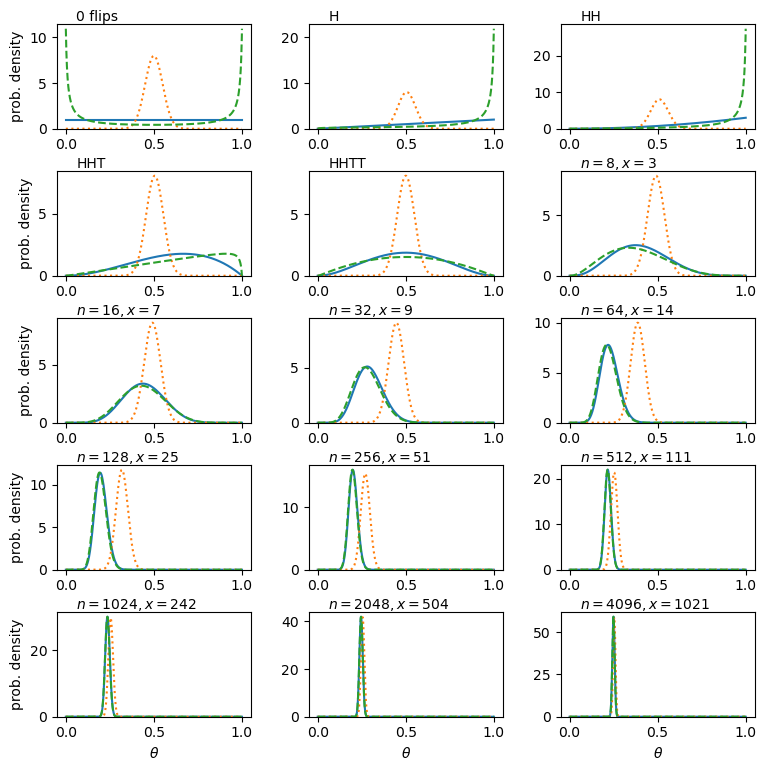
To conclude, we see that the choice of prior does not significantly change the posterior distribution of the coins fairness, expressed by \(\theta\) (i.e. what we conclude \(\theta\) is most likely to be after our experiment). But a poor choice of prior, i.e. a prior belief that is far from reality, will mean that we need a lot more data (coin flips, in this case) to get to a more accurate assessment of the truth. It is also important to bear in mind that if our prior gave zero probability at the true value of \(\theta\), we would never converge on it with our posterior distribution, no matter how much data it contained. So it is generally better to have a fairly loose prior, with a broad distribution, than one that is very constrained, unless that choice of prior is well-motivated (e.g. we can use as prior the posterior distribution from a previous experiment, i.e. different data, provided that we trust the experiment!).
Test yourself: what is the true GW event rate?
In 1 year of monitoring with a hypothetical gravitational wave (GW) detector, you observe 4 GW events from binary neutron stars. Based on this information, you want to calculate the probability distribution of the annual rate of detectable binary neutron star mergers \(\lambda\).
From the Poisson distribution, you can write down the equation for the probability that you detect 4 GW in 1 year given a value for \(\lambda\). Use this equation with Bayes’ theorem to write an equation for the posterior probability distribution of \(\lambda\) given the observed rate, \(x\) and assuming a prior distribution for \(\lambda\), \(p(\lambda)\). Then, assuming that the prior distribution is uniform over the interval \([0,\infty]\) (since the rate cannot be negative), derive the posterior probability distribution for the observed \(x=4\). Calculate the expectation for your distribution (i.e. the distribution mean).
Hint
You will find this function useful for generating the indefinite integrals you need: \(\int x^{n} e^{-x}\mathrm{d}x = -e^{-x}\left(\sum\limits_{k=0}^{n} \frac{n!}{k!} x^{k}\right) + \mathrm{constant}\)
Solution
The posterior probability is \(p(\lambda \vert x)\) - we know \(p(x \vert \lambda)\) (the Poisson distribution, in this case) and we assume a prior \(p(\lambda)\), so we can write down Bayes’ theorem to find \(p(\lambda \vert x)\) as follows:
\(p(\lambda \vert x) = \frac{p(x \vert \lambda) p(\lambda)}{p(x)} = \frac{p(x \vert \lambda) p(\lambda)}{\int_{0}^{\infty} p(x \vert \lambda) p(\lambda) \mathrm{d}\lambda}\)Where we use the law of total probability we can write \(p(x)\) in terms of the conditional probability and prior (i.e. we integrate the numerator in the equation). For a uniform prior, \(p(\lambda)\) is a constant, so it can be taken out of the integral and cancels from the top and bottom of the equation: \(p(\lambda \vert x) = \frac{p(x \vert \lambda)}{\int_{0}^{\infty} p(x \vert \lambda)\mathrm{d}\lambda}\)
From the Poisson distribution \(p(x \vert \lambda) = \lambda^{x} \frac{e^{-\lambda}}{x!}\), so for \(x=4\) we have \(p(x \vert \lambda) = \lambda^{4} \frac{e^{-\lambda}}{4!}\). We usually use the Poisson distribution to calculate the pmf for variable integer counts \(x\) (this is also forced on us by the function’s use of the factorial of \(x\)) and fixed \(\lambda\). But here we are fixing \(x\) and looking at the dependence of \(p(x\vert \lambda)\) on \(\lambda\), which is a continuous function. In this form, where we fix the random variable, i.e. the data (the value of \(x\) in this case) and consider instead the distribution parameter(s) as the variable, the distribution is known as a likelihood function.
So we now have:
\(p(\lambda \vert x) = \frac{\lambda^{4} \exp(-\lambda)/4!}{\int_{0}^{\infty} \left(\lambda^{4} \exp(-\lambda)/4!\right) \mathrm{d}\lambda} = \lambda^{4} \exp(-\lambda)/4!\)since (e.g. using the hint above), \(\int_{0}^{\infty} \left(\lambda^{4} \exp(-\lambda)/4!\right) \mathrm{d}\lambda=4!/4!=1\). This latter result is not surprising, because it corresponds to the integrated probability over all possible values of \(\lambda\), but bear in mind that we can only integrate over the likelihood because we were able to divide out the prior probability distribution.
The mean is given by \(\int_{0}^{\infty} \left(\lambda^{5} \exp(-\lambda)/4!\right) \mathrm{d}\lambda = 5!/4! =5\).
Programming example: simulating the true event rate distribution
Now we have seen how to calculate the posterior probability for \(\lambda\) analytically, let’s see how this can be done computationally via the use of scipy’s random number generators. Such an approach is known as a Monte Carlo integration of the posterior probability distribution. Besides obtaining the mean, we can also use this approach to obtain the confidence interval on the distribution, that is the range of values of \(\lambda\) which contain a given amount of the probability. The method is also generally applicable to different, non-uniform priors, for which the analytic calculation approach may not be straightforward, or even possible.
The starting point here is the equation for posterior probability:
\[p(\lambda \vert x) = \frac{p(x \vert \lambda) p(\lambda)}{p(x)}\]The right hand side contains two probability distributions. By generating random variates from these distributions, we can simulate the posterior distribution simply by counting the values which satisfy our data, i.e. for which \(x=4\). Here is the procedure:
- Simulate a large number (\(\geq 10^{6}\)) of possible values of \(\lambda\), by drawing them from the uniform prior distribution. You don’t need to extend the distribution to \(\infty\), just to large enough \(\lambda\) that the observed \(x=4\) becomes extremely unlikely. You should simulate them quickly by generating one large numpy array using the
sizeargument of thervsmethod for thescipy.statsdistribution.- Now use your sample of draws from the prior as input to generate the same number of draws from the
scipy.statsPoisson probability distribution. I.e. use your array of \(\lambda\) values drawn from the prior as the input to the argumentmu, and be sure to setsizeto be equal to the size of your array of \(\lambda\). This will generate a single Poisson variate for each draw of \(\lambda\).- Now make a new array, selecting only the elements from the \(\lambda\) array for which the corresponding Poisson variate is equal to 4 (our observed value).
- The histogram of the new array of \(\lambda\) values follows the posterior probability distribution for \(\lambda\). The normalising ‘evidence’ term \(p(x)\) is automatically accounted for by plotting the histogram as a density distribution (so the histogram is normalised by the number of \(x=4\) values). You can also use this array to calculate the mean of the distribution and other statistical quantities, e.g. the standard deviation and the 95% confidence interval (which is centred on the median and contains 0.95 total probability).
Now carry out this procedure to obtain a histogram of the posterior probability distribution for \(\lambda\), the mean of this distribution and the 95% confidence interval.
Solution
# Set the number of draws to be very large
ntrials = 10000000
# Set the upper boundary of the uniform prior (lower boundary is zero)
uniform_upper = 20
# Now draw our set of lambda values from the prior
lam_draws = sps.uniform.rvs(loc=0,scale=uniform_upper,size=ntrials)

# And use as input to generate Poisson variates each drawn from a distribution with
# one of the drawn lambda values:
poissvars = sps.poisson.rvs(mu=lam_draws, size=ntrials)

## Plot the distribution of Poisson variates drawn for the prior-distributed lambdas
plt.figure()
# These are integers, so use bins in steps of 1 or it may look strange
plt.hist(poissvars,bins=np.arange(0,2*uniform_upper,1.0),density=True,histtype='step')
plt.xlabel('$x$',fontsize=14)
plt.ylabel('Probability density',fontsize=14)
plt.show()
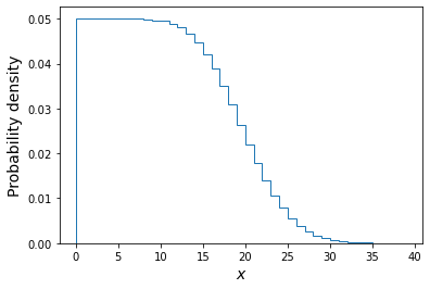
The above plot shows the distribution of the \(x\) values each corresponding to one draw of a Poisson variate with rate \(\lambda\) drawn from a uniform distribution \(U(0,20)\). Of these we will only choose those with \(x=4\) and plot their \(\lambda\) distribution below.
plt.figure()
## Here we use the condition poissvars==4 to select only values of lambda which
## generated the observed value of x. Then we plot the resulting distribution
plt.hist(lam_draws[poissvars==4],bins=100, density=True,histtype='step')
plt.xlabel('$\lambda$',fontsize=14)
plt.ylabel('Probability density',fontsize=14)
plt.show()
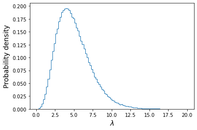
We also calculate the mean, standard deviation and the median and 95% confidence interval around it:
print("Mean of lambda = ",np.mean(lam_draws[poissvars==4]))
print("Standard deviation of lambda = ",np.std(lam_draws[poissvars==4],ddof=1))
lower95, median, upper95 = np.percentile(lam_draws[poissvars==4],q=[2.5,50,97.5])
print("The median, and 95% confidence interval is:",median,lower95,"-",upper95)
Mean of lambda = 5.00107665467192 Standard deviation of lambda = 2.2392759435694183 The median, and 95% confidence interval is: 4.667471008241424 1.622514190062071 - 10.252730578626686We can see that the mean is very close to the distribution mean calculated with the analytical approach. The confidence interval tells us that, based on our data and assumed prior, we expect the true value of lambda to lie in the range \(1.62-10.25\) with 95% confidence, i.e. there is only a 5% probability that the true value lies outside this range.
For additional challenges:
- You could define a Python function for the cdf of the analytical function for the posterior distribution of \(\lambda\), for \(x=4\) and then use it to plot on your simulated distribution the analytical posterior distribution, plotted for comparison as a histogram with the same binning as the simulated version.
- You can also plot the ratio of the simulated histogram to the analytical version, to check it is close to 1 over a broad range of values.
- Finally, see what happens to the posterior distribution of \(\lambda\) when you change the prior distribution, e.g. to a lognormal distribution with default
locandscaleands=1. (Note that you must choose a prior which does not generate negative values for \(\lambda\), otherwise the Poisson variates cannot be generated for those values).
Calculating the posterior probability distribution for multiple independent measurements
So far we have seen how to calculate the posterior probability distribution for a model parameter based on a single measurement, e.g. the number of coin flips that show as heads, or the number of GW events observed in a year. However, in many cases our data may consist of multiple independent measurements, for example from an experiment to repeatedly measure a given quantity, either to obtain an average, or to measure the response of an observable quantity to a variable which we can control.
For example, let’s assume that we have a vector of \(n\) measurements \(\mathbf{x}=[x_{1},x_{2},...,x_{n}]\), which we want to use to figure out the probability distribution of a parameter \(\theta\) (we now use \(\theta\) as a general term for a model parameter, not only for the probability parameter of the binomial distribution):
[p(\theta \vert \mathbf{x}) = \frac{p(\mathbf{x}\vert \theta)p(\theta)}{p(\mathbf{x})} = \frac{p(\mathbf{x}\vert \theta)p(\theta)}{\int^{\infty}_{-\infty} p(\mathbf{x}\vert \theta)p(\theta)\mathrm{d}\theta}]
In this case the prior term is the same as before, but what about the likelihood, which should now be calculated for a set of independent measurements instead of a single measurement? Since our measurements are statistically independent, the joint probability density of measuring values \(x_{1}\) and \(x_{2}\) is \(p(x_{1} \mbox{ and } x_{2})=p(x_{1})p(x_{2})\). I.e. we can simply multiply the probability densities of the individual measurements and rewrite the likelihood as:
[p(\mathbf{x}\vert \theta) = p(x_{1}\vert \theta)\times p(x_{2}\vert \theta)\times … \times p(x_{n}\vert \theta) = \prod\limits_{i=1}^{n} p(x_{i}\vert \theta)]
Provided that the probability densities of individual measurements can be calculated for any given \(\theta\), it should be possible to calculate the posterior probability distribution for \(\theta\), as long as the choice of prior permits it (e.g. a simple uniform prior). In practice it is often not straightforward to do these calculations and thereby map out the entire posterior probability distribution, often because the model or the data (or both) are too complicated, or the prior is not so simple to work with. For these cases, we will turn in later episodes to maximum-likelihood methods of model fitting using numerical optimisation, or Markov Chain Monte Carlo techniques to map out the posterior pdf.
Programming example: constraining the Poisson rate parameter with multiple intervals
We’ve already seen how to derive the posterior probability distribution of the Poisson rate parameter \(\lambda\) analytically for a single measurement, and how to use Monte Carlo integration to calculate the same thing. For cases with few parameters such as this, it is also possible to do the calculation numerically, using pdfs for the likelihood function and the prior together with Scipy’s integration library. Here we will see how this works for the case of measurements of the counts obtained in multiple intervals.
First, let’s assume we now have measurements of the number of GW events due to binary neutron star mergers in 8 successive years. We’ll put these in a numpy array as follows:
n_events = np.array([4,2,4,0,5,3,8,3])Assuming that the measurements are independent, we can obtain the posterior probability distribution for the true rate parameter given a data vector \(\mathbf{x}\) of \(n\) measurements from Bayes’ formula as follows:
\[p(\lambda \vert \mathbf{x}) = \frac{p( \mathbf{x} \vert \lambda)p(\lambda)}{\int^{+\infty}_{-\infty} p( \mathbf{x} \vert \lambda)p(\lambda) \mathrm{d}\lambda} = \frac{\left(\prod\limits_{i=1}^{n} p( x_{i} \vert \lambda)\right)p(\lambda)}{\int^{+\infty}_{-\infty} \left(\prod\limits_{i=1}^{n} p( x_{i} \vert \lambda)\right)p(\lambda) \mathrm{d}\lambda}\]where \(p(x_{i}\vert \lambda)\) is the Poisson likelihood (the pmf evaluated continuously as a function of \(\lambda\)) for the measurement \(x_{i}\) and \(p(\lambda)\) is the prior pdf, which we assume to be uniform as previously.
We can implement this calculation in Python as follows:
n_events = np.array([4,2,4,0,5,3,8,3])
# Create a grid of 1000 values of lambda to calculate the posterior over:
lam_array = np.linspace(0,20,1000)

# Here we assume a uniform prior. The prior probability should integrate to 1,
# although since the normalisation of the prior divides out of Bayes' formula it could have been arbitrary
prior = 1/20

# This is the numerator in Bayes' formula, the likelihood multiplied by the prior. Note that we have to
# reshape the events data array to be 2-dimensional, in the output array the 2nd dimension will
# correspond to the lambda array values. Like np.sum, the numpy product function np.prod needs us to tell
# it which axis to take the product over (the data axis for the likelihood calculation)
likel_prior = np.prod(sps.poisson.pmf(n_events.reshape(len(n_events),1),mu=lam_array),axis=0)*prior

# We calculate the denominator (the "evidence") with one of the integration functions.
# The second parameter (x) is the array of parameter values we are integrating over.
# The axis is the axis of the array we integrate over (by default the last one but we will state
# it explicitly as an argument here anyway, for clarity):
likel_prior_int = spint.simpson(likel_prior,lam_array,axis=0)

# Now we normalise and we have our posterior pdf for lambda!
posterior_pdf = likel_prior/likel_prior_int
# And plot it...
plt.figure()
plt.plot(lam_array,posterior_pdf)
plt.xlabel(r'$\lambda$',fontsize=12)
plt.ylabel(r'posterior density',fontsize=12)
plt.savefig('',bbox_inches='tight')
plt.show()
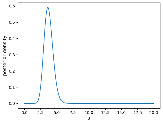
Now use the following code to randomly generate a new
n_eventsarray (with true \(\lambda=3.7\)), for \(10^{4}\) measurements (maybe we have a superior detector rather than a very long research project…). Re-run the code above to calculate the posterior pdf for these data and see what happens. What causes the resulting problem, and how can we fix it?n_events = sps.poisson.rvs(mu=3.7,size=10000)Solution
You should (at least based on current personal computers) obtain an error
RuntimeWarning: invalid value encountered in true_divide. This arises because we are multiplying so many small but finite probabilities together when we calculate the likelihood, which approaches extremely small values as a result. Once the likelihood is small enough that the computer precision cannot handle it, it goes to zero and results in an error.In a correct calculation, the incredibly small likelihood values would be normalised by their integral, also incredibly small, to obtain a posterior distribution with reasonable probabilities (which integrates to a total probability of 1). But the computation fails due to the precision issue before we can get there.
So how can we fix this? There is a simple trick we can use, which is simply to convert the likelihoods to log-likelihoods and take their sum, which is equivalent to the logarithm of the product of likelihoods. We can apply an arbitrary additive shift of the log-likelihood sum to more reasonable values before converting back to linear likelihood (which is necessary for integrating to obtain the evidence). Since a shifted log-likelihood is equivalent to a renormalisation, the arbitrary shift cancels out when we calculate the posterior. Let’s see how it works:
# For this many measurements the posterior pdf will be much narrower - our previous lambda grid
# will be too coarse with the old range of lambda, we will need to zoom in to a smaller range:
lam_array = np.linspace(3,4,1000)

prior = 1/20
# We need to sum the individual log-likelihoods and also the log(prior):
loglikel_prior = np.sum(np.log(sps.poisson.pmf(n_events.reshape(len(n_events),1),
                                            mu=lam_array)),axis=0) + np.log(prior)

# We can shift the function maximum to zero in log units, i.e. unity in linear units.
# The shift is arbitrary, we just need to make the numbers manageable for the computer.
likel_prior = np.exp(loglikel_prior-np.amax(loglikel_prior))

likel_prior_int = spint.simpson(likel_prior,lam_array,axis=0)

print(likel_prior_int)
# Now we normalise and we have our posterior pdf for lambda!
posterior_pdf = likel_prior/likel_prior_int
# And plot it...
plt.figure()
plt.plot(lam_array,posterior_pdf)
plt.xlabel(r'$\lambda$',fontsize=12)
plt.ylabel(r'posterior density',fontsize=12)
plt.show()
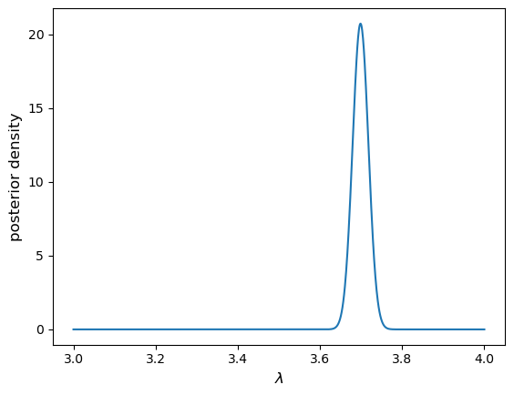
The posterior pdf is much more tightly constrained. In fact for these many measurements it should also be close to normally distributed, with a standard deviation of \(\lambda_{\rm true}/\sqrt{n}\) (corresponding to the standard error), i.e. 0.037 for \(\lambda_{\rm true}=3.7\).
Programming challenge: estimating \(g\) by timing a pendulum
In a famous physics lab experiment, the swing of a pendulum can be used to estimate the gravitational acceleration at the Earth’s surface \(g\). Using the small-angle approximation, the period of the pendulum swing \(T\), is related to \(g\) and the length of the pendulum string \(L\), via:
\[T=2\pi \sqrt{\frac{L}{g}}\]You obtain the following set of four measurements of \(T\) for a pendulum with \(L=1\) m (you may assume that \(L\) is precisely known):
\(1.98\pm0.02\) s, \(2.00\pm0.01\) s, \(2.05\pm0.03\) s, \(1.99\pm0.02\) s.
You may assume that the experimental measurements are drawn from normal distributions around the true value of \(T\), with distribution means equal to the true value of \(T\) and standard deviations \(\sigma\) equal to the error for that measurement. Assuming a uniform prior, use these measurements with Bayes’ theorem to calculate the posterior probability distribution for \(g\) (not T!).
Then, show what happens if you add a very precise measurement to the existing data: \(2.004\pm0.001\) s.
Hints
You will need to calculate the pdf value for each measurement and value of \(g\) that you calculate the posterior distribution for, using the normal distribution pdf. For scipy statistical distributions it is possible to use numpy array broadcasting to generate multi-dimensional arrays, e.g. to determine the pdf for each measurement and value of \(g\) separately and efficiently in a single 2-dimensional array, assuming a set of different location and scale parameters for each measurement. To do so, you should reshape the initial arrays you use for the measurements and errors to be 2-dimensional with shape (4,1), when you want to use them in the scipy pdf function. For integration you can use the
scipy.integrateSimpson’s rule method, used elsewhere in this episode.
Key Points
For conditional probabilities, Bayes’ theorem tells us how to swap the conditionals around.
In statistical terminology, the probability distribution of the hypothesis given the data is the posterior and is given by the likelihood multiplied by the prior probability, divided by the evidence.
The likelihood is the probability to obtained fixed data as a function of the distribution parameters, in contrast to the pdf which obtains the distribution of data for fixed parameters.
The prior probability represents our prior belief that the hypothesis is correct, before collecting the data
The evidence is the total probability of obtaining the data, marginalising over viable hypotheses. For complex data and/or models, it can be the most difficult quantity to calculate unless simplifying assumptions are made.
The choice of prior can determine how much data is required to converge on the value of a parameter (i.e. to produce a narrow posterior probability distribution for that parameter).
Working with and plotting large multivariate data sets
Overview
Teaching: 60 min
Exercises: 60 minQuestions
How can I easily read in, clean and plot multivariate data?
Objectives
Learn how to use Pandas to be able to easily read in, clean and work with data.
Use scatter plot matrices and 3-D scatter plots, to display complex multivariate data.
In this episode we will be using numpy, as well as matplotlib’s plotting library. Scipy contains an extensive range of distributions in its ‘scipy.stats’ module, so we will also need to import it. Remember: scipy modules should be imported separately as required - they cannot be called if only scipy is imported. We will also need to use the Pandas library, which contains extensive functionality for handling complex multivariate data sets. You should install it if you don’t have it.
import numpy as np
import matplotlib.pyplot as plt
import scipy.stats as sps
import pandas as pd
Now that we have covered the main concepts of probability theory, probability distributions and random variates and Bayes’ theorem, we are ready to look in more detail at statistical inference with data. First, we will look at some approaches to data handling and plotting for multivariate data sets. Multivariate data is complex and generally has a high information content, and more specialised python modules as well as plotting functions exist to explore the data as well as plotting it, while preserving as much of the information contained as possible.
Reading in, cleaning and transforming data with Pandas
Hipparcos, operating from 1989-1993 was the first scientific satellite devoted to precision astrometry, to accurately measure the positions of stars. By measuring the parallax motion of stars on the sky as the Earth (and the satellite) moves in its orbit around the sun, Hipparcos could obtain accurate measures of distances to stars up to a few hundred parsecs (pc). We will use some data from the Hipparcos mission as our example data set, in order to plot a ‘colour-magnitude’ diagram of the general population of stars. We will see how to read the data into a Pandas dataframe, clean it of bad and low-precision data, and transform the data into useful values which we can plot.
The file hipparcos.txt (see the Lesson data here) is a multivariate data-set containing a lot of information. To start with you should look at the raw data file using your favourite text editor, Pythons native text input/output commands or the more or cat commands in the linux shell. The file is formatted in a complex way, so that we need to skip the first 53 lines in order to get to the data. We will also need to skip the final couple of lines. Using the pandas.read_csv command to read in the file, we specify delim_whitespace=True since the values are separated by spaces not commas in this file, and we use the skiprows and skipfooter commands to skip the lines that do not correspond to data at the start and end of the file. We specify engine='python' to avoid a warning message, and index_col=False ensures that Pandas does not automatically assume that the integer ID values that are in the first column correspond to the indices in the array (this way we ensure direct correspondence of our index with our position in the array, so it is easier to diagnose problems with the data if we encounter any).
Note also that here we specify the names of our columns - we could also use names given in a specific header row in the file if one exists. Here, the header row is not formatted such that the names are easy to use, so we give our own names for the columns.
Finally, we need to account for the fact that some of our values are not defined (in the parallax and its error, Plx and ePlx columns) and are denoted with -. This is done by setting - to count as a NaN value to Pandas, using na_values='-'. If we don’t include this instruction in the command, those columns will appear as strings (object) according to the dtypes list.
hipparcos = pd.read_csv('hipparcos.txt', delim_whitespace=True, skiprows=53, skipfooter=2, engine='python',
names=['ID','Rah','Ram','Ras','DECd','DECm','DECs','Vmag','Plx','ePlx','BV','eBV'],
  index_col=False, na_values='-')
Note that Pandas automatically assigns a datatype (dtype) to each column based on the type of values it contains. It is always good to check that this is working to assign the correct types (here using the pandas.DataFrame.dtypes command), or errors may arise. If needed, we can also assign a dtype to each column using that variable in the pandas.read_csv command.
print(hipparcos.dtypes,hipparcos.shape)
ID        int64
Rah       int64
Ram       int64
Ras     float64
DECd      int64
DECm      int64
DECs    float64
Vmag    float64
Plx     float64
ePlx    float64
BV      float64
eBV     float64
dtype: object (85509, 12)
Once we have read the data in, we should also clean it to remove NaN values (use the Pandas .dropna function). We add a print statement to see how many rows of data are left. We should then also remove parallax values (\(p\)) with large error bars \(\Delta p\) (use a conditional statement to select only items in the pandas array which satisfy \(\Delta p/p < 0.05\). Then, let’s calculate the distance (distance in parsecs is \(d=1/p\) where \(p\) is the parallax in arcsec) and the absolute V-band magnitude (\(V_{\rm abs} = V_{\rm mag} - 5\left[\log_{10}(d) -1\right]\)), which is needed for the colour-magnitude diagram.
hnew = hipparcos[:].dropna(how="any") # get rid of NaNs if present
print(len(hnew),"rows remaining")

# get rid of data with parallax error > 5 per cent
hclean = hnew[hnew.ePlx/np.abs(hnew.Plx) < 0.05]

hclean[['Rah','Ram','Ras','DECd','DECm','DECs','Vmag','Plx','ePlx','BV','eBV']] # Just use the values
# we are going to need - avoids warning message

hclean['dist'] = 1.e3/hclean["Plx"] # Convert parallax to distance in pc
# Convert to absolute magnitude using distance modulus
hclean['Vabs'] = hclean.Vmag - 5.*(np.log10(hclean.dist) - 1.) # Note: larger magnitudes are fainter!
You will probably see a SettingWithCopyWarning on running the cell containing this code. It arises from the fact that we are producing output to the same dataframe that we are using as input. We get a warning because in some situations this kind of operation is dangerous - we could modify our dataframe in a way that affects things in unexpected ways later on. However, here we are safe, as we are creating a new column rather than modifying any existing column, so we can proceed, and ignore the warning.
Programming example: colour-luminosity scatter plot
For a basic scatter plot, we can use
plt.scatter()on the Hipparcos data. This function has a lot of options to make it look nicer, so you should have a closer look at the official matplotlib documentation forplt.scatter(), to find out about these possibilities.Now let’s look at the colour-magnitude diagram. We will also swap from magnitude to \(\mathrm{log}_{10}\) of luminosity in units of the solar luminosity, which is easier to interpret \(\left[\log_{10}(L_{\rm sol}) = -0.4(V_{\rm abs} -4.83)\right]\). Make a plot using \(B-V\) (colour) on the \(x\)-axis and luminosity on the \(y\)-axis.
Solution
loglum_sol = np.multiply(-0.4,(hclean.Vabs - 4.83)) # The calculation uses the fact that solar V-band absolute
# magnitude is 4.83, and the magnitude scale is in base 10^0.4

plt.figure()
## The value for argument s represents the area of the data-point in units of point size (as in "10 point font").
plt.scatter(hclean.BV, loglum_sol, c="red", s=1)
plt.xlabel("B-V (mag)", fontsize=14)
plt.ylabel("V band log-$L_{\odot}$", fontsize=14)
plt.tick_params(axis='x', labelsize=12)
plt.tick_params(axis='y', labelsize=12)
plt.show()
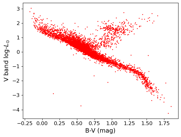
Plotting multivariate data with a scatter-plot matrix
Multivariate data can be shown by plotting each variable against each other variable (with histograms plotted along the diagonal). This is quite difficult to do in matplotlib. It is possible by plotting on a grid and making sure to keep the indices right, but doing so can be quite instructive. We will first demonstrate this (before you try it yourself using the Hipparcos data) using some multi-dimensional fake data drawn from normal distributions, using numpy’s random.multivariate_normal function. Note that besides the size of the random data set to be generated, the variable takes two arrays as input, a 1-d array of mean values and a 2-d matrix of covariances, which defines the correlation of each axis value with the others. To see the effect of the covariance matrix, you can experiment with changing it in the cell below.
Note that the random.multivariate.normal function may (depending on the choice of parameter values)throw up a warning covariance is not positive-semidefinite. For our simple simulation to look at how to plot multi-variate data, this is not a problem. However, such warnings should be taken seriously if you are using the simulated data or covariance to do a statistical test (e.g. Monte Carlo simulation to fit a model where different observables are random but correlated as defined by a covariance matrix). As usual, more information can be found via an online search.
When plotting scatter-plot matrices, you should be sure to make sure that the indices and grid are set up so that the \(x\) and \(y\) axes are shared across columns and rows of the matrix respectively. This way it is easy to compare the relation of one variable with the others, by reading either across a row or down a column. You can also share the axes (using arguments sharex=True and sharey=True of the subplots function) and remove tickmark labels from the plots that are not on the edges of the grid, if you want to put the plots closer together (the subplots_adjust function can be used to adjust the spacing between plots.
rand_data = sps.multivariate_normal.rvs(mean=[1,20,60,40], cov=[[3,2,1,3],[2,2,1,4],[1,1,3,2],[3,4,2,1]], size=100)
ndims = rand_data.shape[1]
labels = ['x1','x2','x3','x4']
fig, axes = plt.subplots(4,4,figsize=(10,10))
fig.subplots_adjust(wspace=0.3,hspace=0.3)
for i in range(ndims): ## y dimension of grid
    for j in range(ndims): ## x dimension of grid
        if i == j:
            axes[i,j].hist(rand_data[:,i], bins=20)
        elif i > j:
            axes[i,j].scatter(rand_data[:,j], rand_data[:,i])
        else:
            axes[i,j].axis('off')
        if j == 0:
            if i == j:
                axes[i,j].set_ylabel('counts',fontsize=12)
            else:
                axes[i,j].set_ylabel(labels[i],fontsize=12)
        if i == 3:
            axes[i,j].set_xlabel(labels[j],fontsize=12)
plt.show()
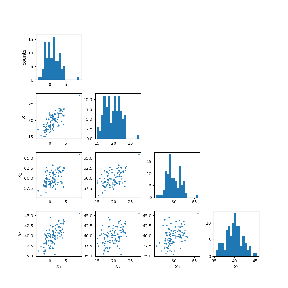
Programming example: plotting the Hipparcos data with a scatter-plot matrix
Now plot the Hipparcos data as a scatter-plot matrix. To use the same approach as for the scatter-plot matrix shown above, you can first stack the columns in the dataframe into a single array using the function
numpy.column_stack.Solution
h_array = np.column_stack((hclean.BV,hclean.dist,loglum_sol))

ndims=3
labels = ['B-V (mag)','Distance (pc)','V band log-$L_{\odot}$']
fig, axes = plt.subplots(ndims,ndims,figsize=(8,8))
fig.subplots_adjust(wspace=0.27,hspace=0.2)
for i in range(ndims): ## y dimension
    for j in range(ndims): ## x dimension
        if i == j:
            axes[i,j].hist(h_array[:,i], bins=20)
        elif i > j:
            axes[i,j].scatter(h_array[:,j],h_array[:,i],s=1)
        else:
            axes[i,j].axis('off')
        if j == 0:
            if i == j:
                axes[i,j].set_ylabel('counts',fontsize=12)
            else:
                axes[i,j].set_ylabel(labels[i],fontsize=12)
        if i == 2:
            axes[i,j].set_xlabel(labels[j],fontsize=12)
plt.show()
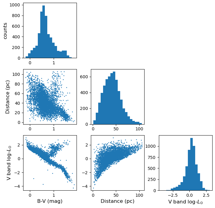
Exploring data with a 3-D plot
We can also use matplotlib’s 3-D plotting capability (after importing from mpl_toolkits.mplot3d import Axes3D) to plot and explore data in 3 dimensions (provided that you set up interactive plotting using %matplotlib notebook, the plot can be rotated using the mouse). We will first plot the multivariate normal data which we generated earlier to demonstrate the scatter-plot matrix.
from mpl_toolkits.mplot3d import Axes3D
%matplotlib notebook

fig = plt.figure() # This refreshes the plot to ensure you can rotate it
ax = fig.add_subplot(111, projection='3d')
ax.scatter(rand_data[:,0], rand_data[:,1], rand_data[:,2], c="red", marker='+')
ax.set_xlabel('x')
ax.set_ylabel('y')
ax.set_zlabel('z')
plt.show()
Programming example: 3-D plot of the Hipparcos data
Now make a 3-D plot of the Hipparcos data.
Solution
%matplotlib notebook
fig = plt.figure()
ax = fig.add_subplot(111, projection='3d')
ax.scatter(hclean.BV, loglum_sol, hclean.dist, c="red", s=1)
ax.set_xlabel('B-V (mag)', fontsize=12)
ax.set_ylabel('V band log-$L_{\odot}$', fontsize=12)
ax.set_zlabel('Distance (pc)', fontsize=12)
plt.show()
Programming challenge: reading in and plotting SDSS quasar data
The data set
sdss_quasars.txtcontains measurements by the Sloan Digital Sky Survey (SDSS) of various parameters obtained for a sample of 10000 “quasars” - supermassive black holes where gas drifts towards the black hole in an accretion disk, which heats up via gravitational potential energy release, to emit light at optical and UV wavelengths. This question is about extracting and plotting this multivariate data. In doing so, you will prepare for some exploratory data analysis using this data, which you will carry out in the programming challenges for the next three episodes.You should first familiarise yourself with the data file - the columns are already listed in the first row. The first three give the object ID and position (RA and Dec in degrees), then the redshift of the object, a target flag which you can ignore, followed by the total “bolometric” log10(luminosity), also called ‘log-luminosity’. The luminosity units are erg/s - note that 1 erg/s=10-7 W, though this is not important here. The error bar on log-luminosity is also given. Then follows a variable giving the ratio of radio to UV (250 nm) emission (so-called “radio loudness”), three pairs of columns listing a broadband “continuum” log-luminosity (and error) at three different wavelengths, and seven pairs of columns each listing a specific emission line log-luminosity (and error). Finally, a pair of columns gives an estimate of the black hole mass and its error (in log10 of the mass in solar-mass units).
An important factor when plotting and looking for correlations is that not all objects in the file have values for every parameter. In some cases this is due to poor data quality, but in most cases it is because the redshift of the object prevents a particular wavelength from being sampled by the telescope. In this data-set, when extracting data for your analysis, you should ignore objects where any of the specific quantities being considered are less than or equal to zero (this can be done using a conditional statement to define a new numpy array or Pandas dataframe, as shown above).
Now do the following:
- Load the data into a Pandas dataframe. To clean the data of measurements with large errors, only include log-luminosities with errors <0.1 (in log-luminosity) and log-black hole masses with errors <0.2.
- Now plot a labelled scatter-plot matrix showing the following quantities: LOGL3000, LOGL_MGII, R_6CM_2500A and LOGBH (note that due to the wide spread in values, you should plot log10 of the radio-loudness rather than the original data).
- Finally, plot an interactive 3D scatter plot with axes: LOGL3000, R_6CM_2500A and LOGBH. Note that interactive plots may not work if you run your notebook from within JupyterLab, but they should work in stand-alone notebooks.
Key Points
The Pandas module is an efficient way to work with complex multivariate data, by reading in and writing the data to a dataframe, which is easier to work with than a numpy structured array.
Pandas functionality can be used to clean dataframes of bad or missing data, while scipy and numpy functions can be applied to columns of the dataframe, in order to modify or transform the data.
Scatter plot matrices and 3-D plots offer powerful ways to plot and explore multi-dimensional data.
Introducing significance tests and comparing means
Overview
Teaching: 60 min
Exercises: 60 minQuestions
How do I use the sample mean to test whether a set of measurements is drawn from a given population, or whether two samples are drawn from the same population?
Objectives
Learn the general approach to significance testing, including how to test a null hypothesis and calculate and interpret a p-value.
Learn how to compare a normally distributed sample mean with an expected value for a given hypothesis, assuming that you know the variance of the distribution the data are sampled from.
Learn how to compare normally distributed sample means with an expected value, or two sample means with each other, when only the sample variance is known.
In this episode we will be using numpy, as well as matplotlib’s plotting library. Scipy contains an extensive range of distributions in its ‘scipy.stats’ module, so we will also need to import it. Remember: scipy modules should be installed separately as required - they cannot be called if only scipy is imported.
import numpy as np
import matplotlib.pyplot as plt
import scipy.stats as sps
One of the simplest questions we can ask is whether the data is consistent with being drawn from a given distribution. This might be a known and pre-specified distribution (either theoretical or given by previous measurements), or it might be a comparison with the distribution of another data set. These are simple yes/no questions: we are not trying to determine what the best distribution parameters are to describe the data, or ask whether one model is better than another. We are simply asking whether the data are consistent with some pre-determined hypothesis.
Test statistics and significance testing
We have already seen in our discussion of Bayes’ theorem that our goal is usually to determine the probability of whether a hypothesis (\(H\)) is true, under certain assumptions and given the data (\(D\)), which we express as \(P(H\vert D)\). However, the calculation of this posterior probability is challenging and we may have limited data available which we can only use to address simpler questions. For asking simple yes/no questions of the data, frequentist statistics has developed an approach called significance testing, which works as follows.
- Formulate a simple null hypothesis \(H_{0}\) that can be used to ask the question: are the data consistent with \(H_{0}\)?
- Calculate a test statistic \(z^{\prime}\) from the data, the probability distribution of which, \(p(z)\) can be determined in the case when \(H_{0}\) is true.
- Use \(p(z)\) to calculate the probability (or \(p\)-value) that \(z\) would equal or exceed the observed value \(z^{\prime}\), if \(H_{0}\) is true, i.e. calculate the \(p\)-value: \(P(z>z^{\prime})\).
The \(p\)-value is an estimate of the statistical significance of your hypothesis test. It represents the probability that the test statistic is equal to or more extreme than the one observed, Formally, the procedure is to pre-specify (before doing the test, or ideally before even looking at the data!) a required significance level \(\alpha\), below which one would reject the null hypothesis, but one can also conduct exploratory data analysis (e.g. when trying to formulate more detailed hypotheses for testing with additional data) where a \(p\)-value is simply quoted as it is and possibly used to define a set of conclusions.
Significance testing: two-tailed case
Often the hypothesis we are testing predicts a test statistic with a (usually symmetric) two-tailed distribution, because only the magnitude of the deviation of the test statistic from the expected value matters, not the direction of that deviation. A good example is for deviations from the expected mean due to statistical error: if the null hypothesis is true we don’t expect a preferred direction to the deviations and only the size of the deviation matters.
Calculation of the 2-tailed \(p\)-value is demonstrated in the figure below. For a positive observed test statistic \(Z=z^{\prime}\), the \(p\)-value is twice the integrated probability density for \(z\geq z^{\prime}\), i.e. \(2\times(1-cdf(z^{\prime}))\).
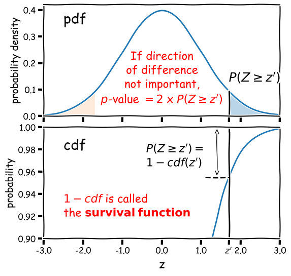
Note that the function 1-cdf is called the survival function and it is available as a separate method for the statistical distributions in
scipy.stats, which can be more accurate than calculating 1-cdf explicitly for very small \(p\)-values.For example, for the graphical example above, where the distribution is a standard normal:
print("p-value = ",2*sps.norm.sf(1.7))p-value = 0.08913092551708608In this example the significance is low (i.e. the \(p\)-value is relatively large) and the null hypothesis is not ruled out at better than 95% confidence.
Significance levels and reporting
How should we choose our significance level, \(\alpha\)? It depends on how important is the answer to the scientific question you are asking!
- Is it a really big deal, e.g. the discovery of a new particle, or an unexpected source of emission in a given waveband (such as the first electromagnetic counterpart to a gravitational wave source)? If so, then the usual required significance is \(\alpha= 5\sigma\), which means the probability of the data being consistent with the null hypothesis (i.e. non-detection of the particle or electromagnetic counterpart) is equal to or less than that in the integrated pdf more than 5 standard deviations from the mean for a standard normal distribution (\(p\simeq 5.73\times 10^{-7}\) or about 1 in 1.7 million).
- Is it important but not completely groundbreaking or requiring re-writing of or large addition to our understanding of the scientific field? For example, the ruling out of a particular part of parameter space for a candidate dark matter particle, or the discovery of emission in a known electromagnetic radiation source but in a completely different waveband to that observed before (e.g. an X-ray counterpart to an optical source)? In this case we would usually be happy with \(\alpha= 3\sigma\) (\(p\simeq 2.7\times 10^{-3}\), i.e. 0.27% probability).
- Does the analysis show (or rule out) an effect but without much consequence, since the effect (or lack of it) was already expected based on previous analysis, or as a minor consequence of well-established theory? Or is the detection of the effect tentative and only reported to guide design of future experiments or analysis of additional data? If so, then we might accept a significance level as low as \(\alpha=0.05\). This level is considered the minimum bench-mark for publication in some fields, but in physics and astronomy it is usually only considered as suitable for individual claims in a paper that also presents more significant results or novel interpretation.
When reporting results for pre-specified tests we usually state them in this way (or similar, according to your own style or that of the field):
”<The hypothesis> is rejected at the <insert \(\alpha\) here> significance level.”
‘Rule out’ is also often used as a synonym for ‘reject’. Or if we also include the calculated \(p\)-value for completeness:
“We obtained a \(p-\)value of <insert \(p\) here>”, so the hypothesis is rejected at the <insert \(\alpha\) here> significance level.”
Sometimes we invert the numbers (taking 1 minus the \(p\)-value or probability) and report the confidence level as a percentage e.g. for \(\alpha=0.05\) we can also state:
“We rule out …. at the 95% confidence level.”
And if (as is often the case) our required significance is not satisfied, we should also state that:
“We cannot rule out …. at better than the <insert \(\alpha\) here> significance level.”
Introducing our data: Michelson’s speed of light measurements
To demonstrate a simple signifiance test of the distribution of the mean of our data, we will use Michelson’s speed-of-light measurements michelson.txt which you can find here in the data folder. It’s important to understand the nature of the data before you read it in, so be sure to check this by looking at the data file itself (e.g. via a text editor or other file viewer) before loading it. For the speed-of-light data we see 4 columns. The 1st column is just an identifier (‘row number’) for the measurement. The 2nd column is the ‘run’ - the measurement within a particular experiment (an experiment consists of 20 measurements). The 4th column identifies the experiment number. The crucial measurement itself is the 3rd column - to save on digits this just lists the speed (in km/s) minus 299000, rounded to the nearest 10 km/s.
If the data is in a fairly clean array, this is easily achieved with numpy.genfromtxt (google it!). By setting the argument names=True we can read in the column names, which are assigned as field names to the resulting numpy structured data array.
We will use the field names of your input 2-D array to assign the data columns Run, Speed and Expt to separate 1-D arrays and print the three arrays to check them:
michelson = np.genfromtxt("michelson.txt",names=True)
print(michelson.shape) ## Prints shape of the array as a tuple
run = michelson['Run']
speed = michelson['Speed']
experiment = michelson['Expt']
print(run,speed,experiment)
(100,)
[ 1.  2.  3.  4.  5.  6.  7.  8.  9. 10. 11. 12. 13. 14. 15. 16. 17. 18.
 19. 20.  1.  2.  3.  4.  5.  6.  7.  8.  9. 10. 11. 12. 13. 14. 15. 16.
 17. 18. 19. 20.  1.  2.  3.  4.  5.  6.  7.  8.  9. 10. 11. 12. 13. 14.
 15. 16. 17. 18. 19. 20.  1.  2.  3.  4.  5.  6.  7.  8.  9. 10. 11. 12.
 13. 14. 15. 16. 17. 18. 19. 20.  1.  2.  3.  4.  5.  6.  7.  8.  9. 10.
 11. 12. 13. 14. 15. 16. 17. 18. 19. 20.] [ 850.  740.  900. 1070.  930.  850.  950.  980.  980.  880. 1000.  980.
  930.  650.  760.  810. 1000. 1000.  960.  960.  960.  940.  960.  940.
  880.  800.  850.  880.  900.  840.  830.  790.  810.  880.  880.  830.
  800.  790.  760.  800.  880.  880.  880.  860.  720.  720.  620.  860.
  970.  950.  880.  910.  850.  870.  840.  840.  850.  840.  840.  840.
  890.  810.  810.  820.  800.  770.  760.  740.  750.  760.  910.  920.
  890.  860.  880.  720.  840.  850.  850.  780.  890.  840.  780.  810.
  760.  810.  790.  810.  820.  850.  870.  870.  810.  740.  810.  940.
  950.  800.  810.  870.] [1. 1. 1. 1. 1. 1. 1. 1. 1. 1. 1. 1. 1. 1. 1. 1. 1. 1. 1. 1. 2. 2. 2. 2.
 2. 2. 2. 2. 2. 2. 2. 2. 2. 2. 2. 2. 2. 2. 2. 2. 3. 3. 3. 3. 3. 3. 3. 3.
 3. 3. 3. 3. 3. 3. 3. 3. 3. 3. 3. 3. 4. 4. 4. 4. 4. 4. 4. 4. 4. 4. 4. 4.
 4. 4. 4. 4. 4. 4. 4. 4. 5. 5. 5. 5. 5. 5. 5. 5. 5. 5. 5. 5. 5. 5. 5. 5.
 5. 5. 5. 5.]
The speed-of-light data given here are primarily univariate and continuous (although values are rounded to the nearest km/s). Additional information is provided in the form of the run and experiment number which may be used to screen and compare the data.
Now the most important step: always plot your data!!!
It is possible to show univariate data as a series of points or lines along a single axis using a rug plot, but it is more common to plot a histogram, where the data values are assigned to and counted in fixed width bins. We will combine both approaches. The histogram covers quite a wide range of values, with a central peak and broad ‘wings’, This spread could indicate statistical error, i.e. experimental measurement error due to the intrinsic precision of the experiment, e.g. from random fluctuations in the equipment, the experimenter’s eyesight etc.
The actual speed of light in air is 299703 km/s. We can plot this on our histogram, and also add a ‘rug’ of vertical lines along the base of the plot to highlight the individual measurements and see if we can see any pattern in the scatter.
plt.figure()
# Make and plot histogram (note that patches are matplotlib drawing objects)
counts, edges, patches = plt.hist(speed, bins=10, density=False, histtype='step')

# We can plot the 'rug' using the x values and setting y to zero, with vertical lines for the
# markers and connecting lines switched off using linestyle='None'
plt.plot(speed, np.zeros(len(speed)), marker='|', ms=30, linestyle='None')

# Add a vertical dotted line at 703 km/s
plt.axvline(703,linestyle='dotted')

plt.xlabel("Speed - 299000 [km/s]", fontsize=14)
plt.ylabel("Counts per bin", fontsize=14)
plt.tick_params(axis='x', labelsize=12)
plt.tick_params(axis='y', labelsize=12)
plt.show()
The rug plot shows no clear pattern other than the equal 10 km/s spacing between many data points that is imposed by the rounding of speed values. However, the data are quite far from the correct value. This could indicate a systematic error, e.g. due to an mistake in the experimental setup or a flaw in the apparatus.
To go further, and use data to answer scientific questions, we need to understand a bit more about data, i.e. measurements and how they relate to the probability distributions and random variates we have studied so far.
Measurements are random variates
Data, in the form of measurements, are random variates drawn from some underlying probabiliy distribution. This is one of the most important insights in statistics, which allows us to answer scientific questions about the data, i.e. hypotheses. The distribution that measurements are drawn from will depend on the physical (perhaps random) process that generates the quantity we are measuring as well as the measurement apparatus itself.
As a simple example, imagine that we want to measure the heights of a sample of people in order to estimate the distribution of heights of the wider population, i.e. we are literally sampling from a real population, not a notional one. Our measurement apparatus will introduce some error into the height measurements, which will increase the width of the distribution and hence the spread in our data slightly. But by far the largest effect on the sample of heights will be from the intrinsic width of the underlying population distribution, which will produce the most scatter in the measurements, since we know that intrinsic height variations are considerably larger than the error in our height measurements! Thus, sampling from a real underlying population automatically means that our measurements are random variates. The same can be seen in many physical situations, especially in astronomy, e.g. measuring the luminosity distribution of samples of objects, such as stars or galaxies.
Alternatively, our measurements might be intrinsically random due to the physical process producing random fluctuations in time, or with repeated measurements, e.g. the decays of radioisotopes, the arrival times of individual photons in a detector, or the random occurence of rare events such as the merger of binary neutron stars.
Finally, our measuring instruments may themselves introduce random variations into the measurements. E.g. the random variation in the amount of charge deposited in a detector by a particle, random changes in the internal state of our instrument, or even the accuracy to which we can read a measurement scale. In many cases these measurement errors may dominate over any other errors that are intrinsic to the quantity we are measuring. For example, based on our knowledge of physics we can be pretty confident that the speed of light is not intrinsically varying in Michelson’s experiment, so the dispersion in the data must be due to measurement errors.
Precision and accuracy
In daily speech we usually take the words precision and accuracy to mean the same thing, but in statistics they have distinct meanings and you should be careful when you use them in a scientific context:
- Precision refers to the degree of random deviation, e.g. how broad a measured data distribution is.
- Accuracy refers to how much non-random deviation there is from the true value, i.e. how close the measured data are on average to the ‘true’ value of the quantity being measured.
In terms of errors, high precision corresponds to low statistical error (and vice versa) while high accuracy refers to low systematic error.
Estimators and bias: sample mean and sample variance
To answer scientific questions, we usually want to use our measurements to estimate some property of the underlying physical quantity we are measuring. To do so, we need to estimate the parameters of the distribution that the measurements are drawn from. Where measurement errors dominate, we might hope that the population mean represents the `true’ value of the quantity we wanted to measure. The spread in data (given by the variance) may only be of interest if we want to quantify the precision of our measurements. If the spread in data is intrinsic to the measured quantity itself (e.g. we are sampling from a real underlying population), we might also be interested in the variance of our distribution and the distribution shape itself, if there is enough data to constrain it. We will discuss the latter kind of analysis in a later episode, when we consider fitting models to data distributions.
An estimator is a method for calculating from data an estimate of a given quantity. For example the sample mean or sample variance are estimators of the population (distribution) mean (\(\mu\)) or variance (\(\sigma^{2}\)). The results of biased estimators may be systematically biased away from the true value they are trying to estimate, in which case corrections for the bias are required. The bias is equivalent to systematic error in a measurement, but is intrinsic to the estimator rather than the data itself. An estimator is biased if its expectation value (i.e. its arithmetic mean in the limit of an infinite number of experiments) is systematically different to the quantity it is trying to estimate.
For example, the sample mean is an unbiased estimator of the population mean. Consider the sample mean, \(\bar{x}\) for a sample of \(n\) measurements \(x_{i}\):
[\bar{x}=\frac{1}{n}\sum\limits_{i=1}^{n} x_{i}]
Assuming that our measurements are random variates drawn from the same distribution, with population mean \(\mu = E[x_{i}]\), the expectation value of the sample mean is:
[E\left[\frac{1}{n}\sum\limits_{i=1}^{n} x_{i}\right] = \frac{1}{n}\sum\limits_{i=1}^{n} E[x_{i}] = \frac{1}{n}n\mu = \mu,]
which means that the sample mean is an unbiased estimator of the population mean, i.e. its expectation value is equal to the population mean.
The variance needs to be corrected, however. The population variance for random variates \(X\) is the arithmetic mean of the variance in the limit of infinite observations, i.e.:
[\sigma^{2} = E[(X-\mu)^{2}] = \frac{1}{n}\sum\limits_{i=1}^{n} (X_{i}-\mu)^{2} \mbox{ for } n\rightarrow \infty.]
We might then assume that we can define the sample variance in terms of our measurements and their sample mean as: \(\frac{1}{n}\sum\limits_{i=1}^{n} (x_{i}-\bar{x})^{2}\). However, we would be wrong! Unlike the sample mean, the normalisation of the sum by \(\frac{1}{n}\) produces a biased estimator for the population variance. This results from the fact that the sample mean is itself a random variate, variations of which act to reduce the sample variance slightly, unlike the constant population mean used to estimate the population variance. The unbiased estimator is the sample variance \(s_{x}^{2}\) of our measurements is then defined as:
[s_{x}^{2} = \frac{1}{n-1}\sum\limits_{i=1}^{n} (x_{i}-\bar{x})^{2}]
where the correction by subtracting 1 from \(n\) is known as Bessel’s correction. The specific integer correction to the number of sampled variates (1 in this case) is known as the ‘delta degrees of freedom`. It can differ for other estimators.
The sample standard deviation \(s_{x}\) and sample standard error \(s_{\bar{x}}\) (the error on the sample mean) are defined as:
[s_{x} = \sqrt{\frac{1}{n-1}\sum\limits_{i=1}^{n} (x_{i}-\bar{x})^{2}}]
[s_{\bar{x}} = s_{x}/\sqrt{n}]
however you should note that \(s_{x}\) and \(s_{\bar{x}}\) are biased estimators of (respectively) the population standard deviation \(\sigma\) and standard error \(\sigma_{\bar{x}}\). This follows because \(E\left[\sqrt{s_{x}^{2}}\right]\neq \sqrt{E[s_{x}^{2}]}\) (this is easy to see from comparing the square root of a sum with a sum of square roots). The bias is complex to calculate (when the sample is drawn from a normal distribution it involves Gamma functions) but is only a few per cent for \(n=10\) and for large \(n\) it decreases linearly with \(n\), so that it can be safely ignored for large sample sizes.
Numpy provides functions to calculate from a data array the mean, variance and also the standard deviation (just the square root of variance, but commonly used so it has its own function). scipy.stats also includes a function for the standard error on the sample mean. Note that for calculations of the variance, as well as other estimators, which include degrees of freedom, the default may not be correct for the sample variance, so you may need to specify it. You should check the function descriptions if you are unsure.
michelson_mn = np.mean(speed) + 299000 # Mean speed with offset added back in
michelson_var = np.var(speed,ddof=1) # The delta degrees of freedom for Bessels correction needs to be specified
michelson_std = np.std(speed,ddof=1)
michelson_ste = sps.sem(speed,ddof=1) # The default ddof=1 for the scipy function, but it is good
                                      # practice to specify ddof to be consistent
print("mean =",michelson_mn," variance=",michelson_var," std. deviation=",michelson_std," std. error =",michelson_ste)
mean = 299852.4 variance= 6242.666666666667 std. deviation= 79.01054781905178 std.error = 7.901054781905178
The true speed of light is 299703 km/s, so there is a difference of \(\simeq\)149 km/s. Does this difference reflect a systematic error in Michelson’s measurements, or did it arise by chance?
Bessel’s correction to sample variance
We can write the expectation of the summed squared deviations used to calculate sample variance, in terms of differences from the population mean \(\mu\), as follows:
\[E\left[ \sum\limits_{i=1}^{n} \left[(x_{i}-\mu)-(\bar{x}-\mu)\right]^{2} \right] = \left(\sum\limits_{i=1}^{n} E\left[(x_{i}-\mu)^{2} \right]\right) - nE\left[(\bar{x}-\mu)^{2} \right] = \left(\sum\limits_{i=1}^{n} V[x_{i}] \right) - n V[\bar{x}]\]But we know that (assuming the data are drawn from the same distribution) \(V[x_{i}] = \sigma^{2}\) and \(V[\bar{x}] = \sigma^{2}/n\) (from the standard error) so it follows that the expectation of the average of squared deviations from the sample mean is smaller than the population variance by an amount \(\sigma^{2}/n\), i.e. it is biased:
\[E\left[\frac{1}{n} \sum\limits_{i=1}^{n} (x_{i}-\bar{x})^{2} \right] = \frac{n-1}{n} \sigma^{2}\]and therefore for the sample variance to be an unbiased estimator of the underlying population variance, we need to correct our calculation by a factor \(n/(n-1)\), leading to Bessel’s correction to the sample variance:
\[\sigma^{2} = E\left[\frac{1}{n-1} \sum\limits_{i=1}^{n} (x_{i}-\bar{x})^{2} \right]\]A simple way to think about the correction is that since the sample mean is used to calculate the sample variance, the contribution to population variance that leads to the standard error on the mean is removed (on average) from the sample variance, and needs to be added back in.
Comparing sample and population means with significance tests
Since we can use the sample mean as an estimator for the population mean of the distribution our measurements are drawn from, we can consider a simple hypothesis: are our data consistent with being drawn from a distribution with population mean equal to the known speed of light in air? Frequentist methods offer two common approaches which depend on our knowledge of the population distribution, known as the \(Z\)-test (for populations with known variance) and the one-sample \(t\)-test (for populations with unknown variance).
Standard deviation of sample means and the \(Z\)-test
Imagine that thanks to precise calibration of our instrument, we know that the standard deviation (\(\sigma\), the square-root of variance) of the population of measurements (equivalent to the so-called ‘error bar’ on our measurements), is exactly 75 km/s. Our sample mean is \(\simeq 149\)~km/s larger than the true value of the speed of light. This is only twice the expected standard deviation on our measurements, which doesn’t sound too bad. However the sample mean is calculated by taking the average of 100 measurements. The expected standard deviation of our sample mean is \(\sigma_{\bar{x}}=\frac{\sigma}{\sqrt{n}}\), i.e. the standard deviation on our sample mean, usually known as the standard error on the mean, should be only 7.5 km/s!
We can quantify whether the deviation is statistically significant or not by using a significance test called the \(Z\)-test. We first define a test statistic, the \(Z\)-statistic, which is equal to the difference between sample and population mean normalised by the standard error:
[Z = \frac{\bar{x}-\mu}{\sigma/\sqrt{n}}.]
Under the assumption that the sample mean (\(\bar{x}\)) is drawn from a normal distribution with population mean \(\mu\) with standard deviation \(\sigma/\sqrt{n}\), \(Z\) is distributed as a standard normal (mean 0 and variance 1). By calculating the \(p\)-value of our statistic \(Z=z^{\prime}\) (see Significance testing: two-tailed case above) we can test the hypothesis that the data are drawn from a population with the given \(\mu\) and \(\sigma\).
The \(Z\)-test rests on the key assumption that the sample means are normally distributed. If that is not the case, the calculated significance of the test (or \(p\)-value) will not be correct. However, provided that the sample is large enough (and the distribution of the individual measurements is not extremely skewed), the Central Limit Theorem tells us that a sample mean is likely to be close to normally distributed and our assumption will hold.
Programming example: calculate the \(Z\)-statistic and its significance
Now let’s write a Python function that takes as input the data and the normal distribution parameters we are comparing it with, calculates the \(Z\) statistic from the distribution parameters and sample mean, and outputs the \(p\)-value. Then, use our function to carry out a \(Z\)-test on the Michelson data.
Solution
def ztest(data,mu,sigma):
    '''Calculates the significance of a z-test comparing a sample mean of input data with a specified
    normal distribution
    Inputs: The data (1-D array) and mean and standard deviation of normally distributed comparison population
    Outputs: prints the observed mean and population parameters, the Z statistic value and p-value'''
    mean = np.mean(data)
    # Calculate the Z statistic zmean
    zmean = (mean-mu)/(sigma/np.sqrt(len(data)))
    # Calculate the p-value of zmean from the survival function - default distribution is standard normal
    pval = 2*sps.norm.sf(np.abs(zmean)) # force Z to be positive so the usage of survival
                                        # function is correct
    print("Observed mean =",mean," versus population mean",mu,", sigma",sigma)
    print("Z =",zmean,"with Significance =",pval)
    return
Now we apply it to our data:
ztest(speed,703,75)Observed mean = 852.4 versus population mean 703 , sigma 75 Z = 19.919999999999998 with Significance = 2.7299086350765053e-88The deviation of the sample mean from the true speed of light in air is clearly highly significant! We should not take the exact value of the significance too seriously however, other than to be sure that it is an extremely small number. This is because the calculated \(Z\) is \(\sim\)20-standard deviations from the centre of the distribution. Even with 100 measurements, the central limit theorem will not ensure that the distribution of the sample mean is close to normal so far from the centre. This will only be the case if the measurements are themselves (exactly) normally distributed.
Comparing a sample mean with the mean of a population with unknown variance: the one-sample \(t\)-test
For many data sets we will not know the variance of the underlying measurement distribution exactly, and must calculate it from the data itself, via the sample variance. In this situation, we must replace \(\sigma\) in the \(z\)-statistic calculation \(Z = (\bar{x}-\mu)/(\sigma/\sqrt{n})\) with the sample standard deviation \(s_{x}\), to obtain a new test statistic, the \(t\)-statistic :
[T = \frac{\bar{x}-\mu}{s_{x}/\sqrt{n}}]
Unlike the normally distributed \(z\)-statistic, under certain assumptions the \(t\)-statistic can be shown to follow a different distribution, the \(t\)-distribution. The assumptions are:
- The sample mean is normally distributed. This means that either the data are normally distributed, or that the sample mean is normally distributed following the central limit theorem.
- The sample variance follows a scaled chi-squared distribution. We will discuss the chi-squared distribution in more detail in a later episode, but we note here that it is the distribution that results from summing squared, normally-distributed variates. For sample variances to follow this distribution, it is usually (but not always) required that the data are normally distributed. The variance of non-normally distributed data often deviates significantly from a chi-squared distribution. However, for large sample sizes, the sample variance usually has a narrow distribution of values so that the resulting \(t\)-statistic distribution is not distorted too much.
The significance test is called the one-sample \(t\)-test, or often Student’s one-sample \(t\)-test, after the pseudonym of the test’s inventor, William Sealy Gossett (Gossett worked as a statistician for the Guiness brewery, who required their employees to publish their research anonymously). If the assumptions above apply then assuming the data are drawn from a population with mean \(\mu\), \(T\) will be drawn from a \(t\)-distribution with parameter \(\nu=n-1\). Note that since \(t\) is a symmetric distribution, the deviations measured by \(T\) can be ‘extreme’ for positive or negative values and the significance test is two-sided.
Making the assumptions listed above, we can carry out a one-sample \(t\)-test on our complete data set. To do so we could calculate \(T\) for the sample ourselves and use the \(t\) distribution for \(\nu=99\) to determine the two-sided significance (since we don’t expect any bias on either side of the true valur from statistical error). But scipy.stats also has a handy function scipy.stats.ttest_1samp which we can use to quickly get a \(p\)-value. We will use both for demonstration purposes:
# Define c_air (remember speed has 299000 km/s subtracted from it!)
c_air = 703
# First calculate T explicitly, scipy.stats has a standard error function,
# for calculating the sample standard error:
T = (np.mean(speed)-c_air)/sps.sem(speed,ddof=1)
# The degrees of freedom to be used for the t-distribution is n-1
dof = len(speed)-1
# Applying a 2-tailed significance test, the p-value is twice the survival function for the given T:
pval = 2*sps.t.sf(T,df=dof)
print("T is:",T,"giving p =",pval,"for",dof,"degrees of freedom")

# And now the easy way - the ttest_1samp function outputs T and the p-value but not the dof:
T, pval = sps.ttest_1samp(speed,popmean=c_air)
print("T is:",T,"giving p =",pval,"for",len(speed)-1,"degrees of freedom")
T is: 18.908867755499248 giving p = 1.2428269455699714e-34 for 99 degrees of freedom
T is: 18.90886775549925 giving p = 1.2428269455699538e-34 for 99 degrees of freedom
Both approaches give identical \(p\)-values after some rounding at the highest precisions. The test remains highly significant, i.e. the sample is drawn from a population with a mean which is significantly different from the known speed of light in air. However, unless the data set is large we should again be cautious about taking the significance of very large absolute values of \(T\) at face value, since unless the sample is drawn from a normal distribution, its mean and variance are unlikely to satisfy the normal and chi-squared distribution requirements in the tails of their distributions. Instead it is more ‘honest’ to simply state that the null hypothesis is ruled out, e.g. at \(>5\sigma\) significance.
Probability distributions: the \(t\)-distribution
The \(t\)-distribution is derived based on standard normally distributed variates and depends only on a single parameter, the degrees of freedom \(\nu\). Its pdf and cdf are complicated, involving Gamma and hypergeometric functions, so rather than give the full distribution functions, we will only state the results that for variates \(X\) distributed as a \(t\)-distribution (i.e. \(X\sim t(\nu)\)):
\(E[X] = 0\) for \(\nu > 1\) (otherwise \(E[X]\) is undefined)
\(V[X] = \frac{\nu}{\nu-2}\) for \(\nu > 2\), \(\infty\) for \(1\lt \nu \leq 2\), otherwise undefined.
The distribution in scipy is given by the function scipy.stats.t, which we can use to plot the pdfs and cdfs for different \(\nu\):
nu_list = [1, 2, 5, 10, 100]
fig, (ax1, ax2) = plt.subplots(1,2, figsize=(9,4))
# change the separation between the sub-plots:
fig.subplots_adjust(wspace=0.3)
x = np.arange(-4, 4, 0.01)
for nu in nu_list:
    td = sps.t(df=nu)
    ax1.plot(x, td.pdf(x), lw=2, label=r'$\nu=$'+str(nu))
    ax2.plot(x, td.cdf(x), lw=2, label=r'$\nu=$'+str(nu))
for ax in (ax1,ax2):
    ax.tick_params(labelsize=12)
    ax.set_xlabel("t", fontsize=12)
    ax.tick_params(axis='x', labelsize=12)
    ax.tick_params(axis='y', labelsize=12)
    ax.legend(fontsize=10, loc=2)
ax1.set_ylabel("probability density", fontsize=12)
ax2.set_ylabel("probability", fontsize=12)
plt.show()
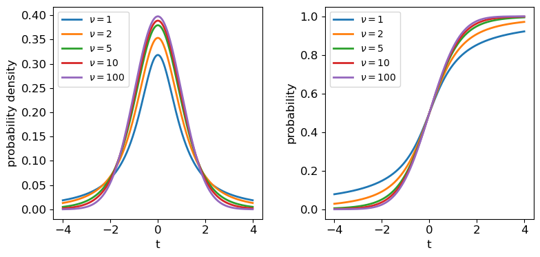
The tails of the \(t\)-distribution are the most prominent for small \(\nu\), but rapidly decrease in strength for larger \(\nu\) as the distribution approaches a standard normal in the limit \(\nu \rightarrow \infty\). This means that for the purposes of significance testing, for large \(n\) the distribution of \(T\) approaches that of the \(Z\)-statistic.
Looking deeper at Michelson’s data
The result of our one-sample \(t\)-test leaves us with the remaining possibility that the difference is real and systematic, i.e. the sample is not drawn from a distribution with mean equal to the known value of \(c_{\rm air}\). Intuitively we know it is much more likely that there is a systematic error in the experimental measurements than a change in the speed of light itself!
However, we know that Michelson’s data was obtained in 5 separate experiments - if there is a systematic error, it could change between experiments. So let’s now pose a further question: are any of Michelson’s 5 individual experiments consistent with the known value of \(c_{\rm air}\)?
We can first carry out a simple visual check by plotting the mean and standard error for each of Michelson’s 5 experiments:
plt.figure()
for i in range(1,6):
    dspeed = speed[experiment == i]
    # The errorbar function allows data points with errors (in y and/or x) to be plotted:
    plt.errorbar(i,np.mean(dspeed),yerr=sps.sem(dspeed),marker='o',color='blue')
# Plot a horizontal line for the known speed:
plt.axhline(703,linestyle='dotted')
plt.xlabel('Experiment',fontsize=14)
plt.ylabel('Speed - 299000 (km/s)',fontsize=14)
# Specify tickmark locations to restrict to experiment ID
plt.xticks(range(1,6))
# The tick marks are small compared to the plot size, we can change that with this command:
plt.tick_params(axis="both", labelsize=12)
plt.show()
The mean speed for all the experiments are clearly systematically offset w.r.t. the known value of \(c_{\rm air}\) (shown by the dotted line). Given the standard errors for each mean, the offsets appear highly significant in all cases (we could do more one-sample \(t\)-tests but it would be a waste of time, the results are clear enough!). So we can conclude that Michelson’s experiments are all affected by a systematic error that leads the measured speeds to be too high, by between \(\sim 120\) and 200 km/s.
The two-sample \(t\)-test
We could also ask, is there evidence that the systematic error changes between experiments?
Now things get a little more complicated, because our physical model incorporates the systematic error which is unknown. So to compare the results from two experiments we must deal with unknown mean and variance! Fortunately there are variants of the \(t\)-test which can deal with this situation, called independent two-sample t-tests.
The independent two-sample t-test uses similar assumptions as the one-sample test to compare the means of two independent samples and determine whether they are drawn from populations with the same mean:
- Both sample means are assumed to be normally distributed.
- Both sample variances are assumed to be drawn from scaled chi-squared distributions. The standard two-sample test further assumes that the two populations being compared have the same population variance, but this assumption is relaxed in Welch’s t-test which allows for comparison of samples drawn from populations with different variance (this situation is expected when comparing measurements of the same physical quantity from experiments with different precisions).
Programming example: comparing Michelson’s experiment means
The calculated \(T\)-statistic and degrees of freedom used for the \(t\)-distribution significance test are complicated for these two-sample tests, but we can use
scipy.stats.ttest_indto do the calculation for us.Experiment 1 shows the largest deviation from the known \(c_{\rm air}\), so we will test whether the data from this experiment is consistent with being drawn from a population with the same mean (i.e. same systematic error) as the other four experiments. Do the following:
- Look up and read the online documentation for
scipy.stats.ttest_ind.- Calculate the \(p\)-value for comparing the mean of experiment 1 with those of experiments 2-5 by using both variance assumptions: i.e. first that variances are equal, and then that variances do not have to be equal (Welch’s \(t\)-test).
- What do you conclude from these significance tests?
Solution
dspeed1 = speed[experiment == 1]
print("Assuming equal population variances:")
for i in range(2,6):
    dspeed0 = speed[experiment == i]
    tstat, pval = sps.ttest_ind(dspeed1,dspeed0,equal_var=True)
    print("Exp. 1 vs. Exp.",i)
    print("T = ",tstat,"and p-value =",pval)
print("\nAllowing different population variances:")
for i in range(2,6):
    dspeed0 = speed[experiment == i]
    tstat, pval = sps.ttest_ind(dspeed1,dspeed0,equal_var=False)
    print("Exp. 1 vs. Exp.",i)
    print("T = ",tstat,"and p-value =",pval)
Assuming equal population variances: Exp. 1 vs. Exp. 2 T = 1.9515833716400273 and p-value = 0.05838720267301064 Exp. 1 vs. Exp. 3 T = 2.1781204580045963 and p-value = 0.035671254712023606 Exp. 1 vs. Exp. 4 T = 3.2739095648811736 and p-value = 0.0022652870881169095 Exp. 1 vs. Exp. 5 T = 2.9345525158236394 and p-value = 0.005638691935846029 Allowing different population variances: Exp. 1 vs. Exp. 2 T = 1.9515833716400273 and p-value = 0.06020049646207564 Exp. 1 vs. Exp. 3 T = 2.1781204580045963 and p-value = 0.03615741764675092 Exp. 1 vs. Exp. 4 T = 3.2739095648811736 and p-value = 0.0026588535542915533 Exp. 1 vs. Exp. 5 T = 2.9345525158236394 and p-value = 0.006537756688652282Relaxing the equal-variance assumption marginally increases the p-values. We can conclude in both cases that the systematic error for Experiment 1 is significantly different to the systematic errors in Experiments 3, 4 and 5 at significances of between 2-3 \(\sigma\).
We need to be cautious however, since we have selected Experiment 1 as being different from the others by using the same data that we are using to compare them, i.e. the result that Experiment 1 is different from the others could be biased by our pre-selection, so that our a posteriori sample selection is not strictly independent of the other experiments!
Furthermore, we have compared this particular extremum in sample mean with multiple other experiments - we might expect some significant differences by chance. So the evidence hints at the possibility that the systematic error changes between experiments, but we should return to these issues later on to be sure.
Programming challenge:
In this challenge we will carry out significance tests to compare the means of certain quantities in our SDSS quasar sample, which you can load in using the code you wrote for the challenge in the previous episode.
First, split your sample into two sub-samples based on radio-loudness (R_6CM_2500A), with the split in the samples corresponding to whether the quasars’ radio-loudness is above or below the median value. Using these two sub-samples, determine whether the mean black hole mass for each sub-sample is drawn from the same population or not. Explain clearly your reasoning.
Finally, for those data in each radio-loudness sub-sample which also have values of LOGL1350\(>\)0 and its error \(<\)0.1, calculate a “colour” (in this case, a quantity which indicates the relative strength of far-UV to near-UV emission) which is equal to (LOGL1350-LOGL3000) and determine whether the sample means of this quantity are drawn from different populations for each sub-sample. Explain clearly your reasoning.
Key Points
Significance testing is used to determine whether a given (null) hypothesis is rejected by the data, by calculating a test statistic and comparing it with the distribution expected for it, under the assumption that the null hypothesis is true.
A null hypothesis is rejected if the measured p-value of the test statistic is equal to or less than a pre-defined significance level.
For comparing measurements with what is expected from a given (population) mean value and variance, a Z-statistic can be calculated, which should be distributed as a standard normal provided that the sample mean is normally distributed.
When the population variance is not known, a t-statistic can be defined from the sample mean and its standard error, which is distributed following a t-distribution, if the sample mean is normally distributed and sample variance is distributed as a scaled chi-squared distribution.
The one-sample t-test can be used to compare a sample mean with a population mean when the population variance is unknown, as is often the case with experimental statistical errors.
The two-sample t-test can be used to compare two sample means, to see if they could be drawn from distributions with the same population mean.
Caution must be applied when interpreting t-test significances of more than several sigma unless the sample is large or the measurements themselves are known to be normally distributed.
Multivariate data - correlation tests and least-squares fitting
Overview
Teaching: 60 min
Exercises: 60 minQuestions
How do we determine if two measured variables are significantly correlated?
How do we carry out simple linear fits to data?
Objectives
Learn the basis for and application of correlation tests, including what their assumptions are and how significances are determined.
Discover several python approaches to simple linear regression.
In this episode we will be using numpy, as well as matplotlib’s plotting library. Scipy contains an extensive range of distributions in its ‘scipy.stats’ library, so we will also need to import it. Remember: scipy modules should be installed separately as required - they cannot be called if only scipy is imported. We will also need to import the scipy.optimize library for some optimisation functions which we will use in this episode.
import numpy as np
import matplotlib.pyplot as plt
import scipy.stats as sps
import scipy.optimize as spopt
Statistical properties of multivariate data
So far, we have considered statistical tests of univariate data by realising that the data themselves can be thought of as random variates. Many data sets consist of measurements of mutliple quantities, i.e. they are multivariate data. For example, optical measurements of a sample of galaxies may produce measurements of their distance, size, luminosity and metallicity for each galaxy.
To understand the statistical properties of these data, such as their means, variance and covariance, and devise statistical tests of simple hypotheses, we can refer to what we have learned about random variates darwn multivariate probability distributions. For simplicity we will focus on a bivariate description in terms of variates \(X\) and \(Y\) which represent the measurements of two paired quantities (e.g. different quantities for a given object), although we will note how these generalise when including more variates.
Sample means, variances and errors on the mean
The sample means of each variate have the same meaning that they do in the univariate case considered in the previous episode. This is because the means can be separated via marginalisation over the other variable in their joint probability distributions, e.g.:
[\mu_{x} = E[X] = \int^{+\infty}{-\infty} xp(x)\mathrm{d}x = \int^{+\infty}{-\infty} x \int^{+\infty}_{-\infty} p(x,y)\mathrm{d}y\;\mathrm{d}x]
Since we know that the sample mean for a sample of \(n\) measurements \(x_{i}\), \(\bar{x}=\frac{1}{n}\sum\limits_{i=1}^{n} x_{i}\) is an unbiased estimator of the population mean, we can calculate the sample mean for any of the quantities we measure and use it for standard univariate tests such as the \(Z\)-test or \(t\)-test, to compare with a known population mean for that quantity, or means from other samples of that quantity.
The same arguments apply to the sample variance \(s^{2}_{x} = \frac{1}{n-1}\sum\limits_{i=1}^{n} (x_{i}-\mu)^{2}\) and sample standard deviations and standard errors on the mean (recalling that the latter two quantities have a small bias which can usually be safely ignored for large sample sizes).
Sample covariance and correlation coefficient
When we are studying multivariate data we can determine sample statistics for each variable separately as described above, but these do not tell us how the variables are related. For this purpose, we can calculate the sample covariance for two measured variables \(x\) and \(y\).:
[s_{xy}=\frac{1}{n-1}\sum\limits_{i=1}^{n} (x_{i}-\bar{x})(y_{i}-\bar{y})]
where \(n\) is the number of pairs of measured data points \(x_{i}\), \(y_{i}\). The sample covariance is closely related to the sample variance (note the same Bessel’s correction), and when covariance is discussed you will sometimes see sample variance denoted as \(s_{xx}\). In fact, the covariance tells us the variance of the part of the variations which is linearly correlated between the two variables, just like the covariance for multivariate probability distributions of variates \(X\) and \(Y\), also known as the population covariance:
[\mathrm{Cov}(X,Y)=\sigma_{xy} = E[(X-\mu_{x})(Y-\mu_{y})] = E[XY]-\mu_{x}\mu_{y}]
The sample covariance \(s_{xy}\) is an unbiased estimator of the population covariance \(\sigma_{xy}\), of the distribution which the measurements are sampled from. Therefore, if the two variables (i.e. the measured quantities) are independent, the expectation of the sample covariance is zero and the variables are also said to be uncorrelated. Positive and negative covariances, if they are statistically significant, correspond to correlated and anticorrelated data respectively. However, the strength of a correlation is hard to determine from covariance alone, since the amplitude of the covariance depends on the sample variance of the two variables, as well as the degree of linear correlation between them.
Therefore, just as with the population correlation coefficient we can normalise by the sample standard deviations of each variable to obtain the sample correlation coefficient, \(r\), also known as Pearson’s \(r\), after its developer:
[r = \frac{s_{xy}}{s_{x}s_{y}} = \frac{1}{n-1} \sum\limits_{i=1}^{n} \frac{(x_{i}-\bar{x})(y_{i}-\bar{y})}{s_{x}s_{y}}]
The correlation coefficient gives us a way to compare the correlations for variables which have very different magnitudes. It is also an example of a test statistic, which can be used to test the hypothesis that the variables are uncorrelated, under certain assumptions.
Anscombe’s quartet
This collection of four graphs, known as Anscombe’s quartet, was first shown by statistician Francis J. Anscombe in a 1973 paper to demonstrate the importance of plotting and visual inspection of data, in addition to the computation of sample statistics. The quartet shows four hypothetical bivariate data sets, with each looking very different but all having the same sample means and variances (for both variables), Pearson correlation coefficients and linear regression parameters (see below). It’s clear that if we only calculated the sample statistics without actually plotting the data, we would miss vital information about some of the relationships. The conclusion from this exercise is: always plot your data!

Credit: Wikimedia Commons based on the figures shown in Anscombe, Francis J. (1973) Graphs in statistical analysis. American Statistician, 27, 17–21.
Correlation tests: Pearson’s r and Spearman’s rho
Besides Pearson’s \(r\), another commonly used correlation coefficient and test statistic for correlation tests is Spearman’s \(\rho\) (not to be confused with the population correlation coefficient which is also often denoted \(\rho\)), which is determined using the following algorithm:
- Rank the data values \(x_{i}\), \(y_{i}\) separately in numerical order. Equal values in the sequence are assigned a rank equal to their average position, e.g. the 4th and 5th highest positions of the \(x_{i}\) have equal values and are given a rank 4.5 each. Note that the values are not reordered in \(i\) by this step, only ranks are assigned based on their numerical ordering.
- For each pair of \(x_{i}\) and \(y_{i}\) a difference \(d_{i}=\mathrm{rank}(x_{i})-\mathrm{rank}(y_{i})\) is calculated.
-
Spearman’s \(\rho\) is calculated from the resulting rank differences:
\[\rho = 1-\frac{6\sum^{n}_{i=1} d_{i}^{2}}{n(n^{2}-1)}\]
To assess the statistical significance of a correlation, \(r\) can be transformed to a new statistic \(t\):
[t = r\sqrt{\frac{n-2}{1-r^{2}}}]
or \(\rho\) can be transformed in a similar way:
[t = \rho\sqrt{\frac{n-2}{1-\rho^{2}}}]
Under the assumption that the data are i.i.d., meaning independent (i.e. no correlation) and identically distributed (i.e. for a given variable, all the data are drawn from the same distribution, although note that both variables do not have to follow this distribution), then provided the data set is large (approximately \(n> 500\)), \(t\) is distributed following a \(t\)-distribution with \(n-2\) degrees of freedom. This result follows from the central limit theorem, since the correlation coefficients are calculated from sums of random variates. As one might expect, the same distribution also applies for small (\(n<500\)) samples, if the data are themselves normally distributed, as well as being i.i.d..
The concept of being identically distributed means that each data point in one variable is drawn from the same population. This requires that, for example, if there is a bias in the sampling it is the same for all data points, i.e. the data are not made up of multiple samples with different biases.
Measurement of either correlation coefficient enables a comparison with the \(t\)-distribution and a \(p\)-value for the correlation coefficient to be calculated. When used in this way, the correlation coefficient can be used as a significance test for whether the data are consistent with following the assumptions (and therefore being uncorrelated) or not. Note that the significance depends on both the measured coefficient and the sample size, so for small samples even large \(r\) or \(\rho\) may not be significant, while for very large samples, even \(r\) or \(\rho\) which are close to zero could still indicate a significant correlation.
A very low \(p\)-value will imply either that there is a real correlation, or that the other assumptions underlying the test are not valid. The validity of these other assumptions, such as i.i.d., and normally distributed data for small sample sizes, can generally be assessed visually from the data distribution. However, sometimes data sets can be so large that even small deviations from these assumptions can produce spuriously significant correlations. In these cases, when the data set is very large, the correlation is (sometimes highly) significant, but \(r\) or \(\rho\) are themselves close to zero, great care must be taken to assess whether the assumptions underlying the test are valid or not.
Pearson or Spearman?
When deciding which correlation coefficient to use, Pearson’s \(r\) is designed to search for linear correlations in the data themselves, while Spearman’s \(\rho\) is suited to monotonically related data, even if the data are not linearly correlated. Spearman’s \(\rho\) is also better able to deal with large outliers in the tails of the data samples, since the contribution of these values to the correlation is limited by their ranks (i.e. irrespective of any large values the outlying data points may have).
Correlation tests with scipy
We can compute Pearson’s correlation coefficient \(r\) and Spearman’s correlation coefficient, \(\rho\), for bivariate data using the functions in scipy.stats. For both outputs, the first value is the correlation coefficient, the second the p-value. To start with, we will test this approach using randomly generated data (which we also plot on a scatter-plot).
First, we generate a set of \(x\)-values using normally distributed data. Next, we generate corresponding \(y\)-values by taking the \(x\)-values and adding another set of random normal variates of the same size (number of values). You can apply a scaling factor to the new set of random normal variates to change the scatter in the correlation. We will plot the simulated data as a scatter plot.
x = sps.norm.rvs(size=50)
y = x + 1.0*sps.norm.rvs(size=50)

plt.figure()
plt.scatter(x, y, c="red")
plt.xlabel("x", fontsize=14)
plt.ylabel("y", fontsize=14)
plt.tick_params(axis='x', labelsize=12)
plt.tick_params(axis='y', labelsize=12)
plt.show()
Finally, use the scipy.stats functions pearsonr and spearmanr to calculate and print the correlation coefficients and corresponding \(p\)-value of the correlation for both tests of the correlation. Since we know the data are normally distributed in both variables, the \(p\)-values should be reliable, even for \(n=50\). Try changing the relative scaling of the \(x\) and \(y\) random variates to make the scatter larger or smaller in your plot and see what happens to the correlation coefficients and \(p\)-values.
## Calculate Pearson's r and Spearman's rho for the data (x,y) and print them out, also plot the data.
(rcor, rpval) = sps.pearsonr(x,y)
(rhocor, rhopval) = sps.spearmanr(x,y)

print("Pearson's r and p-value:",rcor, rpval)
print("Spearman's rho and p-value:",rhocor, rhopval)
For the example data plotted above, this gives:
Pearson's r and p-value: 0.5358536492516484 6.062792564158924e-05
Spearman's rho and p-value: 0.5417046818727491 4.851710819096097e-05
Note that the two methods give different values (including for the \(p\)-value). How can this be? Surely the data are correlated or they are not, with a certain probability? It is important to bear in mind that (as in all statistical tests) we are not really asking the question “Are the data correlated?” rather we are asking: assuming that the data are really uncorrelated, independent and identically distributed, what is the probability that we would see such a non-zero absolute value of this particular test-statistic by chance? \(r\) and \(\rho\) are different test-statistics: they are optimised in different ways to spot deviations from random uncorrelated data.
Programming example: comparing the effects of outliers on Pearson’s \(r\) and Spearman’s \(\rho\)
Let’s look at this difference between the two methods in more detail. What happens when our data has certain properties, which might favour or disfavour one of the methods?
Let us consider the case where there is a cloud of data points with no underlying correlation, plus an extreme outlier (as might be expected from some error in the experiment or data recording). You may remember something like this as one of the four cases from ‘Anscombe’s quartet’.
First generate the random data: use the normal distribution to generate 50 data points which are uncorrelated between x and y and then replace one with an outlier which implies a correlation, similar to that seen in Anscombe’s quartet. Plot the data, and measure Pearson’s \(r\) and Spearman’s \(\rho\) coefficients and \(p\)-values, and compare them - how are the results of the two methods different in this case? Why do you think this is?
Solution
x = sps.norm.rvs(size=50)
y = sps.norm.rvs(size=50)
x[49] = 10.0
y[49] = 10.0

## Now plot the data and compare Pearson's r and Spearman's rho and the associated p-values

plt.figure()
plt.scatter(x, y, c="red",s=10)
plt.xlabel("x", fontsize=20)
plt.ylabel("y", fontsize=20)
plt.tick_params(axis='x', labelsize=20)
plt.tick_params(axis='y', labelsize=20)
plt.show()

(rcor, rpval) = sps.pearsonr(x,y)
(rhocor, rhopval) = sps.spearmanr(x,y)

print("Pearson's r and p-value:",rcor, rpval)
print("Spearman's rho and p-value:",rhocor, rhopval)
Simple fits to bivariate data: linear regression
In case our data are linearly correlated, we can try to parameterise the linear function describing the relationship using a simple fitting approach called linear regression. The approach is to minimise the scatter (so called residuals) around a linear model. For data \(x_{i}\), \(y_{i}\), and a linear model with coefficients \(\alpha\) and \(\beta\), the residuals \(e_{i}\) are given by data\(-\)model, i.e:
[e_{i} = y_{i}-(\alpha + \beta x_{i})]
Since the residuals themselves can be positive or negative, their sum does not tell us how small the residuals are on average, so the best approach to minimising the residuals is to minimise the sum of squared errors (\(SSE\)):
[SSE = \sum\limits_{i=1}^{n} e_{i}^{2} = \sum\limits_{i=1}^{n} \left[y_{i} - (\alpha + \beta x_{i})\right]^{2}]
To minimise the \(SSE\) we can take partial derivatives w.r.t. \(\alpha\) and \(\beta\) to find the minimum for each at the corresponding best-fitting values for the fit parameters \(a\) (the intercept) and \(b\) (the gradient). These best-fitting parameter values can be expressed as functions of the means or squared-means of the sample:
[b = \frac{\overline{xy}-\bar{x}\bar{y}}{\overline{x^{2}}-\bar{x}^{2}},\quad a=\bar{y}-b\bar{x}]
where the bars indicate sample means of the quantity covered by the bar (e.g. \(\overline{xy}\) is \(\frac{1}{n}\sum_{i=1}^{n} x_{i}y_{i}\)) and the best-fitting model is:
[y_{i,\mathrm{mod}} = a + b x_{i}]
It’s important to bear in mind some of the limitations and assumptions of linear regression. Specifically it takes no account of uncertainty on the x-axis values and further assumes that the data points are equally-weighted, i.e. the ‘error bars’ on every data point are assumed to be the same. The approach also assumes that experimental errors are uncorrelated. The model which is fitted is necessarily linear – this is often not the case for real physical situations, but many models may be linearised with a suitable mathematical transformation. The same approach of minimising \(SSE\) can also be applied to non-linear models, but this must often be done numerically via computation.
Linear regression in numpy, scipy and seaborn
Here we just make and plot some fake data (with no randomisation). First use the following sequences to produce a set of correlated \(x\), \(y\) data:
x = np.array([10.0, 12.2, 14.4, 16.7, 18.9, 21.1, 23.3, 25.6, 27.8, 30.0])
y = np.array([12.6, 17.5, 19.8, 17.0, 19.7, 20.6, 23.9, 28.9, 26.0, 30.6])
There are various methods which you can use to carry out linear regression on your data:
- use
np.polyfit() - use
scipy.optimize.curve_fit() - If you have it installed, use seaborn’s
regplot()orlmplot. Note that this will automatically also draw 68% confidence contours.
Below we use all three methods to fit and then plot the data with the resulting linear regression model. For the curve_fit approach we will need to define a linear function (either with a separate function definition or by using a Python lambda function, which you can look up online). For the seaborn version you will need to install seaborn if you don’t already have it in your Python distribution, and must put x and y into a Panda’s dataframe in order to use the seaborn function.
fig, (ax1, ax2) = plt.subplots(1, 2, figsize=(10,5)) # Put first two plots side by side to save space

## first attempt: numpy.polyfit
r = np.polyfit(x, y, 1)
ax1.plot(x,y, "o");
ax1.plot(x, r[0]*x+r[1], lw=2)
ax1.text(11,27,"polyfit",fontsize=20)
ax1.set_xlabel("x", fontsize=14)
ax1.set_ylabel("y", fontsize=14)
ax1.tick_params(axis='x', labelsize=12)
ax1.tick_params(axis='y', labelsize=12)

## second attempt: scipy.optimize.curve_fit
func = lambda x, a, b: x*a+b # Here we use a Python lambda function to define our function in a single line.
r2, pcov = spopt.curve_fit(func, x,y, p0=(1,1))
ax2.plot(x,y, "o");
ax2.plot(x, r2[0]*x+r2[1], lw=2)
ax2.text(11,27,"curve_fit",fontsize=20)
ax2.set_xlabel("x", fontsize=14)
ax2.set_ylabel("y", fontsize=14)
ax2.tick_params(axis='x', labelsize=12)
ax2.tick_params(axis='y', labelsize=12)

import seaborn as sns

## fancy version with pandas and seaborn
df = pd.DataFrame(np.transpose([x,y]), index=np.arange(len(x)), columns=["x", "y"])
fig = plt.figure()
sns.regplot("x", "y", df)
plt.text(11,27,"seaborn regplot",fontsize=20)
plt.show()
Linear regression using Reynolds’ fluid flow data
This uses the data in reynolds.txt (available here, which gives Reynolds’ 1883 experimental measurements of the pressure gradient for water in a pipe vs. the fluid velocity. We can load this into Python very simply using numpy.genfromtxt (use the names ["dP", "v"] for the pressure gradient and velocity columns. Then change the pressure gradient units to p.p.m. by multiplying the pressure gradient by \(9.80665\times 10^{3}\).
It’s important to note that we cannot use Reynolds’ data in a correlation test, because the variables are not both randomly sampled: at least one (the velocity) is controlled for the purpose of the experiment. However, we can still determine the linear relationship using linear regression, which only assumes a random component in the \(y\)-axis measurements. Now fit the data with a linear model using curve_fit (assume \(v\) as the explanatory variable, i.e. the one which is controlled for the experiment, on the x-axis).
Finally, plot the data and linear model, and also the data-model residuals as a pair of panels one on top of the other (you can use plt.subplots and share the x-axis values using the appropriate function argument). You may need to play with the scaling of the two plot windows, generally it is better to show the residuals with a more compressed vertical size than the data and model, since the former should be a fairly flat function if the fit converges). To set up the subplots with the right ratio of sizes, shared x-axes and no vertical space between them, you can use a sequence of commands like this:
fig, (ax1, ax2) = plt.subplots(2,1, figsize=(8,6),sharex=True,gridspec_kw={'height_ratios':[2,1]})
fig.subplots_adjust(hspace=0)
and then use ax1, ax2 to add labels or modify tick parameters (note that the commands for these may be different for subplots than for a usual single-panel figure). You can highlight the residuals better by adding a horizontal dotted line at \(y=0\) in the residual plot, using the axhline command.
reynolds = np.genfromtxt ("reynolds.txt", dtype=np.float, names=["dP", "v"], skip_header=1, autostrip=True)

## change units
ppm = 9.80665e3
dp = reynolds["dP"]*ppm
v = reynolds["v"]

popt, pcov = spopt.curve_fit(func,dp, v)
fig, (ax1, ax2) = plt.subplots(2,1, figsize=(8,6),sharex=True,gridspec_kw={'height_ratios':[2,1]})
fig.subplots_adjust(hspace=0)
ax1.plot(dp, v, "o")
ax1.plot(dp, popt[0]*dp+popt[1], lw=2)
ax1.set_ylabel("Velocity (m/s)", fontsize=14)
ax1.tick_params(axis="x",direction="in",labelsize=12) # Use this to include visible tick-marks inside the plot
ax2.plot(dp, v-(popt[0]*dp+popt[1]), "o")
ax2.set_xlabel("Pressure gradient (Pa/m)",fontsize=14)
ax2.set_ylabel("Residuals (m/s)", fontsize=14)
# The next two commands can be used to align the y-axis labels
ax1.get_yaxis().set_label_coords(-0.1,0.5)
ax2.get_yaxis().set_label_coords(-0.1,0.5)
ax2.axhline(0.0,ls=':') # plot a horizontal dotted line to better show the deviations from zero
ax2.tick_params(labelsize=12)
plt.show()
The fit doesn’t quite work at high values of the pressure gradient. We can exclude those data points for now. Create new pressure gradient and velocity arrays which only use the first 8 data points. Then repeat the fitting and plotting procedure used above. You should see that the residuals are now more randomly scattered around the model, with no systematic curvature or trend.
dp_red = dp[:8]
v_red = v[:8]

popt, pcov = spopt.curve_fit(func, dp_red, v_red)
fig, (ax1, ax2) = plt.subplots(2,1, figsize=(8,6),sharex=True,gridspec_kw={'height_ratios':[2,1]})
fig.subplots_adjust(hspace=0)
ax1.plot(dp_red, v_red, "o")
ax1.plot(dp_red, popt[0]*dp_red+popt[1], lw=2)
ax1.set_ylabel("Velocity (m/s)", fontsize=14)
ax1.tick_params(axis="x",direction="in",labelsize=12) # Use this to include visible tick-marks inside the plot
ax2.plot(dp_red, v_red-(popt[0]*dp_red+popt[1]), "o")
ax2.set_xlabel("Pressure gradient (Pa/m)",fontsize=14)
ax2.set_ylabel("Residuals (m/s)", fontsize=14)
# The next two commands can be used to align the y-axis labels
ax1.get_yaxis().set_label_coords(-0.1,0.5)
ax2.get_yaxis().set_label_coords(-0.1,0.5)
ax2.axhline(0.0,ls=':') # plot a horizontal dotted line to better show the deviations from zero
ax2.tick_params(labelsize=12)
plt.show()
Programming challenge:
In the Episode 6 programming challenge, you made scatter plots of the quantities LOGL3000, LOGL_MGII, R_6CM_2500A and LOGBH. Now use appropriate methods to look for correlations between these different quantities and report your conclusions based on your results.
Next, use linear regression to determine the gradient and offset of the relation between LOGL3000 (on the 𝑥-axis) and LOGL_MGII (on the 𝑦-axis). Then repeat the linear regression analysis of these variables for the two sub-samples based on radio loudness, which you created in the Episode 7 programming challenge and note any differences between the linear regression parameters for the two sub-samples.
Key Points
The sample covariance between two variables is an unbiased estimator for population covariance and shows the part of variance that is produced by linearly related variations in both variables.
Normalising the sample covariance by the product of the sample standard deviations of both variables, yields Pearson’s correlation coefficient, r.
Spearman’s rho correlation coefficient is based on the correlation in the ranking of variables, not their absolute values, so is more robust to outliers than Pearson’s coefficient.
By assuming that the data are independent (and thus uncorrelated) and identically distributed, significance tests can be carried out on the hypothesis of no correlation, provided the sample is large (\(n>500\)) and/or is normally distributed.
By minimising the squared differences between the data and a linear model, linear regression can be used to obtain the model parameters.
Confidence intervals, errors and bootstrapping
Overview
Teaching: 60 min
Exercises: 60 minQuestions
How do we quantify the uncertainty in a parameter from its posterior distribution?
With minimal assumptions, can we use our data to estimate uncertainties in a variety of measurements obtained from it?
Objectives
Learn how to assign confidence intervals and upper limits to model parameters based on the posterior distribution, and to carry out transformations of distributions of random variables.
Learn to use bootstrapping to estimate the uncertainties on statistical quantities obtained from data.
We will first need to import Numpy, the Scipy statistics and integration libraries and Matplotlib’s plotting library. We will also need Scipy’s library of interpolation functions.
import numpy as np
import scipy.stats as sps
import scipy.integrate as spint
import scipy.interpolate as spinterp
import matplotlib.pyplot as plt
Confidence intervals
Often we want to use our data to constrain some quantity or physical parameter. For example we might have noisy measurements of the photon counts from an astronomical source which we would like to use to calculate the underlying constant flux of the source (and then the luminosity, if we know the distance). Or perhaps we want to know the gravitational acceleration \(g\) from measurements of the period of oscillation of a pendulum, \(T\). We have already seen how we can use our data together with Bayes’ theorem and the appropriate statistical distribution to estimate a probability distribution for our model parameter(s).
It is often useful to estimate how likely a parameter of interest is to fall within a certain range of values. Often this range is specified to correspond to a given probability that the parameter lies within it and then it is known as a confidence interval. For example, consider a posterior probability distribution for a parameter \(\theta\) given some data \(x\), \(p(\theta\vert x)\). The \(95\%\) confidence interval would be the range \([\theta_{1},\theta_{2}]\) such that:
[\int^{\theta_{2}}{\theta{1}} p(\theta\vert x) = 0.95]
The commonly used 1\(\sigma\) confidence interval (often known as an error or error bar) corresponds to the range of \(\theta\) which contains \(\simeq68.3\%\) of the probability (i.e. \(P\simeq0.683\)), which equates to \(P( \mu-1\sigma \leq X \leq \mu+1\sigma)\) for a variate \(X\sim N(\mu,\theta)\). Similarly for 2\(\sigma\) (\(P\simeq0.955\)) and 3\(\sigma\) (\(P\simeq0.9973\)) although these are generally designated as confidence intervals, with the term ‘error’ reserved for 1\(\sigma\) unless otherwise noted.
You may have noticed that the values we obtain for the range covered by a confidence interval have some flexibility, as long as the probability enclosed is equal to the corresponding probability required for the confidence interval. A common convention is that the confidence interval is centred on the median of the distribution \(\theta_{\rm med}\), i.e. the 50th percentile: \(\int_{-\infty}^{\theta_{\rm med}} p(\theta\vert x) = 0.5\). It may sometimes be the case that the confidence interval is centred on the distribution mean (i.e. the expectation \(E[\theta]\)) or, as we will see in a couple of episodes, the maximum probability density of the distribution (the so-called maximum likelihood estimate or MLE.
Unless the distribution is symmetric (in which case the median and mean are identical) and ideally symmetric and centrally peaked (in which case the median, mean and MLE are identical), it may only be possible to centre wide confidence intervals (e.g. \(95\%\)) on the median. This is because there may not be enough probability on one side or the other of the mean or MLE to accommodate half of the confidence interval, if the distribution is asymmetric. Therefore, a good rule of thumb is to center on the median as a default for confidence intervals which encompass a large fraction of the probability (e.g. \(95\%\) or greater).
Numerical calculation of a confidence interval from the posterior
Let’s return to the problem of estimating the underlying (‘true’) rate of gravitational wave events from binary neutron stars (\(\lambda\)), based on an observation of 4 of these events in 1 year (so our data \(x=4\)). In Episode 5 (“Test yourself: what is the true GW event rate?”) we calculated the posterior distribution (assuming a uniform prior for \(\lambda\)):
[p(\lambda\vert x=4)=\lambda^{4}\mathrm{exp}(-\lambda)/4!]
To get the percentiles for calculating a confidence interval, we need to invert the cdf to obtain the percent point function (ppf) for the distribution. The cdf e.g. for \(\lambda\) from 0 to \(a\), \(F(a)\) is:
[F(a) = \int_{0}^{a} \lambda^{4}\frac{\mathrm{exp}(-\lambda)}{4!}\mathrm{d}\lambda,]
which is difficult to compute even with the standard integral provided in the hint to the Episode 5 problem (and we then need to invert the cdf!).
Instead, we can try a numerical approach. First, we’ll calculate our posterior pdf in the usual way, for \(x=4\) and assuming a uniform prior, which we can ignore since it divides out. Note that since the integral of the Poisson likelihood from \(0\) to \(\infty\) is \(1\), strictly speaking we do not need to calculate it here, but we do so here for completeness, as it will be needed for other combinations of likelihood pdf and/or prior.
x = 4
# This will only be a 1-D calculation so we can calculate over a large array length
# Make sure the lambda array covers the range where p(x|lam)p(lam) is (effectively) non-zero
lam_arr = np.linspace(0,50,10000)
likel_pdf = sps.poisson.pmf(x,lam_arr) # Calculate the likelihood
posterior_pdf = likel_pdf/spint.simpson(likel_pdf,lam_arr)
Now we need to get the cdf of the posterior probability distribution. The cdf is the integral of the posterior pdf from 0 to a given value of \(\lambda\), \(a\), so to calculate for many values of \(a\) we need some kind of cumulative function. Scipy provides this in the scipy.integrate.cumulative_trapezoid function. This function will calculate (via the composite trapezoidal rule) the integral in steps corresponding to the steps between values in the input x and y arrays. For input arrays of length \(n\), the default is to output an array for the cumulative integral of length \(n-1\), since the integral evaluations are done for the steps between input array values. Thus the cdf for \(\lambda=0\) is not included by default. However, we can include it (and make our cdf array the same length as our \(\lambda\) array) by setting initial=0 in the cumulative_trapezoid arguments.
posterior_cdf = spint.cumulative_trapezoid(posterior_pdf,lam_arr,initial=0)
Next we need to invert the cdf to obtain the ppf, which will allow us to convert a percentile straight into a value for \(\lambda\). Since our cdf is calculated for a fixed array of \(\lambda\) values, a Scipy interpolation object (created by the function scipy.interpolate.interp1d) would be useful so that we can immediately return the ppf for any value. Furthermore, the interpolation can be used to directly invert the cdf, since we have a matched grid of \(\lambda\) and cdf values which are both in ascending numerical order. Therefore we can also interpolate the \(\lambda\) array for steps of the cdf, and use the resulting interpolation object to obtain \(\lambda\) for a given cdf value.
posterior_ppf = spinterp.interp1d(posterior_cdf,lam_arr)
Now that we have what we need, let’s use it to calculate the \(95\%\) confidence interval (centered on the median) on \(\lambda\) (given 4 detected events), print it and plot the confidence interval boundaries on the posterior pdf using two vertical dotted lines.
# Calculate 95% confidence interval. The range must be 0.95, centred on 0.5 (the median)
int95 = posterior_ppf([0.025,0.975])
# Print the confidence interval
print(r'95% confidence interval on lambda =',int95)
# And plot the posterior pdf and confidence interval
plt.figure()
plt.plot(lam_arr,posterior_pdf)
# The command below plots the vertical lines to show the interval range
plt.vlines(int95,ymin=0,ymax=0.2,color='gray',linestyle='dotted')
plt.xlabel(r'$\lambda$ (yr$^{-1}$)',fontsize=12)
plt.ylabel(r'posterior pdf',fontsize=12)
plt.xlim(0,20)
plt.ylim(0,0.2)
plt.show()
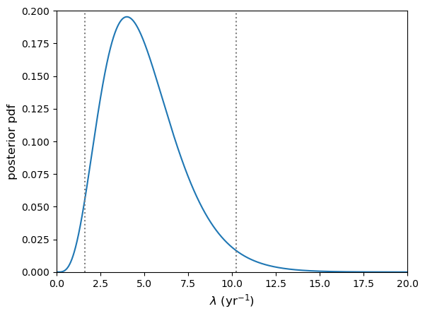
95% confidence interval on lambda = [ 1.62347925 10.24159071]
Note that if we are asked to formally quote the interval, we should use a reasonable number of decimal places in our quoted values and not the full numerical accuracy. A good rule of thumb is for this to correspond to no more than \(\sim 1\%\) of the range given. E.g. Here we might state the \(95\%\) confidence interval to be: \(1.6\)–\(10.2\).
Measurement errors
You will often see error bars quoted with measurements, e.g. from experimental data. Generally (unless clearly stated otherwise) these will correspond to 1-\(\sigma\) (\(\simeq68\%\)) confidence intervals. This may be because the error bars correspond to the standard error on a sample mean (e.g. if the measurements are an averaged quantity), or because the measurements correspond to a large number of counts \(n\), which if Poisson distributed will asymptote to a normal distribution with \(\mu=n\) and \(\sigma=\sqrt{n}\). In some cases the distribution of the measurements around the true value may be found to be normal (e.g. via prior calculation). This is seen surprisingly often, due (not surprisingly) to the central limit theorem, since the process of obtaining the measurement may itself be seen as a large combination of random processes.
You should bear in mind however that not all errors can be assumed to be normally distributed and it may not also be clear what the distribution of errors is. However, if you have enough data, you can continue to rely on the central limit theorem to ensure that your sample mean is normally distributed, which will allow you to do a number of statistical tests on your data.
Upper and lower limits
Sometimes the value of the parameter we want to measure is not precisely constrained by our data. A simple example of this is when we are working with Poisson type data and have a non-detection, e.g. have taken data over a given interval, but not measured any counts. Assuming our measuring instrument is working okay, this non-detection (or zero counts) is actually useful data! We can use it to place an upper limit (with a certain confidence) on the allowed value of our rate parameter.
For example, lets consider the hypothetical GW detector searching for binary neutron star mergers. Imagine if, instead of detecting 4 such events in 1 year, we recorded no events. What is the 3\(\sigma\) upper limit on the true event rate \(\lambda\)?
First, let’s note our terminology here: when we quote an upper limit to a certain confidence, e.g. \(99\%\) what we mean is: there is a \(99\%\) chance that the true rate is equal to or smaller than this upper limit value. When we use a \(\sigma\)-valued confidence limit, e.g. a 3\(\sigma\) upper limit, we mean that the probability is only 3\(\sigma\) (\(\sim 0.3\%\)) that the true event rate could be larger than the quoted upper limit value. Either approach is acceptable and formally equivalent, as long as the statement is clear.
Now to answer our question:
# calculate the exact 3-sigma p-value with a standard normal (multiply by 2
# since distribution is 2-tailed)
p_3sig = 2*sps.norm.sf(3)
print("3-sigma corresponds to p-value=",p_3sig)

# Now set x = 0 for the non-detection
x = 0

# This will only be a 1-D calculation so we can calculate over a large array length
# Make sure the lambda array covers the range where p(x|lam)p(lam) is (effectively) non-zero
lam_arr = np.linspace(0,20,10000)
likel_pdf = sps.poisson.pmf(x,lam_arr) # Calculate the likelihood
posterior_pdf = likel_pdf/spint.simpson(likel_pdf,lam_arr)
posterior_cdf = spint.cumulative_trapezoid(posterior_pdf,lam_arr,initial=0)
posterior_ppf = spinterp.interp1d(posterior_cdf,lam_arr)

# Now we just plug in our required p-value. Note that for an upper limit the confidence
# interval is one-sided and towards larger values, we ignore the median, so we need to
# use the percentile for 1-p.
print("For",x,"events, the 3-sigma upper limit is ",posterior_ppf(1-p_3sig))
3-sigma corresponds to p-value= 0.0026997960632601866
For 0 events, the 3-sigma upper limit is  5.914578267301981
We would most likely formally quote our upper limit (e.g. in a presentation or paper) as being \(5.9\) or possibly \(5.91\), but no more significant figures than that.
We could also do the same calculation for detected events too, e.g. to set an upper limit on how large the true rate can be, given the observed number of detections (which might be useful to constrain models of the progenitor systems of binary neutron stars).
Lower limits work the same way but in the opposite direction, i.e. we apply the limit on the lower-valued side of the pdf.
Transformation of variables
Sometimes we may know the probability distribution and hence confidence intervals for some variable \(x\), but we would like to know the distribution and confidence intervals for another variable \(y\), which is calculated from \(x\). For example, consider a measurement, represented by a random variate \(X\) which is drawn from a distribution \(p(x)\), from which we can derive a confidence interval (or ‘error’) on \(X\).
We want to transform our measurement to another quantity \(Y=1/X^{2}\). How do we calculate the distribution which \(Y\) is drawn from \(p(y)=p(x^{-2})\), to obtain an error on \(Y\)? First consider the probability that \(X\) is drawn in the range \(x^{\prime}-\Delta x/2 \leq X < x^{\prime}+\Delta x/2\), which is \(P(x^{\prime}-\Delta x/2 \leq X < x^{\prime}+\Delta x/2)\). If we calculate \(Y\) from \(X\) there must be a corresponding range of \(Y\) which has the same probability, i.e.:
[P\left(x^{\prime}-\frac{\Delta x}{2} \leq X < x^{\prime}+\frac{\Delta x}{2}\right) = P\left(y^{\prime}-\frac{\Delta y}{2} \leq Y = 1/X^{2} < y^{\prime}+\frac{\Delta y}{2}\right)]
This situation is illustrated by the shaded regions in the figure below, which both contain equal probability (the calculated area is the same when appropriately scaled by the axes).
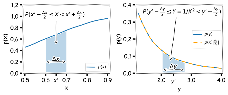
Note that the shaded range could in principle contain any probability \(0\leq (P(X)=P(Y)) \leq1\), and therefore if the range represents a given confidence interval for \(X\), it also represents the same confidence interval for \(Y\). By keeping track of the integrated probability in very small intervals we can transform one into the other. This approach was used to produce the curve for \(p(y)\) in the figure above, by assuming that \(p(x)\) is a normal distribution \(N(\mu, \sigma) = (1,0.4)\), using the following code:
x_arr = np.linspace(0.5,0.9,10000) # We need a fine grid of x to calculate over
y_arr = x_arr**(-2) # Calculate corresponding values of y

# Now to calculate the integrated probability in the small intervals (bins) between each gridpoint of x,
# using the cdf for the normal distribution:
x_diffcdf = np.diff(sps.norm.cdf(x_arr,loc=1,scale=0.4))

# We could calculate the x pdf directly from the scipy function, but for consistency we will derive
# it from the probability in each x bin, by dividing by the bin width (difference in adjacent x values)
x_pdf = x_diffcdf/np.diff(x_arr)
y_pdf = x_diffcdf/(-1*np.diff(y_arr)) # Same for y but remember the y values run from large to small!

# For plotting purposes we should assign new x and y values to each of our pdf values, using the centre
# of each bin.
x_mid = (x_arr[1:]+x_arr[:-1])/2
y_mid = (y_arr[1:]+y_arr[:-1])/2
We can go further and take the limit \(\Delta x = \delta x \rightarrow 0\). In this case we can simply evaluate the probability:
[P\left(x^{\prime}-\frac{\delta x}{2} \leq X < x^{\prime}+\frac{\delta x}{2}\right) = p(x)\delta x = p(y)\delta y = P\left(y^{\prime}-\frac{\delta y}{2} \leq Y < y^{\prime}+\frac{\delta y}{2}\right)]
Therefore, in the limit of infinitesimally small intervals, the probability distribution for \(Y\) can be obtained from:
[p(y)=p(x) \biggr\lvert \frac{\mathrm{d}x}{\mathrm{d}y} \biggr\rvert]
I.e. for the transformation \(y=x^{-2}\) we have \(p(y)=\frac{1}{2}x^{3}p(x)\). This function, shown as the orange dashed curve in the figure above (which is evaluated for each \(x\) value and then plotted as function of \(y\)), is an exact match to \(p(y)\).
The modulus of the derivative of \(y\) is used because the probability must be positive-valued while the gradient can be positive or negative. This transformation of variables formula allows us to transform our distribution for functions of \(X\) and obtain new confidence intervals, which allows exact error propagation for the transformation of our measurements.
The transformation of variables formula given above will account for transformations which monotonically transform one variable into another, i.e. irrespective of the value of \(X\), and increases in \(X\) produces either an increases or decrease in the transformed variate \(Y\), but not both (i.e. the gradient \(\mathrm{d}x/\mathrm{d}y\) is always either positive or negative). If this is not the case, there may not be a one-to-one relation between values of \(X\) and \(Y\), and you must account for this in the transformed distribution by piecewise adding together the transformed distribution \(p(y)\) for each monotonic part of the function. This would be necessary in the example above if the probability distribution for \(x\) extended to negative values of \(x\).
Example: the distribution of a squared standard normal variate
\(X\) is a variate drawn from a standard normal distribution (\(N(0,1)\)) which you use to form a new variate \(Z=X^{2}\). What is the distribution of \(Z\)?
\(Z\) varies monotonically with \(\vert X\vert\) if we consider \(X\lt 0\) and \(X\geq 0\) separately. Therefore, we first transform to \(Y=\vert X\vert\), and multiply the resulting pdf by a factor 2 to account for the contributions from positive and negative values of \(X\).
[p(y)=p(x)+p(-x)=2N(0,1)=\frac{2}{\sqrt{2\pi}} e^{-y^{2}/2}]
Now define \(Z=Y^{2}\). Then \(\frac{\mathrm{d}y}{\mathrm{d}z}=z^{-1/2}/2\) and substituting \(z=y^{2}\) into \(p(y)\) gives:
[p(z)=\frac{2}{\sqrt{2\pi}}e^{-z/2}\biggr\lvert \frac{z^{-1/2}}{2}\biggr\rvert = \frac{z^{-1/2}e^{-z/2}}{\sqrt{2\pi}},]
which is a \(\chi^{2}\) distribution for \(\nu=1\) degrees of freedom (see a later episode for a discussion of this distribution).
Approximate variance relations (propagation of errors)
Consider a vector of \(n\) random variates, \(\mathbf{X}=[X_{1},X_{2},...,X_{n}]\) which are each drawn from different distributions with means \(\boldsymbol{\mu}=[\mu_{1},\mu_{2},...,\mu_{n}]\) and variances \(\boldsymbol{\sigma}^{2}=[\sigma^{2}_{1},\sigma^{2}_{2},...,\sigma^{2}_{n}]\). We now form a single variate \(Z\) from a function of \(\mathbf{X}\), i.e.: \(Z=f(\mathbf{X})\). The question is, what is the variance of the new variable \(Z\)?
First, let’s expand \(f(\mathbf{X})\) as a Taylor series around \(\boldsymbol{\mu}\):
\[Z = f(\mathbf{X}) = f(\boldsymbol{\mu}) + \sum\limits_{i=1}^{n} \frac{\partial f}{\partial X_{i}}\Biggr\vert_{\mathbf{X}=\boldsymbol{\mu}} (X_{i}-\mu_{i})+\cdots\]where the vertical line indicates that the partial derivative is evaluated at \(\mathbf{X}=\boldsymbol{\mu}\). If we neglect the higher-order terms, we see that \(E[Z]=E[f(\mathbf{X})] \approx f(\boldsymbol{\mu})\), since \(E[X_{i}-\mu_{i}]=0\). Now we calculate the variance, again neglecting the higher-order terms and using the result (see Episode 2) that \(V[Z] = V[f(X)]=E[f(X)^{2}]-E[f(X)]^{2}\). First we calculate \(f(X)^{2}\):
\[f(\mathbf{X})^{2} = f(\boldsymbol{\mu})^{2} + 2f(\boldsymbol{\mu}) \sum\limits_{i=1}^{n} \frac{\partial f}{\partial X_{i}}\Biggr\vert_{\mathbf{X}=\boldsymbol{\mu}} (X_{i}-\mu_{i}) + \left[\sum\limits_{i=1}^{n} \frac{\partial f}{\partial X_{i}}\Biggr\vert_{\mathbf{X}=\boldsymbol{\mu}} (X_{i}-\mu_{i})\right] \left[\sum\limits_{j=1}^{n} \frac{\partial f}{\partial X_{j}}\Biggr\vert_{\mathbf{X}=\boldsymbol{\mu}} (X_{j}-\mu_{j})\right]\]Now we take the expectation value and subtract \(E[f(X)]^{2}= f(\boldsymbol{\mu})^{2}\) to obtain:
\[V[Z] \approx \sum\limits_{i=1}^{n} \sum\limits_{j=1}^{n} \frac{\partial f}{\partial X_{i}} \frac{\partial f}{\partial X_{j}}\Biggr\vert_{\mathbf{X}=\boldsymbol{\mu}} \Sigma_{ij} ,\]where \(\Sigma_{ij}\) is the \((i,j)\)th element of the population covariance matrix for the variates \(\mathbf{X}\). If the variates in \(\mathbf{X}\) are uncorrelated then the off-diagonal elements \(\Sigma_{i\neq j}=0\) and we obtain the famous formula for propagation of errors:
\[V[Z] = \sigma^{2}_{z}\approx \sum\limits_{i=1}^{n} \left(\frac{\partial f}{\partial X_{i}}\right)^{2}_{\mathbf{X}=\boldsymbol{\mu}} \sigma_{i}^{2}\]where \(\sigma_{i}^{2}\) are the variances for the variates \(X_{i}\).
You will probably be familiar with this formula from introductory statistics or lab data analysis courses that you have taken, as they are useful to convert errors (i.e. the standard deviation \(\sigma_{i}\)) from one more more measured quantities to obtain the error on a derived quantity. For example, for \(Z=X+Y\) we infer \(\sigma_{z}=\sqrt{\sigma_{x}^{2}+\sigma_{y}^{2}}\) (i.e. errors add in quadrature, as expected). For \(Z=XY\) we infer \(\sigma_{z}=\sqrt{Y^{2}\sigma_{x}^{2}+X^{2}\sigma_{y}^{2}}\).
Bootstrapping
Bootstrapping is a method to leverage the power of large samples of data (ideally \(n=100\) or more) in order to generate ‘fake’ samples of data with similar statistical properties, simply by resampling the original data set with replacement. Assuming that they are the same size as the original sample, the variation in the new samples that are produced by bootstrapping is equivalent to what would be observed if the data was resampled from the underlying population. This means that bootstrapping is a remarkably cheap and easy way to produce Monte Carlo simulations of any type of quantity, estimator or statistic generated from the data. The resulting samples can thus be used to determine confidence intervals and other quantities, even when the underlying population distribution is not known.
Bootstrapping to obtain error estimates
Now we’ll generate some fake correlated data, and then use the Numpy choice function (see Episode 1) to randomly select samples of the data (with replacement) for a bootstrap analysis of the variation in linear fit parameters \(a\) and \(b\). We will first generate fake sets of correlated \(x\) and \(y\) values as in the earlier example for exploring the correlation coefficient. Use 100 data points for \(x\) and \(y\) to start with and plot your data to check that the correlation is clear.
x = sps.norm.rvs(size=100)
y = x + 0.5*sps.norm.rvs(size=100)
First use curve_fit to obtain the \(a\) and \(b\) coefficients for the simulated, ‘observed’ data set and print your results.
When making our new samples, we need to make sure we sample the same indices of the array for all variables being sampled, otherwise we will destroy any correlations that are present. Here you can do that by setting up an array of indices matching that of your data (e.g. with numpy.arange(len(x))), randomly sampling from that using choice, and then using the numpy.take function to select the values of x and y which correspond to those indices of the arrays. Then use curve_fit to obtain the coefficients \(a\) and \(b\) of the linear correlation and record these values to arrays. Use a loop to repeat the process a large number of times (e.g. 1000 or greater) and finally make a scatter plot of your values of \(a\) and \(b\), which shows the bivariate distribution expected for these variables, given the scatter in your data.
Now find the mean and standard deviations for your bootstrapped distributions of \(a\) and \(b\), print them and compare with the expected errors on these values given in the lecture slides. These estimates correspond to the errors of each, marginalised over the other variable. Your distribution could also be used to find the covariance or correlation coefficient between the two variables.
Note that the standard error on the mean of \(a\) or \(b\) is not relevant for estimating the errors here because you are trying to find the scatter in the values expected from your observed number of data points, not the uncertainty on the many repeated ‘bootstrap’ versions of the data.
Try repeating for repeated random samples of your original \(x\) and \(y\) values to see the change in position of the distribution as your sample changes. Try changing the number of data points in the simulated data set, to see how the scatter in the distributions change. How does the simulated distribution compare to the ‘true’ model values for the gradient and intercept, that you used to generate the data?
Note that if you want to do bootstrapping using a larger set of variables, you can do this more easily by using a Pandas dataframe and using the pandas.DataFrame.sample function. By setting the number of data points in the sample to be equal to the number of rows in the dataframe, you can make a resampled dataframe of the same size as the original. Be sure to sample with replacement!
nsims = 1000
indices = np.arange(len(x))
func = lambda x, a, b: x*a+b
r2, pcov = spopt.curve_fit(func, x,y, p0=(1,1))
a_obs = r2[0]
b_obs = r2[1]

print("The obtained a and b coefficients are ",a_obs,"and",b_obs,"respectively.")

a_arr = np.zeros(nsims)
b_arr = np.zeros(nsims)
rng = np.random.default_rng()  # Set up the generator with the default system seed
for i in range(nsims):
    new_indices = rng.choice(indices, size=len(x), replace=True)
    new_x = np.take(x,new_indices)
    new_y = np.take(y,new_indices)
    r2, pcov = spopt.curve_fit(func, new_x,new_y, p0=(1,1))
    a_arr[i] = r2[0]
    b_arr[i] = r2[1]

plt.figure()
plt.plot(a_arr, b_arr, "o")
plt.xlabel("a", fontsize=14)
plt.ylabel("b", fontsize=14)
plt.tick_params(axis='x', labelsize=12)
plt.tick_params(axis='y', labelsize=12)
plt.show()

print("The mean and standard deviations of the bootstrapped samples of $a$ are:",
      np.mean(a_arr),"and",np.std(a_arr,ddof=1),"respectively")
print("The mean and standard deviations of the bootstrapped samples of $b$ are:",
      np.mean(b_arr),"and",np.std(b_arr,ddof=1),"respectively")
Programming challenge
In the challenge from the previous episode, you used linear regression to determine the gradient and offset (\(y\)-axis intercept) of the relation between LOGL3000 (on the \(x\)-axis) and LOGL_MGII (on the \(y\)-axis) for your cleaned SDSS quasar sample. You split the sample according to radio loudness (as in the Episode 7 challenge) and carried out a linear regression on the LOGL3000 vs. LOGL_MGII relation of the two radio-selected sub-samples. Although we asked you to note any difference between the regression parameters for the two sub-samples, you were not able to assign any statistical significance or meaning to these quantities, without appropriate confidence intervals on them.
In this challenge, you will use bootstrapping to assess the uncertainty on your regression parameters and estimate errors on them. Use bootstrapping (with at least 1000 bootstrap trials) on your two radio-selected sub-samples, to measured gradients and offsets for each sub-sample. For each of the bootstrap trials, record the gradient and offset and use these values from all trials to estimate the correlation coefficient between the gradient and offset parameters in your sample of bootstrap measurements. Also use the bootstrap results to calculate the mean and standard deviation (i.e. 1-\(\sigma\) errors) for the gradient and offset for each radio-selected sub-sample.
Is most of the observed variance in the gradient and offset due to correlated variations in the two parameters, or independent variations?
Also, make a scatter-plot of the offsets and gradient from the bootstrap sample to see how they are distributed. By overplotting these scatter plots for the different quasar samples, show whether or not the relation between LOGL3000 and LOGL_MGII is different between the two radio-selected sub-samples.
Key Points
Confidence intervals and upper limits on model parameters can be calculated by integrating the posterior probability distribution so that the probability within the interval or limit bounds matches the desired significance of the interval/limit.
While upper limit integrals are taken from the lowest value of the distribution upwards, confidence intervals are usually centred on the median (\(P=0.5\)) for asymmetric distributions, to ensure that the full probability is enclosed.
If confidence intervals (or equivalently, error bars) are required for some function of random variable, they can be calculated using the transformation of variables method, based on the fact that a transformed range of the variable contains the same probability as the original posterior pdf.
A less accurate approach for obtaining errors for functions of random variables is to use propagation of errors to estimate transformed error bars, however this method implicitly assumes zero covariance between the combined variable errors and assumes that 2nd order and higher derivatives of the new variable w.r.t the original variables are negligible, i.e. the function cannot be highly non-linear.
Bootstrapping (resampling a data set with replacement, many times) offers a simple but effective way to calculate relatively low-significance confidence intervals (e.g. 1- to 2-sigma) for tens to hundreds of data values and complex transformations or calculations with the data. Higher significances require significantly larger data sets and numbers of bootstrap realisations to compute.
Maximum likelihood estimation and weighted least-squares model fitting
Overview
Teaching: 60 min
Exercises: 60 minQuestions
What are the best estimators of the parameters of models used to explain data?
How do we fit models to normally distributed data, to determine the best-fitting parameters and their errors?
Objectives
See how maximum likelihood estimation provides optimal estimates of model parameters.
Learn how to use the normal distribution log-likelihood and the equivalent weighted least-squares statistic to fit models to normally distributed data.
Learn how to estimate errors on the best-fitting model parameters.
In this episode we will be using numpy, as well as matplotlib’s plotting library. Scipy contains an extensive range of distributions in its ‘scipy.stats’ module, so we will also need to import it and we will also make use of scipy’s optimize and interpolate modules. Remember: scipy modules should be installed separately as required - they cannot be called if only scipy is imported.
import numpy as np
import matplotlib.pyplot as plt
import scipy.stats as sps
Maximum likelihood estimation
Consider a hypothesis which is specified by a single parameter \(\theta\), for which we can calculate the posterior pdf (given data vector \(\mathbf{x}\)), \(p(\theta \vert \mathbf{x})\). Based on the posterior distribution, what would be a good estimate for \(\theta\)? We could consider obtaining the mean of \(p(\theta\vert \mathbf{x})\), but this may often be skewed if the distribution has asymmetric tails, and is also difficult to calculate in many cases. A better estimate would involve finding the value of \(\theta\) which maximises the posterior probability density. I.e. we should find the value of \(\theta\) corresponding to the peak (i.e. the mode) of the posterior pdf. Therefore we require:
[\frac{\mathrm{d}p}{\mathrm{d}\theta}\bigg\rvert_{\hat{\theta}} = 0 \quad \mbox{and} \quad \frac{\mathrm{d}^{2}p}{\mathrm{d}\theta^{2}}\bigg\rvert_{\hat{\theta}} < 0]
where \(\hat{\theta}\) is the value of the parameter corresponding to the maximum probability density. This quantity is referred to as the maximum likelihood, although the pdf used is the posterior rather than the likelihood in Bayes’ theorem (but the two are equivalent for uniform priors). The parameter value \(\hat{\theta}\) corresponding to the maximum likelihood is the best estimator for \(\theta\) and is known as the maximum likelihood estimate of \(\theta\) or MLE. The process of maximising the likelihood to obtain MLEs is known as maximum likelihood estimation.
Log-likelihood and MLEs
Many posterior probability distributions are quite ‘peaky’ and it is often easier to work with the smoother transformation \(L(\theta)=\ln[p(\theta)]\) (where we now drop the conditionality on the data, which we assume as a given). \(L(\theta)\) is a monotonic function of \(p(\theta)\) so it must also satisfy the relations for a maximum to occur for the same MLE value, i.e:
[\frac{\mathrm{d}L}{\mathrm{d}\theta}\bigg\rvert_{\hat{\theta}} = 0 \quad \mbox{and} \quad \frac{\mathrm{d}^{2}L}{\mathrm{d}\theta^{2}}\bigg\rvert_{\hat{\theta}} < 0]
Furthermore, the log probability also has the advantages that products become sums, and powers become multiplying constants, which besides making calculations simpler, also avoids the computational errors that occur for the extremely large or small numbers obtained when multiplying the likelihood for many measurements. We will use this property to calculate the MLEs for some well-known distributions (i.e. we assume a uniform prior so we only consider the likelihood function of the distribution) and demonstrate that the MLEs are the best estimators of function parameters.
Firstly, consider a binomial distribution:
[p(\theta\vert x, n) \propto \theta^{x} (1-\theta)^{n-x}]
where \(x\) is now the observed number of successes in \(n\) trials and success probability \(\theta\) is a parameter which is the variable of the function. We can neglect the binomial constant since we will take the logarithm and then differentiate, to obtain the maximum log-likelihood:
[L(\theta) = x\ln(\theta) + (n-x)\ln(1-\theta) + \mathrm{constant}]
[\frac{\mathrm{d}L}{\mathrm{d}\theta}\bigg\rvert_{\hat{\theta}} = \frac{x}{\hat{\theta}} - \frac{n-x}{(1-\hat{\theta})} = 0 \quad \rightarrow \quad \hat{\theta} = \frac{x}{n}]
Further differentiation will show that the second derivative is negative, i.e. this is indeed the MLE. If we consider repeating our experiment many times, the expectation of our data \(E[x]\) is equal to that of variates drawn from a binomial distribution with \(\theta\) fixed at the true value, i.e. \(E[x]=E[X]\). We therefore obtain \(E[X] = nE[\hat{\theta}]\) and comparison with the expectation value for binomially distributed variates confirms that \(\hat{\theta}\) is an unbiased estimator of the true value of \(\theta\).
Test yourself: MLE for a Poisson distribution
Determine the MLE of the rate parameter \(\lambda\) for a Poisson distribution and show that it is an unbiased estimator of the true rate parameter.
Solution
For fixed observed counts \(x\) and a uniform prior on \(\lambda\), the Poisson distribution \(P(\lambda \vert x) \propto \lambda^{x} e^{-\lambda}\). Therefore the log-likelihood is: \(L(\lambda) = x\ln(\lambda) -\lambda\) \(\quad \rightarrow \quad \frac{\mathrm{d}L}{\mathrm{d}\lambda}\bigg\rvert_{\hat{\lambda}} = \frac{x}{\hat{\lambda}} - 1 = 0 \quad \rightarrow \quad \hat{\lambda} = x\)
\(\frac{\mathrm{d}^{2}L}{\mathrm{d}\lambda^{2}}\bigg\rvert_{\hat{\lambda}} = - \frac{x}{\hat{\lambda}^{2}}\), i.e. negative, so we are considering the MLE.
Therefore, the observed rate \(x\) is the MLE for \(\lambda\).
For the Poisson distribution, \(E[X]=\lambda\), therefore since \(E[x]=E[X] = E[\hat{\lambda}]\), the MLE is an unbiased estimator of the true \(\lambda\). You might wonder why we get this result when in the challenge in the previous episode, we showed that the mean of the prior probability distribution for the Poisson rate parameter and observed rate \(x=4\) was 5!
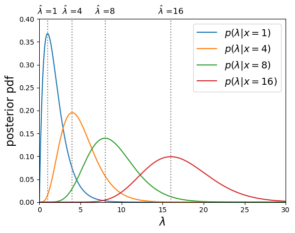
Poisson posterior distribution MLEs are equal to the observed rate.
The mean of the posterior distribution \(\langle \lambda \rangle\) is larger than the MLE (which is equivalent to the mode of the distribution, because the distribution is positively skewed (i.e. skewed to the right). However, over many repeated experiments with the same rate parameter \(\lambda_{\mathrm{true}}\), \(E[\langle \lambda \rangle]=\lambda_{\mathrm{true}}+1\), while \(E[\hat{\lambda}]=\lambda_{\mathrm{true}}\). I.e. the mean of the posterior distribution is a biased estimator in this case, while the MLE is not.
Errors on MLEs
It’s important to remember that the MLE \(\hat{\theta}\) is only an estimator for the true parameter value \(\theta_{\mathrm{true}}\), which is contained somewhere in the posterior probability distribution for \(\theta\), with probability of it occuring in a certain range, given by integrating the distribution over that range, as is the case for the pdf of a random variable. Previously, we looked at the approach of using the posterior distribution to define confidence intervals. Now we will examine a simpler approach to estimating the error on an MLE, which is exact for the case of a posterior which is a normal distribution.
Consider a log-likelihood \(L(\theta)\) with maximum at the MLE, at \(L(\hat{\theta})\). We can examine the shape of the probability distribution of \(\theta\) around \(\hat{\theta}\) by expanding \(L(\theta)\) about the maximum:
[L(\theta) = L(\hat{\theta}) + \frac{1}{2} \frac{\mathrm{d}^{2}L}{\mathrm{d}\theta^{2}}\bigg\rvert_{\hat{\theta}}(\theta-\hat{\theta})^{2} + \cdots]
where the 1st order term is zero because \(\frac{\mathrm{d}L}{\mathrm{d}\theta}\bigg\rvert_{\hat{\theta}} = 0\) at \(\theta=\hat{\theta}\), by definition.
For smooth log-likelihoods, where we can neglect the higher order terms, the distribution around the MLE can be approximated by a parabola with width dependent on the 2nd derivative of the log-likelihood. To see what this means, lets transform back to the probability, \(p(\theta)=\exp\left(L(\theta)\right)\):
[L(\theta) = L(\hat{\theta}) + \frac{1}{2} \frac{\mathrm{d}^{2}L}{\mathrm{d}\theta^{2}}\bigg\rvert_{\hat{\theta}}(\theta-\hat{\theta})^{2} \quad \Rightarrow \quad p(\theta) = p(\hat{\theta})\exp\left[\frac{1}{2} \frac{\mathrm{d}^{2}L}{\mathrm{d}\theta^{2}}\bigg\rvert_{\hat{\theta}}(\theta-\hat{\theta})^{2}\right]]
The equation on the right hand side should be familiar to us: it is the normal distribution!
[p(x\vert \mu,\sigma)=\frac{1}{\sigma \sqrt{2\pi}} e^{-(x-\mu)^{2}/(2\sigma^{2})}]
i.e. for smooth log-likelihood functions, the posterior probability distribution of the parameter \(\theta\) can be approximated with a normal distribution about the MLE \(\hat{\theta}\), i.e. with mean \(\mu=\hat{\theta}\) and variance \(\sigma^{2}=-\left(\frac{\mathrm{d}^{2}L}{\mathrm{d}\theta^{2}}\bigg\rvert_{\hat{\theta}}\right)^{-1}\). Thus, assuming this Gaussian or normal approximation , we can estimate a 1-\(\sigma\) uncertainty or error on \(\theta\) which corresponds to a range about the MLE value where the true value should be \(\simeq\)68.2% of the time:
[\sigma = \left(-\frac{\mathrm{d}^{2}L}{\mathrm{d}\theta^{2}}\bigg\rvert_{\hat{\theta}}\right)^{-1/2}]
How accurate this estimate for \(\sigma\) is will depend on how closely the posterior distribution approximates a normal distribution, at least in the region of parameter values that contains most of the probability. The estimate will become exact in the case where the posterior is normally distributed.
Test yourself: errors on Binomial and Poisson MLEs
Use the normal approximation to estimate the standard deviation on the MLE for binomial and Poisson distributed likelihood functions, in terms of the observed data (\(x\) successes in \(n\) trials, or \(x\) counts).
Solution
For the binomial distribution we have already shown that: \(\frac{\mathrm{d}L}{\mathrm{d}\theta} = \frac{x}{\theta} - \frac{n-x}{(1-\theta)} \quad \rightarrow \quad \frac{\mathrm{d}^{2}L}{\mathrm{d}\theta^{2}}\bigg\rvert_{\hat{\theta}} = -\frac{x}{\hat{\theta}^{2}} - \frac{n-x}{(1-\hat{\theta})^{2}} = -\frac{n}{\hat{\theta}(1-\hat{\theta})}\)
So we obtain: \(\sigma = \sqrt{\frac{\hat{\theta}(1-\hat{\theta})}{n}}\) and since \(\hat{\theta}=x/n\) our final result is: \(\sigma = \sqrt{\frac{x(1-x/n)}{n^2}}\)
For the Poisson distributed likelihood we already showed in a previous challenge that \(\frac{\mathrm{d}^{2}L}{\mathrm{d}\lambda^{2}}\bigg\rvert_{\hat{\lambda}} = - \frac{x}{\hat{\lambda}^{2}}\) and \(\hat{\lambda}=x\)
So, \(\sigma = \sqrt{x}\).
Using optimisers to obtain MLEs
For the distributions discussed so far, the MLEs could be obtained analytically from the derivatives of the likelihood function. However, in most practical examples, the data are complex (i.e. multiple measurements) and the model distribution may include multiple parameters, making an analytical solution impossible. In some cases, like those we have examined so far, it is possible to calculate the posterior distribution numerically. However, that can be very challenging when considering complex data and/or models with many parameters, leading to a multi-dimensional parameter hypersurface which cannot be efficiently mapped using any kind of computation over a dense grid of parameter values. Furthermore, we may only want the MLEs and perhaps their errors, rather than the entire posterior pdf. In these cases, where we do not need or wish to calculate the complete posterior distribution, we can obtain the MLEs numerically, via a numerical approach called optimisation.
Optimisation methods use algorithmic approaches to obtain either the minimum or maximum of a function of one or more adjustable parameters. These approaches are implemented in software using optimisers. We do not need the normalised posterior pdf in order to obtain an MLE, since only the pdf shape matters to find the peak. So the function to be optimised is often the likelihood function (for the uniform prior case) or product of likelihood and prior, or commonly some variant of those, such as the log-likelihood or, as we will see later weighted least squares, colloquially known as chi-squared fitting.
Optimisation methods and the
scipy.optimizemodule.There are a variety of optimisation methods which are available in Python’s
scipy.optimizemodule. Many of these approaches are discussed in some detail in Chapter 10 of the book ‘Numerical Recipes’, available online here. Here we will give a brief summary of some of the main methods and their pros and cons for maximum likelihood estimation. An important aspect of most numerical optimisation methods, including the ones in scipy, is that they are minimisers, i.e. they operate to minimise the given function rather than maximise it. This works equally well for maximising the likelihood, since we can simply multiply the function by -1 and minimise it to achieve our maximisation result.
- Scalar minimisation: the function
scipy.optimize.minimize_scalarhas several methods for minimising functions of only one variable. The methods can be specified as arguments, e.g.method='brent'uses Brent’s method of parabolic interpolation: find a parabola between three points on the function, find the position of its minimum and use the minimum to replace the highest point on the original parabola before evaluating again, repeating until the minimum is found to the required tolerance. The method is fast and robust but can only be used for functions of 1 parameter and as no gradients are used, it does not return the useful 2nd derivative of the function.- Downhill simplex (Nelder-Mead):
scipy.optimize.minimizeoffers the methodnelder-meadfor rapid and robust minimisation of multi-parameter functions using the ‘downhill simplex’ approach. The approach assumes a simplex, an object of \(n+1\) points or vertices in the \(n\)-dimensional parameter space. The function to be minimised is evaluated at all the vertices. Then, depending on where the lowest-valued vertex is and how steep the surrounding ‘landscape’ mapped by the other vertices is, a set of rules are applied to move one or more points of the simplex to a new location. E.g. via reflection, expansion or contraction of the simplex or some combination of these. In this way the simplex ‘explores’ the \(n\)-dimensional landscape of function values to find the minimum. Also known as the ‘amoeba’ method because the simplex ‘oozes’ through the landscape like an amoeba!- Gradient methods: a large set of methods calculate the gradients or even second derivatives of the function (hyper)surface in order to quickly converge on the minimum. A commonly used example is the Broyden-Fletcher-Goldfarb-Shanno (BFGS) method (
method=BFGSinscipy.optimize.minimizeor the legacy functionscipy.optimize.fmin_bfgs). A more specialised function using a variant of this approach which is optimised for fitting functions to data with normally distributed errors (‘weighted non-linear least squares’) isscipy.optimize.curve_fit. The advantage of these functions is that they usually return either a matrix of second derivatives (the ‘Hessian’) or its inverse, which is the covariance matrix of the fitted parameters. These can be used to obtain estimates of the errors on the MLEs, following the normal approximation approach described in this episode.An important caveat to bear in mind with all optimisation methods is that for finding minima in complicated hypersurfaces, there is always a risk that the optimiser returns only a local minimum, end hence incorrect MLEs, instead of those at the true minimum for the function. Most optimisers have built-in methods to try and mitigate this problem, e.g. allowing sudden switches to completely different parts of the surface to check that no deeper minimum can be found there. It may be that a hypersurface is too complicated for any of the optimisers available. In this case, you should consider looking at Markov Chain Monte Carlo methods to fit your data.
In the remainder of this course we will use the Python package lmfit which combines the use of scipy’s optimisation methods with some powerful functionality to control model fits and determine errors and confidence contours.
General maximum likelihood estimation: model fitting
So far we have only considered maximum likelihood estimation applied to simple univariate models and data. It’s much more common in the physical sciences that our data is (at least) bivariate i.e. \((x,y)\) and that we want to fit the data with multi-parameter models. We’ll look at this problem in this episode.
First consider our hypothesis, consisting of a physical model relating a response variable \(y\) to some explanatory variable \(x\). There are \(n\) pairs of measurements, with a value \(y_{i}\) corresponding to each \(x_{i}\) value, \(x_{i}=x_{1},x_{2},...,x_{n}\). We can write both sets of values as vectors, denoted by bold fonts: \(\mathbf{x}\), \(\mathbf{y}\).
Our model is not completely specified, some parameters are unknown and must be obtained from fitting the model to the data. The \(M\) model parameters can also be described by a vector \(\pmb{\theta}=[\theta_{1},\theta_{2},...,\theta_{M}]\).
Now we bring in our statistical model. Assuming that the data are unbiased, the model gives the expectation value of \(y\) for a given \(x\) value and model parameters, i.e. it gives \(E[y]=f(x,\pmb{\theta})\). The data are assumed to be independent and drawn from a probability distribution with expectation value given by the model, and which can be used to calculate the probability of obtaining a data \(y\) value given the corresponding \(x\) value and model parameters: \(p(y_{i}\vert x_{i}, \pmb{\theta})\).
Since the data are independent, their probabilities are multiplied together to obtain a total probability for a given set of data, under the assumed hypothesis. The likelihood function is:
[l(\pmb{\theta}) = p(\mathbf{y}\vert \mathbf{x},\pmb{\theta}) = p(y_{1}\vert x_{1},\pmb{\theta})\times … \times p(y_{n}\vert x_{n},\pmb{\theta}) = \prod\limits_{i=1}^{n} p(y_{i}\vert x_{i},\pmb{\theta})]
So that the log-likelihood is:
[L(\pmb{\theta}) = \ln[l(\pmb{\theta})] = \ln\left(\prod\limits_{i=1}^{n} p(y_{i}\vert x_{i},\pmb{\theta}) \right) = \sum\limits_{i=1}^{n} \ln\left(p(y_{i}\vert x_{i},\pmb{\theta})\right)]
and to obtain the MLEs for the model parameters, we should maximise the value of his log-likelihood function. This procedure of finding the MLEs of model parameters via maximising the likelihood is often known more colloquially as model fitting (i.e. you ‘fit’ the model to the data).
MLEs and errors from multi-parameter model fitting
When using maximum likelihood to fit a model with multiple (\(M\)) parameters \(\pmb{\theta}\), we obtain a vector of 1st order partial derivatives, known as scores:
[U(\pmb{\theta}) = \left( \frac{\partial L(\pmb{\theta})}{\partial \theta_{1}}, \cdots, \frac{\partial L(\pmb{\theta})}{\partial \theta_{M}}\right)]
i.e. \(U(\pmb{\theta})=\nabla L\). In vector calculus we call this vector of 1st order partial derivatives the Jacobian. The MLEs correspond to the vector of parameter values where the scores for each parameter are zero, i.e. \(U(\hat{\pmb{\theta}})= (0,...,0) = \mathbf{0}\).
We saw in the previous episode that the variances of these parameters can be derived from the 2nd order partial derivatives of the log-likelihood. Now let’s look at the case for a function of two parameters, \(\theta\) and \(\phi\). The MLEs are found where:
[\frac{\partial L}{\partial \theta}\bigg\rvert_{\hat{\theta},\hat{\phi}} = 0 \quad , \quad \frac{\partial L}{\partial \phi}\bigg\rvert_{\hat{\theta},\hat{\phi}} = 0]
where we use \(L=L(\phi,\theta)\) for convenience. Note that the maximum corresponds to the same location for both MLEs, so is evaluated at \(\hat{\theta}\) and \(\hat{\phi}\), regardless of which parameter is used for the derivative. Now we expand the log-likelihood function to 2nd order about the maximum (so the first order term vanishes):
[L = L(\hat{\theta},\hat{\phi}) + \frac{1}{2}\left[\frac{\partial^{2}L}{\partial\theta^{2}}\bigg\rvert_{\hat{\theta},\hat{\phi}}(\theta-\hat{\theta})^{2} + \frac{\partial^{2}L}{\partial\phi^{2}}\bigg\rvert_{\hat{\theta},\hat{\phi}}(\phi-\hat{\phi})^{2}] + 2\frac{\partial^{2}L}{\partial\theta \partial\phi}\bigg\rvert_{\hat{\theta},\hat{\phi}}(\theta-\hat{\theta})(\phi-\hat{\phi})\right] + \cdots]
The ‘error’ term in the square brackets is the equivalent for 2-parameters to the 2nd order term for one parameter which we saw in the previous episode. This term may be re-written using a matrix equation:
[Q =
\begin{pmatrix}
\theta-\hat{\theta} & \phi-\hat{\phi}
\end{pmatrix}
\begin{pmatrix}
A & C
C & B
\end{pmatrix}
\begin{pmatrix}
\theta-\hat{\theta}\
\phi-\hat{\phi}
\end{pmatrix}]
where \(A = \frac{\partial^{2}L}{\partial\theta^{2}}\bigg\rvert_{\hat{\theta},\hat{\phi}}\), \(B = \frac{\partial^{2}L}{\partial\phi^{2}}\bigg\rvert_{\hat{\theta},\hat{\phi}}\) and \(C=\frac{\partial^{2}L}{\partial\theta \partial\phi}\bigg\rvert_{\hat{\theta},\hat{\phi}}\). Since \(L(\hat{\theta},\hat{\phi})\) is a maximum, we require that \(A<0\), \(B<0\) and \(AB>C^{2}\).
This approach can also be applied to models with \(M\) parameters, in which case the resulting matrix of 2nd order partial derivatives is \(M\times M\). In vector calculus terms, this matrix of 2nd order partial derivatives is known as the Hessian. As could be guessed by analogy with the result for a single parameter in the previous episode, we can directly obtain estimates of the variance of the MLEs by taking the negative inverse matrix of the Hessian of our log-likelihood evaluated at the MLEs. In fact, this procedure gives us the covariance matrix for the MLEs. For our 2-parameter case this is:
[-\begin{pmatrix}
A & C
C & B
\end{pmatrix}^{-1} = -\frac{1}{AB-C^{2}}
\begin{pmatrix}
B & -C
-C & A
\end{pmatrix} =
\begin{pmatrix}
\sigma^{2}{\theta} & \sigma{\theta \phi}
\sigma_{\theta \phi} & \sigma^{2}_{\phi}
\end{pmatrix}]
The diagonal terms of the covariance matrix give the marginalised variances of the parameters, so that in the 2-parameter case, the 1-\(\sigma\) errors on the parameters (assuming the normal approximation, i.e. normally distributed likelihood about the maximum) are given by:
[\sigma_{\theta}=\sqrt{\frac{-B}{AB-C^{2}}} \quad , \quad \sigma_{\phi}=\sqrt{\frac{-A}{AB-C^{2}}}.]
The off-diagonal term is the covariance of the errors between the two parameters. If it is non-zero, then the errors are correlated, e.g. a deviation of the MLE from the true value of one parameter causes a correlated deviation of the MLE of the other parameter from its true value. If the covariance is zero (or negligible compared to the product of the parameter errors), the errors on each parameter reduce to the same form as the single-parameter errors described above, i.e.:
[\sigma_{\theta} = \left(-\frac{\mathrm{d}^{2}L}{\mathrm{d}\theta^{2}}\bigg\rvert_{\hat{\theta}}\right)^{-1/2} \quad , \quad \sigma_{\phi}=\left(-\frac{\mathrm{d}^{2}L}{\mathrm{d}\phi^{2}}\bigg\rvert_{\hat{\phi}}\right)^{-1/2}]
Weighted least squares: ‘chi-squared fitting’
Let’s consider the case where the data values \(y_{i}\) are drawn from a normal distribution about the expectation value given by the model, i.e. we can define the mean and variance of the distribution for a particular measurement as:
[\mu_{i} = E[y_{i}] = f(x_{i},\pmb{\theta})]
and the standard deviation \(\sigma_{i}\) is given by the error on the data value. Note that this situation is not the same as in the normal approximation discussed above, since here it is the data which are normally distributed, not the likelihood function.
The likelihood function for the data points is:
[p(\mathbf{y}\vert \pmb{\mu},\pmb{\sigma}) = \prod\limits_{i=1}^{n} \frac{1}{\sqrt{2\pi\sigma_{i}^{2}}} \exp\left[-\frac{(y_{i}-\mu_{i})^{2}}{2\sigma_{i}^{2}}\right]]
and the log-likelihood is:
[L(\pmb{\theta}) = \ln[p(\mathbf{y}\vert \pmb{\mu},\pmb{\sigma})] = -\frac{1}{2} \sum\limits_{i=1}^{n} \ln(2\pi\sigma_{i}^{2}) - \frac{1}{2} \sum\limits_{i=1}^{n} \frac{(y_{i}-\mu_{i})^{2}}{\sigma_{i}^{2}}]
Note that the first term on the RHS is a constant defined only by the errors on the data, while the second term is the sum of squared residuals of the data relative to the model, normalised by the squared error of the data. This is something we can easily calculate without reference to probability distributions! We therefore define a new statistic \(X^{2}(\pmb{\theta})\):
[X^{2}(\pmb{\theta}) = -2L(\pmb{\theta}) + \mathrm{constant} = \sum\limits_{i=1}^{n} \frac{(y_{i}-\mu_{i})^{2}}{\sigma_{i}^{2}}]
This statistic is often called the chi-squared (\(\chi^{2}\)) statistic, and the method of maximum likelihood fitting which uses it is formally called weighted least squares but informally known as ‘chi-squared fitting’ or ‘chi-squared minimisation’. The name comes from the fact that, where the model is a correct description of the data, the observed \(X^{2}\) is drawn from a chi-squared distribution. Minimising \(X^{2}\) is equivalent to maximising \(L(\pmb{\theta})\) or \(l(\pmb{\theta})\). In the case where the error is identical for all data points, minimising \(X^{2}\) is equivalent to minimising the sum of squared residuals in linear regression.
The chi-squared distribution
Consider a set of independent variates drawn from a standard normal distribution, \(Z\sim N(0,1)\): \(Z_{1}, Z_{2},...,Z_{n}\).
We can form a new variate by squaring and summing these variates: \(X=\sum\limits_{i=1}^{n} Z_{i}^{2}\)
The resulting variate \(X\) is drawn from a \(\chi^{2}\) (chi-squared) distribution:
\[p(x\vert \nu) = \frac{(1/2)^{\nu/2}}{\Gamma(\nu/2)}x^{\frac{\nu}{2}-1}e^{-x/2}\]where \(\nu\) is the distribution shape parameter known as the degrees of freedom, as it corresponds to the number of standard normal variates which are squared and summed to produce the distribution. \(\Gamma\) is the Gamma function. Note that for integers \(\Gamma(n)=(n-1)!\) and for half integers \(\Gamma(n+\frac{1}{2})=\frac{(2n)!}{4^{n}n!} \sqrt{\pi}\). Therefore, for \(\nu=1\), \(p(x)=\frac{1}{\sqrt{2\pi}}x^{-1/2}e^{-x/2}\). For \(\nu=2\) the distribution is a simple exponential: \(p(x)=\frac{1}{2} e^{-x/2}\). Since the chi-squared distribution is produced by sums of \(\nu\) random variates, the central limit theorem applies and for large \(\nu\), the distribution approaches a normal distribution.
A variate \(X\) which is drawn from chi-squared distribution, is denoted \(X\sim \chi^{2}_{\nu}\) where the subscript \(\nu\) is given as an integer denoting the degrees of freedom. Variates distributed as \(\chi^{2}_{\nu}\) have expectation \(E[X]=\nu\) and variance \(V[X]=2\nu\).
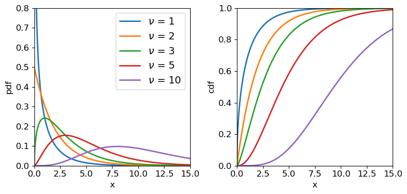
Chi-squared distributions for different degrees of freedom.
Weighted least squares estimation in Python with the lmfit package
We already saw how to use Scipy’s curve_fit function to carry out a linear regression fit with error bars on \(y\) values not included. The curve_fit routine uses non-linear least-squares to fit a function to data (i.e. it is not restricted to linear least-square fitting) and if the error bars are provided it will carry out a weighted-least-squares fit, which is what we need to obtain a goodness-of-fit (see below). As well as returning the MLEs, curve_fit also returns the covariance matrix evaluated at the minimum chi-squared, which allows errors on the MLEs to be estimated. However, while curve_fit can be used on its own to fit models to data and obtain MLEs and their errors, we will instead carry out weighted least squares estimation using the Python lmfit package, which enables a range of optimisiation methods to be used and provides some powerful functionality for fitting models to data and determining errors. We will use lmfit throughout the reminder of this course. It’s documentation can be found here, but it can be difficult to follow without some prior knowledge of the statistical methods being used. Therefore we advise you first to follow the tutorials given in this and the following episodes, before following the lmfit online documentation for a more detailed understanding of the package and its capabilities.
Model fitting with lmfit, in a nutshell
Lmfit can be used to fit models to data by minimising the output (or sum of squares of the output) of a so-called objective function, which the user provides for the situation being considered. For weighted least squares, the objective function calculates and returns a vector of weighted residuals \((y_{i} - y_{\rm model}(x_{i}))/err(y_{i})\), while for general maximum likelihood estimation, the objective function should return a scalar quantity, such as the negative log-likelihood. The inputs to the objective function are the model itself (e.g. the name of a separate model function), the data (\(x\) and \(y\) values and \(y\) errors), a special
Parametersobject which contains and controls the model parameters to be estimated (or assumed) and any other arguments to be used by the objective function. Lmfit is a highly developed package with considerably more (and more complex) functionality and classes than we will outline here. However, for simplicity and the purpose of this course, we present below some streamlined information about the classes which we will use for fitting models to data in this and following episodes.
- The
Parametersobject is a crucial feature of lmfit which enables quite complex constraints to be applied to the model parameters, e.g. freezing some and freeing others, or setting bounds which limit the range of parameter values to be considered by the fit, or even defining parameters using some expression of one or more of the other model parameters. AParametersobject is a dictionary of a number of separateParameterobjects (one per parameter) with keywords corresponding to the properties of the parameter, such as thevalue(which can be used to set the starting value or return the current value),vary(setTrueorFalseif the parameter is allowed to vary in the fit or is frozen at a fixed value), andminormaxto set bounds. TheParametersobject name must be the first argument given to the objective function that is minimised.- The
Minimizerobject is used to set up the minimisation approach to be used. This includes specifying the objective function to be used, the associatedParametersobject and any other arguments and keywords used by the objective function. Lmfit can use a wide variety of minimisation approaches from Scipy’soptimizemodule as well as other modules (e.g.emceefor Markov Chain Monte Carlo - MCMC - fitting) and the approach to be used (and any relevant settings) are also specified when assigning aMinimizerobject. The minimisation (i.e. the fit) is itself done by applying theminimize()method to theMinimizerobject.- The results of the fit (and more besides) are given by the
MinimizerResultobject, which is produced as the output of theminimize()method and includes the best-fitting parameter values (the MLEs), the best-fitting value(s) of the objective function and (if determined) the parameter covariance matrix, chi-squared and degrees of freedom and possibly other test statistics. Note that theMinimizerResultandMinimizerobjects can also be used in other functions, e.g. to produce confidence contour plots or other useful outputs.
Fitting the energy-dependence of the pion-proton scattering cross-section
Resonances in the pion-proton (\(\pi^{+}\)-\(p\) interaction provided important evidence for the existence of quarks. One such interaction was probed in an experiment described by Pedroni et al. (1978):
[\pi^{+}+p \rightarrow \Delta^{++}(1232) \rightarrow \pi^{+}+p]
which describes the scattering producing a short-lived resonance particle (\(\Delta^{++}(1232)\)) which decays back into the original particles. Using a beam of pions with adjustable energy, the experimenters were able to measure the scattering cross-section \(\sigma\) (in mb) as a function of beam energy in MeV. These data, along with the error on the cross-section, are provided in the file pedroni_data.txt, here.
First we will load the data. Here we will use numpy.genfromtxt which will load the data to a structured array with columns identifiable by their names. We will only use the 1st three columns (beam energy, cross-section and error on cross-section). We also select energies \(<=313\) MeV, as recommended by Pedroni et al. and since the data are not already ordered by energy, we sort the data array by energy (having a numerically ordered set of \(x\)-axis values is useful for plotting purposes, but not required by the method).
pion = np.genfromtxt('pedroni.txt', dtype='float', usecols=(0,1,2), names=True)
# Now sort by energy and ignore energies > 313 MeV
pion_clean = np.sort(pion[pion['energy'] <= 313], axis=0)
print(pion_clean.dtype.names) # Check field names for columns of structured array
('energy', 'xsect', 'error')
The resonant energy of the interaction, \(E_{0}\) (in MeV), is a key physical parameter which can be used to constrain physical models. For these data it can be obtained by modelling the cross-section using the non-relativistic Breit-Wigner formula:
[\sigma(E) = N\frac{\Gamma^{2}/4}{(E-E_{0})^{2}+\Gamma^{2}/4},]
where \(\sigma(E)\) is the energy-dependent cross-section, \(N\) is a normalisation factor and \(\Gamma\) is the resonant interaction ‘width’ (also in MeV), which is inversely related to the lifetime of the \(\Delta^{++}\) resonance particle. This lifetime is a function of energy, such that:
[\Gamma(E)=\Gamma_{0} \left(\frac{E}{130 \mathrm{MeV}}\right)^{1/2}]
where \(\Gamma_{0}\) is the width at 130 MeV. Thus we finally have a model for \(\sigma(E)\) with \(N\), \(E_{0}\) and \(\Gamma_{0}\) as its unknown parameters.
To use this model to fit the data with lmfit, we’ll first import lmfit and the subpackages Minimizer and report_fit. Then we’ll define a Parameter object, which we can use as input to the model function and objective function.
import lmfit
from lmfit import Minimizer, Parameters, report_fit

params = Parameters()  # Assigns a variable name to an empty Parameters object
params.add_many(('gam0',30),('E0',130),('N',150))  # Adds multiple parameters, specifying the name and starting value
The initial parameter values (here \(\Gamma_{0}=30\) MeV, \(E_{0}=130\) MeV and \(N=150\) mb) need to be chosen so that they are not so far away from the best-fitting parameters that the fit will get stuck, e.g. in a local-minimum, or diverge in the wrong direction away from the best-fitting parameters. You may have a physical motivation for a good choice of starting parameters, but it is also okay to plot the model on the same plot as the data and tweak the parameters so the model curve is at least not too far from most of the data. For now we only specified the values associated with the name and value keywords. We will use other Parameter keywords in the next episodes. We can output a dictionary of the name and value pairs, and also a tabulated version of all the parameter properties, using the valuesdict and pretty_print methods respectively:
print(params.valuesdict())
params.pretty_print()
{'gam0': 30, 'E0': 130, 'N': 150}
Name     Value      Min      Max   Stderr     Vary     Expr Brute_Step
E0         130     -inf      inf     None     True     None     None
N          150     -inf      inf     None     True     None     None
gam0        30     -inf      inf     None     True     None     None
We will discuss some of the other parameter properties given in the tabulated output (and currently set to the defaults) later on.
Now that we have defined our Parameters object we can use it as input for a model function which returns a vector of model \(y\) values for a given vector of \(x\) values, in this case the \(x\) values are energies e_val and the function is the version of the Breit-Wigner formula given above.
def breitwigner(e_val,params):
    '''Function for non-relativistic Breit-Wigner formula, returns pi-p interaction cross-section
    for input energy and parameters resonant width, resonant energy and normalisation.'''
    v = params.valuesdict()
    gam=v['gam0']*np.sqrt(e_val/130.)
    return v['N']*(gam**2/4)/((e_val-v['E0'])**2+gam**2/4)
Note that the variables are given by using the valuesdict method together with the parameter names given when assigning the Parameters object.
Next, we need to set up our lmfit objective function, which we will do specifically for weighted least squares fitting, so the output should be the array of weighted residuals. We want our function to be quite generic and enable simultaneous fitting of any given model to multiple data sets (which we will learn about in two Episodes time). The main requirement from lmfit, besides the output being the array of weighted residuals, is that the first argument should be the Parameters object used by the fit. Beyond that, there are few restrictions except the usual rule that function positional arguments are followed by keyword arguments (i.e. in formal Python terms, the objective function fcn is defined as fcn(params, *args, **kws)). Therefore we choose to enter the data as lists of arrays: xdata, ydata and yerrs, and we also give the model function name as an argument model (so that the objective function can be calculated with any model chosen by the user). Note that for minimization the residuals for different data sets will be concatenated into a single array, but for plotting purposes we would also like to have the option to use the function to return a list-of-arrays format of the calculated model values for our input data arrays. So we include that possibility of changing the output by using a Boolean keyword argument output_resid, which is set to True as a default to return the objective function output for minimisation.
def lmf_lsq_resid(params,xdata,ydata,yerrs,model,output_resid=True):
    '''lmfit objective function to calculate and return residual array or model y-values.
        Inputs: params - name of lmfit Parameters object set up for the fit.
                xdata, ydata, yerrs - lists of 1-D arrays of x and y data and y-errors to be fitted.
                    E.g. for 2 data sets to be fitted simultaneously:
                        xdata = [x1,x2], ydata = [y1,y2], yerrs = [err1,err2], where x1, y1, err1
                        and x2, y2, err2 are the 'data', sets of 1-d arrays of length n1, n2 respectively,
                        where n1 does not need to equal n2.
                    Note that a single data set should also be given via a list, i.e. xdata = [x1],...
                model - the name of the model function to be used (must take params as its input params and
                        return the model y-value array for a given x-value array).
                output_resid - Boolean set to True if the lmfit objective function (residuals) is
                        required output, otherwise a list of model y-value arrays (corresponding to the
                        input x-data list) is returned.
        Output: if output_resid==True, returns a residual array of (y_i-y_model(x_i))/yerr_i which is
            concatenated into a single array for all input data errors (i.e. length is n1+n2 in
            the example above). If output_resid==False, returns a list of y-model arrays (one per input x-array)'''
    if output_resid == True:
        for i, xvals in enumerate(xdata):  # loop through each input dataset and record residual array
            if i == 0:
                resid = (ydata[i]-model(xdata[i],params))/yerrs[i]
            else:
                resid = np.append(resid,(ydata[i]-model(xdata[i],params))/yerrs[i])
        return resid
    else:
        ymodel = []
        for i, xvals in enumerate(xdata): # record list of model y-value arrays, one per input dataset
            ymodel.append(model(xdata[i],params))
        return ymodel
Of course, you can always set up the objective function in a different way if you prefer it, or to better suit what you want to do. The main thing is to start the input arguments with the Parameters object and return the correct output for minimization (a single residual array in this case).
Now we can fit our data! We do this by first assigning some of our input variables (note that here we assign the data arrays as items in corresponding lists of \(x\), \(y\) data and errors, as required by our pre-defined objective function). Then we create a Minimizer object, giving as arguments our objective function name, parameters object name and keyword argument fcn_args (which requires a tuple of the other arguments that go into our objective function, after the parameter object name). We also use a keyword argument nan_policy to omit NaN values in the data from the calculation (although that is not required here, it may be useful in future).
Once the fit has been done (by applying the minimize method with the optimisation approach set to leastsq), we use the output with the lmfit function report_fit, to output (among other things) the minimum weighted-least squares value (so-called ‘chi-squared’) and the best-fitting parameters (i.e. the parameter MLEs) and their estimated 1-\(\sigma\) (\(68\%\) confidence interval) errors, which are determined using the numerical estimate of 2nd-order partial derivatives of the weighted-least squares function (\(\equiv -\)ve log-likelihood) at the minimum (i.e. the approach described in this episode). The errors should be accurate if the likelihood for the parameters is close to a multivariate normal distribution. The correlations are calculated from the covariance matrix of the parameters, i.e. they give an indication of how well-correlated are the errors in the two parameters.
model = breitwigner
output_resid = True
xdata = [pion_clean['energy']]
ydata = [pion_clean['xsect']]
yerrs = [pion_clean['error']]
set_function = Minimizer(lmf_lsq_resid, params, fcn_args=(xdata, ydata, yerrs, model, output_resid), nan_policy='omit')
result = set_function.minimize(method = 'leastsq')
report_fit(result)
[[Fit Statistics]]
    # fitting method   = leastsq
    # function evals   = 34
    # data points      = 36
    # variables        = 3
    chi-square         = 38.0129567
    reduced chi-square = 1.15190778
    Akaike info crit   = 7.95869265
    Bayesian info crit = 12.7092495
[[Variables]]
    gam0:  110.227040 +/- 0.37736748 (0.34%) (init = 30)
    E0:    175.820915 +/- 0.18032507 (0.10%) (init = 130)
    N:     205.022251 +/- 0.52530542 (0.26%) (init = 150)
[[Correlations]] (unreported correlations are < 0.100)
    C(gam0, N)  = -0.690
    C(gam0, E0) = -0.344
    C(E0, N)    = -0.118
We can also plot our model and the \(data-model\) residuals to show the quality of the fit and assess whether there is any systematic mismatch between the model and the data:
# For plotting a smooth model curve we need to define a grid of energy values:
model_ens = np.linspace(50.0,350.0,1000)

# To calculate the best-fitting model values, use the parameters of the best fit output
# from the fit, result.params and set output_resid=false to output a list of model y-values:
model_vals = lmf_lsq_resid(result.params,[model_ens],ydata,yerrs,model,output_resid=False)

fig, (ax1, ax2) = plt.subplots(2,1, figsize=(8,6),sharex=True,gridspec_kw={'height_ratios':[2,1]})
fig.subplots_adjust(hspace=0)
# Plot data as points with y-errors
ax1.errorbar(pion_clean['energy'], pion_clean['xsect'], yerr=pion_clean['error'], marker="o", linestyle="")

# Plot the model as a continuous curve. The model values produced by our earlier function are an array stored
# as an item in a list, so we need to use index 0 to specifically output the y model values array.
ax1.plot(model_ens, model_vals[0], lw=2)
ax1.set_ylabel("Cross-section (mb)", fontsize=16)
ax1.tick_params(labelsize=14)

# Plot the data-model residuals as points with errors. Here we calculate the residuals directly for each
# data point, again using the index 0 to access the array contained in the output list, which we can append at
# the end of the function call:
ax2.errorbar(pion_clean['energy'],
             pion_clean['xsect']-lmf_lsq_resid(result.params,xdata,ydata,yerrs,model,output_resid=False)[0],
             yerr=pion_clean['error'],marker="o", linestyle="")

ax2.set_xlabel("Energy (MeV)",fontsize=16)
ax2.set_ylabel("Residuals (mb)", fontsize=16)
ax2.axhline(0.0, color='r', linestyle='dotted', lw=2) ## when showing residuals it is useful to also show the 0 line
ax2.tick_params(labelsize=14)
plt.show()
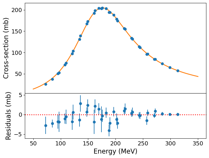
The model curve is clearly a good fit to the data, although the residuals show systematic deviations (up to a few times the error bar) for the cross-sections measured at lower beam energies. It is worth bearing in mind however that our treatment is fairly simplistic, using the non-relativistic version of the formula and ignoring instrumental background. So perhaps it isn’t surprising that we see some deviations. It remains useful to ask: how good is our fit anyway?
Goodness of fit
An important aspect of weighted least squares fitting is that a significance test, the chi-squared test can be applied to check whether the minimum \(X^{2}\) statistic obtained from the fit is consistent with the model being a good fit to the data. In this context, the test is often called a goodness of fit test and the \(p\)-value which results is called the goodness of fit. The goodness of fit test checks the hypothesis that the model can explain the data. If it can, the data should be normally distributed around the model and the sum of squared, weighted data\(-\)model residuals should follow a \(\chi^{2}\) distribution with \(\nu\) degrees of freedom. Here \(\nu=n-m\), where \(n\) is the number of data points and \(m\) is the number of free parameters in the model (i.e. the parameters left free to vary so that MLEs were determined).
It’s important to remember that the chi-squared statistic can only be positive-valued, and the chi-squared test is single-tailed, i.e. we are only looking for deviations with large chi-squared compared to what we expect, since that corresponds to large residuals, i.e. a bad fit. Small chi-squared statistics can arise by chance, but if it is so small that it is unlikely to happen by chance (i.e. the corresponding cdf value is very small), it suggests that the error bars used to weight the squared residuals are too large, i.e. the errors on the data are overestimated. Alternatively a small chi-squared compared to the degrees of freedom could indicate that the model is being ‘over-fitted’, e.g. it is more complex than is required by the data, so that the model is effectively fitting the noise in the data rather than real features.
Sometimes (as in the lmfit output shown above), you will see the ‘reduced chi-squared’ discussed. This is the ratio \(X^2/\nu\), written as \(\chi^{2}/\nu\) and also (confusingly) as \(\chi^{2}_{\nu}\). Since the expectation of the chi-squared distribution is \(E[X]=\nu\), a rule of thumb is that \(\chi^{2}/\nu \simeq 1\) corresponds to a good fit, while \(\chi^{2}/\nu\) greater than 1 are bad fits and values significantly smaller than 1 correspond to over-fitting or overestimated errors on data. It’s important to always bear in mind however that the width of the \(\chi^{2}\) distribution scales as \(\sim 1/\sqrt{\nu}\), so even small deviations from \(\chi^{2}/\nu = 1\) can be significant for larger numbers of data-points being fitted, while large \(\chi^{2}/\nu\) may arise by chance for small numbers of data-points. For a formal estimate of goodness of fit, you should determine a \(p\)-value calculated from the \(\chi^{2}\) distribution corresponding to \(\nu\).
Let’s calculate the goodness of fit of the non-relativistic Breit-Wigner formula to our data. To do so we need the best-fitting chi-squared and the number of degrees of freedom. We can access these from our fit result and use them to calculate the goodness of fit:
print("Minimum Chi-squared = "+str(result.chisqr)+" for "+str(result.nfree)+" d.o.f.")
print("The goodness of fit is: ",sps.chi2.sf(result.chisqr,df=result.nfree))
Minimum Chi-squared = 38.01295670804502 for 33 d.o.f.
The goodness of fit is:  0.25158686748918946
Our \(p\)-value (goodness of fit) is 0.25, indicating that the data are consistent with being normally distributed around the model, according to the size of the data errors. I.e., the fit is good. This does not mean it can’t be improved however, e.g. by a more complex model with additional free parameters. We will discuss this issue in a couple of episodes’ time.
Programming challenge: fitting binary pulsar timing data
The file pulsar-timing.txt contains data on the timing of the binary pulsar PSR~1913+16. The data are from Taylor & Weisberg (1982; Astrophysical Journal, v235, pp.908-920). They show the “orbit phase residuals” from precise timing of the orbit of the system. The first column shows the observation, the second the date (in years) the third column shows the phase residual in years and the fourth column shows the error on the phase residual (also years). You can assume that the errors are normally distributed.
If the orbit was (a) constant (at 7.76 hours) the residuals should be constant with time. If the orbit was (b) constant but its period was incorrectly determined the residuals should grow linearly with time. If the period of the system is constantly changing (c) there should be a parabolic change in the residual with time. A constantly increasing period (a quadratically decreasing phase residual) is what we would expect if gravitational waves are radiating energy from the system.
Use weighted least squares fitting with lmfit to fit the following models to the data and obtain MLEs of the model parameters and their 1\(-\sigma\) errors. By plotting the data and best-fitting models and data-model residuals, and also determining a goodness-of-fit for each model, decide which model or models give a reasonable match to the data:
- a. A constant: \(y=\alpha\)
- b. A linear function: \(y=\alpha+\beta x\)
- c. A quadratic function: \(y=\alpha+\beta x+\gamma x^{2}\)
Key Points
Given a set of data and a model with free parameters, the best unbiased estimators of the model parameters correspond to the maximum likelihood and are called Maximum Likelihood Estimators (MLEs).
In the case of normally-distributed data, the log-likelihood is formally equivalent to the weighted least squares statistic (also known as the chi-squared statistic).
MLEs can be obtained by maximising the (log-)likelihood or minimising the weighted least squares statistic (chi-squared minimisation).
The Python package lmift can be used to fit data efficiently, and the
leastsqminimisation method is optimised to carry out weighted least-squares fitting of models to data.The errors on MLEs can be estimated from the diagonal elements of the covariance matrix obtained from the fit, if the fitting method returns it. These errors are returned directly in the case of lmfit using
Confidence intervals on MLEs and fitting binned Poisson event data
Overview
Teaching: 60 min
Exercises: 60 minQuestions
How do we calculate exact confidence intervals and regions for normally distributed model parameters?
How should we fit models to binned univariate data, such as photon spectra?
Objectives
Learn how to calculate and plot 1- and 2-D confidence intervals for normally distributed MLEs, given any enclosed probability and number of free parameters.
Learn how to bin up univariate data so that the counts per bin are approximately normal and weighted least-squares methods can be used to fit the data.
Use the Poisson likelihood function to fit models to finely binned univariate data.
In this episode we will be using numpy, as well as matplotlib’s plotting library. Scipy contains an extensive range of distributions in its ‘scipy.stats’ module, so we will also need to import it and we will also make use of scipy’s optimize and interpolate modules. Remember: scipy modules should be installed separately as required - they cannot be called if only scipy is imported.
import numpy as np
import matplotlib.pyplot as plt
import scipy.stats as sps
import scipy.interpolate as spinterp
import scipy.integrate as spint
import lmfit
Normal distributions in maximum-likelihood estimation: data vs. MLEs
We should remind ourselves of an important distinction that we made in the previous episode. If the data are normally distributed around their true values, weighted least squares can be used to fit the data and a goodness-of-fit probability can be determined for the fit. If the data are not normally distributed, and cannot be binned up to make it close to normally distributed (see later this episode), then other likelihood statistics should be used, such as the log-likelihood for the distribution that is appropriate for the data.
However, the data does not need to be normally distributed in order for the MLEs to be normally distributed. This may occur for many kinds of data distribution (and corresponding log-likelihood function) and is an expected outcome of the central limit theorem for fitting large data sets. If the MLEs are normally distributed, the covariance matrix (if it can be obtained from the minimisation method) can be used to estimate errors on the MLEs. Also, exact calculations (see following section) may be used to estimate any confidence interval or region for an arbitrary number of model free parameters. The mapping of the likelihood function used to carry out these calculations can also be used to check whether the parameter distribution appears to be normally distributed.
In some cases neither the data nor the MLEs are normally distributed. Or, the parameter space may be too large or complex for any exact calculation of the likelihood. In these situations we should turn to Monte Carlo methods to estimate the goodness of fit and the errors on the MLEs (and perhaps the MLEs themselves). We will turn to this topic in two episodes time.
Confidence intervals of normally distributed MLEs
Optimisation methods such as curve_fit (alongside several other minimisation algorithms) return the covariance matrix of the fitted parameters together with their MLEs. The variances (diagonal elements) in the covariance matrix can then be used to directly estimate the 1-\(\sigma\) errors on each MLE, assuming that they are normally distributed. Lmfit also uses this approach to directly infer error bars on the data which are output by the fit report.
Note however that if the MLEs are not normally distributed, the variances can give an indication of the error but it will not be exact.
It’s also important to bear in mind that the covariance matrix estimated by curve_fit, lmfit and other gradient-based minimisation algorithms are estimates obtained from the Hessian, i.e. the matrix of 2nd-order partial derivatives of log-likelihood (see above) and as such may also not be exact, even if the MLEs are normally distributed. For these situations, it is possible to numerically evaluate exact confidence intervals and regions for MLEs, under the normal approximation, i.e. the assumption that those MLEs are normally distributed. First, consider the log-likelihood for a single model parameter \(\theta\) with MLE \(\hat{\theta}\). Assuming that the likelihood is normally distributed we can write the log-likelihood as:
[L(\theta) = constant - \frac{(\theta - \hat{\theta})^{2}}{2\sigma_{\theta}^{2}}]
Where by definition for a normal distribution, the MLE is the also mean of the distribution and \(\sigma_{\theta}\) is the standard deviation encompassing \(\simeq 68\%\) of the probability. Since \(\theta\) is normally distributed around \(\hat{\theta}\) with standard deviation \(\sigma_{\theta}\), the quantity on the right hand side follows a (scaled by \(1/2\)) chi-squared distribution with \(\nu=1\) degree of freedom, i.e.:
[\frac{(\theta-\hat{\theta})^{2}}{2\sigma_{\theta}^{2}} \sim \frac{1}{2}\chi^{2}_{1}]
This means that we can define any confidence interval \(\hat{\theta}\pm\Delta \theta\) enclosing a probability \(\alpha\) around \(\hat{\theta}\) so that:
[L(\hat{\theta})-L(\hat{\theta}\pm\Delta \theta) = \frac{1}{2}F^{-1}{\chi^{2}{1}}(\alpha)]
where \(F^{-1}_{\chi^{2}_{1}}(\alpha)\) is the inverse cdf (percent-point function, ppf) for the \(\chi^{2}_{1}\) distribution. Equivalently for the weighted least squares statistic \(X^{2}\):
[X^{2}(\hat{\theta}\pm \Delta \theta)-X^{2}(\hat{\theta}) = F^{-1}{\chi^{2}{1}}(\alpha)]
In practice, this means that to calculate a 1-\(\sigma\) confidence interval on a single parameter, we must calculate \(L(\theta)\) vs. \(\theta\) and find where \(L(\hat{\theta})-L(\theta)=1/2\) (since \(F^{-1}_{\chi^{2}_{1}}(\alpha)=1\) for \(\alpha=P(1\sigma)\simeq0.683\)). Or if we are using the weighted-least squares (‘chi-squared’) statistic, we simply look for \(X^{2}(\hat{\theta}\pm\Delta \theta)-X^{2}(\hat{\theta})=1\). Thanks to Wilks’ theorem (which we will discuss later, when we consider hypothesis comparison), this approach also works for the case of multiple parameters when we require the confidence interval for an individual parameter. Provided we let the other free parameters find their best fits (the MLEs), we can consider the change in log-likelihood or chi-squared as we step through a grid of fixed values for the parameter of interest.
In the approach that follows, we will use this so-called ‘brute force’ grid search method to calculate individual (1-D) and joint (2-D) confidence intervals for one or two parameters respectively, by defining our own functions for this purpose. Lmfit includes its own methods for these calculations. However, the current lmfit methods are suitable only for finding confidence intervals via weighted-least squares fitting, so they are not appropriate for more general log-likelihood fitting (e.g. of Poisson-distributed data). Therefore we focus first on our own more general approach, which we demonstrate for our Breit-Wigner model fit results from the previous episode, with the programming example below. Before starting, make sure you load the data and the model function from the previous episode.
Programming example: calculating and plotting 1-D confidence intervals
First we must write a function, to run lmfit
minimizefor a grid of fixed values of the parameter we want a confidence interval for. In order to keep one parameter frozen at the grid value, we can edit the Parameters object to change the value to the grid value and freeze it at that value:def grid1d_chisqmin(a_name,a_range,a_steps,parm,model,xdata,ydata,yerrs): '''Uses lmfit. Finds best the fit and then carries out chisq minimisation for a 1D grid of fixed parameters. Input: a_name - string, name of 'a' parameter (in input Parameters object parm) to use for grid. a_range, a_steps - range (tuple or list) and number of steps for grid. parm - lmfit Parameters object for model to be fitted. model - name of model function to be fitted. xdata, ydata, yerrs - lists of data x, y and y-error arrays (as for the lmf_lsq_resid function) Output: a_best - best-fitting value for 'a' minchisq - minimum chi-squared (for a_best) a_grid - grid of 'a' values used to obtain fits chisq_grid - grid of chi-squared values corresponding to a_grid''' a_grid = np.linspace(a_range[0],a_range[1],a_steps) chisq_grid = np.zeros(len(a_grid)) # First obtain best-fitting value for 'a' and corresponding chi-squared set_function = Minimizer(lmf_lsq_resid, parm, fcn_args=(xdata, ydata, yerrs, model, True), nan_policy='omit') result = set_function.minimize(method = 'leastsq') minchisq = result.chisqr a_best = result.params.valuesdict()[a_name] # Now fit for each 'a' in the grid, to do so we use the .add() method for the Parameters object # to replace the value of a_name with the value for the grid, setting vary=False to freeze it # so it cannot vary in the fit (only the other parameters will be left to vary) for i, a_val in enumerate(a_grid): parm.add(a_name,value=a_val,vary=False) set_function = Minimizer(lmf_lsq_resid, parm, fcn_args=(xdata, ydata, yerrs, model, True), nan_policy='omit') result = set_function.minimize(method = 'leastsq') chisq_grid[i] = result.chisqr return a_best, minchisq, a_grid, chisq_gridTo evaluate the confidence intervals as accurately as we can (given our grid spacing), we can create an interpolation function from the grid, which will return the value of a parameter corresponding to a given \(\chi^{2}\)-statistic value. This way we can calculate the interval corresponding to a given \(\Delta \chi^{2}\) from the minimum value. Since the \(\chi^{2}\)-statistic is symmetric about the minimum, we should consider the lower and upper intervals on either side of the minimum separately:
def calc_error_chisq(delchisq,a_best,minchisq,a_grid,chisq_grid):
    '''Function to return upper and lower values of a parameter 'a' for a given delta-chi-squared
       Input:
           delchisq - the delta-chi-squared for the confidence interval required (e.g. 1 for 1-sigma error)
           a_best, minchisq - best-fitting value for 'a' and corresponding chi-squared minimum
           a_grid, chisq_grid - grid of 'a' and corresponding chi-squared values used for interpolation'''
    # First interpolate over the grid for values > a_best and find upper interval bound
    chisq_interp_upper = spinterp.interp1d(chisq_grid[a_grid > a_best],a_grid[a_grid > a_best])
    a_upper = chisq_interp_upper(minchisq+delchisq)
    # Interpolate for values <= a_best to find lower interval bound
    chisq_interp_lower = spinterp.interp1d(chisq_grid[a_grid <= a_best],a_grid[a_grid <= a_best])
    a_lower = chisq_interp_lower(minchisq+delchisq)
    return [a_lower,a_upper]
Now we can implement these functions to calculate and plot the 1-D \(\chi^{2}\)-statistic distribution for each parameter, and calculate and plot the 1-\(\sigma\) intervals. Try this yourself or look at the solution below.
Solution
model = breitwigner
par_names = ['gam0','E0','N'] # Names of parameters in Parameters object
n_steps = 1000  # Number of steps in our grids
# Ranges for each parameter - should aim for a few times times 1-sigma error estimated from covariance
# We can specify by hand or use the values from the original minimize result if available:
par_ranges = []
for i, par_name in enumerate(par_names):
    # range min/max are best-fitting value -/+ four times the estimated 1-sigma error from variances
    # (diagonals of covariance matrix)
    par_min = result.params.valuesdict()[par_name] - 4*np.sqrt(result.covar[i,i])
    par_max = result.params.valuesdict()[par_name] + 4*np.sqrt(result.covar[i,i])
    par_ranges.append([par_min,par_max])
#par_ranges = [[109,112],[175,177],[204,206]]   # if specified by hand
print("Parameter ranges for grid:",par_ranges)
# For convenience when plotting we will store our results in arrays, which we now set up:
a_best = np.zeros(len(par_ranges))
minchisq = np.zeros(len(par_ranges))
a_grid = np.zeros((len(par_ranges),n_steps))
chisq_grid = np.zeros((len(par_ranges),n_steps))
a_int = np.zeros((len(par_ranges),2))

delchisq = 1.0  # For 1-sigma errors for a single parameter

# Now do the grid calculation for each parameter:
for i, par_range in enumerate(par_ranges):
    params = Parameters()
    params.add_many(('gam0',30),('E0',130),('N',150))
    a_best[i], minchisq[i], a_grid[i,:], chisq_grid[i,:] = grid1d_chisqmin(par_names[i],par_range,n_steps,params,model,
                             pion_clean['energy'],pion_clean['xsect'],pion_clean['error'])
    a_int[i,:] = calc_error_chisq(delchisq,a_best[i],minchisq[i],a_grid[i,:],chisq_grid[i,:])
    # Good presentation of results should round off MLE and errors to an appropriate number
    # of decimal places. Here we choose 3 to demonstrate the symmetry of the errors, we
    # could have used 2 decimal places since that is consistent with the size of the error bars
    print('MLE '+par_names[i]+':',str(np.round(a_best[i],3)),
          'with errors:',str(np.round((a_int[i,:]-a_best[i]),3)))

# Now plot along with a cross to mark the MLE and dotted lines to show the 1-sigma intervals
par_xlabels = [r'$\Gamma_{0}$ (MeV)',r'$E_{0}$ (MeV)',r'$N$ (mb)']
fig, (ax1, ax2, ax3) = plt.subplots(1,3, figsize=(9,3), sharey=True)
fig.subplots_adjust(left=None, bottom=0.2, right=None, top=None, wspace=0.1, hspace=None)
for i, ax in enumerate([ax1, ax2, ax3]):
    ax.plot(a_grid[i,:],chisq_grid[i,:],color='blue')
    ax.scatter(a_best[i],minchisq[i],marker='+',color='blue')
    ax.vlines(a_int[i,:],ymin=30,ymax=100,color='gray',linestyle='dotted')
    ax.set_xlabel(par_xlabels[i],fontsize=12)
ax1.set_ylabel(r'$\chi^{2}$',fontsize=12)
ax1.set_ylim(30,70)
plt.show()
Parameter ranges for grid: [[108.71757041641061, 111.73651025237999], [175.09961457409608, 176.5422151367783], [202.92102931158476, 207.1234726451053]] MLE gam0: 110.227 with errors: [-0.349 0.351] MLE E0: 175.821 with errors: [-0.168 0.167] MLE N: 205.022 with errors: [-0.489 0.49 ]
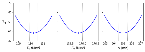
If we compare our calculated 1-\(\sigma\) confidence intervals with the estimates from the covariance matrix of our original fit, we can see that the match is quite good. Furthermore, the calculated intervals are very close to symmetric, and the plotted distributions of the \(\chi^{2}\)-statistic look like symmetric parabolas, which strongly supports the normal approximation for the likelihood obtained from the Breit-Wigner model fitted to our pion scattering data.
Confidence regions for joint distributions of normally distributed MLEs
When fitting models with multiple parameters, we may also want to consider the confidence regions for the joint distributions of our MLEs, not just the individual MLE confidence intervals, which require us to consider more than the variances, which correspond only to the marginalised distributions of each parameter. For likelihood distributions which are multivariate normal (i.e. the normal approximation applies), we can use an extension of the method for a single parameter described above.
If the MLEs are multivariate normally distributed, the likelihood is:
[p(\boldsymbol{\theta}\vert \boldsymbol{\hat{\theta}}, \mathbf{\Sigma}) = \frac{\exp\left(-\frac{1}{2}(\boldsymbol{\theta}-\boldsymbol{\hat{\theta}})^{\mathrm{T}} \mathbf{\Sigma}^{-1}(\boldsymbol{\theta}-\boldsymbol{\hat{\theta}})\right)}{\sqrt{(2\pi)^{k}\lvert\mathbf{\Sigma}\rvert}}]
where bold symbols denote vectors and matrices: \(\boldsymbol{\theta}\) and \(\boldsymbol{\hat{\theta}}\) are \(k\)-dimensional column vectors of the parameter values and their MLEs (with \(\mathrm{T}\) denoting the transpose) and \(\mathbf{\Sigma}\) is the distribution covariance matrix. Taking the log-likelihood:
[L(\boldsymbol{\theta})= constant -\frac{1}{2}(\boldsymbol{\theta}-\boldsymbol{\hat{\theta}})^{\mathrm{T}} \mathbf{\Sigma}^{-1}(\boldsymbol{\theta}-\boldsymbol{\hat{\theta}})]
and it can be shown that:
[(\boldsymbol{\theta}-\boldsymbol{\hat{\theta}})^{\mathrm{T}} \mathbf{\Sigma}^{-1}(\boldsymbol{\theta}-\boldsymbol{\hat{\theta}}) \sim \chi^{2}_{k}]
so that for a \(k\)-dimensional confidence region enclosing a probability \(\alpha\) around \(\boldsymbol{\hat{\theta}}\):
[L(\boldsymbol{\hat{\theta}})-L(\boldsymbol{\hat{\theta}}\pm\boldsymbol{\Delta \theta}) = \frac{1}{2}F^{-1}{\chi^{2}{k}}(\alpha)]
where \(F^{-1}_{\chi^{2}_{k}}(\alpha)\) is now the inverse cdf (percent-point function, ppf) for the \(\chi^{2}_{k}\) distribution, i.e. the \(\chi^{2}\) distribution with \(\nu=k\) degrees of freedom. Equivalently for the weighted least squares statistic \(X^{2}\):
[X^{2}(\boldsymbol{\hat{\theta}}\pm \boldsymbol{\Delta \theta})-X^{2}(\boldsymbol{\hat{\theta}}) = F^{-1}{\chi^{2}{k}}(\alpha)]
Note that the \(k\) corresponds to the number of parameters we would like to show a joint confidence region for. The remaining free_parameters which are left to find their best fits do not count (they are effectively marginalised over by the process, according to Wilks’ theorem). To demonstrate how this works, we show the construction of a 2-D confidence region for the Breit-Wigner model using a 2-D grid calculation below:
Programming example: 2-D confidence regions and contour plot
First we define a new function which is the 2-D equivalent of our previous function for calculating 1-D confidence intervals.
def grid2d_chisqmin(ab_names,ab_range,ab_steps,parm,model,xdata,ydata,yerrs):
    '''Finds best fit and then carries out chisq minimisation for a 1D grid of fixed parameters.
       Input:
            ab_names - tuple/list with names of 'a' and 'b' parameter (in input list parm) to use for grid.
            ab_range, ab_steps - range (nested tuple or list) and list/tuple with number of steps for grid
                for parameters a and b.
            parm - lmfit Parameters object for model to be fitted.
            model - name of model function to be fitted.
            xval, dyval, dy - data x, y and y-error arrays
        Output:
            ab_best - list of best-fitting values for a and b.
            minchisq - minimum chi-squared (for ab_best)
            a_grid, b_grid - grids of 'a' and 'b' values used to obtain fits
            chisq_grid - 2-D grid of chi-squared values corresponding to ab_grid'''
    a_grid = np.linspace(ab_range[0][0],ab_range[0][1],ab_steps[0])
    b_grid = np.linspace(ab_range[1][0],ab_range[1][1],ab_steps[1])
    chisq_grid = np.zeros((len(a_grid),len(b_grid)))
    # First obtain best-fitting values for a and b and corresponding chi-squared
    set_function = Minimizer(lmf_lsq_resid, parm, fcn_args=(xdata, ydata, yerrs, model, True),
                             nan_policy='omit')
    result = set_function.minimize(method = 'leastsq')
    minchisq = result.chisqr
    ab_best = [result.params.valuesdict()[ab_names[0]],result.params.valuesdict()[ab_names[1]]]
    # Now fit for each a and b in the grid, to do so we use the .add() method for the Parameters object
    # to replace the value of a_name, b_name with the values for that point in the grid, setting vary=False to
    # freeze them so they cannot vary in the fit (only the other parameters will be left to vary)
    for i, a_val in enumerate(a_grid):
        parm.add(ab_names[0],value=a_val,vary=False)
        for j, b_val in enumerate(b_grid):
            parm.add(ab_names[1],value=b_val,vary=False)
            set_function = Minimizer(lmf_lsq_resid, parm, fcn_args=(xdata, ydata, yerrs, model, True),
                                                                nan_policy='omit')
            result = set_function.minimize(method = 'leastsq')
            chisq_grid[i,j] = result.chisqr
        print(str((i+1)*len(b_grid))+' out of '+str(len(a_grid)*len(b_grid))+' grid-points calculated')
    return ab_best, minchisq, a_grid, b_grid, chisq_grid
As an example, we calculate the 2-D grid of \(\chi^{2}\)-statistic values for the width \(\Gamma_{0}\) and resonant energy \(E_{0}\), with 100 grid points for each parameter, so we calculate for 10000 pairs of grid points in total.
model = breitwigner
params = Parameters()
params.add_many(('gam0',30),('E0',130),('N',150))
par_names = ['gam0','E0'] # Names of parameters for grid search
par_steps = [100,100]  # Number of steps in our grids
# Ranges for each parameter - should aim for a few times times 1-sigma error estimated from covariance
# We can specify by hand or use the values from the original minimize result if available:
par_ranges = []
for i, par_name in enumerate(par_names):
    # range min/max are best-fitting value -/+ five times the estimated 1-sigma error from variances
    # (diagonals of covariance matrix)
    par_min = result.params.valuesdict()[par_name] - 5*np.sqrt(result.covar[i,i])
    par_max = result.params.valuesdict()[par_name] + 5*np.sqrt(result.covar[i,i])
    par_ranges.append([par_min,par_max])
#par_ranges = [[109,112],[175,177]]   # if specified by hand
print("Parameter ranges for grid:",par_ranges)

ab_best, minchisq, a_grid, b_grid, chisq_grid  = grid2d_chisqmin(par_names,par_ranges,par_steps,
                    params,model,pion_clean['energy'],pion_clean['xsect'],pion_clean['error'])
The main use of a 2-D calculation is to be able to plot confidence contours for the model parameters. To do so we need to determine what the appropriate contour levels are. We define these as passing through constant values of \(X^{2}_{i}(\Gamma_{0},E_{0})\) such that:
\[X^{2}_{i}(\Gamma_{0},E_{0}) = X^{2}(\hat{\Gamma}_{0},\hat{E}_{0})+F^{-1}_{\chi^{2}_{2}}(\alpha_{i}),\]where \(X^{2}(\hat{\Gamma}_{0},\hat{E}_{0})\) is the minimum (best-fit) weighted least squares statistic, corresponding to the MLEs, and \(\alpha_{i}\) is the required \(i\)th confidence level. In the example below, we show the 1, 2 and 3-\(\sigma\) confidence. contours. Note that they differ from the projection of the corresponding 1-D contours, since the latter correspond to the marginal distributions of the parameters.
# Determine the chisq_2 values which contain 1, 2 and 3-sigma regions:
del1 = sps.chi2.isf(2*sps.norm.sf(1),df=2)
del2 = sps.chi2.isf(2*sps.norm.sf(2),df=2)
del3 = sps.chi2.isf(2*sps.norm.sf(3),df=2)

print("1, 2, 3-sigma contours correspond to delta-chisq =",del1,del2,del3)

# Now plot the contours, including a cross to mark the location of the MLEs
# First we assign all three variables to their own 2D arrays:
X, Y = np.meshgrid(a_grid,b_grid,indexing='ij')
Z = chisq_grid
levels = [minchisq+del1, minchisq+del2, minchisq+del3] # plots the 1, 2 and 3-sigma
# confidence contours
plt.figure()
plt.contour(X, Y, Z, levels, colors=('r', 'g', 'b'), linestyles=('solid','dashed','dotted'))
plt.scatter(*ab_best, marker="+")
plt.xlabel(r'$\Gamma_{0}$', fontsize=14)
plt.ylabel(r'$E_{0}$', fontsize=14)
plt.show()
1, 2, 3-sigma contours correspond to delta-chisq = 2.295748928898636 6.180074306244174 11.82915808190081
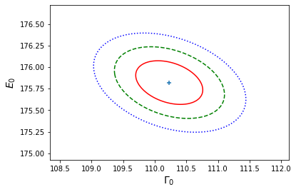
Binned Poisson event data
So far we have considered fitting models to data consisting of pairs of \(x\) and \(y\) values (and errors on the \(y\) values), which commonly arise from experimental measurements of some quantity vs. an explanatory (\(x\)-axis) variable, such as measurements of pion-proton scattering cross-section vs. the pion beam energy. It is often the case however that we measure a sample of univariate data and we would like to model its distribution. Common examples include distributions of some variable drawn from an underlying population, such as the masses of stars in a cluster. Another very common type of univariate data is when we obtain a spectrum, e.g. recording photon or particle event energies in a detector. To constrain and model the shape of these distributions, it is common to make a histogram of the data.
Consider a single event \(X\) which is an outcome of a single draw from a probability xdistribution \(p(x\vert \boldsymbol{\theta})\), where \(\boldsymbol{\theta}\) is the vector of parameters of the distribution. The event will occur in a bin with central value \(x=\epsilon_{i}\) and width \(\Delta_{i}\) with probability:
[P_{i} = P(\epsilon_{i}-\Delta_{i}/2 \leq X \leq \epsilon_{i}+\Delta_{i}/2) = \int^{\epsilon_{i}+\Delta_{i}/2}{\epsilon{i}-\Delta_{i}/2} p(x)\mathrm{d}x]
Assuming that the events are independent, Poisson events, then for a given mean total event rate in a fixed nterval, \(\lambda_{\rm total}\), we expect that the mean rate in a given bin will be \(\lambda_{i} = P_{i}\lambda_{\rm total}\). Since the events are independent, the number of counts in the bin \(n_{i}\) will also be Poisson-distributed with rate parameter \(\lambda_{i}\). Another way to look at this is that the bins also count as intervals, or could be considered as sub-intervals within the wider interval (in energy and/or time) which the total counts are sampled in.
Fitting binned Poisson event data using weighted least-squares
Having seen that the counts in a bin is Poisson distributed, and that we can calculate the expected rate by integrating the distribution over the bin, we can consider two approaches to fitting the data The first is to use weighted-least squares, for which we must ensure that the data in each bin are close to normally distributed. The central limit theorem enables this provided the number of counts is large enough. For example, comparing the distribution for \(\lambda=20\) with that of a normal distribution with the same mean (\(\mu=20\)) and variance (\(\sigma^{2}=20\)):
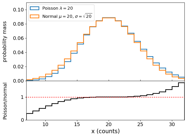
We can see that the distributions are very close in their centres and deviate for values \(\vert x-\lambda \vert > \sigma\). For this reason, a minimum of 20 counts per bin is used as standard in fields which work with binned photon event data, such as X-ray astronomy, but you can also be more conservative and choose a larger minimum counts/bin, to ensure that the data are even closer to being normally distributed.
Programming example: binning a photon count spectrum
The file
photon_energies.txt(see here) contains a list of 1054 measured photon energies simulated to represent a power-law distributed spectrum typical of those obtained by high-energy photon detectors from astronomical sources or particle colliders (if the photons are ‘events’). The energies themselves are arbitrary here, real detectors might cover ranges of keV, MeV or even GeV or higher. For our investigation we will assume that the energies are in GeV and that the detector is sensitive to energies from 10-200 GeV, such that photons outside this range are not detected.To help us bin the spectrum we will first define a function that will rebin a histogram to a given minimum counts per bin:
def histrebin(mininbin,counts,edges):
    '''Takes as input a minimum counts per bin and a histogram counts and bin edges, and combines
       adjacent histogram bins as needed so that no bin has less than the required minimum.
       Inputs:
           mininbin - required minimum counts/bin.
           counts, edges - input histogram counts/bin and bin edges arrays.
       Outputs:
           counts2, edges2 - rebinned counts/bin and bin edges arrays'''
    edges2=np.zeros(1)
    counts2=np.zeros(1)
    i=0
    countsum=0
    firstbin_flag = 1
    edges2[0]=edges[0]
    for x in counts:
        countsum=countsum+x
        i=i+1
        if countsum >= mininbin and (sum(counts[i:]) >= mininbin or i == len(counts)):  # The sum over counts in
            # remaining bins ensures that we are not left with a bin with counts less than our limit at the end.
            if firstbin_flag == 1: # if this is the first bin satisfying our requirement,
                # do not append but replace bin 0 with countsum
                counts2[0]=countsum
                firstbin_flag = 0 # now we read the first bin we can switch this off
            else:
                counts2=np.append(counts2,countsum)
            edges2=np.append(edges2,edges[i])
            countsum=0
    return counts2, edges2
Now load the data and make a histogram of it, then rebin your histogram to a minimum of 20 counts/bin. Then plot your data points using
plt.errorbarwith the \(x\)-values given by the bin centres with \(x\) errorbars corresponding to half the bin width, the \(y\)-values given by the count densities (counts/bin divided by the bin width) and appropriate 1-\(\sigma\) errors calculated for the count densities as \(y\)-errors. Note that plotting the data using data points with errors will make the comparison with the models clearer, as we will use a stepped histogram style for plotting the models to compare with the data.Solution
There are a few important points to take account of here:
- Non-detections of counts in bins also counts as data, so always make sure you use the entire range that the data can be sampled over (i.e. even if the events are not detected over the whole range) to define the range used for binning. This is 10-200 GeV in this example.
- The errors correspond to the Poisson standard deviation \(\sqrt{\lambda}\) which for counts \(n\) can be taken as \(\sqrt{n}\) (since the observed counts in an interval is an unbiased estimator of \(\lambda\)).
- When plotting data which follow a power-law or power-law-like distribution, it is usually best to plot against logarithmic \(x\) and \(y\) axis scales. This means that the power-law shape appears as a straight line and any deviations from it can be more easily seen.
#  First read in the data.  This is a simple (single-column) list of energies:
photens = np.genfromtxt('photon_energies.txt')

# Now we make our unbinned histogram.  We can keep the initial number of bins relatively large.
emin, emax = 10., 200.   # We should always use the known values that the data are sampled over
                         # for the range used for the bins!
nbins = 50
counts, edges = np.histogram(photens, bins=nbins, range=[emin,emax], density=False)

# And now we use our new function to rebin so there are at least mincounts counts per bin:
mincounts = 20  # Here we set it to our minimum requirement of 20, but in principle you could set it higher
counts2, edges2 = histrebin(mincounts,counts,edges)

bwidths = np.diff(edges2) # calculates the width of each bin
cdens = counts2/bwidths # determines the count densities
cdens_err = np.sqrt(counts2)/bwidths # calculate the errors: remember the error is based on the counts,
# not the count density, so we have to also apply the same normalisation.
energies = (edges2[:-1]+edges2[1:])/2.  # This calculates the energy bin centres
# Now plot the data - use a log-log scale since we are plotting a power-law
plt.figure()
plt.errorbar(energies, cdens, xerr=bwidths/2., yerr=cdens_err, fmt='o')
plt.xlabel("Energy (GeV)", fontsize=16)
plt.ylabel("Counts/GeV", fontsize=16)
plt.tick_params(labelsize=14)
plt.yscale('log')
plt.xscale('log')
plt.xlim(10.0,200.0)
plt.show()
Now we have ‘binned up’ our data with at least 20 counts/bin we are ready to fit a model to it, using a weighted least-squares method such as the approach we have been using with lmfit. However, before we do so, we must remember that the expected Poisson rate parameter for the bin, which is our model estimate for the number of counts, is:
[\lambda_{i} = \lambda_{\rm total} \int^{\epsilon_{i}+\Delta_{i}/2}{\epsilon{i}-\Delta_{i}/2} p(E)\mathrm{d}E]
where we have now replaced the variable \(x\) with energy \(E\), specific to our data, \(\lambda_{\rm total}\) is the rate parameter for the total counts (the complete energy range) and the term in the integral is the probability of an event occuring in the energy bin covering the range \(\epsilon_{i}\pm\Delta_{i}/2\). We can subsume \(\lambda_{\rm total}\) and the normalisation of our distribution \(p(E)\) into a single normalisation constant which can be one of our model parameters. But we also need to integrate our model function over each energy bin to obtain the counts predicted by the model for that bin, so we can fit the data. There are several ways to do this:
- The indefinite integral function may be calculated explicitly and used directly as the model function. This is easy to do for a simple function such as a power-law, but may be difficult for more complicated or challenging functions.
- Python offers numerical methods to calculate the definite integral for a given function (e.g. in
scipy.integrate). - If you are fitting a model which is itself a statistical distribution in Python, you could use the cdf of the distribution to determine the integral between two values. Note that in this case you may have to scale the distribution accordingly, to match your spectrum (e.g. the integral of the pdf would no longer be 1.0, but would be the total number of counts in the spectrum).
To allow for fitting binned data in lmfit, while keeping the model format unchanged, we can create a new function to calculate for any given model \(y_{\rm mod}(x)\) the average counts density per bin (i.e. model integrated over the bin and then divided by bin width). We will also create a new version of our lmfit objective function which uses this new model integration function.
def model_bin(xbins, model, params):
    '''General function for integrating the input model over bins defined by contiguous (no gaps)
        bin edges, xbins.
       Inputs:
           xbins - x bin edges.
           model, params - the model name and associated Parameters object.
       Outputs:
           ymod - calculated counts-density model values for y-axis.'''
    i = 0
    ymod = np.zeros(len(xbins)-1)
    for i, xval in enumerate(xbins[:-1]):
        ymod[i], ymoderr = spint.quad(lambda x: model(x, params),xbins[i],xbins[i+1])
        ymod[i] = ymod[i]/(xbins[i+1]-xbins[i])  # we now divide by the bin width to match the counts density
        # units of our data
    return ymod

def lmf_lsq_binresid(params,xdata,ydata,yerrs,model,output_resid=True):
    '''lmfit objective function to calculate and return residual array or model y-values for
        binned data where the xdata are the input bin edges and ydata are the densities (integral over bin
        divided by bin width).
        Inputs: params - name of lmfit Parameters object set up for the fit.
                xdata, ydata, yerrs - lists of 1-D arrays of x (must be bin edges not bin centres)
                and y data and y-errors to be fitted.
                    E.g. for 2 data sets to be fitted simultaneously:
                        xdata = [x1,x2], ydata = [y1,y2], yerrs = [err1,err2], where x1, y1, err1
                        and x2, y2, err2 are the 'data', sets of 1-d arrays of length n1 (n1+1 for x2
                        since it is bin edges), n2 (n2+1 for x2) respectively,
                        where n1 does not need to equal n2.
                    Note that a single data set should also be given via a list, i.e. xdata = [x1],...
                model - the name of the model function to be used (must take params as its input params and
                        return the model y-value array for a given x-value array).
                output_resid - Boolean set to True if the lmfit objective function (residuals) is
                        required output, otherwise a list of model y-value arrays (corresponding to the
                        input x-data list) is returned.
        Output: if output_resid==True, returns a residual array of (y_i-y_model(x_i))/yerr_i which is
            concatenated into a single array for all input data errors (i.e. length is n1+n2 in
            the example above). If output_resid==False, returns a list of y-model arrays (one per input x-array)'''
    if output_resid == True:
        for i, xvals in enumerate(xdata):  # loop through each input dataset and record residual array
            if i == 0:
                resid = (ydata[i]-model_bin(xdata[i],model,params))/yerrs[i]
            else:
                resid = np.append(resid,(ydata[i]-model_bin(xdata[i],model,params))/yerrs[i])
        return resid
    else:
        ymodel = []
        for i, xvals in enumerate(xdata): # record list of model y-value arrays, one per input dataset
            ymodel.append(model_bin(xdata[i],model,params))
        return ymodel
To fit the data, we next define a power-law model function and Parameters object with starting values:
def pl_model(x, params):
    '''Simple power-law function.
       Inputs:
           x - input x value(s) (can be list or single value).
           params - lmfit Parameters object: PL normalisation (at x = 1) and power-law index.'''
    v = params.valuesdict()
    return v['N'] * x**v['gamma']

params = Parameters()
params.add_many(('N',2500),('gamma',-1.5))
Next we set up our Minimizer function and input parameters. The approach is the same as for our previous Breit-Wigner model fit, with the data included in lists as required by our objective function. In addition to printing the fit report, we will also print out the chi-squared and degrees-of-freedom along with the corresponding goodness of it.
model = pl_model
output_resid = True
xdata = [edges2]
ydata = [cdens]
yerrs = [cdens_err]
set_function = Minimizer(lmf_lsq_binresid, params, fcn_args=(xdata, ydata, yerrs, model, output_resid),nan_policy='omit')
result = set_function.minimize(method = 'leastsq')
report_fit(result)
print("Minimum Chi-squared = "+str(result.chisqr)+" for "+str(result.nfree)+" d.o.f.")
print("The goodness of fit is: ",sps.chi2.sf(result.chisqr,df=result.nfree))
[[Fit Statistics]]
    # fitting method   = leastsq
    # function evals   = 13
    # data points      = 22
    # variables        = 2
    chi-square         = 20.6520859
    reduced chi-square = 1.03260429
    Akaike info crit   = 2.60902520
    Bayesian info crit = 4.79111011
[[Variables]]
    N:      2695.86051 +/- 372.233648 (13.81%) (init = 2500)
    gamma: -1.57250939 +/- 0.03962710 (2.52%) (init = -1.5)
[[Correlations]] (unreported correlations are < 0.100)
    C(N, gamma) = -0.973
Minimum Chi-squared = 20.65208589188919 for 20 d.o.f.
The goodness of fit is:  0.41785865938157196
A good fit is obtained! It’s interesting to note that the power-law index and the power-law normalisation are very strongly (anti-)correlated. This is typical for models which fit steep slopes to the data, since a change in the slope will lead to a compensating change in the normalisation to maintain a reasonable fit to the data (one way to think about this is that the model ‘pivots’ around the average \(x\) and \(y\) values of the data which hold the model in place there).
If we plot our best-fitting model against the data, we can make a better-informed judgement about whether it is a good fit and whether there are any features in the data which the model cannot explain. To compare our best-fitting model with the data, it is useful to plot the model as a stepped histogram function. To do this we need to make use of the weights parameter of plt.hist, so that we can give the histogram function a bespoke set of \(y\)-values for the histogram plot. We also compare the model to data by plotting the data/model ratio. For a model with a large dynamic range of \(y\)-axis values such as a power-law, the deviations of the data from the model are best shown as a ratio, as absolute differences would be dominated by the values where \(y\) is largest.
def plot_spec_model(ebins,cdens,cdens_err,cdens_model):
    '''Plot the binned (GeV) spectrum with the model as a histogram, and
       data/model residuals.
       Inputs:
           ebins - energy bin edges.
           cdens, cdens_err - counts density and its error.
           cdens_model - model counts density.'''
    energies = (ebins[1:]+ebins[:-1])/2
    bwidths = np.diff(ebins)
    fig, (ax1, ax2) = plt.subplots(2,1, figsize=(8,6),sharex=True,gridspec_kw={'height_ratios':[2,1]})
    fig.subplots_adjust(hspace=0)
    ax1.errorbar(energies, cdens, xerr=bwidths/2., yerr=cdens_err, fmt='o')
    model_hist, edges, patches = ax1.hist(energies, bins=ebins, weights=cdens_model,
                                      density=False, histtype='step')
    ax2.errorbar(energies, cdens/cdens_model, xerr=bwidths/2., yerr=cdens_err/cdens_model, fmt='o')
    ax2.set_xlabel("Energy (GeV)", fontsize=16)
    ax1.set_ylabel("Counts/Gev", fontsize=14)
    ax2.set_ylabel("data/model", fontsize=14)
    ax2.axhline(1.0, color='r', linestyle='dotted', lw=2)
    ax1.tick_params(labelsize=14)
    ax1.tick_params(axis="x",direction="in",which="both", length=4)
    ax2.tick_params(axis="x",which="both", length=4)
    ax2.tick_params(labelsize=14)
    ax1.set_yscale('log')
    ax1.set_xscale('log')
    ax2.set_xscale('log')
    ax1.get_yaxis().set_label_coords(-0.12,0.5)
    ax2.get_yaxis().set_label_coords(-0.12,0.5)
    ax2.set_xlim(ebins[0],ebins[-1]) # Strictly speaking we should only show the energy range
    # where data is sampled, to avoid impression from model that the flux suddenly drops
    # at the boundaries.
    plt.show()

# To calculate the best-fitting model values, use the parameters of the best fit output
# from the fit, result.params and set output_resid=false to output a list of model y-values:
model_vals = lmf_lsq_binresid(result.params,xdata,ydata,yerrs,model,output_resid=False)
# Now plot the data and model and residuals
# The plotting function we defined takes the array of model values, so we must
# specify the index for the model_vals list, to provide this array
plot_spec_model(edges2,cdens,cdens_err,model_vals[0])
We could go further and calculate the confidence intervals and plot confidence contours using the modified version of the model for binned data, but we will leave this as an exercise for the reader.
Fitting binned Poisson event data using a Poisson likelihood function
In some cases when we are modelling data as counts in bins, we may not want to rebin our data to achieve at least 20 counts per bin. Perhaps we don’t have sufficient counts to bin up, or we want to preserve the resolution of our data to take the opportunity to look for narrow features at energies where the counts are sparse (such features may be smeared out if we use wide bins, but could be significant if several counts appear close together in energy). Or perhaps we don’t care about getting a goodness-of-fit and therefore don’t want to use weighted-least-squares as our likelihood statistic. In these cases an alternative option will be to use the Poisson distribution to generate our likelihood function, so we do not care whether there are sufficient counts in a bin (or even if the bins are empty: with a Poisson distribution having zero counts in a bin is possible for small rate parameters and therefore conveys useful information!).
In situations where data are not normally distributed (about the ‘true’ value), weighted least squares is not appropriate to fit the data, but we can directly maximise the log-likelihood instead, or equivalently, minimise the negative log-likelihood. This approach can be used for Poisson data, as well as for other situations where the data are not normally distributed. For Poisson counts data, that means we must integrate over the data bins inside the log-likelihood function. In lmfit, we need to change the objective function to return the summed negative log-likelihood for our data conditional on the model. This is a scalar quantity so we also need to change the Minimizer method to scalar_minimize, which uses Nelder-Mead optimisation as the default (but can be changed to other methods). Note that since the Poisson likelihood compares the observed and model-predicted counts (not count density), we need to be careful to give the data to the function in those units. For plotting purposes however, we could still plot counts density using our original plotting function with the non-rebinned histograms and the corresponding model.
We first define a function to calculate the summed negative log-likelihood, using the logpmf method which is more accurate and reliable than determining the pmf and then separately taking the log. Then we define a new version of our lmfit objective function (for binned data), to return the summed negative log-likelihood for the input dataset(s).
def LogLikelihood_Pois(model_counts, counts):
    '''Calculate the negative Poisson log-likelihood for a model vs counts data.
       Inputs:
           model_counts - array of predicted model counts per bin
           counts - data: observed counts per bin.
        Outputs: the negative Poisson log-likelihood'''
    pd = sps.poisson(model_counts) #we define our Poisson distribution
    return -1*np.sum(pd.logpmf(counts))

def lmf_poissll(params,xdata,ydata,model,output_ll=True):
    '''lmfit objective function to calculate and return total negative Poisson log-likelihood or model
        y-values for binned data where the xdata are the contiguous (i.e. no gaps) input bin edges and
        ydata are the counts (not count densities) per bin.
        Inputs: params - name of lmfit Parameters object set up for the fit.
                xdata, ydata - lists of 1-D arrays of x (must be bin edges not bin centres)
                and y data and y-errors to be fitted.
                    E.g. for 2 data sets to be fitted simultaneously:
                        xdata = [x1,x2], ydata = [y1,y2], yerrs = [err1,err2], where x1, y1, err1
                        and x2, y2, err2 are the 'data', sets of 1-d arrays of length n1 (n1+1 for x2
                        since it is bin edges), n2 (n2+1 for x2) respectively,
                        where n1 does not need to equal n2.
                    Note that a single data set should also be given via a list, i.e. xdata = [x1],...
                model - the name of the model function to be used (must take params as its input params and
                        return the model y counts density array for a given x-value array).
                output_resid - Boolean set to True if the lmfit objective function (total -ve
                        log-likelihood) is required output, otherwise a list of model y-value arrays
                        (corresponding to the input x-data list) is returned.
        Output: if output_resid==True, returns the total negative log-likelihood. If output_resid==False,
                returns a list of y-model counts density arrays (one per input x-array)'''
    if output_ll == True:
        poissll = 0
        for i, xvals in enumerate(xdata):  # loop through each input dataset to sum negative log-likelihood
                # We can re-use our model binning function here, but the model then needs to be converted into
                # counts units from counts density, by multiplying by the bin widths
                ymodel = model_bin(xdata[i],model,params)*np.diff(xdata[i])
                # Then obtain negative Poisson log-likelihood for data (in counts units) vs the model
                poissll = poissll + LogLikelihood_Pois(ymodel,ydata[i])
        return poissll
    else:
        ymodel = []
        for i, xvals in enumerate(xdata): # record list of model y-value arrays, one per input dataset
            ymodel.append(model_bin(xdata[i],model,params))
        return ymodel
We now run the model on our data without rebinning (i.e. using the original edges and counts arrays). Note that we use the counts array rather than count densities. The chi-squared in the fit report does not mean anything for Poisson data, but we can use report.residual to output the best-fitting result of the objective function, multiplying by -1 to give the log-likelihood. Note that without the renormalisation in Bayes’ formula the log-likelihood does not tell us much about how well the model is described by the data. However, differences in log-likelihood can still be used to calculate confidence intervals, and for setting limits and hypothesis testing (see next episode).
params = Parameters()
params.add_many(('N',2500),('gamma',-1.5))
params.add('gamma',value=-1.5,vary=True)
model = pl_model
output_ll = True
xdata = [edges]
ydata = [counts]
set_function = Minimizer(lmf_poissll, params, fcn_args=(xdata, ydata, model, output_ll),
                         nan_policy='omit',calc_covar=True)
result = set_function.scalar_minimize(method='Nelder-Mead') # We specify the method for completeness,
                                                            # but Nelder-Mead is the default
report_fit(result)
print("Summed log-likelihood = ",-1*result.residual)
[[Fit Statistics]]
    # fitting method   = Nelder-Mead
    # function evals   = 108
    # data points      = 1
    # variables        = 2
    chi-square         = 15950.0258
    reduced chi-square = 15950.0258
    Akaike info crit   = 13.6772157
    Bayesian info crit = 9.67721572
##  Warning: uncertainties could not be estimated:
[[Variables]]
    N:      2555.59555 (init = 2500)
    gamma: -1.55096712 (init = -1.5)
Summed log-likelihood =  [-126.2934115]
Comparison with the results for the binned-up histogram fitted with weighted least squares shows agreement within the errors, although the MLEs are not identical. This is not surprising since the data values and assumptions going into each fit are different.
Unfortunately, although the Hessian (and covariance matrix) could in principle be calculated by the fit, lmfit does not yet have this functionality for a scalar output from the objective function. Therefore we cannot estimate errors from the initial fit like we can with weighted least squares in lmfit. We should instead calculate them directly using brute force grid search, which you can attempt in the programming challenge which follows.
Programming challenge: confidence regions for Poisson event data
Now use the data in
photon_energies.txtprovided for this episode, with weighted least-squares to calculate 1-D and 2-D confidence regions on the power-law MLEs, plotting your results as for the Breit-Wigner example for non-binned data above. Then repeat this exercise for the unbinned histogram with Poisson likelihood function, and compare your confidence regions to see if the two approaches to the data give similar results. Remember that the log-likelihood and the weighted least squares statistic are simply related, such that the confidence intervals for log-likelihood correspond to a change in negative log-likelihood equal to half the corresponding change for the weighted least squares statistic!
Key Points
For normally distributed MLEs, confidence intervals and regions can be calculated by finding the parameter values on either side of the MLE where the weighted least squares (or log-likelihood) gets larger (smaller) by a fixed amount, determined by the required confidence level and the chi-squared distribution (multiplied by 0.5 for log-likelihood) for degrees of freedom equal to the dimensionality of the confidence region (usually 1 or 2).
Confidence regions may be found using brute force grid search, although this is not efficient for joint confidence regions with multiple dimensions, in which case Markov Chain Monte Carlo fitting should be considered.
Univariate data are typically binned into histograms (e.g. count distributions) and the models used to fit these data should be binned in the same way.
If count distributions are binned to at least 20 counts/bin the errors remain close to normally distributed, so that weighted least squares methods may be used to fit the data and a goodness of fit obtained in the usual way. Binned data with fewer counts/bin should be fitted using minimisation of negative log-likelihood. The same approach can be used for other types of data which are not normally distributed about the ‘true’ values.
Likelihood ratio: model comparison and confidence intervals
Overview
Teaching: 60 min
Exercises: 60 minQuestions
How do we compare hypotheses corresponding to models with different parameter values, to determine which is best?
Objectives
Understand how likelihood ratio can be used to compare hypotheses, and how this can be done for model-fitting and comparison of nested models using their log-likelihood-ratio (or equivalently delta-chi-squared).
Use the log-likelihood-ratio/delta-chi-squared to determine whether an additional model component, such as an emission line, is significant.
Use the log-likelihood-ratio/delta-chi-squared to calculate confidence intervals or upper limits on MLEs using brute force.
Use the log-likelihood-ratio/delta-chi-squared to determine whether different datasets fitted with the same model, are best explained with the same or different MLEs.
In this episode we will be using numpy, as well as matplotlib’s plotting library. Scipy contains an extensive range of distributions in its ‘scipy.stats’ module, so we will also need to import it and we will also make use of scipy’s scipy.optimize module. Remember: scipy modules should be installed separately as required - they cannot be called if only scipy is imported.
import numpy as np
import matplotlib.pyplot as plt
import scipy.stats as sps
import scipy.interpolate as spinterp
import scipy.integrate as spint
import lmfit
Which is the best hypothesis?
Imagine that you have two hypotheses, a null hypothesis \(H_{0}\) and an alternative hypothesis \(H_{A}\), which you will accept as the alternative to the null. You want to test which is the best hypothesis to explain your data \(D\). You might think that your favoured hypothesis should be the one with the greatest posterior probability, i.e. you will accept the alternative if \(P(H_{A}\vert D)/P(H_{0}\vert D)>1)\).
However, consider the case shown in the plots below, where for simplicity we assume that the data we are using to choose between our hypotheses consists of a single value \(x\), which may represent a single measurement or even a test statistic calculated from multiple measurements. Let’s further assume that we have the following posterior probability distributions for each hypothesis as a function of \(x\), along with their ratio:
Now, in order to conduct our test we need to place a threshold on the region of \(x\) values where we will reject \(H_{0}\) and accept \(H_{A}\). Based on what we have learned about significance testing so far, we may decide to reject the null hypothesis for values of \(x\) exceeding some threshold value, i.e. \(x > x_{\rm thr}\). Taking our alternative hypothesis into account, in the case illustrated above, we might somewhat arbitrarily set \(x_{\rm thr}=8.55\) because at that point the alternative hypothesis has a three times higher posterior probability than the null hypothesis. However, this approach has some serious problems:
- If the null hypothesis is true, there is a 12.8% probability (corresponding to the significance level \(\alpha\)) that it will be rejected in favour of the alternative. This rejection of a true null hypothesis in favour of a false alternative is called a false positive, also known as a [type I error].
- If the null hypothesis is false and the alternative is true, there is a 7.4% probability (corresponding to the integral \(\beta\)) that the alternative will be rejected and the false null will be accepted. The acceptance of a false null hypothesis is known as a false negative or a [type II error].
- Furthermore, in this particular case, values of \(x>12.7\) are more likely to be produced by the null hypothesis than the alternative, according to their posterior probability ratios!
When we carry out significance tests of a null hypothesis, we often place quite a strong requirement on the significance needed to reject the null, because the null is generally chosen as being the simplest and most plausible explanation in the absence of compelling evidence otherwise. The same principle holds for whether we should reject the null hypothesis in favour of an alternative or not. Clearly the possibility of a false negative in our example is too high to be acceptable for a relaible statistical test. We need a better approach to calculate what range of \(x\) we should use as our threshold for rejecting the null and accepting the alternative.
The likelihood ratio test
We would like to control the rate of false positive and false negative errors that arise from our test to compare hypotheses. To control the fraction of false negative tests, we should first be able to pre-specify our desired value of \(\alpha\), i.e. we will only reject the null hypothesis in favour of the alternative if the test gives a \(p\)-value, \(p < \alpha\) where \(\alpha\) is set to be small enough to be unlikely. The choice of \(\alpha\) should also reflect the importance of the outcome of rejecting the null hypothesis, e.g. does this correspond to the detection of a new particle (usually \(5\sigma\), or just the detection of an astronomical source where one is already known in another waveband (perhaps 3\(\sigma\))? If \(\alpha\) is sufficiently small, the risk of a false positive (e.g. detecting a particle or source which isn’t real) is low, by definition.
To control the false negative rate, we need to minimise \(\beta\), which corresponds to the probability that we reject a true alternative and accept the false null hypothesis. The statistical power of the test is \(1-\beta\), i.e. by minimising the risk of a false negative we maximise the power of the test.
Significance and power
Consider a test where rejection of the null hypothesis (\(H_{0}\)) (and acceptance of the alternative \(H_{A}\)) occurs when the value of the test statistic \(x\) lies in a rejection region \(R\). We then define:
\[\int_{R} P(H_{0}\vert x)\mathrm{d}x = \alpha\] \[\int_{R} P(H_{A}\vert x)\mathrm{d}x = 1-\beta\]
Given a desired significance level \(\alpha\), what is the rejection region that maximises the statistical power of a test? The answer to this question is given by the Neyman-Pearson Lemma, which states that the rejection region that maximises statistical power is given by all \(x\) that have a large enough likelihood ratio:
[\frac{P(H_{A}\vert x)}{P(H_{0}\vert x)} > c]
where c if fixed such that the test has the desired significance:
[\int_{R} P(H_{0}\vert x) \mathrm{Hv}\left[\frac{P(H_{A}\vert x)}{P(H_{0}\vert x)}-c\right] \mathrm{d}x = \alpha]
where \(\mathrm{Hv}[y]\) is the Heaviside step function, which is zero for negative \(y\) and 1 otherwise.
To see how this works, we will take our example above and require a fairly minimal significance level \(\alpha=0.05\).
The figure shows two regions (shaded red and blue) where the false positive rate is 5%. The false negative rate is given by the area of the alternative hypothesis curve \(P(H_{A}\vert x)\) outside this region. For the blue shaded region, bounded only to the left at \(x_{\mathrm{thr}}\) with the dashed line as for a standard significance test, the false negative rate is 86%. For the Neyman-Pearson red shaded region, bounded on either side by the dotted lines at \(x_{1}\) and \(x_{2}\), the false negative rate is 36%. This means that the Neyman-Pearson likelihood ratio test is substantially more powerful: if the alternative hypothesis is correct it will be favoured versus the null 64% of the time, while using the standard significance threshold \(x_{\mathrm{thr}}\) will only lead to the correct alternative being favoured 14% of the time, a factor \(>\)4.5 times worse!
Practical application to model fitting: Wilks’ theorem
In general it will be very challenging to calculate the critical threshold to maximise the power of a likelihood ratio test, since one must integrate over the posterior distributions for both the null and alternative hypotheses. However, with some simplifying assumptions that commonly apply in model-fitting, there is an easy way to carry out the test, by applying Wilks’ theorem.
First of all, assume that the null hypothesis is a model with \(n\) parameters \(\theta_{i}\), with likelihood:
[p(\mathbf{x} \vert H) = p(\mathbf{x}\vert \theta_{1}, \theta_{2}, … , \theta_{n})]
where \(\mathbf{x}\) is the vector of data points. Now further assume that of the \(n\) model parameters, a number \(k\) of them are free parameters, which are free to vary to find their best-fitting MLEs. The remaining \(m=n-k\) parameters are fixed and unable to vary when fitting the model (in model-fitting terminology we say that the parameters are frozen).
Now assume that there is an alternative hypothesis with likelihood \(p(\mathbf{x} \vert A)\), which is the same overall model but in which the \(m\) fixed parameters are now allowed to vary (they are freed or in some model-fitting software, ‘thawed’). The null hypothesis is said to be a nested model of the alternative, which in geometric terms means that its likelihood surface (likelihood vs. parameters) is a sub-manifold of a more multi-dimensional hyper-surface describing the likelihood over the parameter space of the alternative hypothesis.
Now let’s look at the likelihood ratio between the null and the alternative hypotheses. We can define the log-likelihood-ratio:
[\Lambda = 2 \ln \frac{p(\mathbf{x}\vert A)}{p(\mathbf{x}\vert H)}]
The threshold \(c\) for rejecting the null hypothesis is obtained from:
[\int^{\infty}_{c} p(\Lambda\vert H)\mathrm{d}\Lambda = \alpha]
which is equivalent to asking the question: assuming the null hypothesis is correct, what is the chance that I would see this value of the log-likelihood-ratio (or equivalently: this difference between the alternative and the null log-likelihoods)?
Wilks’ theorem states that in the large-sample limit (i.e. sufficient data), or equivalently, when the MLEs of the additional free parameters in the alternative hypothesis are normally distributed:
[p(\Lambda\vert H) \sim \chi^{2}_{m}]
i.e. the log-likelihood-ratio is distributed as a \(\chi^{2}\) distribution with degrees of freedom equal to the number of extra free parameters in the alternative hypothesis compared to the null hypothesis. That means we can look at the difference in weighted-least squares (or log-likelihood) statistics between the null and alternative best fits and it will tell us whether the null is rejected or not, by calculating the significance level (\(p\)-value) for \(\Delta \chi^{2}\) or \(-2\Delta L\), with respect to a \(\chi^{2}_{m}\) distribution.
To illustrate how to use likelihood ratio tests in this way, we will show a couple of examples.
Adding model components: is that a significant emission line?
Looking at the spectral plot of our \(\gamma\)-ray photon data from the previous episode, there is a hint of a possible feature at around 70 GeV. Could there be an emission feature there? This is an example of a hypothesis test with a nested model where the main model is a power-law plus a Gaussian emission feature. The simple power-law model is nested in the power-law plus Gaussian: it is this model with a single constraint, namely that the Gaussian flux is zero, which is our null hypothesis (i.e. which should have a lower probability than the alternative with more free parameters). Since zero gives a lower bound of the parameter for an emission feature (which is not formally allowed for likelihood ratio tests), we should be sure to allow the Gaussian flux also to go negative (to approximate an absorption feature).
Before we start, you should first run in your notebook the analysis in the previous episode in the section on Fitting binned Poisson event data using weighted least-squares,to model the example photon spectrum with a simple power-law model and plot the data, model and data/model ratio:
The model is formally a good fit, but there may be an addition to the model which will formally give an even better fit. In particular, it looks as if there may be an emission feature around 70~GeV. Will adding a Gaussian emission line here make a significant improvement to the fit? To test this, we must use the (log)-likelihood ratio test.
First, let’s define a model for a power-law plus a Gaussian component, using an lmfit Parameters object as input:
def plgauss_model(x, params):
    '''Power-law plus Gaussian function.
       Inputs:
           x - input x value(s) (can be list or single value).
           params - lmfit Parameters object normalisation (at x = 1) and power-law index,
                Gaussian mean, Gaussian sigma and Gaussian normalisation.'''
    v = params.valuesdict()
    # The line is a Gaussian shape with a normalisation equal to the number of counts in the line
    gflux = np.exp(-0.5*((x - v['gauss_mu'])/v['gauss_sig'])**2)/(v['gauss_sig']*
                                                                  np.sqrt(2.*np.pi))
    return  v['N'] * x**v['gamma'] + v['N_gauss']*gflux
Now we set up the Parameters object for lmfit to initialise the fit parameters and set up the model name. Since the possible emission feature is quite narrow, you need to be fairly precise about the starting energy of the Gaussian component, otherwise the fit will not find the emission feature. We will start with assuming no line, i.e. we initialise Gaussian normalisation N_gauss equal to zero, and let the fit find the best-fitting normalisation from there. With narrow features you may sometimes need to give a reasonable estimate of normalisation as your initial value, to prevent the minimizer trial-location of the feature wandering off to some value where it cannot find (and thus cannot successfully model) the feature again. In this case however, the fit should work well and successfully find the feature we want to model.
params = Parameters()
params.add_many(('N',2500),('gamma',-1.5),('N_gauss',0),('gauss_mu',70),('gauss_sig',10))
From here we can run the lmfit Minimizer again, although we use a different variable name from our previous output result so that we can compare the effect of adding the Gaussian component. The relative narrowness of the Gaussian feature means that the covariance and error estimates for the Gaussian parameters from the fit are not very reliable. We would need to use the grid search method from the previous episode to obtain reliable error estimates in this case. But the fit itself is fine and shows improvement in the chi-squared and goodness-of-fit.
model = plgauss_model
output_resid = True
xdata = [edges2]
ydata = [cdens]
yerrs = [cdens_err]
set_function = Minimizer(lmf_lsq_binresid, params, fcn_args=(xdata, ydata, yerrs, model, output_resid),nan_policy='omit')
result_withgaussian = set_function.minimize(method = 'leastsq')
report_fit(result_withgaussian)
print("Minimum Chi-squared = "+str(result_withgaussian.chisqr)+" for "+
      str(result_withgaussian.nfree)+" d.o.f.")
print("The goodness of fit is: ",sps.chi2.sf(result_withgaussian.chisqr,df=result_withgaussian.nfree))
[[Fit Statistics]]
    # fitting method   = leastsq
    # function evals   = 61
    # data points      = 22
    # variables        = 5
    chi-square         = 14.4301537
    reduced chi-square = 0.84883257
    Akaike info crit   = 0.72210652
    Bayesian info crit = 6.17731879
[[Variables]]
    N:          2795.93653 +/- 355.799130 (12.73%) (init = 2500)
    gamma:     -1.58614493 +/- 0.03685151 (2.32%) (init = -1.5)
    N_gauss:    16.2385238 +/- 3589.23773 (22103.23%) (init = 0)
    gauss_mu:   70.8014411 +/- 12961923.3 (18307428.71%) (init = 70)
    gauss_sig:  0.34398656 +/- 3.0984e+09 (900737942495.81%) (init = 10)
[[Correlations]] (unreported correlations are < 0.100)
    C(gauss_mu, gauss_sig) = 1.000
    C(N_gauss, gauss_mu)   = -1.000
    C(N_gauss, gauss_sig)  = -1.000
    C(N, gamma)            = -0.973
Minimum Chi-squared = 14.430153675574797 for 17 d.o.f.
The goodness of fit is:  0.636453578068235
We can also plot the data vs. model using the same function as we defined in the previous episode.
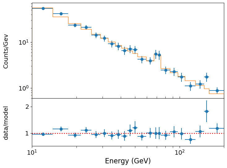
Now we can assess the significance of the improvement using Wilks’ theorem. We can see that the fit has improved by allowing the line flux to be non-zero, with the chi-squared dropping from 20.65 to 14.43, i.e. \(\Delta \chi^{2}\), measured from subtracting the worse (higher) value from the better one, is 6.22. Is this a significant improvement?
One important question here is: what is the number of additional free parameters? Wilks’ theorem tells us that the \(\Delta \chi^{2}\) in going from a less constrained model to a more constrained one is itself distributed as \(\chi^{2}_{m}\) where \(m\) is the number of additional constraints in the more constrained model (or equivalently, the number of additional free parameters in the less constrained model). In our case, it seems like \(m=3\), but for an emission line we should be careful: the line energy is not really a ‘nestable’ model parameter because the likelihood does not smoothly change if we change the position of such a sharp feature. The line width might be considered as a parameter, but often is limited by the resolution of the instrument which applies a significant lower bound, also making the likelihood ratio approach unsuitable. Therefore for simplicity here it is better to do the test assuming only the flux as the additional constraint, i.e. the null hypothesis is for flux = 0.
Thus, we have a \(\chi^{2}_{1}\) distribution and we can estimate the significance of our improvement as follows:
# result.chisqr is the chi-squared value from the previous fit with only the power-law
deltachisq = result.chisqr-result_withgaussian.chisqr
print("p-value for our delta-chi-squared: ",sps.chi2.sf(deltachisq,df=1))
p-value for our delta-chi-squared: 0.01263151128225959
The Bonferroni correction
The significance for the possible emission line above is not very impressive! Furthermore, we haven’t allowed for the fact that in this case we did not expect to find a line at this energy a priori - we only saw there was a possible feature there a posteriori, i.e. ‘after the fact’. A crude way to correct for this is to allow for the number of ‘hidden’ trials that we effectively conducted by searching across the residuals by eye for a line-like feature. Then we ask the question ‘if I carried out \(n\) trials, what is the chance I would find the observed \(p\)-value by chance in at least one trial?’. In probability terms, this is the complement of the question ‘what is the chance that I would see no \(p\)-value of this magnitude or smaller in \(n\) trials?’. To answer this question, we just consider a Binomial probability with \(\theta=p\), \(n=20\) trials and \(x=0\) successes:
\[p(0|n,\theta) = (1-\theta)^{n} = (1-0.01314)^{20} \simeq 0.77\]Here we have estimated the effective number of trials, which we take to be the ratio of the logarithmic range of energies observed divided by the approximate logarithmic energy width of the possible line feature, which spans a couple of bins. The chance that we would see at least 1 success (\(p< 0.01314\)) in the resulting 20 trials is then 0.23, i.e. much less significant than our already not-impressive \(p=0.013\).
Thus we conclude that the apparent emission feature at ~70 GeV is not significant. Note that if we were even more conservative and assumed \(k=2\) or 3 for our constraints, our \(p\)-value would be even larger and therefore even less significant.
The correction for the number of trials described above is known as a Bonferroni correction - the estimate of the number of trials seems a bit hand-wavy here, based on a heuristic which is somewhat subjective. In Bayesian terms, we can deal with this question (and its subjectivity) more rigorously, including the use of the prior (which represents our uncertainty over where any line can be located). The Bayesian approach is beyond the scope of this course, but an introduction can be found in Chapter 4 of Sivia’s book.
Relation to errors and limits: upper limit on an emission line normalisation
Confidence intervals and upper or lower limits can be thought of as the model calculated for a fixed parameter value, such that the best-fit becomes significantly improved vs. the constrained fit at the confidence interval or limit boundary. In this way, we can interpret confidence intervals and upper and lower limits in the language of hypothesis testing and think of the model evaluated at the interval/limit bounds as the contrained null hypothesis with \(m\) fewer free parameters than the alternative best-fitting model, where \(m\) is the dimensionality required for the confidence region. Thus we obtain our result from the previous episode, of using the change in \(\chi^{2}\) statistic or \(L\) to define confidence intervals/regions.
Let’s imagine that our \(\gamma\)-ray photon data arises from an extreme cosmic explosion like a gamma-ray burst, and that a model predicts that we should see a Gaussian emission line appearing in our spectrum at \(E_{\rm line}=33.1\) GeV, with Gaussian width \(\sigma=5\) GeV. There doesn’t appear to be feature there in our spectrum, but the line flux (i.e. normalisation) is not specified by the model, so it is an adjustable parameter which our data can constrain. What is the 3-\(\sigma\) upper limit on the line flux?
For this task we can repurpose the functions grid1d_chisqmin and calc_error_chisq, defined in the previous episode in order to calculate exact confidence intervals from the \(\chi^{2}\) statistics calculated for a grid of parameter values. For 1 constrained parameter (i.e. 1 degree of freedom) and a 3-\(\sigma\) upper limit, we need to find when \(\chi^{2}\) has changed (relative to the \(\chi^{2}\) for zero line flux) by \(\Delta \chi^{2}=3^{2}=9\). This was an easy calculation by hand, but with scipy.stats distributions you can also use the inverse survival function which is the survival-function equivalent of the ppf (which is the inverse cdf), e.g. try:
print(sps.chi2.isf(2*sps.norm.sf(3),df=1))
Now the modified versions of the functions. The calc_error_chisq function is modified to calculate only the upper value of an interval, consistent with an upper limit.
def grid1d_binchisqmin(a_name,a_range,a_steps,parm,model,xdata,ydata,yerrs):
    '''Uses lmfit. Finds best the fit and then carries out chisq minimisation for a 1D grid of fixed
       parameters, but using a binned model suitable for binned counts data
       Input:
            a_name - string, name of 'a' parameter (in input Parameters object parm) to use for grid.
            a_range, a_steps - range (tuple or list) and number of steps for grid.
            parm - lmfit Parameters object for model to be fitted.
            model - name of model function to be fitted.
            xdata, ydata, yerrs - lists of data x, y and y-error arrays (as for the lmf_lsq_resid function)
        Output:
            a_best - best-fitting value for 'a'
            minchisq - minimum chi-squared (for a_best)
            a_grid - grid of 'a' values used to obtain fits
            chisq_grid - grid of chi-squared values corresponding to a_grid'''
    a_grid = np.linspace(a_range[0],a_range[1],a_steps)
    chisq_grid = np.zeros(len(a_grid))
    # First obtain best-fitting value for 'a' and corresponding chi-squared
    set_function = Minimizer(lmf_lsq_binresid, parm, fcn_args=(xdata, ydata, yerrs, model, True),
                             nan_policy='omit')
    result = set_function.minimize(method = 'leastsq')
    minchisq = result.chisqr
    a_best = result.params.valuesdict()[a_name]
    # Now fit for each 'a' in the grid, to do so we use the .add() method for the Parameters object
    # to replace the value of a_name with the value for the grid, setting vary=False to freeze it
    # so it cannot vary in the fit (only the other parameters will be left to vary)
    for i, a_val in enumerate(a_grid):
        parm.add(a_name,value=a_val,vary=False)
        set_function = Minimizer(lmf_lsq_binresid, parm, fcn_args=(xdata, ydata, yerrs, model, True),
                                                                nan_policy='omit')
        result = set_function.minimize(method = 'leastsq')
        chisq_grid[i] = result.chisqr

    return a_best, minchisq, a_grid, chisq_grid

def calc_upper_chisq(delchisq,minchisq,a_grid,chisq_grid):
    '''Function to return upper values of a parameter 'a' for a given delta-chi-squared
       Input:
           delchisq - the delta-chi-squared for the confidence interval required (e.g. 1 for 1-sigma error)
           a_grid, chisq_grid - grid of 'a' and corresponding chi-squared values used for interpolation'''
    # First interpolate over the grid for values > a_best and find upper interval bound
    chisq_interp_upper = spinterp.interp1d(chisq_grid,a_grid)
    a_upper = chisq_interp_upper(minchisq+delchisq)
    return a_upper
Now we can run the grid search to find the upper limit. However, we need to bear in mind that we must keep the Gaussian feature mean energy and width \(\sigma\) fixed at the stated values for these fits!:
# First we set up the parameters for the search. Remember we want to find the upper-limit
# on Gaussian normalisation at a fixed Gaussian mean energy and sigma, so we need to
# set the `vary` argument for those two parameters to be False, to keep them fixed.
fixed_en = 33.1
fixed_sig = 5.0
params = Parameters()
params.add_many(('N',2500),('gamma',-1.5),('N_gauss',0),
                ('gauss_mu',fixed_en,False),('gauss_sig',fixed_sig,False))

# Now set up the parameter to be stepped over for the upper-limit search
a_range = [0,40]
a_name = 'N_gauss'
n_steps = 100

# Run the grid calculation
a_best, minchisq, a_grid, chisq_grid = grid1d_binchisqmin(a_name,a_range,n_steps,params,model,
                             xdata,ydata,yerrs)

# Now give the output
delchisq = 9
a_upper = calc_upper_chisq(delchisq,minchisq,a_grid,chisq_grid)
print("Best-fitting line flux = ",a_best,"for chisq = ",minchisq)
print("3-sigma upper limit on line flux: ", a_upper,"for chisq = ",minchisq+delchisq)
Best-fitting line flux =  -13.534821277620663 for chisq =  19.869492823618017
3-sigma upper limit on line flux:  32.3673655153036 for chisq =  28.869492823618017
Note that for a meaningful 3-\(\sigma\) upper limit according to Wilks’ theorem, we must compare with the best-fit (the alternative hypothesis) even if the best-fitting line flux is non-zero, and since it is an upper limit and not an interval, we just state the absolute value of the flux not the difference from the best-fitting value.
We can also plot our grid to check that everything has worked okay and that there is a smooth variation of the \(\Delta \chi^{2}\) with the line flux. We also show the location for \(\Delta \chi^{2}\) on the plot (the corresponding line flux is \(32.4\) counts).
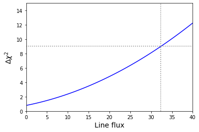
Fitting multiple datasets: are the MLEs different?
It can be common that we have multiple datasets that we want to fit the same model to. Perhaps these are the spectra of a sample of some type of astronomical objects, or perhaps the same object but observed at different times. Or perhaps we have data from repeated experiments to make the same measurements. Fitting multiple datasets can give us better constraints on our model parameters.
But it can also happen that we want to look for differences between our datasets which may give us new insights. For example, we may want to see if astronomical source spectra are different in ways which may correlate with other source properties. Or perhaps we want to see if spectra from a single source varies over time. Or maybe we ran our experiment multiple times with different settings and we want to see if there is an effect on our data. In these cases, it is useful to work out whether the MLEs for each dataset are consistent with being the same or whether they are different for different datasets. This is a type of hypothesis test and we can use the change in \(\chi^{2}\) statistic or \(L\) when we ‘tie together’ or ‘free’ some of the model parameters used to fit each dataset.
For simultaneous fitting of multiple datasets we can input our data using the list format we already applied for our lmfit objective function in this and previous episodes. This time each list for xdata, ydata and yerrs will contain the corresponding data for multiple datasets. For this example of spectral fitting of (imagined) gamma ray spectra, we use the three photon events data files named spec1.txt, spec2.txt and spec3.txt (see here). Our loop over the photon data files reads them in, rebins them so we can use weighted least squares fitting (this is possible due to the high photon counts) and then assigns the binned data and errors to our lmfit dataset arrays:
emin, emax = 10., 200.   # We should always use the known values that the data are sampled over
                         # for the range used for the bins!
nbins = 50
# And now we use our new function to rebin so there are at least mincounts counts per bin:
mincounts = 20  # Here we set it to our minimum requirement of 20, but in principle you could set it higher

xdata = []  # We create empty lists to assign our binned spectra to lists for lmfit to fit them together
ydata = []
yerrs = []
files = ['spec1.txt','spec2.txt','spec3.txt']
for file in files:
    #  First read in the data.  This is a simple (single-column) list of energies:
    photens = np.genfromtxt(file)
    counts, edges = np.histogram(photens, bins=nbins, range=[emin,emax], density=False)
    counts2, edges2 = histrebin(mincounts,counts,edges)
    bwidths = np.diff(edges2) # calculates the width of each bin
    cdens = counts2/bwidths # determines the count densities
    cdens_err = np.sqrt(counts2)/bwidths # calculate the errors: remember the error is based on the counts,
    # not the count density, so we have to also apply the same normalisation.
    xdata.append(edges2) # Now assign to our lists for lmfit
    ydata.append(cdens)
    yerrs.append(cdens_err)
We can plot the resulting binned spectra, which confirms that they have power-law shapes that are similar to one another, albeit with different normalisations.
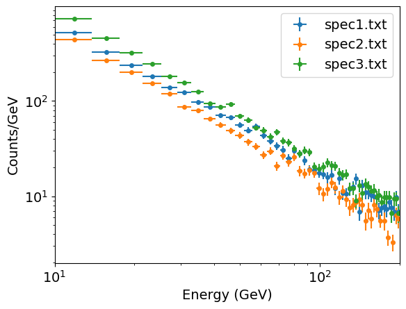
For fitting multiple datasets we need to modify our objective function as well as the function used to bin the model (since we are fitting binned data), so that we can tell the model which dataset to consider for which parameters. The reason for this is that lmfit requires a single Parameters object as input to the objective function which is minimized. Therefore if we fit multiple spectra simultaneously and wish to allow the model parameter values to be different for different spectra, we need to include the parameters for each spectrum separately in our Parameters object and then provide a way for the objective function to determine which parameters to use. Note that if we wished to fit the same model parameter values to all datasets (which may be preferred in some cases, e.g. where we have good reason to think they should be the same), we can use our original function definitions for this purpose (since they are also designed to be able to handle a list of datasets, but will fit all with the same model parameter values).
To proceed, we make a small modification to our objective function and model binning function which includes as an argument an index for the dataset (i.e. in this case, spectrum) we are using:
def model_bin_mult(xbins, model, i_data, params):
    '''General function for integrating the input model over bins defined by contiguous (no gaps)
        bin edges, xbins.
       Inputs:
           xbins - x bin edges.
           i_data - the dataset being considered (determines which parameters to use in the model)
           model, params - the model name and associated Parameters object.
       Outputs:
           ymod - calculated counts-density model values for y-axis.'''
    i = 0
    ymod = np.zeros(len(xbins)-1)
    for i, xval in enumerate(xbins[:-1]):
        ymod[i], ymoderr = spint.quad(lambda x: model(x, i_data, params),xbins[i],xbins[i+1])
        ymod[i] = ymod[i]/(xbins[i+1]-xbins[i])  # we now divide by the bin width to match the counts density
        # units of our data
    return ymod

def lmf_lsq_binresid_mult(params,xdata,ydata,yerrs,model,output_resid=True):
    '''lmfit objective function to calculate and return residual array or model y-values for
        binned data where the xdata are the input bin edges and ydata are the densities (integral over bin
        divided by bin width).
        Inputs: params - name of lmfit Parameters object set up for the fit.
                xdata, ydata, yerrs - lists of 1-D arrays of x (must be bin edges not bin centres)
                and y data and y-errors to be fitted.
                    E.g. for 2 data sets to be fitted simultaneously:
                        xdata = [x1,x2], ydata = [y1,y2], yerrs = [err1,err2], where x1, y1, err1
                        and x2, y2, err2 are the 'data', sets of 1-d arrays of length n1 (n1+1 for x2
                        since it is bin edges), n2 (n2+1 for x2) respectively,
                        where n1 does not need to equal n2.
                    Note that a single data set should also be given via a list, i.e. xdata = [x1],...
                model - the name of the model function to be used (must take params as its input params and
                        return the model y-value array for a given x-value array).
                output_resid - Boolean set to True if the lmfit objective function (residuals) is
                        required output, otherwise a list of model y-value arrays (corresponding to the
                        input x-data list) is returned.
        Output: if output_resid==True, returns a residual array of (y_i-y_model(x_i))/yerr_i which is
            concatenated into a single array for all input data errors (i.e. length is n1+n2 in
            the example above). If output_resid==False, returns a list of y-model arrays (one per input x-array)'''
    if output_resid == True:
        for i, xvals in enumerate(xdata):  # loop through each input dataset and record residual array
                     # Note that we identify the dataset by counting from 1 not 0, this is just the
                    # standard we will use for naming the parameters.
            if i == 0:
                resid = (ydata[i]-model_bin_mult(xdata[i],model,i+1,params))/yerrs[i]
            else:
                resid = np.append(resid,(ydata[i]-model_bin_mult(xdata[i],model,i+1,params))/yerrs[i])
        return resid
    else:
        ymodel = []
        for i, xvals in enumerate(xdata): # record list of model y-value arrays, one per input dataset
            ymodel.append(model_bin_mult(xdata[i],model,i+1,params))
        return ymodel
Next we define our power-law model so it contains multiple parameters. By using the input dataset index in parameter name we can make this function generic for simultaneous fitting of any number of datasets.
def pl_model_mult(x, i_data, params):
    '''Simple power-law function to fit multiple datasets.
       Inputs:
           x - input x value(s) (can be list or single value).
           i_data - Index of dataset
           params - lmfit Parameters object: PL normalisation (at x = 1) and power-law index.'''
    v = params.valuesdict()
    return v['N_'+str(i_data)] * x**v['gamma_'+str(i_data)]
We now set up our lmfit Parameters object. We can already see that the normalisations of our power-laws are clearly different, but the power-law indices (so-called photon index \(\Gamma\)) look similar. Are they the same or not? To test this idea we first try our null hypothesis where the three fitted power-law indices are tied together so that the same value is used for all of them and allowed to vary to find its MLE. To ‘tie together’ the power-law indices we need to consider some of the other properties of the corresponding Parameter: we set vary=True and we also use the expr property, for which we must give a mathematical expression (without the preceding equals sign) in the form of a string. expr forces the parameter to take the value given by expr which allows us to set parameters to values calculated with the mathematical expression, including functions of the other parameters. To set the parameter to be equal to the another parameter, we can just give that parameter name as the expression:
params = Parameters()
params.add_many(('N_1',2500),('gamma_1',-1.5,True),
                ('N_2',2500),('gamma_2',-1.5,True,None,None,'gamma_1'), # We must specifiy all properties up to `gamma_1`,
                # here using None except for vary which we set to True.
                ('N_3',2500),('gamma_3',-1.5,True,None,None,'gamma_1'))
Now we are ready to fit our null hypothesis of a single photon index (but different normalisations) for all three spectra.
model = pl_model_mult
output_resid = True
set_function = Minimizer(lmf_lsq_binresid_mult, params, fcn_args=(xdata, ydata, yerrs, model, output_resid),nan_policy='omit')
result_null = set_function.minimize(method = 'leastsq')
report_fit(result_null)
print("Minimum Chi-squared = "+str(result_null.chisqr)+" for "+str(result_null.nfree)+" d.o.f.")
print("The goodness of fit is: ",sps.chi2.sf(result_null.chisqr,df=result_null.nfree))
[[Fit Statistics]]
    # fitting method   = leastsq
    # function evals   = 53
    # data points      = 147
    # variables        = 4
    chi-square         = 180.133178
    reduced chi-square = 1.25967257
    Akaike info crit   = 37.8797884
    Bayesian info crit = 49.8415188
[[Variables]]
    N_1:      28046.3749 +/- 818.363220 (2.92%) (init = 2500)
    gamma_1: -1.60080260 +/- 0.00804811 (0.50%) (init = -1.5)
    N_2:      22411.0523 +/- 674.301381 (3.01%) (init = 2500)
    gamma_2: -1.60080260 +/- 0.00804811 (0.50%) == 'gamma_1'
    N_3:      36682.3746 +/- 1065.10145 (2.90%) (init = 2500)
    gamma_3: -1.60080260 +/- 0.00804811 (0.50%) == 'gamma_1'
[[Correlations]] (unreported correlations are < 0.100)
    C(gamma_1, N_3) = -0.940
    C(N_1, gamma_1) = -0.921
    C(gamma_1, N_2) = -0.907
    C(N_1, N_3)     = 0.866
    C(N_2, N_3)     = 0.852
    C(N_1, N_2)     = 0.835
Minimum Chi-squared = 180.13317771619816 for 143 d.o.f.
The goodness of fit is:  0.019284359760601277
The fit finds that a power-law index of \(\simeq -1.6\) can best fit the data if a single value is assumed for all three spectra. The fit isn’t great but it’s not terrible either (from the goodness-of-fit, the model is ruled out with less than 3-\(\sigma\) significance). We can plot our spectra vs. the model, and the residuals, to see if there are any systematic deviations from the model. First we define a handy plotting function for plotting data vs. model comparisons for multiple spectra, which also allows different options for the data vs. model residuals:
def plot_spec_model_mult(ebins_list,cdens_list,cdens_err_list,cdens_model_list,emin,emax,resid_type,
                         legend_labels):
    '''Plot the binned (GeV) spectrum with the model as a histogram, and
       data/model residuals.
       Inputs:
           ebins_list - energy bin edges.
           cdens_list, cdens_err_list - counts density and its error.
           cdens_model_list - model counts density.
           emin, emax - minimum and maximum energy to be plotted
           resid_type - string, type of data vs model residuals, these can be:
               ratio: data/model, resid: data-model, weighted resid: data-model/error
           legend_labels - list of labels for each dataset to use in legend,
                   use None if no legend required'''

    fig, (ax1, ax2) = plt.subplots(2,1, figsize=(8,6),sharex=True,gridspec_kw={'height_ratios':[2,1]})
    fig.subplots_adjust(hspace=0)
    for i,ebins in enumerate(ebins_list):
        energies = (ebins[1:]+ebins[:-1])/2
        bwidths = np.diff(ebins)
        if legend_labels != None:
            label_txt = legend_labels[i]
        # Note that colours in the default Matplotlib colour cycle can be specified using strings
        # 'C0'..'C9', which is useful for plotting the same colours for model and data.
        ax1.errorbar(energies, cdens_list[i], xerr=bwidths/2., yerr=cdens_err_list[i],
                     color='C'+str(i), markersize=4, fmt='o', label=label_txt)
        model_hist, edges, patches = ax1.hist(energies, bins=ebins, weights=cdens_model_list[i],
                    density=False, histtype='step', color='C'+str(i), alpha=0.5,
                                              linestyle='dotted', linewidth=2)
        if resid_type == 'ratio':
            ax2.errorbar(energies, cdens_list[i]/cdens_model_list[i], xerr=bwidths/2.,
                    yerr=cdens_err_list[i]/cdens_model_list[i], color='C'+str(i), markersize=4, fmt='o')
        elif resid_type == 'resid':
            ax2.errorbar(energies, (cdens_list[i]-cdens_model_list[i]), xerr=bwidths/2.,
                    yerr=cdens_err_list[i], color='C'+str(i), markersize=4, fmt='o')
        elif resid_type == 'weighted resid':
            ax2.errorbar(energies, (cdens_list[i]-cdens_model_list[i])/cdens_err_list[i], xerr=bwidths/2.,
                    yerr=1.0, color='C'+str(i), markersize=4, fmt='o')
    ax2.set_xlabel("Energy (GeV)", fontsize=14)
    ax1.set_ylabel("Counts/Gev", fontsize=14)
    ax1.get_yaxis().set_label_coords(-0.12,0.5)
    ax2.get_yaxis().set_label_coords(-0.12,0.5)
    if resid_type == 'ratio':
        ax2.set_ylabel("data/model", fontsize=14)
        ax2.axhline(1., color='gray', linestyle='dotted', lw=2)
    elif resid_type == 'resid':
        ax2.set_ylabel("data-model", fontsize=14)
        ax2.axhline(0., color='gray', linestyle='dotted', lw=2)
    elif resid_type == 'weighted resid':
        ax2.get_yaxis().set_label_coords(-0.09,0.5)
        ax2.set_ylabel(r"$\frac{data-model}{error}$", fontsize=16)
        ax2.axhline(0., color='gray', linestyle='dotted', lw=2)
    ax1.tick_params(labelsize=14)
    ax1.tick_params(axis="x",direction="in",which="both", length=4)
    ax2.tick_params(axis="x",which="both", length=4)
    ax2.tick_params(labelsize=14)
    ax1.set_yscale('log')
    ax1.set_xscale('log')
    ax2.set_xscale('log')
    ax2.set_xlim(emin,emax) # Strictly speaking we should only show the energy range
    # where data is sampled, to avoid impression from model that the flux suddenly drops
    # at the boundaries.
    ax1.legend(fontsize=14)
    plt.show()
Now we plot our data vs. model comparison.
# To calculate the best-fitting model values, use the parameters of the best fit output
# from the fit, result.params and set output_resid=false to output a list of model y-values:
model_vals = lmf_lsq_binresid_mult(result_null.params,xdata,ydata,yerrs,model,output_resid=False)
# Now plot the data and model and residuals
legend_labels = files
plot_spec_model_mult(xdata,ydata,yerrs,model_vals,10,200,'weighted resid',legend_labels)
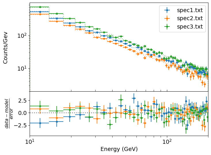
For our plot we choose to show the weighted residuals, i.e. (data-model)/error, since the differences are quite small and if we plot the data/model ratio or the data-model residuals the plot scale is driven by either the high energy or low energy parts of the spectra respectively, such that we cannot easily see deviations across the full energy range. With this plot we can see some small but systematic differences in the weighted residuals for spectrum 1 vs the other spectra, which may indicated a flatter spectrum (i.e. less negative index) for that dataset.
We can now see whether there are significant differences in the power-law index between the three spectra, by relaxing our constraint which ties the three index values together, so that they are free to vary independently in the fit. To do this we replace our parameters with the default values (free to vary and with mathematical expression to constrain them), and fit again:
params.add_many(('N_1',2500),('gamma_1',-1.5),
                ('N_2',2500),('gamma_2',-1.5),
                ('N_3',2500),('gamma_3',-1.5))

model = pl_model_mult
output_resid = True
set_function = Minimizer(lmf_lsq_binresid_mult, params, fcn_args=(xdata, ydata, yerrs, model, output_resid),nan_policy='omit')
result = set_function.minimize(method = 'leastsq')
report_fit(result_altern)
print("Minimum Chi-squared = "+str(result_altern.chisqr)+" for "+str(result_altern.nfree)+" d.o.f.")
print("The goodness of fit is: ",sps.chi2.sf(result_altern.chisqr,df=result_altern.nfree))
We show here only part of the results, for brevity:
[[Variables]]
    N_1:      23457.2880 +/- 1069.88979 (4.56%) (init = 2500)
    gamma_1: -1.54756853 +/- 0.01301848 (0.84%) (init = -1.5)
    N_2:      24235.3503 +/- 1237.64629 (5.11%) (init = 2500)
    gamma_2: -1.62394581 +/- 0.01479000 (0.91%) (init = -1.5)
    N_3:      40046.3917 +/- 1610.95889 (4.02%) (init = 2500)
    gamma_3: -1.62674743 +/- 0.01166195 (0.72%) (init = -1.5)
[[Correlations]] (unreported correlations are < 0.100)
    C(N_3, gamma_3) = -0.973
    C(N_2, gamma_2) = -0.973
    C(N_1, gamma_1) = -0.973
Minimum Chi-squared = 154.01314423376198 for 141 d.o.f.
The goodness of fit is:  0.2142664317881377
Our new fit finds that the fit has improved (goodness-of-fit now 0.21) with gamma_1 less negative than gamma_2 and gamma_3, as we suspected from the data vs. model residuals of our previous fit. But is this change formally significant? How sure can we be that the data require that the power-law index is different between the spectra?
To do this test we look at the change in chi-squared (to use the colloquial term for the weighted least squares statistic) between our null hypothesis (with constrained power-law index) and our alternative, with that constraint removed. We also need to account for the change in the number of constraints, i.e. our degrees of freedom. In our null hypothesis we had two constraints for the index which we relaxed. So according to Wilks’ theorem, if the null hypothesis is correct and the improvement with the alternative is just due to chance, the improvement \(\Delta \chi^{2}\) should be distributed as \(\chi^{2}_{m}\) where \(m=2\). Let’s take a look:
m = result_null.nfree-result_altern.nfree
deltachisq = result_null.chisqr-result_altern.chisqr
print("p-value for our delta-chi-squared: ",sps.chi2.sf(deltachisq,df=m),"for",m,"fewer constraints.")
p-value for our delta-chi-squared: 2.1286624330119402e-06 for 2 fewer constraints.
Which means the improvement is significant at better than 4-\(\sigma\) significance (actually 4.74-\(\sigma\)). This is more than acceptable for spectral comparisons (unless the difference would imply something really important, like the discovery of a new particle or physical effect), so we can state that the data are consistent with the spectra (at least spectrum 1 vs spectra 2 and 3) having different power-law indices.
If we want to test whether spectra 2 and 3 also have different indices from each other, we can go further and compare the situation with all indices free to vary with that where the indices for spectra 2 and 3 are tied to be the same, but the index for spectrum 1 is allowed to be different. I.e. we edit the Parameters object and run our fit as follows:
params.add_many(('N_1',2500),('gamma_1',-1.5),
                ('N_2',2500),('gamma_2',-1.5),
                ('N_3',2500),('gamma_3',-1.5,True,None,None,'gamma_2'))

model = pl_model_mult
output_resid = True
set_function = Minimizer(lmf_lsq_binresid_mult, params, fcn_args=(xdata, ydata, yerrs, model, output_resid),nan_policy='omit')
result_altern2 = set_function.minimize(method = 'leastsq')
report_fit(result_altern2)
print("Minimum Chi-squared = "+str(result_altern2.chisqr)+" for "+str(result_altern2.nfree)+" d.o.f.")
print("The goodness of fit is: ",sps.chi2.sf(result_altern2.chisqr,df=result_altern2.nfree))
# note that our new fit is the new null, since it has the most constraints
m = result_altern2.nfree-result_altern.nfree
deltachisq = result_altern2.chisqr-result_altern.chisqr
print("p-value for our delta-chi-squared: ",sps.chi2.sf(deltachisq,df=m),"for",m,"fewer constraints.")
[[Variables]]
    N_1:      23457.2870 +/- 1066.20685 (4.55%) (init = 2500)
    gamma_1: -1.54756851 +/- 0.01297362 (0.84%) (init = -1.5)
    N_2:      24375.5752 +/- 800.070733 (3.28%) (init = 2500)
    gamma_2: -1.62566426 +/- 0.00912604 (0.56%) (init = -1.5)
    N_3:      39900.9893 +/- 1277.00511 (3.20%) (init = 2500)
    gamma_3: -1.62566426 +/- 0.00912604 (0.56%) == 'gamma_2'
[[Correlations]] (unreported correlations are < 0.100)
    C(N_1, gamma_1) = -0.973
    C(gamma_2, N_3) = -0.958
    C(N_2, gamma_2) = -0.933
    C(N_2, N_3)     = 0.894
Minimum Chi-squared = 154.0375075024773 for 142 d.o.f.
The goodness of fit is:  0.23136639609523538
p-value for our delta-chi-squared:  0.8759641494768704 for 1 fewer constraints.
Now we see that the \(p\)-value is high and so there is no significant improvement in the fit from allowing the power-law indices of spectra 2 and 3 to be different from one another. I.e. our final conclusion should be that spectrum 1 has a different power-law index to spectra 2 and 3, but the latter two datasets are consistent with having the same power-law index.
It’s useful to note also that although the chi-squared value has increased slightly, the goodness-of-fit has actually improved because of adding this extra constraint between the spectral indices of spectra 2 and 3. This shows that improvements in the goodness-of-fit can happen not just because of smaller chi-squared but also because we reduce the freedom of our model to fit the data, so that if the quality of fit stays the same or only gets very slightly worse despite that reduction in freedom to fit, we can consider that an improvement in the consistency of the model with data. If the data can be fitted with a simpler (i.e. fewer free parameters) model without a significant reduction in fit quality, we should (usually) favour the simpler model.
Programming challenge: constraining spectral features
A particle accelerator experiment gives (after cleaning the data of known particle events) a set of measured event energies (in GeV) contained in the file
\[N_{\rm cont}(E)=N_{0}E^{-\Gamma} \exp(-E⁄E_{\rm cut})\]event_energies.txt. The detector detects events with energies in the range 20 to 300 GeV and the background events produce a continuum spectrum which follows an exponentially cut-off power-law shape:where \(N_{\rm cont}(E)\) is the number of continuum photons per GeV at energy \(E\) GeV. The normalisation \(N_{0}\), power-law index \(\Gamma\) and cut-off energy \(E_{\rm cut}\) (in GeV) are parameters to be determined from the data. Besides the background spectrum, a newly-discovered particle which is under investigation produces an additional feature in the spectrum somewhere between 80-85 GeV, with a Gaussian profile:
\[N_{\rm Gauss}(E)=\frac{N_{\rm total}}{\sigma\sqrt{2\pi}} \exp\left(-(E-E_{\rm cent})^{2}/(2\sigma^{2})\right)\]Where \(N_{\rm Gauss}(E)\) is the number of photons per GeV in the Gaussian feature, at energy \(E\) GeV. \(N_{\rm total}\) is a normalisation corresponding to the (expected) total number of photons in the feature, \(E_{\rm cent}\) is the Gaussian centroid energy and \(\sigma\) is the Gaussian width (i.e. standard deviation). The \(\sigma\) of the Gaussian feature can be assumed to be fixed at the instrument resolution, which is 1.3 GeV and is the same at all energies.
- a) Calculate and plot (with appropriate axes and in appropriate units) a histogram of the event spectrum and then fit the continuum-only model to the data. Use the data/model ratio to identify the possible location(s) of any Gaussian features, including the known feature in the 80-85 GeV range.
- b) Now add a Gaussian profile to your continuum model to fit the feature in the 80-85 GeV range. Fit the new combined model and determine the continuum and Gaussian MLEs, their errors (use covariance matrix or 1-D grid search) and the model goodness of fit. Confirm that the Gaussian feature makes a significant improvement to the fit compared to the continuum-only model. Estimate what the significance of the line feature would be if you did not already know its expected energy range.
- c) Prof. Petra Biggs has proposed a theory that predicts that a new particle should produce a feature (also a Gaussian at the instrument resolution) at 144.0 GeV. Use your data to set 3-sigma upper limit on the normalization (in terms of expected number of events N_total) that can be produced by this particle.
Key Points
A choice between two hypotheses can be informed by the likelihood ratio, the ratio of posterior pdfs expressed as a function of the possible values of data, e.g. a test statistic.
Statistical significance is the chance that a given pre-specified value (or more extreme value) for a test statistic would be observed if the null hypothesis is true. Set as a significance level, it represents the chance of a false positive, where we would reject a true null hypothesis in favour of a false alternative.
When a significance level has been pre-specified, the statistical power of the test is the chance that something less extreme than the pre-specified test-statistic value would be observed if the alternative hypothesis is true. It represents the chance of rejecting a true alternative and accept a false null hypothesis, i.e. the chance of a false negative.
The Neyman-Pearson Lemma together with Wilks’ theorem show how the log-likelihood ratio between an alternative hypothesis and nested (i.e. with more parameter constraints) null hypothesis allows the statistical power of the comparison to be maximised for any given significance level.
Provided that the MLEs being considered in the alternative (fewer constraints) model are normally distributed, we can use the delta-log-likelihood or delta-chi-squared to compare the alternative with the more constrained null model.
The above approach can be used to calculate confidence intervals or upper/lower limits on parameters, determine whether additional model components are required and test which (if any) parameters are significantly different between multiple datasets.
For testing significance of narrow additive model components such as emission or absorption lines, only the line normalisation can be considered a nested parameter provided it is allowed to vary without constraints in the best fit. The significance should therefore be corrected using e.g. the Bonferroni correction, to account for the energy range searched over for the feature.