Looking at some univariate data: summary statistics and histograms
Overview
Teaching: 50 min
Exercises: 20 minQuestions
How do we visually present univariate data (relating to a single variable)?
How can we quantify the data distribution in a simple way?
Objectives
Learn to use numpy and matplotlib to load in and plot univariate data as histograms and rug plots.
Learn about simple sample statistics and how to calculate them with numpy.
We are going to start by using Numpy and Matplotlib’s plotting library.
import numpy as np
import matplotlib.pyplot as plt
First, let’s load some data. We’ll start with the Michelson speed-of-light measurements (called michelson.txt).
It’s important to understand the nature of the data before you read it in, so be sure to check this by looking at the data file itself (e.g. via a text editor or other file viewer) before loading it. For the speed-of-light data we see 4 columns. The 1st column is just an identifier (‘row number’) for the measurement. The 2nd column is the ‘run’ - the measurement within a particular experiment (an experiment consists of 20 measurements). The 4th column identifies the experiment number. The crucial measurement itself is the 3rd column - to save on digits this just lists the speed (in km/s) minus 299000, rounded to the nearest 10 km/s.
If the data is in a fairly clean array, this is easily achieved with numpy.genfromtxt (google it!). By setting the argument names=True we can read in the column names, which are assigned as field names to the resulting numpy structured data array.
We will use the field names of your input 2-D array to assign the data columns Run, Speed and Expt to separate 1-D arrays and print the three arrays to check them:
michelson = np.genfromtxt("michelson.txt",names=True)
print(michelson.shape) ## Prints shape of the array as a tuple
run = michelson['Run']
speed = michelson['Speed']
experiment = michelson['Expt']
print(run,speed,experiment)
(100,)
[ 1.  2.  3.  4.  5.  6.  7.  8.  9. 10. 11. 12. 13. 14. 15. 16. 17. 18.
 19. 20.  1.  2.  3.  4.  5.  6.  7.  8.  9. 10. 11. 12. 13. 14. 15. 16.
 17. 18. 19. 20.  1.  2.  3.  4.  5.  6.  7.  8.  9. 10. 11. 12. 13. 14.
 15. 16. 17. 18. 19. 20.  1.  2.  3.  4.  5.  6.  7.  8.  9. 10. 11. 12.
 13. 14. 15. 16. 17. 18. 19. 20.  1.  2.  3.  4.  5.  6.  7.  8.  9. 10.
 11. 12. 13. 14. 15. 16. 17. 18. 19. 20.] [ 850.  740.  900. 1070.  930.  850.  950.  980.  980.  880. 1000.  980.
  930.  650.  760.  810. 1000. 1000.  960.  960.  960.  940.  960.  940.
  880.  800.  850.  880.  900.  840.  830.  790.  810.  880.  880.  830.
  800.  790.  760.  800.  880.  880.  880.  860.  720.  720.  620.  860.
  970.  950.  880.  910.  850.  870.  840.  840.  850.  840.  840.  840.
  890.  810.  810.  820.  800.  770.  760.  740.  750.  760.  910.  920.
  890.  860.  880.  720.  840.  850.  850.  780.  890.  840.  780.  810.
  760.  810.  790.  810.  820.  850.  870.  870.  810.  740.  810.  940.
  950.  800.  810.  870.] [1. 1. 1. 1. 1. 1. 1. 1. 1. 1. 1. 1. 1. 1. 1. 1. 1. 1. 1. 1. 2. 2. 2. 2.
 2. 2. 2. 2. 2. 2. 2. 2. 2. 2. 2. 2. 2. 2. 2. 2. 3. 3. 3. 3. 3. 3. 3. 3.
 3. 3. 3. 3. 3. 3. 3. 3. 3. 3. 3. 3. 4. 4. 4. 4. 4. 4. 4. 4. 4. 4. 4. 4.
 4. 4. 4. 4. 4. 4. 4. 4. 5. 5. 5. 5. 5. 5. 5. 5. 5. 5. 5. 5. 5. 5. 5. 5.
 5. 5. 5. 5.]
The speed-of-light data given here are primarily univariate and continuous (although values are rounded to the nearest km/s). Additional information is provided in the form of the run and experiment number which may be used to screen and compare the data.
Data types and dimensions
Data can be categorised according to the type of data and also the number of dimensions (number of variables describing the data).
- Continuous data may take any value within a finite or infinite interval; e.g. the energy of a photon produced by a continuum emission process, the strength of a magnetic field or the luminosity of a star.
- Discrete data has numerical values which are distinct, most commonly integer values for counting something; e.g. the number of particles detected in a specified energy range and/or time interval, or the number of objects with a particular property (e.g. stars with luminosity in a certain range, or planets in a stellar system).
- Categorical data takes on non-numerical values, e.g. particle type (electron, pion, muon…).
- Ordinal data is a type of categorical data which can be given a relative ordering or ranking but where the actual differences between ranks are not known or explicitly given by the categories; e.g. questionnaires with numerical grading schemes such as strongly agree, agree…. strongly disagree. Astronomical classification schemes (e.g. types of star, A0, G2 etc.) are a form of ordinal data, although the categories may map on to some form of continuous data (e.g. stellar temperature).
In this course we will consider the analysis of continuous and discrete data types which are most common in the physical sciences, although categorical/ordinal data types may be used to select and compare different sub-sets of data.
Besides the data type, data may have different numbers of dimensions.
- Univariate data is described by only one variable (e.g. stellar temperature). Visually, it is often represented as a one-dimensional histogram.
- Bivariate data is described by two variables (e.g. stellar temperature and luminosity). Visually it is often represented as a set of co-ordinates on a 2-dimensional plane, i.e. a scatter plot.
- Multivariate data includes three or more variables (e.g. stellar temperature, luminosity, mass, distance etc.). Visually it can be difficult to represent, but colour or tone may be used to describe a 3rd dimension on a plot and it is possible to show interactive 3-D scatter plots which can be rotated to see all the dimensions clearly. Multivariate data can also be represented 2-dimensionally using a scatter plot matrix.
We will first consider univariate data, and explore statistical methods for bivariate and multivariate data later on.
Making and plotting histograms
Now the most important step: always plot your data!!!
It is possible to show univariate data as a series of points or lines along a single axis using a rug plot, but it is more common to plot a histogram, where the data values are assigned to and counted in fixed width bins. The bins are usually defined to be contiguous (i.e. touching, with no gaps between them), although bins may have values of zero if no data points fall in them.
The matplotlib.pyplot.hist function in matplotlib automatically produces a histogram plot and returns the edges and counts per bin. The bins argument specifies the number of histogram bins (10 by default), range allows the user to predefine a range over which the histogram will be made. If the density argument is set to True, the histogram counts will be normalised such that the integral over all bins is 1 (this turns your histogram units into those of a probability density function). For more information on the commands and their arguments, google them or type in the cell plt.hist?.
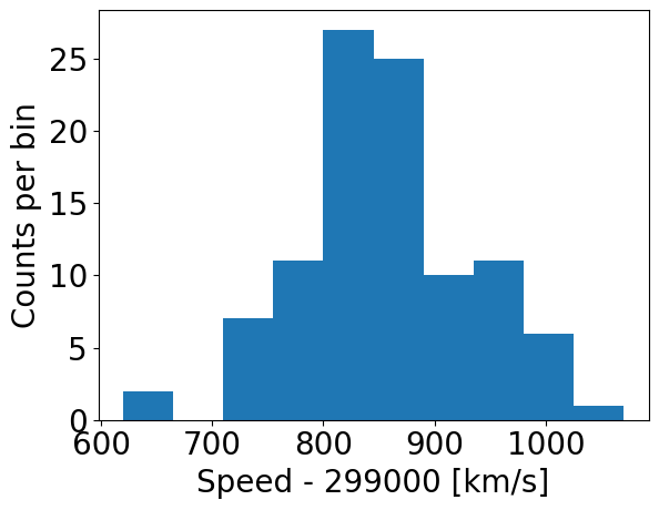
Now let’s try plotting the histogram of the data. When plotting, we should be sure to include clearly and appropriately labelled axes for this and any other figures we make, including correct units as necessary!
Note that it is important to make sure that your labels are easily readable by using the fontsize/labelsize arguments in the commands below. It is worth spending some time playing with the settings for making the histogram plots, to understand how you can change the plots to suit your preferences.
### First we use the matplotlib hist command, setting density=False:
## Set up plot window
plt.figure()
## Make and plot histogram (note that patches are matplotlib drawing objects)
counts, edges, patches = plt.hist(speed, bins=10, density=False)
plt.xlabel("Speed - 299000 [km/s]", fontsize=14)
plt.ylabel("Counts per bin", fontsize=14)
plt.tick_params(axis='x', labelsize=12)
plt.tick_params(axis='y', labelsize=12)
plt.show()

### And with density=True
plt.figure()
densities, edges, patches = plt.hist(speed, bins=10, density=True, histtype='step')
plt.xlabel("Speed - 299000 [km/s]", fontsize=14)
plt.ylabel("Density (km$^{-1}$ s)", fontsize=14)
plt.tick_params(axis='x', labelsize=12)
plt.tick_params(axis='y', labelsize=12)
plt.show()

### For demonstration purposes, check that the integral over densities add up to 1 (you don't normally need to do this!)
### We need to multiply the densities by the bin widths (the differences between adjacent edges) and sum the result.
print("Integrated densities =",np.sum(densities*(np.diff(edges))))
By using histtype='step' we can plot the histogram using lines and no colour fill (the default, corresponding to histtype='bar').
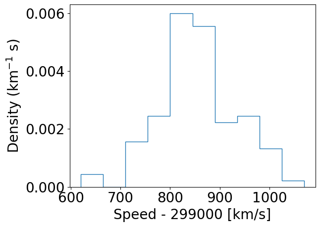
Integrated densities = 1.0
Note that there are 11 edges and 10 values for counts when 10 bins are chosen, because the edges define the upper and lower limits of the contiguous bins used to make the histogram. The bins argument of the histogram function is used to define the edges of the bins: if it is an integer, that is the number of equal-width bins which is used over range. The binning can also be chosen using various algorithms to optimise different aspects of the data, or specified in advance using a sequence of bin edge values, which can be used to allow non-uniform bin widths. For example, try remaking the plot using some custom binning below.
## First define the bin edges:
newbins=[600.,700.,750.,800.,850.,900.,950.,1000.,1100.]
## Now plot
plt.figure()
counts, edges, patches = plt.hist(speed, bins=newbins, density=False)
plt.xlabel("Speed - 299000 [km/s]", fontsize=20)
plt.ylabel("Counts per bin", fontsize=20)
plt.tick_params(axis='x', labelsize=20)
plt.tick_params(axis='y', labelsize=20)
plt.show()
Numpy also has a simple function, np.histogram to bin data into a histogram using similar function arguments to the matplotlib version. The numpy function also returns the edges and counts per bin. It is especially useful to bin univariate data, but for plotting purposes Matplotlib’s plt.hist command is better.
Plotting histograms with pre-assigned values
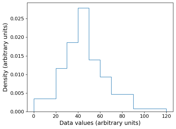
The matplotlib hist function is useful when we want to bin and plot data in one action, but sometimes we want to plot a histogram where the values are pre-assigned, e.g. from data already in the form of a histogram or where we have already binned our data using a separate function. There isn’t a separate function to do this in matplotlib, but it is easy to use the weights argument of hist to plot pre-assigned values, by using the following trick.
First, let’s define some data we have been given, in the form of bin edges and counts per bin:
counts = np.array([3,5,8,12,6,4,4,1])
bin_edges = np.array([0,20,30,40,50,60,70,90,120])
# We want to plot the histogram in units of density:
dens = counts/(np.diff(bin_edges)*np.sum(counts))
Now we trick hist by giving as input data a list of the bin centres, and as weights the input values we want to plot. This works because the weights are multiplied by the number of data values assigned to each bin, in this case one per bin (since we gave the bin centres as ‘dummy’ data), so we essentially just plot the weights we have given instead of the counts.
# Define the 'dummy' data values to be the bin centres, so each bin contains one value
dum_vals = (bin_edges[1:] + bin_edges[:-1])/2

plt.figure()
# Our histogram is already given as a density, so set density=False to switch calculation off
densities, edges, patches = plt.hist(dum_vals, bins=bin_edges, weights=dens, density=False, histtype='step')
plt.xlabel("Data values (arbitrary units)", fontsize=14)
plt.ylabel("Density (arbitrary units)", fontsize=14)
plt.tick_params(axis='x', labelsize=12)
plt.tick_params(axis='y', labelsize=12)
plt.show()
Combined rug plot and histogram
Going back to the speed of light data, the histogram covers quite a wide range of values, with a central peak and broad ‘wings’, This spread could indicate statistical error, i.e. experimental measurement error due to the intrinsic precision of the experiment, e.g. from random fluctuations in the equipment, the experimenter’s eyesight etc.
The actual speed of light in air is 299703 km/s. We can plot this on our histogram, and also add a ‘rug’ of vertical lines along the base of the plot to highlight the individual measurements and see if we can see any pattern in the scatter.
plt.figure()
# Make and plot histogram (note that patches are matplotlib drawing objects)
counts, edges, patches = plt.hist(speed, bins=10, density=False, histtype='step')

# We can plot the 'rug' using the x values and setting y to zero, with vertical lines for the
# markers and connecting lines switched off using linestyle='None'
plt.plot(speed, np.zeros(len(speed)), marker='|', ms=30, linestyle='None')

# Add a vertical dotted line at 703 km/s
plt.axvline(703,linestyle='dotted')

plt.xlabel("Speed - 299000 [km/s]", fontsize=14)
plt.ylabel("Counts per bin", fontsize=14)
plt.tick_params(axis='x', labelsize=12)
plt.tick_params(axis='y', labelsize=12)
plt.show()
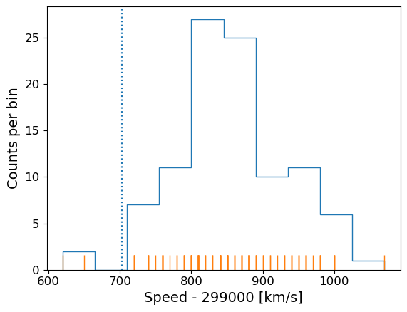
The rug plot shows no clear pattern other than the equal 10 km/s spacing between many data points that is imposed by the rounding of speed values. However, the data are quite far from the correct value. This could indicate a systematic error, e.g. due to an mistake in the experimental setup or a flaw in the apparatus. A final, more interesting possibility is that the speed of light itself has changed!
Statistical and systematic error
When experimental results or observations are presented you will often hear discussion of two kinds of error:
- statistical error is a random error, due for example to measurement errors (i.e. related to the precision of the measuring device) or intrinsic randomness in the quantities being measured (so that, by chance, the data sample may be more or less representative of the true distribution or properties). Statistical errors do not have a preferred direction (they may be positive or negative deviations from the ‘true’ values) although their distribution may not be symmetric (e.g. positive fluctuations may on average be larger than negative, or vice versa)
- systematic error is a non-random error in a particular direction. For example, a mistake or design-flaw in the experimental setup may lead to the measurement being systematically too large or too small. Or, when data are collected via observations, a bias in the way a sample is selected may lead to the distrbution of the measured quantity being distorted (e.g. selecting a sample of stellar colours on bright stars will preferentially select luminous ones which are hotter and therefore bluer, causing blue stars to be over-represented). Systematic errors have a preferred direction and since they are non-random, dealing with them requires good knowledge of the experiment or sample selection approach (and underlying population properties), rather than simple application of statistical methods (although statistical methods can help in the simulation and caliibration of systematic errors, and to determine if they are present in your data or not).
Asking questions about the data: hypotheses
At this point we might be curious about our data and what it is really telling us, and we can start asking questions, for example:
- Is the deviation from the known speed of light in air real, e.g. due to systematic error in the experiment or a real change in the speed of light(!), or can it just be down to bad luck with measurement errors pushing us to one side of the curve (i.e. the deviation is within expectations for statistical errors)?
This kind of question about data can be answered using statistical methods. The challenge is to frame the question into a form called a hypothesis to which a statistical test can be applied, which will either rule the hypothesis out or not. We can never say that a hypothesis is really true, only that it isn’t true, to some degree of confidence.
To see how this works, we first need to think how we can frame our questions in a more quantifiable way, using summary statistics for our data.
Summary statistics: quantifying data distributions
So far we have seen what the data looks like and that most of the data are distributed on one side of the true value of the speed of light in air. To make further progress we need to quantify the difference and then figure out how to say whether that difference is expected by chance (statistical error) or is due to some other underlying effect (in this case, systematic error since we don’t expect a real change in the speed of light!).
However, the data take on a range of values - they follow a distribution which we can approximate using the histogram. We call this the sample distribution, since our data can be thought of as a sample of measurements from a much larger set of potential measurements (known in statistical terms as the population). To compare with the expected value of the speed of the light it is useful to turn our data into a single number, reflecting the ‘typical’ value of the sample distribution.
We can start with the sample mean, often just called the mean:
\[\bar{x} = \frac{1}{n} \sum\limits_{i=1}^{n} x_{i}\]where our sample consists of \(n\) measurements \(x = x_{1}, x_{2}, ...x_{n}\).
It is also common to use a quantity called the median which corresponds to the ‘central’ value of \(x\) and is obtained by arranging \(x\) in numerical order and taking the middle value if \(n\) is an odd number. If \(n\) is even we take the average of the \((n/2)\)th and \((n/2+1)\)th ordered values.
Challenge: obtain the mean and median
Numpy has fast (C-based and Python-wrapped) implementation for most basic functions, among them the mean and median. Find and use these to calculate the mean and median for the speed values in the complete Michelson data set.
Solution
michelson_mn = np.mean(speed) + 299000 ## Mean speed with offset added back in
michelson_md = np.median(speed) + 299000 ## Median speed with offset added back in
print("Mean =",michelson_mn,"and median =",michelson_md)
Mean = 299852.4 and median = 299850.0
We can also define the mode, which is the most frequent value in the data distribution. This does not really make sense for continuous data (then it makes more sense to define the mode of the population rather than the sample), but one can do this for discrete data.
Challenge: find the mode
As shown by our rug plot, the speed-of-light data here is discrete in the sense that it is rounded to the nearest ten km/s. Numpy has a useful function
histogramfor finding the histogram of the data without plotting anything. Apart from the plotting arguments, it has the same arguments for calculating the histogram as matplotlib’shist. Use this (and another numpy functions) to find the mode of the speed of light measurements.Hint
You will find the numpy functions
amin,amaxandargmaxuseful for this challenge.Solution
# Calculate number of bins needed for each value to lie in the centre of
# a bin of 10 km/s width
nbins = ((np.amax(speed)+5)-(np.amin(speed)-5))/10
# To calculate the histogram we should specify the range argument to the min and max bin edges used above
counts, edges = np.histogram(speed,bins=int(nbins),range=(np.amin(speed)-5,np.amax(speed)+5))
# Now use argmax to find the index of the bin with the maximum counts and print the bin centre
i_max = np.argmax(counts)
print("Maximum counts for speed[",i_max,"] =",edges[i_max]+5.0)
Maximum counts for speed[ 19 ] = 810.0However, if we print out the counts, we see that there is another bin with the same number of counts!
[ 1  0  0  1  0  0  0  0  0  0  3  0  3  1  5  1  2  3  5 10  2  2  8  8
3  4 10  3  2  2  1  2  3  3  4  1  3  0  3  0  0  0  0  0  0  1]
If there is more than one maximum,
argmaxoutputs the index of the first occurence.Scipy provides a simpler way to obtain the mode of a data array:
## Remember that for scipy you need to import modules individually, you cannot
## simply use `import scipy`
import scipy.stats
print(scipy.stats.mode(speed))
ModeResult(mode=array([810.]), count=array([10]))I.e. the mode corresponds to value 810 with a total of 10 counts. Note that
scipy.stats.modealso returns only the first occurrence of multiple maxima.
The mean, median and mode(s) of our data are all larger than 299703 km/s by more than 100 km/s, but is this difference really significant? The answer will depend on how precise our measurements are, that is, how tightly clustered are they around the same values? If the precision of the measurements is low, we can have less confidence that the data are really measuring a different value to the true value.
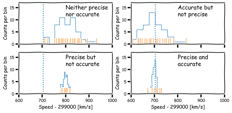
Precision and accuracy
In daily speech we usually take the words precision and accuracy to mean the same thing, but in statistics they have distinct meanings and you should be careful when you use them in a scientific context:
- Precision refers to the degree of random deviation, e.g. how broad a measured data distribution is.
- Accuracy refers to how much non-random deviation there is from the true value, i.e. how close the measured data are on average to the ‘true’ value of the quantity being measured.
In terms of errors, high precision corresponds to low statistical error (and vice versa) while high accuracy refers to low systematic error (or equivalently, low bias).
We will be be able to make statements comparing data with an expected value more quantitatively after a few more episodes, but for now it is useful to quantify the precision of our distribution in terms of its width. For this, we calculate a quantity known as the variance.
\[s_{x}^{2} = \frac{1}{n-1} \sum\limits_{i=1}^{n} (x_{i}-\bar{x})^{2}\]Variance is a squared quantity but we can convert to the standard deviation \(s_{x}\) by taking the square root:
\[s_{x} = \sqrt{\frac{1}{n-1} \sum\limits_{i=1}^{n} (x_{i}-\bar{x})^{2}}\]You can think of this as a measure of the ‘width’ of the distribution and thus an indication of the precision of the measurements.
Note that the sum to calculate variance (and standard deviation) is normalised by \(n-1\), not \(n\), unlike the mean. This is called Bessel’s correction and is a correction for bias in the calculation of sample variance compared to the ‘true’ population variance - we will see the origin of this in a couple of episodes time. The number subtracted from \(n\) (in this case, 1) is called the number of degrees of freedom.
Challenge: calculate variance and standard deviations
Numpy contains functions for both variance and standard deviation - find and use these to calculate these quantities for the speed data in the Michelson data set. Be sure to check and use the correct number of degrees of freedom (Bessel’s correction), as the default may not be what you want! Always check the documentation of any functions you use, to understand what the function does and what the default settings or assumptions are.
Solution
## The argument ddof sets the degrees of freedom which should be 1 here (for Bessel's correction)
michelson_var = np.var(speed, ddof=1)
michelson_std = np.std(speed, ddof=1)
print("Variance:",michelson_var,"and s.d.:",michelson_std)
Variance: 6242.666666666667 and s.d.: 79.01054781905178
Population versus sample
In frequentist approaches to statistics it is common to imagine that samples of data (that is, the actual measurements) are drawn from a much (even infinitely) larger population which follows a well-defined (if unknown) distribution. In some cases, the underlying population may be a real one, for example a sample of stellar masses will be drawn from the masses of an actual population of stars. In other cases, the population may be purely notional, e.g. as if the data are taken from an infinite pool of possible measurements from the same experiment (and associated errors). In either case the statistical term population refers to something for which a probability distribution can be defined.
Therefore, it is important to make distinction between the sample mean and variance, which are calculated from the data (and therefore not fixed, since the sample statistics are themselves random variates and population mean and variance (which are fixed and well-defined for a given probability distribution). Over the next few episodes, we will see how population statistics are derived from probability distributions, and how to relate them to the sample statistics.
Hypothesis testing with statistics
The sample mean, median, mode and variance that we have defined are all statistics.
A statistic is a single number calculated by applying a statistical algorithm/function to the values of the items in the sample (the data). We will discuss other statistics later on, but they all share the property that they are single numbers that are calculated from data.
Statistics are drawn from a distribution determined by the population distribution (note that the distribution of a statistic is not necessarily the same as that of the population which the data used to calculate the statistic is drawn from!).
A statistic can be used to test a hypothesis about the data, often by comparing it with the expected distribution of the statistic, given some assumptions about the population. When used in this way, it is called a test statistic.
So, let’s now reframe our earlier question about the data into a hypothesis that we can test:
- Is the deviation real or due to statistical error?
Since there is not one single measured value, but a distribution of measured values of the speed of light, it makes sense (in the absence of further information) to not prefer any particular measurement, but to calculate the sample mean of our measured values of the speed of light. Furthermore, we do not (yet) have any information that should lead us to prefer any of the 5 Michelson experiments, so we will weight them all equally and calculate the mean from the 100 measured values.
Our resulting sample mean is 299852.4 km/s. This compares with the known value (in air) of 299703 km/s, so there is a difference of \(\simeq 149\) km/s.
The standard deviation of the data is 79 km/s, so the sample mean is less than 2 standard deviations from the known value, which doesn’t sound like a lot (some data points are further than this difference from the mean). However, we would expect that the random variation on the mean should be smaller than the variation of individual measurements, since averaging the individual measurements should smooth out their variations.
To assess whether or not the difference is compatible with statistical errors or not, we need to work out what the ‘typical’ random variation of the mean should be. But we first need to deepen our understanding about probability distributions and random variables.
Why not use the median?
You might reasonably ask why we don’t use the median as our test statistic here. The simple answer is that the mean is a more useful test statistic with some very important properties. Most importantly it follows the central limit theorem, which we will learn about later on.
The median is useful in other situations, e.g. when defining a central value of data where the distribution is highly skewed or contains outliers which you don’t want to remove.
Key Points
Univariate data can be plotted using histograms, e.g. with
matplotlib.pyplot.hist. Histograms can also be calculated (without plotting) usingnumpy.hist.Pre-binned data can be plotted using
matplotlib.pyplot.histusing weights matching the binned frequencies/densities and bin centres used as dummy values to be binned.Statistical errors are due to random measurement errors or randomness of the population being sampled, while systematic errors are non-random and linked to faults in the experiment or limitations/biases in sample collection.
Precise measurements have low relative statistical error, while accurate measurements have low relative systematic error.
Data distributions can be quantified using sample statistics such as the mean and median and variance or standard-deviation (quantifying the width of the distribution), e.g. with
numpyfunctionsmean,median,varandstd. Remember to check the degrees of freedom assumed for the variance and standard deviation functions!Quantities calculated from data such as such as mean, median and variance are statistics. Hypotheses about the data can be tested by comparing a suitable test statistic with its expected distribution, given the hypothesis and appropriate assumptions.