Reading, working with and plotting multivariate data
Overview
Teaching: 30 min
Exercises: 20 minQuestions
How can I easily read in, clean and plot multivariate data?
Objectives
Learn how to use Pandas to be able to easily read in, clean and work with data.
Use scatter plot matrices and 3-D scatter plots, to display complex multivariate data.
In this episode we will be using numpy, as well as matplotlib’s plotting library. Scipy contains an extensive range of distributions in its ‘scipy.stats’ module, so we will also need to import it. Remember: scipy modules should be imported separately as required - they cannot be called if only scipy is imported. We will also need to use the Pandas library, which contains extensive functionality for handling complex multivariate data sets. You should install it if you don’t have it.
import numpy as np
import matplotlib.pyplot as plt
import scipy.stats as sps
import pandas as pd
Now, will look at some approaches to data handling and plotting for multivariate data sets. Multivariate data is complex and generally has a high information content, and more specialised python modules as well as plotting functions exist to explore the data as well as plotting it, while preserving as much of the information contained as possible.
Reading in, cleaning and transforming data with Pandas
Hipparcos, operating from 1989-1993 was the first scientific satellite devoted to precision astrometry, to accurately measure the positions of stars. By measuring the parallax motion of stars on the sky as the Earth (and the satellite) moves in its orbit around the sun, Hipparcos could obtain accurate measures of distance to stars up to a few hundred pc. We will use some data from the Hipparcos mission as our example data set, in order to plot a ‘colour-magnitude’ diagram of the general population of stars. We will see how to read the data into a Pandas dataframe, clean it of bad and low-precision data, and transform the data into useful values which we can plot.
The file hipparcos.txt is a multivariate data-set containing a lot of information. To start with you should look at the raw data file using your favourite text editor or the more command in linux. The file is formatted in a complex way, so that we need to skip the first 53 lines in order to get to the data. We will also need to skip the final couple of lines. Using the pandas.read_csv command to read in the file, we specify delim_whitespace=True since the values are separated by spaces not commas in this file, and we use the skiprows and skipfooter commands to skip the lines that do not correspond to data at the start and end of the file. We specify engine=Python to avoid a warning message, and index_col=False ensures that Pandas does not automatically assume that the integer ID values that are in the first column correspond to the indices in the array (this way we ensure direct correspondence of our index with our position in the array, so it is easier to diagnose problems with the data if we encounter any).
Note also that here we specify the names of our columns - we could also use names given in a specific header row in the file if one exists. Here, the header row is not formatted in a way that the names are easy to use, so we give our own names for the columns.
Finally, we need to account for the fact that some of our values are not defined (in the parallax and its error, Plx and ePlx columns) and are denoted with -. This is done by setting - to count as a NaN value to Pandas, using na_values='-'. If we don’t include this instruction in the command, those columns will appear as strings (object) according to the dtypes list.
hipparcos = pd.read_csv('hipparcos.txt', delim_whitespace=True, skiprows=53, skipfooter=2, engine='python',
names=['ID','Rah','Ram','Ras','DECd','DECm','DECs','Vmag','Plx','ePlx','BV','eBV'],
  index_col=False, na_values='-')
Note that Pandas automatically assigns a datatype (dtype) to each column based on the type of values it contains. It is always good to check that this is working to assign the correct types (here using the pandas.DataFrame.dtypes command), or errors may arise. If needed, you can also assign a dtype to each column using that variable in the pandas.read_csv command.
print(hipparcos.dtypes,hipparcos.shape)
ID        int64
Rah       int64
Ram       int64
Ras     float64
DECd      int64
DECm      int64
DECs    float64
Vmag    float64
Plx     float64
ePlx    float64
BV      float64
eBV     float64
dtype: object (85509, 12)
Once we have read the data in, we should also clean it to remove NaN values (use the Pandas .dropna function). We add a print statement to see how many rows of data are left. We should then also remove parallax values (\(p\)) with large error bars \(\Delta p\) (use a conditional statement to select only items in the pandas array which satisfy \(\Delta p/p < 0.05\). Then, let’s calculate the distance (distance in parsecs is \(d=1/p\) where \(p\) is the parallax in arcsec) and the absolute V-band magnitude (\(V_{\rm abs} = V_{\rm mag} - 5\left[\log_{10}(d) -1\right]\)), which is needed for the colour-magnitude diagram.
hnew = hipparcos[:].dropna(how="any") # get rid of NaNs if present
print(len(hnew),"rows remaining")

# get rid of data with parallax error > 5 per cent
hclean = hnew[hnew.ePlx/np.abs(hnew.Plx) < 0.05]

hclean[['Rah','Ram','Ras','DECd','DECm','DECs','Vmag','Plx','ePlx','BV','eBV']] # Just use the values
# we are going to need - avoids warning message

hclean['dist'] = 1.e3/hclean["Plx"] # Convert parallax to distance in pc
# Convert to absolute magnitude using distance modulus
hclean['Vabs'] = hclean.Vmag - 5.*(np.log10(hclean.dist) - 1.) # Note: larger magnitudes are fainter!
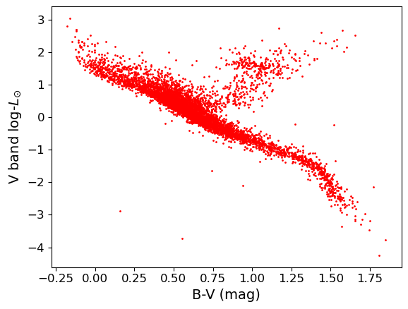
Challenge: colour-luminosity scatter plot
For a basic scatter plot, we can use
plt.scatter()on the Hipparcos data. This function has a lot of options to make it look nicer, so you should have a closer look at the documentation to find out about these possibilities.plt.scattercommand. The value given represents the area of the data-point in plot pixels.Now let’s look at the colour-magnitude diagram. We will also swap from magnitude to \(\mathrm{log}_{10}\) of luminosity in units of the solar luminosity, which is easier to interpret \(\left[\log_{10}(L_{\rm sol}) = -0.4(V_{\rm abs} -4.83)\right]\). Make a plot using \(B-V\) (colour) on the \(x\)-axis and luminosity on the \(y\)-axis.
Solution
loglum_sol = np.multiply(-0.4,(hclean.Vabs - 4.83)) # The calculation uses the fact that solar V-band absolute
# magnitude is 4.83, and the magnitude scale is in base 10^0.4

plt.figure()
plt.scatter(hclean.BV, loglum_sol, c="red", s=1)
plt.xlabel("B-V (mag)", fontsize=14)
plt.ylabel("V band log-$L_{\odot}$", fontsize=14)
plt.tick_params(axis='x', labelsize=12)
plt.tick_params(axis='y', labelsize=12)
plt.show()
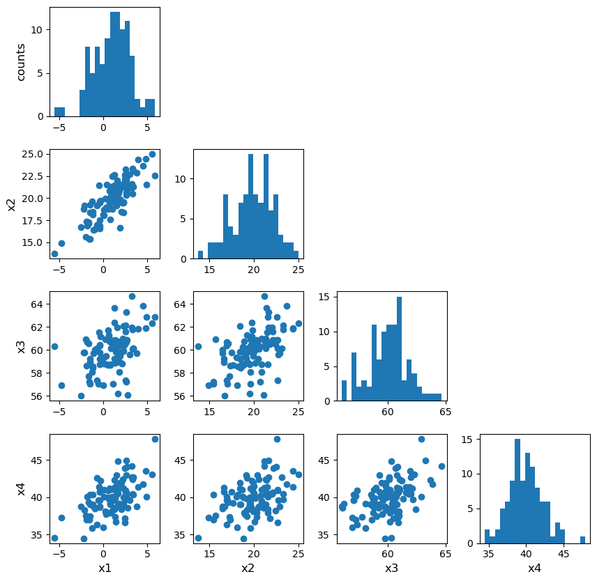
Plotting multivariate data with a scatter-plot matrix
Multivariate data can be shown by plotting each variable against each other variable (with histograms plotted along the diagonal). This is quite difficult to do in matplotlib. It is possible by plotting on a grid and making sure to keep the indices right, but doing so can be quite instructive. We will first demonstrate this (before you try it yourself using the Hipparcos data) using some multi-dimensional fake data drawn from normal distributions, using numpy’s random.multivariate_normal function. Note that besides the size of the random data set to be generated, the variable takes two arrays as input, a 1-d array of mean values and a 2-d matrix of covariances, which defines the correlation of each axis value with the others. To see the effect of the covariance matrix, you can experiment with changing it in the cell below.
Note that the random.multivariate.normal function may (depending on the choice of parameter values)throw up a warning covariance is not positive-semidefinite. For our simple simulation to look at how to plot multi-variate data, this is not a problem. However, such warnings should be taken seriously if you are using the simulated data or covariance to do a statistical test (e.g. Monte Carlo simulation to fit a model where different observables are random but correlated as defined by a covariance matrix). As usual, more information can be found via an online search.
When plotting scatter-plot matrices, you should be sure to make sure that the indices and grid are set up so that the \(x\) and \(y\) axes are shared across columns and rows of the matrix respectively. This way it is easy to compare the relation of one variable with the others, by reading either across a row or down a column. You can also share the axes (using arguments sharex=True and sharey=True of the subplots function) and remove tickmark labels from the plots that are not on the edges of the grid, if you want to put the plots closer together (the subplots_adjust function can be used to adjust the spacing between plots.
rand_data = np.random.multivariate_normal([1,20,60,40], np.array([[3,2,1,3],
[2,2,1,4], [1,1,3,2], [3,4,2,1]]), size=100) # The second array is the assumed covariance matrix
ndims = rand_data.shape[1]
labels = ['x1','x2','x3','x4']
fig, axes = plt.subplots(4,4,figsize=(10,10))
fig.subplots_adjust(wspace=0.3,hspace=0.3)
for i in range(ndims): ## y dimension of grid
    for j in range(ndims): ## x dimension of grid
        if i == j:
            axes[i,j].hist(rand_data[:,i], bins=20)
        elif i > j:
            axes[i,j].scatter(rand_data[:,j], rand_data[:,i])
        else:
            axes[i,j].axis('off')
        if j == 0:
            if i == j:
                axes[i,j].set_ylabel('counts',fontsize=12)
            else:
                axes[i,j].set_ylabel(labels[i],fontsize=12)
        if i == 3:
            axes[i,j].set_xlabel(labels[j],fontsize=12)
plt.show()
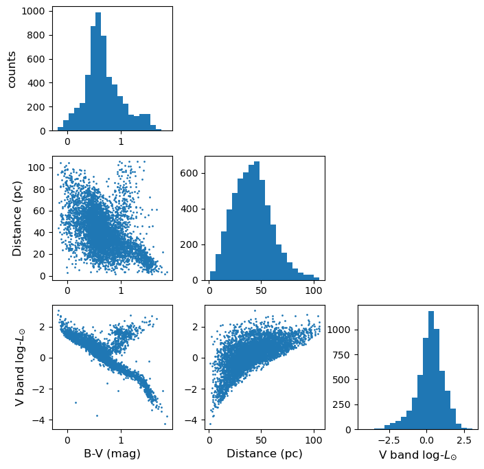
Challenge: plotting the Hipparcos data with a scatter-plot matrix
Now plot the Hipparcos data as a scatter-plot matrix. To use the same approach as for the scatter-plot matrix shown above, you can first stack the columns in the dataframe into a single array using the function
numpy.column_stack.Solution
h_array = np.column_stack((hclean.BV,hclean.dist,loglum_sol))

ndims=3
labels = ['B-V (mag)','Distance (pc)','V band log-$L_{\odot}$']
fig, axes = plt.subplots(ndims,ndims,figsize=(8,8))
fig.subplots_adjust(wspace=0.27,hspace=0.2)
for i in range(ndims): ## y dimension
    for j in range(ndims): ## x dimension
        if i == j:
            axes[i,j].hist(h_array[:,i], bins=20)
        elif i > j:
            axes[i,j].scatter(h_array[:,j],h_array[:,i],s=1)
        else:
            axes[i,j].axis('off')
        if j == 0:
            if i == j:
                axes[i,j].set_ylabel('counts',fontsize=12)
            else:
                axes[i,j].set_ylabel(labels[i],fontsize=12)
        if i == 2:
            axes[i,j].set_xlabel(labels[j],fontsize=12)
plt.show()
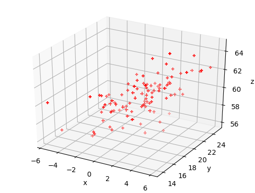
Exploring data with a 3-D plot
We can also use matplotlib’s 3-D plotting capability (after importing from mpl_toolkits.mplot3d import Axes3D) to plot and explore data in 3 dimensions (provided that you set up interactive plotting using %matplotlib notebook, the plot can be rotated using the mouse).
from mpl_toolkits.mplot3d import Axes3D
%matplotlib notebook

fig = plt.figure() # This refreshes the plot to ensure you can rotate it
ax = fig.add_subplot(111, projection='3d')
ax.scatter(rand_data[:,0], rand_data[:,1], rand_data[:,2], c="red", marker='+')
ax.set_xlabel('x')
ax.set_ylabel('y')
ax.set_zlabel('z')
plt.show()
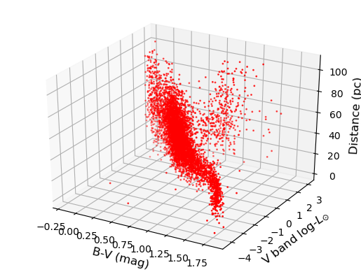
Challenge: 3-D plot of the Hipparcos data
Now make a 3-D plot of the Hipparcos data.
Solution
%matplotlib notebook
fig = plt.figure()
ax = fig.add_subplot(111, projection='3d')
ax.scatter(hclean.BV, loglum_sol, hclean.dist, c="red", s=1)
ax.set_xlabel('B-V (mag)', fontsize=12)
ax.set_ylabel('V band log-$L_{\odot}$', fontsize=12)
ax.set_zlabel('Distance (pc)', fontsize=12)
plt.show()
Key Points
The Pandas module is an efficient way to work with complex multivariate data, by reading in and writing the data to a dataframe, which is easier to work with than a numpy structured array.
Pandas functionality can be used to clean dataframes of bad or missing data, while scipy and numpy functions can be applied to columns of the dataframe, in order to modify or transform the data.
Scatter plot matrices and 3-D plots offer powerful ways to plot and explore multi-dimensional data.