Looking at some univariate data: summary statistics and histograms
Overview
Teaching: 50 min
Exercises: 20 minQuestions
How do we visually present univariate data (relating to a single variable)?
How can we quantify the data distribution in a simple way?
Objectives
Learn to use numpy and matplotlib to load in and plot univariate data as histograms and rug plots.
Learn about simple sample statistics and how to calculate them with numpy.
We are going to start by using Numpy and Matplotlib’s plotting library.
import numpy as np
import matplotlib.pyplot as plt
First, let’s load some data. We’ll start with the Michelson speed-of-light measurements (called michelson.txt).
It’s important to understand the nature of the data before you read it in, so be sure to check this by looking at the data file itself (e.g. via a text editor or other file viewer) before loading it. For the speed-of-light data we see 4 columns. The 1st column is just an identifier (‘row number’) for the measurement. The 2nd column is the ‘run’ - the measurement within a particular experiment (an experiment consists of 20 measurements). The 4th column identifies the experiment number. The crucial measurement itself is the 3rd column - to save on digits this just lists the speed (in km/s) minus 299000, rounded to the nearest 10 km/s.
If the data is in a fairly clean array, this is easily achieved with numpy.genfromtxt (google it!). By setting the argument names=True we can read in the column names, which are assigned as field names to the resulting numpy structured data array.
We will use the field names of your input 2-D array to assign the data columns Run, Speed and Expt to separate 1-D arrays and print the three arrays to check them:
michelson = np.genfromtxt("michelson.txt",names=True)
print(michelson.shape) ## Prints shape of the array as a tuple
run = michelson['Run']
speed = michelson['Speed']
experiment = michelson['Expt']
print(run,speed,experiment)
(100,)
[ 1.  2.  3.  4.  5.  6.  7.  8.  9. 10. 11. 12. 13. 14. 15. 16. 17. 18.
 19. 20.  1.  2.  3.  4.  5.  6.  7.  8.  9. 10. 11. 12. 13. 14. 15. 16.
 17. 18. 19. 20.  1.  2.  3.  4.  5.  6.  7.  8.  9. 10. 11. 12. 13. 14.
 15. 16. 17. 18. 19. 20.  1.  2.  3.  4.  5.  6.  7.  8.  9. 10. 11. 12.
 13. 14. 15. 16. 17. 18. 19. 20.  1.  2.  3.  4.  5.  6.  7.  8.  9. 10.
 11. 12. 13. 14. 15. 16. 17. 18. 19. 20.] [ 850.  740.  900. 1070.  930.  850.  950.  980.  980.  880. 1000.  980.
  930.  650.  760.  810. 1000. 1000.  960.  960.  960.  940.  960.  940.
  880.  800.  850.  880.  900.  840.  830.  790.  810.  880.  880.  830.
  800.  790.  760.  800.  880.  880.  880.  860.  720.  720.  620.  860.
  970.  950.  880.  910.  850.  870.  840.  840.  850.  840.  840.  840.
  890.  810.  810.  820.  800.  770.  760.  740.  750.  760.  910.  920.
  890.  860.  880.  720.  840.  850.  850.  780.  890.  840.  780.  810.
  760.  810.  790.  810.  820.  850.  870.  870.  810.  740.  810.  940.
  950.  800.  810.  870.] [1. 1. 1. 1. 1. 1. 1. 1. 1. 1. 1. 1. 1. 1. 1. 1. 1. 1. 1. 1. 2. 2. 2. 2.
 2. 2. 2. 2. 2. 2. 2. 2. 2. 2. 2. 2. 2. 2. 2. 2. 3. 3. 3. 3. 3. 3. 3. 3.
 3. 3. 3. 3. 3. 3. 3. 3. 3. 3. 3. 3. 4. 4. 4. 4. 4. 4. 4. 4. 4. 4. 4. 4.
 4. 4. 4. 4. 4. 4. 4. 4. 5. 5. 5. 5. 5. 5. 5. 5. 5. 5. 5. 5. 5. 5. 5. 5.
 5. 5. 5. 5.]
The speed-of-light data given here are primarily univariate and continuous (although values are rounded to the nearest km/s). Additional information is provided in the form of the run and experiment number which may be used to screen and compare the data.
Data types and dimensions
Data can be categorised according to the type of data and also the number of dimensions (number of variables describing the data).
- Continuous data may take any value within a finite or infinite interval; e.g. the energy of a photon produced by a continuum emission process, the strength of a magnetic field or the luminosity of a star.
- Discrete data has numerical values which are distinct, most commonly integer values for counting something; e.g. the number of particles detected in a specified energy range and/or time interval, or the number of objects with a particular property (e.g. stars with luminosity in a certain range, or planets in a stellar system).
- Categorical data takes on non-numerical values, e.g. particle type (electron, pion, muon…).
- Ordinal data is a type of categorical data which can be given a relative ordering or ranking but where the actual differences between ranks are not known or explicitly given by the categories; e.g. questionnaires with numerical grading schemes such as strongly agree, agree…. strongly disagree. Astronomical classification schemes (e.g. types of star, A0, G2 etc.) are a form of ordinal data, although the categories may map on to some form of continuous data (e.g. stellar temperature).
In this course we will consider the analysis of continuous and discrete data types which are most common in the physical sciences, although categorical/ordinal data types may be used to select and compare different sub-sets of data.
Besides the data type, data may have different numbers of dimensions.
- Univariate data is described by only one variable (e.g. stellar temperature). Visually, it is often represented as a one-dimensional histogram.
- Bivariate data is described by two variables (e.g. stellar temperature and luminosity). Visually it is often represented as a set of co-ordinates on a 2-dimensional plane, i.e. a scatter plot.
- Multivariate data includes three or more variables (e.g. stellar temperature, luminosity, mass, distance etc.). Visually it can be difficult to represent, but colour or tone may be used to describe a 3rd dimension on a plot and it is possible to show interactive 3-D scatter plots which can be rotated to see all the dimensions clearly. Multivariate data can also be represented 2-dimensionally using a scatter plot matrix.
We will first consider univariate data, and explore statistical methods for bivariate and multivariate data later on.
Making and plotting histograms
Now the most important step: always plot your data!!!
It is possible to show univariate data as a series of points or lines along a single axis using a rug plot, but it is more common to plot a histogram, where the data values are assigned to and counted in fixed width bins. The bins are usually defined to be contiguous (i.e. touching, with no gaps between them), although bins may have values of zero if no data points fall in them.
The matplotlib.pyplot.hist function in matplotlib automatically produces a histogram plot and returns the edges and counts per bin. The bins argument specifies the number of histogram bins (10 by default), range allows the user to predefine a range over which the histogram will be made. If the density argument is set to True, the histogram counts will be normalised such that the integral over all bins is 1 (this turns your histogram units into those of a probability density function). For more information on the commands and their arguments, google them or type in the cell plt.hist?.
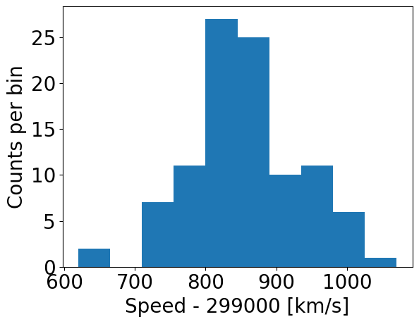
Now let’s try plotting the histogram of the data. When plotting, we should be sure to include clearly and appropriately labelled axes for this and any other figures we make, including correct units as necessary!
Note that it is important to make sure that your labels are easily readable by using the fontsize/labelsize arguments in the commands below. It is worth spending some time playing with the settings for making the histogram plots, to understand how you can change the plots to suit your preferences.
### First we use the matplotlib hist command, setting density=False:
## Set up plot window
plt.figure()
## Make and plot histogram (note that patches are matplotlib drawing objects)
counts, edges, patches = plt.hist(speed, bins=10, density=False)
plt.xlabel("Speed - 299000 [km/s]", fontsize=14)
plt.ylabel("Counts per bin", fontsize=14)
plt.tick_params(axis='x', labelsize=12)
plt.tick_params(axis='y', labelsize=12)
plt.show()

### And with density=True
plt.figure()
densities, edges, patches = plt.hist(speed, bins=10, density=True, histtype='step')
plt.xlabel("Speed - 299000 [km/s]", fontsize=14)
plt.ylabel("Density (km$^{-1}$ s)", fontsize=14)
plt.tick_params(axis='x', labelsize=12)
plt.tick_params(axis='y', labelsize=12)
plt.show()

### For demonstration purposes, check that the integral over densities add up to 1 (you don't normally need to do this!)
### We need to multiply the densities by the bin widths (the differences between adjacent edges) and sum the result.
print("Integrated densities =",np.sum(densities*(np.diff(edges))))
By using histtype='step' we can plot the histogram using lines and no colour fill (the default, corresponding to histtype='bar').
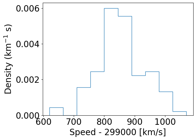
Integrated densities = 1.0
Note that there are 11 edges and 10 values for counts when 10 bins are chosen, because the edges define the upper and lower limits of the contiguous bins used to make the histogram. The bins argument of the histogram function is used to define the edges of the bins: if it is an integer, that is the number of equal-width bins which is used over range. The binning can also be chosen using various algorithms to optimise different aspects of the data, or specified in advance using a sequence of bin edge values, which can be used to allow non-uniform bin widths. For example, try remaking the plot using some custom binning below.
## First define the bin edges:
newbins=[600.,700.,750.,800.,850.,900.,950.,1000.,1100.]
## Now plot
plt.figure()
counts, edges, patches = plt.hist(speed, bins=newbins, density=False)
plt.xlabel("Speed - 299000 [km/s]", fontsize=20)
plt.ylabel("Counts per bin", fontsize=20)
plt.tick_params(axis='x', labelsize=20)
plt.tick_params(axis='y', labelsize=20)
plt.show()
Numpy also has a simple function, np.histogram to bin data into a histogram using similar function arguments to the matplotlib version. The numpy function also returns the edges and counts per bin. It is especially useful to bin univariate data, but for plotting purposes Matplotlib’s plt.hist command is better.
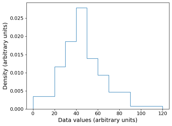
Plotting histograms with pre-assigned values
The matplotlib hist function is useful when we want to bin and plot data in one action, but sometimes we want to plot a histogram where the values are pre-assigned, e.g. from data already in the form of a histogram or where we have already binned our data using a separate function. There isn’t a separate function to do this in matplotlib, but it is easy to use the weights argument of hist to plot pre-assigned values, by using the following trick.
First, let’s define some data we have been given, in the form of bin edges and counts per bin:
counts = np.array([3,5,8,12,6,4,4,1])
bin_edges = np.array([0,20,30,40,50,60,70,90,120])
# We want to plot the histogram in units of density:
dens = counts/(np.diff(bin_edges)*np.sum(counts))
Now we trick hist by giving as input data a list of the bin centres, and as weights the input values we want to plot. This works because the weights are multiplied by the number of data values assigned to each bin, in this case one per bin (since we gave the bin centres as ‘dummy’ data), so we essentially just plot the weights we have given instead of the counts.
# Define the 'dummy' data values to be the bin centres, so each bin contains one value
dum_vals = (bin_edges[1:] + bin_edges[:-1])/2

plt.figure()
# Our histogram is already given as a density, so set density=False to switch calculation off
densities, edges, patches = plt.hist(dum_vals, bins=bin_edges, weights=dens, density=False, histtype='step')
plt.xlabel("Data values (arbitrary units)", fontsize=14)
plt.ylabel("Density (arbitrary units)", fontsize=14)
plt.tick_params(axis='x', labelsize=12)
plt.tick_params(axis='y', labelsize=12)
plt.show()
Combined rug plot and histogram
Going back to the speed of light data, the histogram covers quite a wide range of values, with a central peak and broad ‘wings’, This spread could indicate statistical error, i.e. experimental measurement error due to the intrinsic precision of the experiment, e.g. from random fluctuations in the equipment, the experimenter’s eyesight etc.
The actual speed of light in air is 299703 km/s. We can plot this on our histogram, and also add a ‘rug’ of vertical lines along the base of the plot to highlight the individual measurements and see if we can see any pattern in the scatter.
plt.figure()
# Make and plot histogram (note that patches are matplotlib drawing objects)
counts, edges, patches = plt.hist(speed, bins=10, density=False, histtype='step')

# We can plot the 'rug' using the x values and setting y to zero, with vertical lines for the
# markers and connecting lines switched off using linestyle='None'
plt.plot(speed, np.zeros(len(speed)), marker='|', ms=30, linestyle='None')

# Add a vertical dotted line at 703 km/s
plt.axvline(703,linestyle='dotted')

plt.xlabel("Speed - 299000 [km/s]", fontsize=14)
plt.ylabel("Counts per bin", fontsize=14)
plt.tick_params(axis='x', labelsize=12)
plt.tick_params(axis='y', labelsize=12)
plt.show()
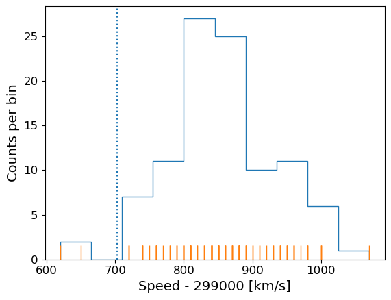
The rug plot shows no clear pattern other than the equal 10 km/s spacing between many data points that is imposed by the rounding of speed values. However, the data are quite far from the correct value. This could indicate a systematic error, e.g. due to an mistake in the experimental setup or a flaw in the apparatus. A final, more interesting possibility is that the speed of light itself has changed!
Statistical and systematic error
When experimental results or observations are presented you will often hear discussion of two kinds of error:
- statistical error is a random error, due for example to measurement errors (i.e. related to the precision of the measuring device) or intrinsic randomness in the quantities being measured (so that, by chance, the data sample may be more or less representative of the true distribution or properties). Statistical errors do not have a preferred direction (they may be positive or negative deviations from the ‘true’ values) although their distribution may not be symmetric (e.g. positive fluctuations may on average be larger than negative, or vice versa)
- systematic error is a non-random error in a particular direction. For example, a mistake or design-flaw in the experimental setup may lead to the measurement being systematically too large or too small. Or, when data are collected via observations, a bias in the way a sample is selected may lead to the distrbution of the measured quantity being distorted (e.g. selecting a sample of stellar colours on bright stars will preferentially select luminous ones which are hotter and therefore bluer, causing blue stars to be over-represented). Systematic errors have a preferred direction and since they are non-random, dealing with them requires good knowledge of the experiment or sample selection approach (and underlying population properties), rather than simple application of statistical methods (although statistical methods can help in the simulation and caliibration of systematic errors, and to determine if they are present in your data or not).
Asking questions about the data: hypotheses
At this point we might be curious about our data and what it is really telling us, and we can start asking questions, for example:
- Is the deviation from the known speed of light in air real, e.g. due to systematic error in the experiment or a real change in the speed of light(!), or can it just be down to bad luck with measurement errors pushing us to one side of the curve (i.e. the deviation is within expectations for statistical errors)?
This kind of question about data can be answered using statistical methods. The challenge is to frame the question into a form called a hypothesis to which a statistical test can be applied, which will either rule the hypothesis out or not. We can never say that a hypothesis is really true, only that it isn’t true, to some degree of confidence.
To see how this works, we first need to think how we can frame our questions in a more quantifiable way, using summary statistics for our data.
Summary statistics: quantifying data distributions
So far we have seen what the data looks like and that most of the data are distributed on one side of the true value of the speed of light in air. To make further progress we need to quantify the difference and then figure out how to say whether that difference is expected by chance (statistical error) or is due to some other underlying effect (in this case, systematic error since we don’t expect a real change in the speed of light!).
However, the data take on a range of values - they follow a distribution which we can approximate using the histogram. We call this the sample distribution, since our data can be thought of as a sample of measurements from a much larger set of potential measurements (known in statistical terms as the population). To compare with the expected value of the speed of the light it is useful to turn our data into a single number, reflecting the ‘typical’ value of the sample distribution.
We can start with the sample mean, often just called the mean:
[\bar{x} = \frac{1}{n} \sum\limits_{i=1}^{n} x_{i}]
where our sample consists of \(n\) measurements \(x = x_{1}, x_{2}, ...x_{n}\).
It is also common to use a quantity called the median which corresponds to the ‘central’ value of \(x\) and is obtained by arranging \(x\) in numerical order and taking the middle value if \(n\) is an odd number. If \(n\) is even we take the average of the \((n/2)\)th and \((n/2+1)\)th ordered values.
Challenge: obtain the mean and median
Numpy has fast (C-based and Python-wrapped) implementation for most basic functions, among them the mean and median. Find and use these to calculate the mean and median for the speed values in the complete Michelson data set.
Solution
michelson_mn = np.mean(speed) + 299000 ## Mean speed with offset added back in
michelson_md = np.median(speed) + 299000 ## Median speed with offset added back in
print("Mean =",michelson_mn,"and median =",michelson_md)
Mean = 299852.4 and median = 299850.0
We can also define the mode, which is the most frequent value in the data distribution. This does not really make sense for continuous data (then it makes more sense to define the mode of the population rather than the sample), but one can do this for discrete data.
Challenge: find the mode
As shown by our rug plot, the speed-of-light data here is discrete in the sense that it is rounded to the nearest ten km/s. Numpy has a useful function
histogramfor finding the histogram of the data without plotting anything. Apart from the plotting arguments, it has the same arguments for calculating the histogram as matplotlib’shist. Use this (and another numpy functions) to find the mode of the speed of light measurements.Hint
You will find the numpy functions
amin,amaxandargmaxuseful for this challenge.Solution
# Calculate number of bins needed for each value to lie in the centre of
# a bin of 10 km/s width
nbins = ((np.amax(speed)+5)-(np.amin(speed)-5))/10
# To calculate the histogram we should specify the range argument to the min and max bin edges used above
counts, edges = np.histogram(speed,bins=int(nbins),range=(np.amin(speed)-5,np.amax(speed)+5))
# Now use argmax to find the index of the bin with the maximum counts and print the bin centre
i_max = np.argmax(counts)
print("Maximum counts for speed[",i_max,"] =",edges[i_max]+5.0)
Maximum counts for speed[ 19 ] = 810.0However, if we print out the counts, we see that there is another bin with the same number of counts!
[ 1  0  0  1  0  0  0  0  0  0  3  0  3  1  5  1  2  3  5 10  2  2  8  8
3  4 10  3  2  2  1  2  3  3  4  1  3  0  3  0  0  0  0  0  0  1]
If there is more than one maximum,
argmaxoutputs the index of the first occurence.Scipy provides a simpler way to obtain the mode of a data array:
## Remember that for scipy you need to import modules individually, you cannot
## simply use `import scipy`
import scipy.stats
print(scipy.stats.mode(speed))
ModeResult(mode=array([810.]), count=array([10]))I.e. the mode corresponds to value 810 with a total of 10 counts. Note that
scipy.stats.modealso returns only the first occurrence of multiple maxima.
The mean, median and mode(s) of our data are all larger than 299703 km/s by more than 100 km/s, but is this difference really significant? The answer will depend on how precise our measurements are, that is, how tightly clustered are they around the same values? If the precision of the measurements is low, we can have less confidence that the data are really measuring a different value to the true value.
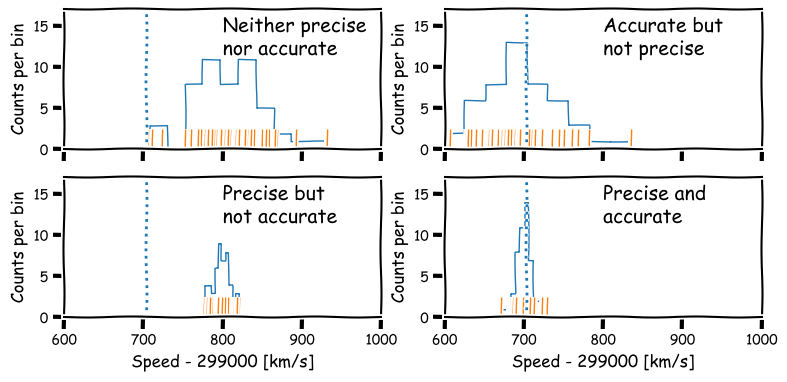
Precision and accuracy
In daily speech we usually take the words precision and accuracy to mean the same thing, but in statistics they have distinct meanings and you should be careful when you use them in a scientific context:
- Precision refers to the degree of random deviation, e.g. how broad a measured data distribution is.
- Accuracy refers to how much non-random deviation there is from the true value, i.e. how close the measured data are on average to the ‘true’ value of the quantity being measured.
In terms of errors, high precision corresponds to low statistical error (and vice versa) while high accuracy refers to low systematic error (or equivalently, low bias).
We will be be able to make statements comparing data with an expected value more quantitatively after a few more episodes, but for now it is useful to quantify the precision of our distribution in terms of its width. For this, we calculate a quantity known as the variance.
[s_{x}^{2} = \frac{1}{n-1} \sum\limits_{i=1}^{n} (x_{i}-\bar{x})^{2}]
Variance is a squared quantity but we can convert to the standard deviation \(s_{x}\) by taking the square root:
[s_{x} = \sqrt{\frac{1}{n-1} \sum\limits_{i=1}^{n} (x_{i}-\bar{x})^{2}}]
You can think of this as a measure of the ‘width’ of the distribution and thus an indication of the precision of the measurements.
Note that the sum to calculate variance (and standard deviation) is normalised by \(n-1\), not \(n\), unlike the mean. This is called Bessel’s correction and is a correction for bias in the calculation of sample variance compared to the ‘true’ population variance - we will see the origin of this in a couple of episodes time. The number subtracted from \(n\) (in this case, 1) is called the number of degrees of freedom.
Challenge: calculate variance and standard deviations
Numpy contains functions for both variance and standard deviation - find and use these to calculate these quantities for the speed data in the Michelson data set. Be sure to check and use the correct number of degrees of freedom (Bessel’s correction), as the default may not be what you want! Always check the documentation of any functions you use, to understand what the function does and what the default settings or assumptions are.
Solution
## The argument ddof sets the degrees of freedom which should be 1 here (for Bessel's correction)
michelson_var = np.var(speed, ddof=1)
michelson_std = np.std(speed, ddof=1)
print("Variance:",michelson_var,"and s.d.:",michelson_std)
Variance: 6242.666666666667 and s.d.: 79.01054781905178
Population versus sample
In frequentist approaches to statistics it is common to imagine that samples of data (that is, the actual measurements) are drawn from a much (even infinitely) larger population which follows a well-defined (if unknown) distribution. In some cases, the underlying population may be a real one, for example a sample of stellar masses will be drawn from the masses of an actual population of stars. In other cases, the population may be purely notional, e.g. as if the data are taken from an infinite pool of possible measurements from the same experiment (and associated errors). In either case the statistical term population refers to something for which a probability distribution can be defined.
Therefore, it is important to make distinction between the sample mean and variance, which are calculated from the data (and therefore not fixed, since the sample statistics are themselves random variates and population mean and variance (which are fixed and well-defined for a given probability distribution). Over the next few episodes, we will see how population statistics are derived from probability distributions, and how to relate them to the sample statistics.
Hypothesis testing with statistics
The sample mean, median, mode and variance that we have defined are all statistics.
A statistic is a single number calculated by applying a statistical algorithm/function to the values of the items in the sample (the data). We will discuss other statistics later on, but they all share the property that they are single numbers that are calculated from data.
Statistics are drawn from a distribution determined by the population distribution (note that the distribution of a statistic is not necessarily the same as that of the population which the data used to calculate the statistic is drawn from!).
A statistic can be used to test a hypothesis about the data, often by comparing it with the expected distribution of the statistic, given some assumptions about the population. When used in this way, it is called a test statistic.
So, let’s now reframe our earlier question about the data into a hypothesis that we can test:
- Is the deviation real or due to statistical error?
Since there is not one single measured value, but a distribution of measured values of the speed of light, it makes sense (in the absence of further information) to not prefer any particular measurement, but to calculate the sample mean of our measured values of the speed of light. Furthermore, we do not (yet) have any information that should lead us to prefer any of the 5 Michelson experiments, so we will weight them all equally and calculate the mean from the 100 measured values.
Our resulting sample mean is 299852.4 km/s. This compares with the known value (in air) of 299703 km/s, so there is a difference of \(\simeq 149\) km/s.
The standard deviation of the data is 79 km/s, so the sample mean is less than 2 standard deviations from the known value, which doesn’t sound like a lot (some data points are further than this difference from the mean). However, we would expect that the random variation on the mean should be smaller than the variation of individual measurements, since averaging the individual measurements should smooth out their variations.
To assess whether or not the difference is compatible with statistical errors or not, we need to work out what the ‘typical’ random variation of the mean should be. But we first need to deepen our understanding about probability distributions and random variables.
Why not use the median?
You might reasonably ask why we don’t use the median as our test statistic here. The simple answer is that the mean is a more useful test statistic with some very important properties. Most importantly it follows the central limit theorem, which we will learn about later on.
The median is useful in other situations, e.g. when defining a central value of data where the distribution is highly skewed or contains outliers which you don’t want to remove.
Key Points
Univariate data can be plotted using histograms, e.g. with
matplotlib.pyplot.hist. Histograms can also be calculated (without plotting) usingnumpy.hist.Pre-binned data can be plotted using
matplotlib.pyplot.histusing weights matching the binned frequencies/densities and bin centres used as dummy values to be binned.Statistical errors are due to random measurement errors or randomness of the population being sampled, while systematic errors are non-random and linked to faults in the experiment or limitations/biases in sample collection.
Precise measurements have low relative statistical error, while accurate measurements have low relative systematic error.
Data distributions can be quantified using sample statistics such as the mean and median and variance or standard-deviation (quantifying the width of the distribution), e.g. with
numpyfunctionsmean,median,varandstd. Remember to check the degrees of freedom assumed for the variance and standard deviation functions!Quantities calculated from data such as such as mean, median and variance are statistics. Hypotheses about the data can be tested by comparing a suitable test statistic with its expected distribution, given the hypothesis and appropriate assumptions.
Introducing probability distributions
Overview
Teaching: 30 min
Exercises: 10 minQuestions
How are probability distributions defined and described?
Objectives
Learn how the pdf, cdf, quantiles, ppf are defined and how to plot them using
scipy.statsdistribution functions and methods.
In this episode we will be using numpy, as well as matplotlib’s plotting library. Scipy contains an extensive range of distributions in its ‘scipy.stats’ module, so we will also need to import it. Remember: scipy modules should be installed separately as required - they cannot be called if only scipy is imported.
import numpy as np
import matplotlib.pyplot as plt
import scipy.stats as sps
Michelson’s speed-of-light data is a form of random variable. Clearly the measurements are close to the true value of the speed of light in air, to within <0.1 per cent, but they are distributed randomly about some average which may not even be the true value (e.g. due to systematic error in the measurements).
We can gain further understanding by realising that random variables do not just take on any value - they are drawn from some probability distribution. In probability theory, a random measurement (or even a set of measurements) is an event which occurs (is ‘drawn’) with a fixed probability, assuming that the experiment is fixed and the underlying distribution being measured does not change over time (statistically we say that the random process is stationary).
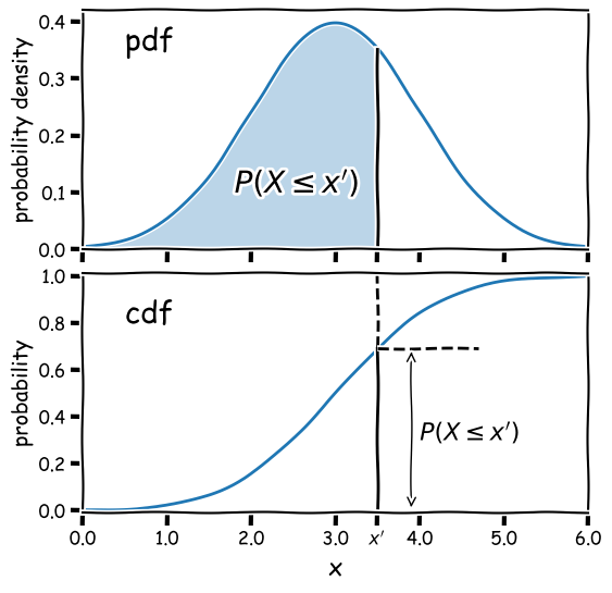
The cdf and pdf of a probability distribution
Consider a continuous random variable \(X\) (for example, a single measurement). For a fixed probability distribution over all possible values $x$, we can define the probability \(P\) that \(X\leq x\) as being the cumulative distribution function (or cdf), \(F(x)\):
[F(x) = P(X\leq x)]
We can choose the limiting values of our distribution, but since the variable must take on some value (i.e. the definition of an ‘event’ is that something must happen) it must satisfy:
\(\lim\limits_{x\rightarrow -\infty} F(x) = 0\) and \(\lim\limits_{x\rightarrow +\infty} F(x) = 1\)
From these definitions we find that the probability that \(X\) lies in the closed interval \([a,b]\) (note: a closed interval, denoted by square brackets, means that we include the endpoints \(a\) and \(b\)) is:
[P(a \leq X \leq b) = F(b) - F(a)]
We can then take the limit of a very small interval \([x,x+\delta x]\) to define the probability density function (or pdf), \(p(x)\):
[\frac{P(x\leq X \leq x+\delta x)}{\delta x} = \frac{F(x+\delta x)-F(x)}{\delta x}]
[p(x) = \lim\limits_{\delta x \rightarrow 0} \frac{P(x\leq X \leq x+\delta x)}{\delta x} = \frac{\mathrm{d}F(x)}{\mathrm{d}x}]
This means that the cdf is the integral of the pdf, e.g.:
[P(X \leq x) = F(x) = \int^{x}_{-\infty} p(x^{\prime})\mathrm{d}x^{\prime}]
where \(x^{\prime}\) is a dummy variable. The probability that \(X\) lies in the interval \([a,b]\) is:
[P(a \leq X \leq b) = F(b) - F(a) = \int_{a}^{b} p(x)\mathrm{d}x]
and \(\int_{-\infty}^{\infty} p(x)\mathrm{d}x = 1\).
Why use the pdf?
By definition, the cdf can be used to directly calculate probabilities (which is very useful in statistical assessments of data), while the pdf only gives us the probability density for a specific value of \(X\). So why use the pdf? One of the main reasons is that it is generally much easier to calculate the pdf for a particular probability distribution, than it is to calculate the cdf, which requires integration (which may be analytically impossible in some cases!).
Also, the pdf gives the relative probabilities (or likelihoods) for particular values of \(X\) and the model parameters, allowing us to compare the relative likelihood of hypotheses where the model parameters are different. This principle is a cornerstone of statistical inference which we will come to later on.
Probability distributions: Uniform
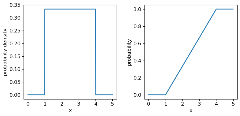
Now we’ll introduce two common probability distributions, and see how to use them in your Python data analysis. We start with the uniform distribution, which has equal probability values defined over some finite interval \([a,b]\) (and zero elsewhere). The pdf is given by:
[p(x\vert a,b) = 1/(b-a) \quad \mathrm{for} \quad a \leq x \leq b]
where the notation \(p(x\vert a,b)\) means ‘probability density at x, conditional on model parameters \(a\) and \(b\)‘. The vertical line \(\vert\) meaning ‘conditional on’ (i.e. ‘given these existing conditions’) is notation from probability theory which we will use often in this course.
## define parameters for our uniform distribution
a = 1
b = 4
print("Uniform distribution with limits",a,"and",b,":")
## freeze the distribution for a given a and b
ud = sps.uniform(loc=a, scale=b-a) # The 2nd parameter is added to a to obtain the upper limit = b
Distribution parameters: location, scale and shape
As in the above example, it is often useful to ‘freeze’ a distribution by fixing its parameters and defining the frozen distribution as a new function, which saves repeating the parameters each time. The common format for arguments of scipy statistical distributions which represent distribution parameters, corresponds to statistical terminology for the parameters:
- A location parameter (the
locargument in the scipy function) determines the location of the distribution on the \(x\)-axis. Changing the location parameter just shifts the distribution along the \(x\)-axis.- A scale parameter (the
scaleargument in the scipy function) determines the width or (more formally) the statistical dispersion of the distribution. Changing the scale parameter just stretches or shrinks the distribution along the \(x\)-axis but does not otherwise alter its shape.- There may be one or more shape parameters (scipy function arguments may have different names specific to the distribution). These are parameters which do something other than shifting, or stretching/shrinking the distribution, i.e. they change the shape in some way.
Distributions may have all or just one of these parameters, depending on their form. For example, normal distributions are completely described by their location (the mean) and scale (the standard deviation), while exponential distributions (and the related discrete Poisson distribution) may be defined by a single parameter which sets their location as well as width. Some distributions use a rate parameter which is the reciprocal of the scale parameter (exponential/Poisson distributions are an example of this).
The uniform distribution has a scale parameter \(\lvert b-a \rvert\). This statistical distribution’s location parameter is formally the centre of the distribution, \((a+b)/2\), but for convenience the scipy uniform function uses \(a\) to place a bound on one side of the distribution. We can obtain and plot the pdf and cdf by applying those named methods to the scipy function. Note that we must also use a suitable function (e.g. numpy.arange) to create a sufficiently dense range of \(x\)-values to make the plots over.
## You can plot the probability density function
fig, (ax1, ax2) = plt.subplots(1,2, figsize=(9,4))
# change the separation between the sub-plots:
fig.subplots_adjust(wspace=0.3)
x = np.arange(0., 5.0, 0.01)
ax1.plot(x, ud.pdf(x), lw=2)
## or you can plot the cumulative distribution function:
ax2.plot(x, ud.cdf(x), lw=2)
for ax in (ax1,ax2):
    ax.tick_params(labelsize=12)
    ax.set_xlabel("x", fontsize=12)
    ax.tick_params(axis='x', labelsize=12)
    ax.tick_params(axis='y', labelsize=12)
ax1.set_ylabel("probability density", fontsize=12)
ax2.set_ylabel("probability", fontsize=12)
plt.show()
Probability distributions: Normal
The normal distribution is one of the most important in statistical data analysis (for reasons which will become clear) and is also known to physicists and engineers as the Gaussian distribution. The distribution is defined by location parameter \(\mu\) (often just called the mean, but not to be confused with the mean of a statistical sample) and scale parameter \(\sigma\) (also called the standard deviation, but again not to be confused with the sample standard deviation). The pdf is given by:
[p(x\vert \mu,\sigma)=\frac{1}{\sigma \sqrt{2\pi}} e^{-(x-\mu)^{2}/(2\sigma^{2})}]
It is also common to refer to the standard normal distribution which is the normal distribution with \(\mu=0\) and \(\sigma=1\):
[p(z\vert 0,1) = \frac{1}{\sqrt{2\pi}} e^{-z^{2}/2}]
The standard normal is important for many statistical results, including the approach of defining statistical significance in terms of the number of ‘sigmas’ which refers to the probability contained within a range \(\pm z\) on the standard normal distribution (we will discuss this in more detail when we discuss statistical significance testing).
Challenge: plotting the normal distribution
Now that you have seen the example of a uniform distribution, use the appropriate
scipy.statsfunction to plot the pdf and cdf of the normal distribution, for a mean and standard deviation of your choice (you can freeze the distribution first if you wish, but it is not essential).Solution
## Define mu and sigma:
mu = 2.0
sigma = 0.7
## Plot the probability density function
fig, (ax1, ax2) = plt.subplots(1,2, figsize=(9,4))
fig.subplots_adjust(wspace=0.3)
## we will plot +/- 3 sigma on either side of the mean
x = np.arange(-1.0, 5.0, 0.01)
ax1.plot(x, sps.norm.pdf(x,loc=mu,scale=sigma), lw=2)
## and the cumulative distribution function:
ax2.plot(x, sps.norm.cdf(x,loc=mu,scale=sigma), lw=2)
for ax in (ax1,ax2):
    ax.tick_params(labelsize=12)
    ax.set_xlabel("x", fontsize=12)
    ax.tick_params(axis='x', labelsize=12)
    ax.tick_params(axis='y', labelsize=12)
ax1.set_ylabel("probability density", fontsize=12)
ax2.set_ylabel("probability", fontsize=12)
plt.show()
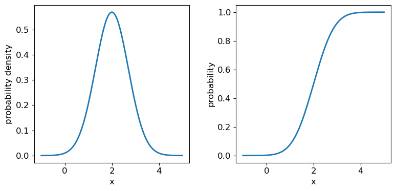
It’s useful to note that the pdf is much more distinctive for different functions than the cdf, which (because of how it is defined) always takes on a similar, slanted ‘S’-shape, hence there is some similarity in the form of cdf between the normal and uniform distributions, although their pdfs look radically different.
Quantiles
It is often useful to be able to calculate the quantiles (such as percentiles or quartiles) of a distribution, that is, what value of \(x\) corresponds to a fixed interval of integrated probability? We can obtain these from the inverse function of the cdf (\(F(x)\)). E.g. for the quantile \(\alpha\):
[F(x_{\alpha}) = \int^{x_{\alpha}}{-\infty} p(x)\mathrm{d}x = \alpha \Longleftrightarrow x{\alpha} = F^{-1}(\alpha)]
Note that \(F^{-1}\) denotes the inverse function of \(F\), not \(1/F\)! This is called the percent point function (or ppf). To obtain a given quantile for a distribution we can use the scipy.stats method ppf applied to the distribution function. For example:
## Print the 30th percentile of a normal distribution with mu = 3.5 and sigma=0.3
print("30th percentile:",sps.norm.ppf(0.3,loc=3.5,scale=0.3))
## Print the median (50th percentile) of the distribution
print("Median (via ppf):",sps.norm.ppf(0.5,loc=3.5,scale=0.3))
## There is also a median method to quickly return the median for a distribution:
print("Median (via median method):",sps.norm.median(loc=3.5,scale=0.3))
30th percentile: 3.342679846187588
Median (via ppf): 3.5
Median (via median method): 3.5
Intervals
It is sometimes useful to be able to quote an interval, containing some fraction of the probability (and usually centred on the median) as a ‘typical’ range expected for the random variable \(X\). We will discuss intervals on probability distributions further when we discuss confidence intervals on parameters. For now, we note that the
.intervalmethod can be used to obtain a given interval centred on the median. For example, the Interquartile Range (IQR) is often quoted as it marks the interval containing half the probability, between the upper and lower quartiles (i.e. from 0.25 to 0.75):## Print the IQR for a normal distribution with mu = 3.5 and sigma=0.3 print("IQR:",sps.norm.interval(0.5,loc=3.5,scale=0.3))IQR: (3.2976530749411754, 3.7023469250588246)So for the normal distribution, with \(\mu=3.5\) and \(\sigma=0.3\), half of the probability is contained in the range \(3.5\pm0.202\) (to 3 decimal places).
Key Points
Probability distributions show how random variables are distributed. Two common distributions are the uniform and normal distributions.
Uniform and normal distributions and many associated functions can be accessed using
scipy.stats.uniformandscipy.stats.normrespectively.The probability density function (pdf) shows the distribution of relative likelihood or frequency of different values of a random variable and can be accessed with the scipy statistical distribution’s
The cumulative distribution function (cdf) is the integral of the pdf and shows the cumulative probability for a variable to be equal to or less than a given value. It can be accessed with the scipy statistical distribution’s
cdfmethod.Quantiles such as percentiles and quartiles give the values of the random variable which correspond to fixed probability intervals (e.g. of 1 per cent and 25 per cent respectively). They can be calculated for a distribution in scipy using the
percentileorintervalmethods.The percent point function (ppf) (
ppfmethod) is the inverse function of the cdf and shows the value of the random variable corresponding to a given quantile in its distribution.Probability distributions are defined by common types of parameter such as the location and scale parameters. Some distributions also include shape parameters.
Random variables
Overview
Teaching: 40 min
Exercises: 10 minQuestions
How do I calculate the means, variances and other statistical quantities for numbers drawn from probability distributions?
How is the error on a sample mean calculated?
Objectives
Learn how the expected means and variances of random variables (and functions of them) can be calculated from their probability distributions.
Discover the
scipy.statsfunctionality for calculated statistical properties of probability distributions and how to generate random numbers from them.Learn how key results such as the standard error on the mean and Bessel’s correction are derived from the statistics of sums of random variables.
In this episode we will be using numpy, as well as matplotlib’s plotting library. Scipy contains an extensive range of distributions in its ‘scipy.stats’ module, so we will also need to import it. Remember: scipy modules should be installed separately as required - they cannot be called if only scipy is imported.
import numpy as np
import matplotlib.pyplot as plt
import scipy.stats as sps
So far we have introduced the idea of working with data which contains some random component (as well as a possible systematic error). We have also introduced the idea of probability distributions of random variables. In this episode we will start to make the connection between the two because all data, to some extent, is a collection of random variables. In order to understand how the data are distributed, what the sample properties such as mean and variance can tell us and how we can use our data to test hypotheses, we need to understand how collections of random variables behave.
Properties of random variables: expectation
Consider a set of random variables which are independent, which means that the outcome of one does not affect the probability of the outcome of another. The random variables are drawn from some probability distribution with pdf \(p(x)\).
The expectation \(E(X)\) is equal to the arithmetic mean of the random variables as the number of sampled variates (realisations of the variable sampled from its probability distribution) increases \(\rightarrow \infty\). For a continuous probability distribution it is given by the mean of the distribution function, i.e. the pdf:
[E[X] = \mu = \int_{-\infty}^{+\infty} xp(x)\mathrm{d}x]
This quantity \(\mu\) is often just called the mean of the distribution, or the population mean to distinguish it from the sample mean of data.
More generally, we can obtain the expectation of some function of \(X\), \(f(X)\):
[E[f(X)] = \int_{-\infty}^{+\infty} f(x)p(x)\mathrm{d}x]
It follows that the expectation is a linear operator. So we can also consider the expectation of a scaled sum of variables \(X_{1}\) and \(X_{2}\) (which may themselves have different distributions):
[E[a_{1}X_{1}+a_{2}X_{2}] = a_{1}E[X_{1}]+a_{2}E[X_{2}]]
Properties of random variables: variance
The (population) variance of a discrete random variable \(X\) with (population) mean \(\mu\) is the expectation of the function that gives the squared difference from the mean:
[V[X] = \sigma^{2} = E[(X-\mu)^{2})] = \int_{-\infty}^{+\infty} (x-\mu)^{2} p(x)\mathrm{d}x]
It is possible to rearrange things:
\(V[X] = E[(X-\mu)^{2})] = E[X^{2}-2X\mu+\mu^{2}]\) \(\rightarrow V[X] = E[X^{2}] - E[2X\mu] + E[\mu^{2}] = E[X^{2}] - 2\mu^{2} + \mu^{2}\) \(\rightarrow V[X] = E[X^{2}] - \mu^{2} = E[X^{2}] - E[X]^{2}\)
In other words, the variance is the expectation of squares - square of expectations. Therefore, for a function of \(X\):
[V[f(X)] = E[f(X)^{2}] - E[f(X)]^{2}]
Means and variances of the uniform and normal distributions
The distribution of a random variable is given using the notation \(\sim\), meaning ‘is distributed as’. I.e. for \(X\) drawn from a uniform distribution over the interval \([a,b]\), we write \(X\sim U(a,b)\). For this case, we can use the approach given above to calculate the mean: \(E[X] = (b+a)/2\) and variance: \(V[X] = (b-a)^{2}/12\)
The
scipy.statsdistribution functions include methods to calculate the means and variances for a distribution and given parameters, which we can use to verify these results, e.g.:## Assume a = 1, b = 8 (remember scale = b-a) a, b = 1, 8 print("Mean is :",sps.uniform.mean(loc=a,scale=b-a)) print("analytical mean:",(b+a)/2) ## Now the variance print("Variance is :",sps.uniform.var(loc=a,scale=b-a)) print("analytical variance:",((b-a)**2)/12)Mean is : 4.5 analytical mean: 4.5 Variance is : 4.083333333333333 analytical variance: 4.083333333333333For the normal distribution with parameters \(\mu\), \(\sigma\), \(X\sim N(\mu,\sigma)\), the results are very simple because \(E[X]=\mu\) and \(V[X]=\sigma^{2}\). E.g.
## Assume mu = 4, sigma = 3
print("Mean is :",sps.norm.mean(loc=4,scale=3))
print("Variance is :",sps.norm.var(loc=4,scale=3))
Mean is : 4.0 Variance is : 9.0
Generating random variables
So far we have discussed random variables in an abstract sense, in terms of the population, i.e. the continuous probability distribution. But real data is in the form of samples: individual measurements or collections of measurements, so we can get a lot more insight if we can generate ‘fake’ samples from a given distribution.
A random variate is the quantity that is generated while a random variable is the notional object able to assume different numerical values, i.e. the distinction is similar to the distinction in python between x=15 and the object to which the number is assigned x (the variable).
The scipy.stats distribution functions have a method rvs for generating random variates that are drawn from the distribution (with the given parameter values). You can either freeze the distribution or specify the parameters when you call it. The number of variates generated is set by the size argument and the results are returned to a numpy array.
# Generate 10 uniform variates from U(0,1) - the default loc and scale arguments
u_vars = sps.uniform.rvs(size=10)
print("Uniform variates generated:",u_vars)

# Generate 10 normal variates from N(20,3)
n_vars = sps.norm.rvs(loc=20,scale=3,size=10)
print("Normal variates generated:",n_vars)
Uniform variates generated: [0.99808848 0.9823057  0.01062957 0.80661773 0.02865487 0.18627394 0.87023007 0.14854033 0.19725284 0.45448424]
Normal variates generated: [20.35977673 17.66489157 22.43217609 21.39929951 18.87878728 18.59606091 22.51755213 21.43264709 13.87430417 23.95626361]
Remember that these numbers depend on the starting seed which is almost certainly unique to your computer (unless you pre-select it: see below). They will also change each time you run the code cell.
How random number generation works
Random number generators use algorithms which are strictly pseudo-random since (at least until quantum-computers become mainstream) no algorithm can produce genuinely random numbers. However, the non-randomness of the algorithms that exist is impossible to detect, even in very large samples.
For any distribution, the starting point is to generate uniform random variates in the interval \([0,1]\) (often the interval is half-open \([0,1)\), i.e. exactly 1 is excluded). \(U(0,1)\) is the same distribution as the distribution of percentiles - a fixed range quantile has the same probability of occurring wherever it is in the distribution, i.e. the range 0.9-0.91 has the same probability of occuring as 0.14-0.15. This means that by drawing a \(U(0,1)\) random variate to generate a quantile and putting that in the ppf of the distribution of choice, the generator can produce random variates from that distribution. All this work is done ‘under the hood’ within the
scipy.statsdistribution function.It’s important to bear in mind that random variates work by starting from a ‘seed’ (usually an integer) and then each call to the function will generate a new (pseudo-)independent variate but the sequence of variates is replicated if you start with the same seed. However, seeds are generated by starting from a system seed set using random and continuously updated data in a special file in your computer, so they will differ each time you run the code.
You can force the seed to take a fixed (integer) value using the
numpy.random.seed()function. It also works for thescipy.statsfunctions, which usenumpy.randomto generate their random numbers. Include your chosen seed value as a function argument - the sequence of random numbers generated will only change if you change the seed (but their mapping to the distribution - which is via the ppf - will mean that the values are different for different distributions). Use the function with no argument in order to reset back to the system seed.
Sums of random variables
Since the expectation of the sum of two scaled variables is the sum of the scaled expectations, we can go further and write the expectation for a scaled sum of variables \(Y=\sum\limits_{i=1}^{n} a_{i}X_{i}\):
[E[Y] = \sum\limits_{i=1}^{n} a_{i}E[X_{i}]]
What about the variance? We can first use the expression in terms of the expectations:
[V[Y] = E[Y^{2}] - E[Y]^{2} = E\left[ \sum\limits_{i=1}^{n} a_{i}X_{i}\sum\limits_{j=1}^{n} a_{j}X_{j} \right] - \sum\limits_{i=1}^{n} a_{i}E[X_{i}] \sum\limits_{j=1}^{n} a_{j}E[X_{j}]]
and convert to linear sums of expectations in terms of \(X_{i}\):
[V[Y] = \sum\limits_{i=1}^{n} a_{i}^{2} E[X_{i}^{2}] + \sum\limits_{i=1}^{n} \sum\limits_{j\neq i} a_{i}a_{j}E[X_{i}X_{j}] - \sum\limits_{i=1}^{n} a_{i}^{2} E[X_{i}]^{2} - \sum\limits_{i=1}^{n} \sum\limits_{j\neq i} a_{i}a_{j}E[X_{i}]E[X_{j}]\;.]
Of the four terms on the LHS, the squared terms only in \(i\) are equal to the summed variances while the cross-terms in \(i\) and \(j\) can be paired up to form the so-called covariances (which we will cover when we discuss bi- and multivariate statistics):
[V[Y] = \sum\limits_{i=1}^{n} a_{i}^{2} \sigma_{i}^{2} + \sum\limits_{i=1}^{n} \sum\limits_{j\neq i} a_{i}a_{j} \sigma_{ij}^{2}\,.]
For independent random variables, the covariances (taken in the limit of an infinite number of trials, i.e. the expectations of the sample covariance) are equal to zero. Therefore, the expected variance is equal to the sum of the individual variances multiplied by their squared scaling factors:
[V[Y] = \sum\limits_{i=1}^{n} a_{i}^{2} \sigma_{i}^{2}]
Intuition builder: covariance of independent random variables
The covariant terms above disappear because for pairs of independent variables \(X_{i}\), \(X_{j}\) (where \(i \neq j\)), \(E[X_{i}X_{j}]=E[X_{i}]E[X_{j}]\). By generating many (\(N\)) pairs of independent random variables (from either the uniform or normal distribution), show that this equality is approached in the limit of large \(N\), by plotting a graph of the average of the absolute difference \(\lvert \langle X_{1}X_{2} \rangle - \langle X_{1} \rangle \langle X_{2} \rangle \rvert\) versus \(N\), where \(X_{1}\) and \(X_{2}\) are independent random numbers and angle-brackets denote sample means over the \(N\) pairs of random numbers. You will need to repeat the calculation many (e.g. at least 100) times to find the average for each \(N\), since there will be some random scatter in the absolute difference. To give a good range of \(N\), step through 10 to 20 values of \(N\) which are geometrically spaced from \(N=10\) to \(N=10^{5}\).
Hint
It will be much faster if you generate the values for \(X_{1}\) and \(X_{2}\) using numpy arrays of random variates, e.g.:
x1 = sps.uniform.rvs(loc=3,scale=5,size=(100,N))will produce 100 sets of \(N\) uniformly distributed random numbers. The multiplied arrays can be averaged over the \(N\) values using theaxis=1argument withnp.mean, before being averaged again over the 100 (or more) sets.Solution
ntrials = np.geomspace(10,1e5,20,dtype=int)
# Set up the array to record the differences
diff = np.zeros(len(ntrials))

for i, N in enumerate(ntrials):
    # E.g. generate uniform variates drawn from U[3,8]
    x1 = sps.uniform.rvs(loc=3,scale=5,size=(100,N))
    x2 = sps.uniform.rvs(loc=3,scale=5,size=(100,N))
    diff[i] = np.mean(np.abs(np.mean(x1*x2,axis=1)-np.mean(x1,axis=1)*np.mean(x2,axis=1)))

plt.figure()
plt.scatter(ntrials,diff)
# We should use a log scale because of the wide range in values on both axis
plt.xscale('log')
plt.yscale('log')
plt.xlabel('$N$',fontsize=14)
# We add an extra pair of angle brackets outside, since we are averaging again over the 100 sets
plt.ylabel(r'$\langle |\langle X_{1}X_{2} \rangle - \langle X_{1} \rangle \langle X_{2} \rangle|\rangle$',fontsize=14)
plt.show()
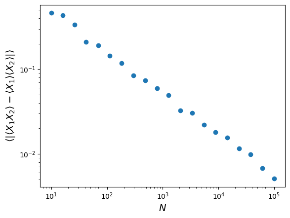
Note that the size of the residual difference between the product of averages and average of products scales as \(1/\sqrt{N}\).
The standard error on the mean
We’re now in a position to estimate the uncertainty on the mean of our speed-of-light data, since the sample mean is effectively equal to a sum of scaled random variables (our \(n\) individual measurements \(x_{i}\)):
[\bar{x}=\frac{1}{n}\sum\limits_{i=1}^{n} x_{i}]
The scaling factor is \(1/n\) which is the same for all \(i\). Now, the expectation of our sample mean (i.e. over an infinite number of trials, that is repeats of the same collection of 100 measurements) is:
[E[\bar{x}] = \sum\limits_{i=1}^{n} \frac{1}{n} E[x_{i}] = n\frac{1}{n}E[x_{i}] = \mu]
Here we also implicitly assume that the measurements \(X_{i}\) are all drawn from the same (i.e. stationary) distribution, i.e \(E[x_{i}] = \mu\) for all \(i\). If this is the case, then in the absence of any systematic error we expect that \(\mu=c_{\mathrm{air}}\), the true value for the speed of light in air.
However, we don’t measure \(\mu\), which corresponds to the population mean!! We actually measure the scaled sum of measurements, i.e. the sample mean \(\bar{x}\), and this is distributed around the expectation value \(\mu\) with variance \(V[\bar{x}] = \sum\limits_{i=1}^{n} n^{-2} \sigma_{i}^{2} = \sigma^{2}/n\) (using the result for variance of a sum of random variables with scaling factor \(a_{i}=1/n\) assuming the measurements are all drawn from the same distribution, i.e. \(\sigma_{i}=\sigma\)). Therefore the expected standard deviation on the mean of \(n\) values, also known as the standard error is:
[\sigma_{\bar{x}} = \frac{\sigma}{\sqrt{n}}]
where \(\sigma\) is the population standard deviation. If we guess that the sample standard deviation is the same as that of the population (and we have not yet shown whether this is a valid assumption!), we estimate a standard error of 7.9 km/s for the 100 measurements, i.e. the observed sample mean is \(\sim19\) times the standard error away from the true value!
We have already made some progress, but we still cannot formally answer our question about whether the difference of our sample mean from \(c_{\mathrm{air}}\) is real or due to statistical error. This is for two reasons:
- The standard error on the sample mean assumes that we know the population standard deviation. This is not the same as the sample standard deviation, although we might expect it to be similar.
- Even assuming that we know the standard deviation and mean of the population of sample means, we don’t know what the distribution of that population is yet, i.e. we don’t know the probability distribution of our sample mean.
We will address these remaining issues in the next episodes.
Estimators, bias and Bessel’s correction
An estimator is a method for calculating from data an estimate of a given quantity. The results of biased estimators may be systematically biased away from the true value they are trying to estimate, in which case corrections for the bias are required. The bias is equivalent to systematic error in a measurement, but is intrinsic to the estimator rather than the data itself. An estimator is biased if its expectation value (i.e. its arithmetic mean in the limit of an infinite number of experiments) is systematically different to the quantity it is trying to estimate.
The sample mean is an unbiased estimator of the population mean. This is because for measurements \(x_{i}\) which are random variates drawn from the same distribution, the population mean \(\mu = E[x_{i}]\), and the expectation value of the sample mean of \(n\) measurements is:
\[E\left[\frac{1}{n}\sum\limits_{i=1}^{n} x_{i}\right] = \frac{1}{n}\sum\limits_{i=1}^{n} E[x_{i}] = \frac{1}{n}n\mu = \mu\]We can write the expectation of the summed squared deviations used to calculate sample variance, in terms of differences from the population mean \(\mu\), as follows:
\[E\left[ \sum\limits_{i=1}^{n} \left[(x_{i}-\mu)-(\bar{x}-\mu)\right]^{2} \right] = \left(\sum\limits_{i=1}^{n} E\left[(x_{i}-\mu)^{2} \right]\right) - nE\left[(\bar{x}-\mu)^{2} \right] = \left(\sum\limits_{i=1}^{n} V[x_{i}] \right) - n V[\bar{x}]\]But we know that (assuming the data are drawn from the same distribution) \(V[x_{i}] = \sigma^{2}\) and \(V[\bar{x}] = \sigma^{2}/n\) (from the standard error) so it follows that the expectation of the average of squared deviations from the sample mean is smaller than the population variance by an amount \(\sigma^{2}/n\), i.e. it is biased:
\[E\left[\frac{1}{n} \sum\limits_{i=1}^{n} (x_{i}-\bar{x})^{2} \right] = \frac{n-1}{n} \sigma^{2}\]and therefore for the sample variance to be an unbiased estimator of the underlying population variance, we need to correct our calculation by a factor \(n/(n-1)\), leading to Bessel’s correction to the sample variance:
\[\sigma^{2} = E\left[\frac{1}{n-1} \sum\limits_{i=1}^{n} (x_{i}-\bar{x})^{2} \right]\]A simple way to think about the correction is that since the sample mean is used to calculate the sample variance, the contribution to population variance that leads to the standard error on the mean is removed (on average) from the sample variance, and needs to be added back in.
Key Points
Random variables are drawn from probability distributions. The expectation value (arithmetic mean for an infinite number of sampled variates) is equal to the mean of the distribution function (pdf).
The expectation of the variance of a random variable is equal to the expectation of the squared variable minus the squared expectation of the variable.
Sums of scaled random variables have expectation values equal to the sum of scaled expectations of the individual variables, and variances equal to the sum of scaled individual variances.
The means and variances of summed random variables lead to the calculation of the standard error (the standard deviation) of the mean.
scipy.statsdistributions have methods to calculate the mean (.mean), variance (.var) and other properties of the distribution.
scipy.statsdistributions have a method (.rvs) to generate arrays of random variates drawn from that distribution.
The Central Limit Theorem
Overview
Teaching: 30 min
Exercises: 0 minQuestions
What happens to the distributions of sums or means of random data?
Objectives
Discover the wide range of numerical methods that are available in Scipy sub-packages
See how some of the subpackages can be used for interpolation, integration, model fitting and Fourier analysis of time-series.
In this episode we will be using numpy, as well as matplotlib’s plotting library. Scipy contains an extensive range of distributions in its ‘scipy.stats’ module, so we will also need to import it. Remember: scipy modules should be installed separately as required - they cannot be called if only scipy is imported.
import numpy as np
import matplotlib.pyplot as plt
import scipy.stats as sps
So far we have learned about probability distributions and the idea that sample statistics such as the mean should be drawn from a distribution with a modified variance (with standard deviation given by the standard error), due to the summing of independent random variables. An important question is what happens to the distribution of summed variables?
The distributions of random numbers
In the previous episode we saw how to use Python to generate random numbers and calculate statistics or do simple statistical experiments with them (e.g. looking at the covariance as a function of sample size). We can also generate a larger number of random variates and compare the resulting sample distribution with the pdf of the distribution which generated them. We show this for the uniform and normal distributions below:
mu = 1
sigma = 2
## freeze the distribution for the given mean and standard deviation
nd = sps.norm(mu, sigma)

## Generate a large and a small sample
sizes=[100,10000]
x = np.arange(-5.0, 8.0, 0.01)
fig, (ax1, ax2) = plt.subplots(1,2, figsize=(9,4))
fig.subplots_adjust(wspace=0.3)
for i, ax in enumerate([ax1,ax2]):
    nd_rand = nd.rvs(size=sizes[i])
    # Make the histogram semi-transparent
    ax.hist(nd_rand, bins=20, density=True, alpha=0.5)
    ax.plot(x,nd.pdf(x))
    ax.tick_params(labelsize=12)
    ax.set_xlabel("x", fontsize=12)
    ax.tick_params(axis='x', labelsize=12)
    ax.tick_params(axis='y', labelsize=12)
    ax.set_ylabel("probability density", fontsize=12)
    ax.set_xlim(-5,7.5)
    ax.set_ylim(0,0.3)
    ax.text(2.5,0.25,
            "$\mu=$"+str(mu)+", $\sigma=$"+str(sigma)+"\n n = "+str(sizes[i]),fontsize=14)
plt.show()

## Repeat for the uniform distribution
a = 1
b = 4
## freeze the distribution for given a and b
ud = sps.uniform(loc=a, scale=b-a)
sizes=[100,10000]
x = np.arange(0.0, 5.0, 0.01)
fig, (ax1, ax2) = plt.subplots(1,2, figsize=(9,4))
fig.subplots_adjust(wspace=0.3)
for i, ax in enumerate([ax1,ax2]):
    ud_rand = ud.rvs(size=sizes[i])
    ax.hist(ud_rand, bins=20, density=True, alpha=0.5)
    ax.plot(x,ud.pdf(x))
    ax.tick_params(labelsize=12)
    ax.set_xlabel("x", fontsize=12)
    ax.tick_params(axis='x', labelsize=12)
    ax.tick_params(axis='y', labelsize=12)
    ax.set_ylabel("probability density", fontsize=12)
    ax.set_xlim(0,5)
    ax.set_ylim(0,0.8)
    ax.text(3.0,0.65,
            "$a=$"+str(a)+", $b=$"+str(b)+"\n n = "+str(sizes[i]),fontsize=14)
plt.show()
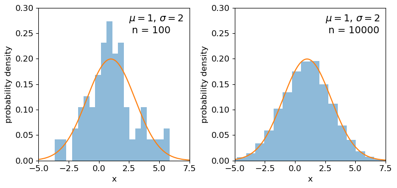
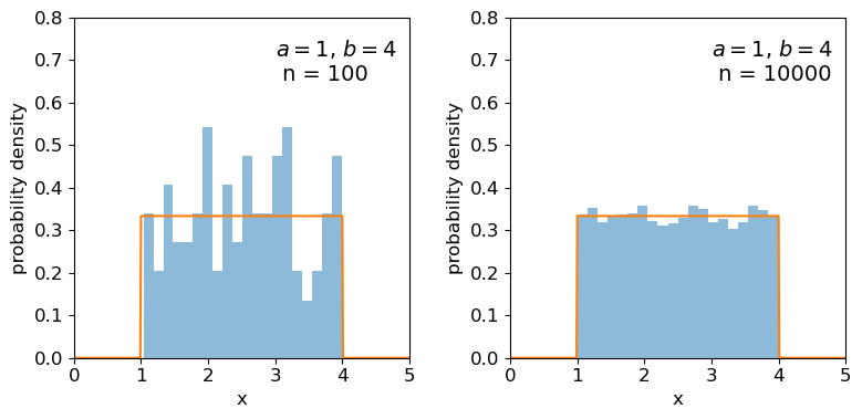
Clearly the sample distributions for 100 random variates are much more scattered compared to the 10000 random variates case (and the ‘true’ distribution).
The distributions of sums of uniform random numbers
Now we will go a step further and run a similar experiment but plot the histograms of sums of random numbers instead of the random numbers themselves. We will start with sums of uniform random numbers which are all drawn from the same, uniform distribution. To plot the histogram we need to generate a large number (ntrials) of samples of size given by nsamp, and step through a range of nsamp to make a histogram of the distribution of summed sample variates. Since we know the mean and variance of the distribution our variates are drawn from, we can calculate the expected variance and mean of our sum using the approach for sums of random variables described in the previous episode.
# Set ntrials to be large to keep the histogram from being noisy
ntrials = 100000
# Set the list of sample sizes for the sets of variates generated and summed
nsamp = [2,4,8,16,32,64,128,256,512]
# Set the parameters for the uniform distribution and freeze it
a = 0.5
b = 1.5
ud = sps.uniform(loc=a,scale=b-a)
# Calculate variance and mean of our uniform distribution
ud_var = ud.var()
ud_mean = ud.mean()
# Now set up and plot our figure, looping through each nsamp to produce a grid of subplots
n = 0  # Keeps track of where we are in our list of nsamp
fig, ax = plt.subplots(3,3, figsize=(9,4))
fig.subplots_adjust(wspace=0.3,hspace=0.3) # Include some spacing between subplots
# Subplots ax have indices i,j to specify location on the grid
for i in range(3):
    for j in range(3):
        # Generate an array of ntrials samples with size nsamp[n]
        ud_rand = ud.rvs(size=(ntrials,nsamp[n]))
        # Calculate expected mean and variance for our sum of variates
        exp_var = nsamp[n]*ud_var
        exp_mean = nsamp[n]*ud_mean
        # Define a plot range to cover adequately the range of values around the mean
        plot_range = (exp_mean-4*np.sqrt(exp_var),exp_mean+4*np.sqrt(exp_var))
        # Define xvalues to calculate normal pdf over
        xvals = np.linspace(plot_range[0],plot_range[1],200)
        # Calculate histogram of our sums
        ax[i,j].hist(np.sum(ud_rand,axis=1), bins=50, range=plot_range,
                                              density=True, alpha=0.5)
        # Also plot the normal distribution pdf for the calculated sum mean and variance
        ax[i,j].plot(xvals,sps.norm.pdf(xvals,loc=exp_mean,scale=np.sqrt(exp_var)))
        # The 'transform' argument allows us to locate the text in relative plot coordinates
        ax[i,j].text(0.1,0.8,"$n=$"+str(nsamp[n]),transform=ax[i,j].transAxes)
        n = n + 1
        # Only include axis labels at the left and lower edges of the grid:
        if j == 0:
            ax[i,j].set_ylabel('prob. density')
        if i == 2:
            ax[i,j].set_xlabel("sum of $n$ $U($"+str(a)+","+str(b)+"$)$ variates")
plt.show()
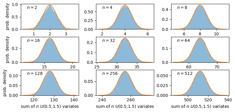
A sum of two uniform variates follows a triangular probability distribution, but as we add more variates we see that the distribution starts to approach the shape of the normal distribution for the same (calculated) mean and variance! Let’s show this explicitly by calculating the ratio of the ‘observed’ histograms for our sums to the values from the corresponding normal distribution.
To do this correctly we should calculate the average probability density of the normal pdf in bins which are the same as in the histogram. We can calculate this by integrating the pdf over each bin, using the difference in cdfs at the upper and lower bin edge (which corresponds to the integrated probability in the normal pdf over the bin). Then if we normalise by the bin width, we get the probability density expected from a normal distribution with the same mean and variance as the expected values for our sums of variates.
# For better precision we will make ntrials 10 times larger than before, but you
# can reduce this if it takes longer than a minute or two to run.
ntrials = 1000000
nsamp = [2,4,8,16,32,64,128,256,512]
a = 0.5
b = 1.5
ud = sps.uniform(loc=a,scale=b-a)
ud_var = ud.var()
ud_mean = ud.mean()
n = 0
fig, ax = plt.subplots(3,3, figsize=(9,4))
fig.subplots_adjust(wspace=0.3,hspace=0.3)
for i in range(3):
    for j in range(3):
        ud_rand = ud.rvs(size=(ntrials,nsamp[n]))
        exp_var = nsamp[n]*ud_var
        exp_mean = nsamp[n]*ud_mean
        nd = sps.norm(loc=exp_mean,scale=np.sqrt(exp_var))
        plot_range = (exp_mean-4*np.sqrt(exp_var),exp_mean+4*np.sqrt(exp_var))
        # Since we no longer want to plot the histogram itself, we will use the numpy function instead
        dens, edges = np.histogram(np.sum(ud_rand,axis=1), bins=50, range=plot_range,
                                              density=True)
        # To get the pdf in the same bins as the histogram, we calculate the differences in cdfs at the bin
        # edges and normalise them by the bin widths.
        norm_pdf = (nd.cdf(edges[1:])-nd.cdf(edges[:-1]))/np.diff(edges)
        # We can now plot the ratio as a pre-calculated histogram using the trick we learned in Episode 1
        ax[i,j].hist((edges[1:]+edges[:-1])/2,bins=edges,weights=dens/norm_pdf,density=False,
                     histtype='step')
        ax[i,j].text(0.05,0.8,"$n=$"+str(nsamp[n]),transform=ax[i,j].transAxes)
        n = n + 1
        ax[i,j].set_ylim(0.5,1.5)
        if j == 0:
            ax[i,j].set_ylabel('ratio')
        if i == 2:
            ax[i,j].set_xlabel("sum of $n$ $U($"+str(a)+","+str(b)+"$)$ variates")
plt.show()
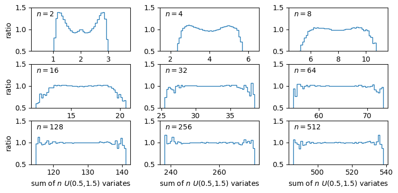
The plots show the ratio between the distributions of our sums of \(n\) uniform variates, and the normal distribution with the same mean and variance expected from the distribution of summed variates. There is still some scatter at the edges of the distributions, where there are only relatively few counts in the histograms of sums, but the ratio plots still demonstrate a couple of important points:
- As the number of summed uniform variates increases, the distribution of the sums gets closer to a normal distribution (with mean and variance the same as the values expected for the summed variable).
- The distribution of summed variates is closer to normal in the centre, and deviates more strongly in the ‘wings’ of the distribution.
The Central Limit Theorem
The Central Limit Theorem (CLT) states that under certain general conditions (e.g. distributions with finite mean and variance), a sum of \(n\) random variates drawn from distributions with mean \(\mu_{i}\) and variance \(\sigma_{i}^{2}\) will tend towards being normally distributed for large \(n\), with the distribution having mean \(\mu = \sum\limits_{i=1}^{n} \mu_{i}\) and variance \(\sigma^{2} = \sum\limits_{i=1}^{n} \sigma_{i}^{2}\).
It is important to note that the limit is approached asymptotically with increasing \(n\), and the rate at which it is approached depends on the shape of the distribution(s) of variates being summed, with more asymmetric distributions requiring larger \(n\) to approach the normal distribution to a given accuracy. The CLT also applies to mixtures of variates drawn from different types of distribution or variates drawn from the same type of distribution but with different parameters. Note also that summed normally distributed variables are always distributed normally, whatever the combination of normal distribution parameters.
The Central Limit Theorem tells us that when we calculate a sum (or equivalently a mean) of a sample of \(n\) randomly distributed measurements, for increasing \(n\) the resulting quantity will tend towards being normally distributed around the true mean of the measured quantity (assuming no systematic error), with standard deviation equal to the standard error.
Key Points
Sums of samples of random variates from non-normal distributions with finite mean and variance, become asymptotically normally distributed as their sample size increases.
The theorem holds for sums of differently distributed variates, but the speed at which a normal distribution is approached depends on the shape of the variate’s distribution, with symmetric distributions approaching the normal limit faster than asymmetric distributions.
Means of large numbers (e.g. 100 or more) of non-normally distributed measurements are distributed close to normal, with distribution mean equal to the population mean that the measurements are drawn from and standard deviation given by the standard error on the mean.
Distributions of means (or other types of sum) of non-normal random data are closer to normal in their centres than in the tails of the distribution, so the normal assumption is most reliable for smaller deviations of sample mean from the population mean.
Significance tests: the z-test - comparing with a population of known mean and variance
Overview
Teaching: 30 min
Exercises: 10 minQuestions
How do I compare a sample mean with an expected value, when I know the true variance that the data are sampled from?
Objectives
Learn the general approach to significance testing, including how to formulate a null hypothesis and calculate a p-value.
See how you can formulate statements about the signficance of a test.
Learn how to compare a normally distributed sample mean with an expected value for a given hypothesis, assuming that you know the variance of the distribution the data are sampled from.
In this episode we will be using numpy, as well as matplotlib’s plotting library. Scipy contains an extensive range of distributions in its ‘scipy.stats’ module, so we will also need to import it. Remember: scipy modules should be installed separately as required - they cannot be called if only scipy is imported.
import numpy as np
import matplotlib.pyplot as plt
import scipy.stats as sps
Significance testing
We want to test the idea that our data are drawn from a distribution with a given mean value. For the Michelson case, this is the speed of light in air, i.e. we are testing the null hypothesis that the difference between our data distribution’s mean and the speed of light in air is consistent with being zero. To do this, we need to carry out a significance test, which is a type of hypothesis test where we compare a test statistic calculated from the data with the distribution expected it if the null hypothesis is true.
The procedure for significance testing is:
- Choose a test statistic appropriate to test the null hypothesis.
- Calculate the test statistic for your data.
- Compare the test statistic with the distribution expected for it if your null hypothesis is true: the percentile (and whether or not the test is two-tailed) of the test statistic in the distribution gives the \(p\)-value, which is the probability that you would obtain the observed test statistic if your null hypothesis is true.
The \(p\)-value is an estimate of the statistical significance of your hypothesis test. It represents the probability that the test statistic is equal to or more extreme than the one observed, Formally, the procedure is to pre-specify (before doing the test, or ideally before even looking at the data!) a required significance level \(\alpha\), below which one would reject the null hypothesis, but one can also conduct exploratory data analysis (e.g. when trying to formulate more detailed hypotheses for testing with additional data) where a \(p\)-value is simply quoted as it is and possibly used to define a set of conclusions.
The null hypothesis itself should be framed according to the scientific question you are trying to answer. We cannot write a simple prescription for this as the range of questions and ways to address them is too vast, but we give some starting points further below and you will see many examples for inspiration in the remainder of this course.
Significance testing: two-tailed case
Often the hypothesis we are testing predicts a test statistic with a (usually symmetric) two-tailed distribution, because only the magnitude of the deviation of the test statistic from the expected value matters, not the direction of that deviation. A good example is for deviations from the expected mean due to statistical error: if the null hypothesis is true we don’t expect a preferred direction to the deviations and only the size of the deviation matters.
Calculation of the 2-tailed \(p\)-value is demonstrated in the figure below. For a positive observed test statistic \(Z=z^{\prime}\), the \(p\)-value is twice the integrated probability density for \(z\geq z^{\prime}\), i.e. \(2\times(1-cdf(z^{\prime}))\).
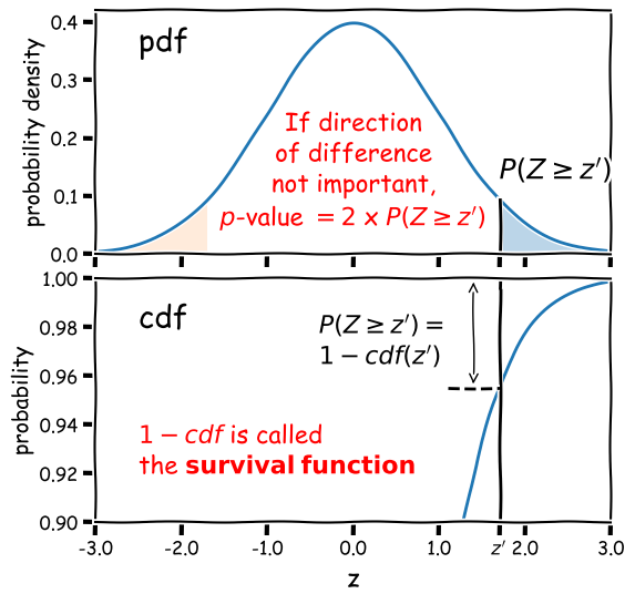
Note that the function 1-cdf is called the survival function and it is available as a separate method for the statistical distributions in
scipy.stats, which can be more accurate than calculating 1-cdf explicitly for very small \(p\)-values.For example, for the graphical example above, where the distribution is a standard normal:
print("p-value = ",2*sps.norm.sf(1.7))p-value = 0.08913092551708608In this example the significance is low and the null hypothesis is not ruled out at better than 95% confidence.
Significance levels and reporting
How should we choose our significance level, \(\alpha\)? It depends on how important is the answer to the scientific question you are asking!
- Is it a really big deal, e.g. the discovery of a new particle, or an unexpected source of emission in a given waveband (such as the first electromagnetic counterpart to a gravitational wave source)? If so, then the usual required significance is \(\alpha= 5\sigma\), which means the probability of the data being consistent with the null hypothesis (i.e. non-detection of the particle or electromagnetic counterpart) is equal or less than that in the integrated pdf more than 5 standard deviations from the mean for a standard normal distribution (\(p\simeq 5.73\times 10^{-7}\) or about 1 in 1.7 million).
- Is it important but not completely groundbreaking or requiring re-writing of or large addition to our understanding of the scientific field? For example, the ruling out of a particular part of parameter space for a candidate dark matter particle, or the discovery of emission in a known electromagnetic radiation source but in a completely different waveband to that observed before (e.g. an X-ray counterpart to an optical source)? In this case we would usually be happy with \(\alpha= 3\sigma\) (\(p\simeq 2.7\times 10^{-3}\), i.e. 0.27% probability).
- Does the analysis show (or rule out) an effect but without much consequence, since the effect (or lack of it) was already expected based on previous analysis, or as a minor consequence of well-established theory? Or is the detection of the effect tentative and only reported to guide design of future experiments or analysis of additional data? If so, then we might accept a significance level as low as \(\alpha=0.05\). This level is considered the minimum bench-mark for publication in some fields, but in physics and astronomy it is usually only considered as suitable for individual claims in a paper that also presents more significant results or novel interpretation.
When reporting results for pre-specified tests we usually state them in this way (or similar, according to your own style or that of the field):
”<The hypothesis> is rejected at the <insert \(\alpha\) here> significance level.”
‘Rule out’ is also often used as a synonym for ‘reject’. Or if we also include the calculated \(p\)-value for completeness:
“We obtained a \(p-\)value of <insert \(p\) here>”, so that the hypothesis is rejected at the <insert \(\alpha\) here> significance level.”
Sometimes we invert the numbers (taking 1 minus the \(p\)-value or probability) and report the confidence level as a percentage e.g. for \(\alpha=0.05\) we can also state:
“We rule out …. at the 95% confidence level.”
And if (as is often the case) our required significance is not satisfied, we should also state that:
“We cannot rule out …. at better than the <insert \(\alpha\) here> significance level.”
Example: comparing the sample mean with a population with known mean and variance
We’ll start with a simpler example than the speed-of-light data (where our null hypothesis only tells us the mean of the underlying population), by looking at some data where we already know both the mean and variance of the population we are comparing with.
The data consists of a sample of heights (in cm) of students in this class in previous years. The heights are given in the first column and the second column gives an integer (1 or 0) in place of the self-identified gender of the student.
From official data we have the means and standard deviations of the adult population of the Netherlands, split female/male, as follows:
- Female: \(\mu=169\) cm, \(\sigma=7.11\) cm.
- Male: \(\mu=181.1\) cm, \(\sigma=7.42\) cm.
The first question we would like to answer is, are the data from our class consistent with either (or both) of these distributions?
We’ll first load the data and split it into two subsamples according to the integer used to ID the gender. We’ll then take a look at the distribution of the two subsamples by plotting histograms. For comparison we will also plot the means of male and female heights in the Netherlands from the official data
# Load the class heights data
class_heights = np.genfromtxt("class_heights.dat")

# Create arrays of the two gender subsamples:
heights0 = class_heights[class_heights[:,1] == 0]
heights1 = class_heights[class_heights[:,1] == 1]

plt.figure()
plt.hist(heights0[:,0], bins=10, histtype='step', linewidth=4, alpha=0.5, label='subsample 0')
plt.hist(heights1[:,0], bins=10, histtype='step', linewidth=4, alpha=0.5, label='subsample 1')
plt.xlabel('height (cm)', fontsize=14)
plt.ylabel('counts', fontsize=14)
plt.axvline(181.1, label=r'$\mu_{\rm m}$', color='gray', linestyle='dashed')
plt.axvline(169, label=r'$\mu_{\rm f}$', color='gray', linestyle='dotted')
plt.legend(fontsize=12,ncol=2,columnspacing=1.0,loc=2)
plt.show()
From the histograms, the two subsamples appear to be different and the difference might be explained by the difference in height distributions from the official Dutch survey data, but we need to put this on a more quantitative footing. So let’s frame our question into a testable hypothesis.
Building a testable hypothesis
To frame a scientific question into a hypothesis we can test, we need to specify two key components:
- A physical model: The component that can be described with parameters that are fixed and independent of that particular experiment.
- A statistical model: The component that leads to the specific instance of data and which may be repeated to produce a different experimental realisation of the data which is drawn from the same distribution as the previous experiment.
For example, in an experiment to measure the distribution of photon energies (i.e. a spectrum) from a synchrotron emission process, the physical model is the parameterisation of the underlying spectral shape (e.g. with a power-law index and normalisation for an empirical description) and possibly the modification of the spectrum by the instrument itself (collecting area vs. photon energy). The statistical model is that the photon detections are described by a Poisson process with rate parameter proportional to the photon flux of the underlying spectrum.
Splitting the components of the hypothesis in this way is important because it makes it easier to select an appropriate statistical test and it reminds us that a hypothesis may be rejected because the statistical model is incorrect, i.e. not necessarily because the underlying physical model is false.
Our (null) hypothesis is: A given subsample of heights is drawn from a population with mean and standard deviation given by the values for the Dutch male or female populations.
This doesn’t sound like much but now breaking it down into the statistical (red) and physical (blue) models implicit to the hypothesis:
A given subsample of class heights is drawn in an unbiased way from a population with mean and standard deviation given by the values for either of the given Dutch male or female populations.
The statistical part is subtle because parameters of the distribution are subsumed into the physical part, since these are fixed and independent of our experiment provided that the experimental sample is indeed drawn from one of these populations. Note that the statistical model of the hypothesis also covers the possibility that the subsamples are selected in different ways (gender identification is complex and also not strictly binary and we don’t know whether the quoted Dutch population statistics were based on self-identification or another method which may be biased in a different way).
Testing our hypothesis
Now we’re ready to test our hypothesis. Since we know the mean and standard deviation of our populations, the obvious statistic to test is the mean since it is an unbiased estimator. We need to make (and state!) a further assumption to continue with our test:
The sample mean is drawn from a normal distribution with mean \(\mu\) and standard deviation equal to the standard error \(\sigma/\sqrt{n}\) (where \(\mu\) and \(\sigma\) are the mean and standard deviation of the population we are comparing with and \(n\) is the number of heights in a subsample).
This assumption allows us to justify our choice of test statistic and specify the kind of test we will be using. The choice of population parameters is driven by the data, but the assumption of a normally distributed sample mean can be justified in two ways. Firstly, the assumption will hold exactly if the population height distributions are normal (this is actually the case!), since a sum (and hence mean) of normally distributed variates is itself normally distributed.
The assumption will also hold (but more weakly) if we can apply the central limit theorem to our data. Our sample sizes (\(n=20\) and \(n=11\)) are rather small for this, but it’s likely that the assumption holds for deviations at least out to 2 to 3 times \(\sigma/\sqrt{n}\) from the population means (e.g. compare with the simulations for sums of uniform variates in the previous episode).
Challenge: calculate the test statistic and its significance
Having stated our null hypothesis and assumption(s) required for the test, we now proceed with the test itself. If (as assumed) the sample means (\(\bar{x}\)) are uniformly distributed around \(\mu\) with standard deviation \(\sigma/\sqrt{n}\), we can define a new test statistic, the \(z\)-statistic
\[Z = \frac{\bar{x}-\mu}{\sigma/\sqrt{n}}\]which is distributed as a standard normal. By calculating the \(p\)-value of our statistic \(Z=z^{\prime}\) (e.g. see Significance testing: two-tailed case above) we can determine the significance of our \(z\)-test.
Now write a function that takes as input the data for a class heights subsample and the normal distribution parameters you are comparing it with, and outputs the \(p\)-value, and use your function to compare the means of each subsample with the male and female adult height distributions for the Netherlands.
Solution
def mean_significance(data,mu,sigma):
    '''Calculates the significance of a sample mean of input data vs. a specified normal distribution
    Inputs: The data (1-D array) and mean and standard deviation of normally distributed comparison population
    Outputs: prints the observed mean and population parameters, the Z statistic value and p-value'''
    mean = np.mean(data)
    # Calculate the Z statistic zmean
    zmean = np.abs((mean-mu)*np.sqrt(len(data))/sigma)
    # Calculate the p-value of zmean from the survival function - default distribution is standard normal
    pval = 2*sps.norm.sf(zmean)
    print("Observed mean =",mean," versus population mean",mu,", sigma",sigma)
    print("z_mean =",zmean,"with Significance =",pval)
    return
Now running the function with the data and given population parameters:
print("\nComparing with Dutch female height distribution:")
mu, sigma = 169, 7.11
print("\nSubsample 0:")
mean_significance(heights0[:,0],mu,sigma)
print("\nSubsample 1:")
mean_significance(heights1[:,0],mu,sigma)

print("\nComparing with Dutch male height distribution:")
mu, sigma = 181.1, 7.42
print("\nSubsample 0:")
mean_significance(heights0[:,0],mu,sigma)
print("\nSubsample 1:")
mean_significance(heights1[:,0],mu,sigma)
Comparing with Dutch female height distribution: Subsample 0: Observed mean = 180.6 versus population mean 169 , sigma 7.11 z_mean = 1.6315049226441622 with Significance = 0.10278382199989615 Subsample 1: Observed mean = 168.0909090909091 versus population mean 169 , sigma 7.11 z_mean = 0.12786088735455786 with Significance = 0.8982590642895918 Comparing with Dutch male height distribution: Subsample 0: Observed mean = 180.6 versus population mean 181.1 , sigma 7.42 z_mean = 0.0673854447439353 with Significance = 0.9462748562617406 Subsample 1: Observed mean = 168.0909090909091 versus population mean 181.1 , sigma 7.42 z_mean = 1.7532467532467522 with Significance = 0.07955966096511223
We can see that the means of both subsamples are formally consistent with being drawn from either population, although the significance for subsample 0 is more consistent with the male population than the female, and vice versa for subsample 1. Formally we can state that none of the hypotheses are ruled out at more than 95% confidence.
Our results seem inconclusive in this case, however here we have only performed significance tests of each hypothesis individually. We can also ask a different question, which is: is one hypothesis (i.e. in this case one population) preferred over another at a given confidence level? We will cover this form of hypothesis comparison in a later episode.
Key Points
Significance testing is used to determine whether a given (null) hypothesis is rejected by the data, by calculating a test statistic and comparing it with the distribution expected for it, under the assumption that the null hypothesis is true.
A null hypothesis is formulated from a physical model (with parameters that are fixed and independent of the experiment) and a statistical model (which governs the probability distribution of the test statistic). Additional assumptions may be required to derive the distribution of the test statistic.
A null hypothesis is rejected if the measured p-value of the test statistic is equal to or less than a pre-defined significance level.
Rejection of the null hypothesis could indicate rejection of either the physical model or the statistical model (or both), with further experiments or tests required to determine which.
For comparing measurements with an expected (population mean) value, a z-statistic can be calculated to compare the sample mean with the expected value, normalising by the standard error on the sample mean, which requires knowledge of the variance of the population that the measurements are sampled from.
The z-statistic should be distributed as a standard normal provided that the sample mean is normally distributed, which may arise for large samples from the central limit theorem, or for any sample size if the measurements are drawn from normal distributions.
Significance tests: the t-test - comparing means when population variance is unknown
Overview
Teaching: 30 min
Exercises: 30 minQuestions
How do I compare a sample mean with an expected value, when I don’t know the true variance that the data are sampled from?
How do I compare two sample means, when neither the true mean nor variance that the data are sampled from are known?
Objectives
Learn how to compare normally distributed sample means with an expected value, or two sample means with each other, when only the sample variance is known.
In this episode we will be using numpy, as well as matplotlib’s plotting library. Scipy contains an extensive range of distributions in its ‘scipy.stats’ module, so we will also need to import it. Remember: scipy modules should be installed separately as required - they cannot be called if only scipy is imported.
import numpy as np
import matplotlib.pyplot as plt
import scipy.stats as sps
Comparing the sample mean with a population with known mean but unknown variance
Now let’s return to the speed-of-light data, where we want to compare our data to the known mean of the speed of light in air. Here we have a problem because the speed of light data is drawn from a population with an unknown variance, since it is due to the experimental statistical error which (without extremely careful modelling of the experiment) can only be determined from the data itself.
Therefore we must replace \(\sigma\) in the \(z\)-statistic calculation \(Z = (\bar{x}-\mu)/(\sigma/\sqrt{n})\) with the sample standard deviation \(s_{x}\), to obtain a new test statistic, the \(t\)-statistic :
[T = \frac{\bar{x}-\mu}{s_{x}/\sqrt{n}}]
Unlike the normally distributed \(z\)-statistic, under certain assumptions the \(t\)-statistic can be shown to follow a different distribution, the \(t\)-distribution. The assumptions are:
- The sample mean is normally distributed. This means that either the data are normally distributed, or that the sample mean is normally distributed following the central limit theorem.
- The sample variance follows a scaled chi-squared distribution. We will discuss the chi-squared distribution in more detail in a later episode, but we note here that it is the distribution that results from summing squared, normally-distributed variates. For sample variances to follow this distribution, it is usually (but not always) required that the data are normally distributed. The variance of non-normally distributed data often deviates significantly from a chi-squared distribution. However, for large sample sizes, the sample variance usually has a narrow distribution of values so that the resulting \(t\)-statistic distribution is not distorted too much.
Intuition builder: \(t\)-statistic
We can use the
scipy.statsrandom number generator to see how the distribution of the calculated \(t\)-statistic changes with sample size, and how it compares with the pdfs for the normal and \(t\)-distributions.First generate many (\(10^{5}\) or more) samples of random variates with sample sizes \(n\) of \(n\) = 4, 16, 64 and 256, calculating and plotting histograms of the \(t\)-statistic for each sample (this can be done quickly using numpy arrays, e.g. see the examples in the central limit theorem episode). For comparison, also plot the histograms of the standard normal pdf and the \(t\)-distribution for \(\nu = n-1\) degrees of freedom.
For your random variates, try using normally distributed variates first, and the uniform variates for comparison (this will show the effects of convergence to a normal distribution from the central limit theorem). Because the t-statistic is calculated from the scaled difference in sample and population means, the distribution parameters won’t matter here. You can use the scipy distribution function defaults if you wish.
Solution part 1
ntrials = 1000000  # Ideally generate at least 100000 samples
# Set the list of sample sizes for the sets of variates generated and used to calculate the t-statistic
nsamp = [4,16,64,256]

# Try with normal and then uniformly distributed variates:
distributions = [sps.norm,sps.uniform]
fig, ax = plt.subplots(2,4, figsize=(10,6))
fig.subplots_adjust(wspace=0.2)
for i in range(2):
    distrib = distributions[i]
    dist = distrib(loc=1,scale=1)
    mu = dist.mean()
    for j in range(4):
        # Generate an array of ntrials samples with size nsamp[j]
        dist_rand = dist.rvs(size=(ntrials,nsamp[j]))
        # Calculate the t-values explicitly to produce an array of t-statistics for all trials
        tvals = (np.mean(dist_rand,axis=1)-mu)/sps.sem(dist_rand,axis=1)
        # Now set up the distribution functions to compare with, first standard normal:
        nd = sps.norm()
        # Next the t-distribution. It has one parameter, the degrees of freedom (df) = sample size - 1
        td = sps.t(df=nsamp[j]-1)
        plot_range = (-4,4)
        # We are first comparing the histograms:
        dens, edges, patches = ax[i,j].hist(tvals, bins=50, range=plot_range, density=True, alpha=0.3)
        # To get the pdfs in the same bins as the histogram, we calculate the differences in cdfs at the bin
        # edges and normalise them by the bin widths.
        norm_pdf = (nd.cdf(edges[1:])-nd.cdf(edges[:-1]))/np.diff(edges)
        t_pdf = (td.cdf(edges[1:])-td.cdf(edges[:-1]))/np.diff(edges)
        # We can now plot the pdfs as pre-calculated histograms using the trick we learned in Episode 1
        ax[i,j].hist((edges[1:]+edges[:-1])/2,bins=edges,weights=norm_pdf,density=False,
                     histtype='step',linewidth=2,color='orange')
        ax[i,j].hist((edges[1:]+edges[:-1])/2,bins=edges,weights=t_pdf,density=False,
                     histtype='step',linewidth=2,color='green')
        if (i == 0):
            ax[i,j].text(0.1,0.93,"Normal",transform=ax[i,j].transAxes)
        else:
            ax[i,j].text(0.1,0.93,"Uniform",transform=ax[i,j].transAxes)

        ax[i,j].text(0.1,0.86,"$n=$"+str(nsamp[j]),transform=ax[i,j].transAxes)
        xticks = np.arange(-4,4.1,1)
        ax[i,j].set_xticks(xticks)
        if j == 0:
            ax[i,j].set_ylabel('prob. density')
        if i == 1:
            ax[i,j].set_xlabel("t")
plt.show()
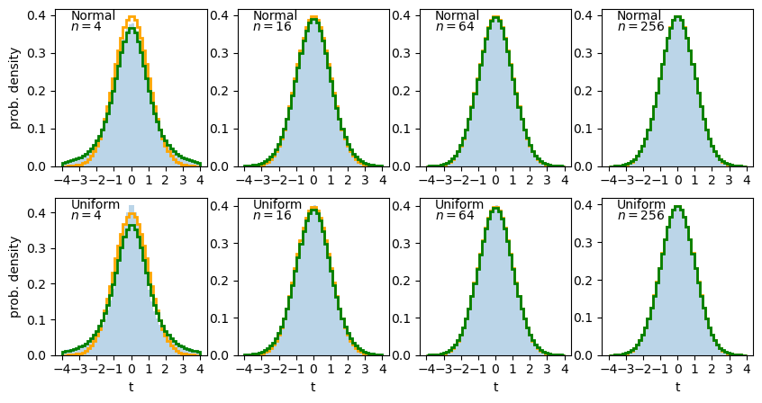
The solid histogram shows the distribution of sample t-statistics for normal (top row) or uniform (bottom row) random variates of sample size \(n\) while the stepped lines show the pdf histograms for the normal (orange) and \(t\)-distribution (green).
We can see that for small \(n\) the distribution of t-statistics has wide ‘tails’ compared to the normal distribution, which match those seen in the t-distribution. For larger \(n\) the t-distribution and the distribution of sample \(t\)-statistics starts to match the normal distribution in shape. This difference is due to the additional variance added to the distribution by dividing by the square-root of sample variance. Sample variance distributions (and hence, the distribution of sample standard deviations) are wider and more asymmetric for smaller sample sizes.
To show the differences between the distributions, and compare uniform and normal variates, it is useful to plot the ratio of the calculated distribution of sample \(t\)-statistics to the pdfs of the normal and \(t\)-distributions. Adapt the code used to plot the histograms, to show these ratios instead.
Solution part 2
fig, ax = plt.subplots(2,4, figsize=(10,6))
fig.subplots_adjust(wspace=0.2)
for i in range(2):
    distrib = distributions[i]
    dist = distrib(loc=1,scale=1)
    mu = dist.mean()
    for j in range(4):
        # Generate an array of ntrials samples with size nsamp[j]
        dist_rand = dist.rvs(size=(ntrials,nsamp[j]))
        # Calculate the t-values explicitly to produce an array of t-statistics for all trials
        tvals = (np.mean(dist_rand,axis=1)-mu)/sps.sem(dist_rand,axis=1)
        # Now set up the distribution functions to compare with, first standard normal:
        nd = sps.norm()
        # Next the t-distribution. It has one parameter, the degrees of freedom (df) = sample size - 1
        td = sps.t(df=nsamp[j]-1)
        plot_range = (-4,4)
        # Since we no longer want to plot the histogram itself, we will use the numpy function instead
        dens, edges = np.histogram(tvals, bins=50, range=plot_range, density=True)
        # To get the pdfs in the same bins as the histogram, we calculate the differences in cdfs at the bin
        # edges and normalise them by the bin widths.
        norm_pdf = (nd.cdf(edges[1:])-nd.cdf(edges[:-1]))/np.diff(edges)
        t_pdf = (td.cdf(edges[1:])-td.cdf(edges[:-1]))/np.diff(edges)
        # We can now plot the ratios as pre-calculated histograms using the trick we learned in Episode 1
        ax[i,j].hist((edges[1:]+edges[:-1])/2,bins=edges,weights=dens/norm_pdf,density=False,
                     histtype='step',linewidth=2,color='orange')
        ax[i,j].hist((edges[1:]+edges[:-1])/2,bins=edges,weights=dens/t_pdf,density=False,
                     histtype='step',linewidth=2,color='green')
        if (i == 0):
            ax[i,j].text(0.1,0.93,"Normal",transform=ax[i,j].transAxes)
        else:
            ax[i,j].text(0.1,0.93,"Uniform",transform=ax[i,j].transAxes)

        ax[i,j].text(0.1,0.86,"$n=$"+str(nsamp[j]),transform=ax[i,j].transAxes)
        ax[i,j].set_ylim(0.5,1.5)
        ax[i,j].tick_params(axis='y',labelrotation=90.0,which='both')
        xticks = np.arange(-4,4.1,1)
        ax[i,j].set_xticks(xticks)
        if j == 0:
            ax[i,j].set_ylabel('ratio')
        if i == 1:
            ax[i,j].set_xlabel("t")
plt.show()
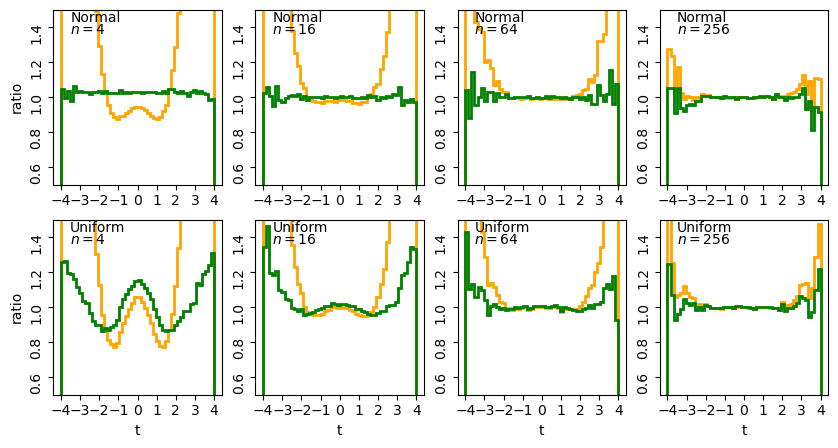
The stepped lines show the ratio of the distribution of sample t-statistics for normal (top row) or uniform (bottom row) random variates of sample size \(n\) relative to the pdf histograms of the normal (orange) and \(t\)-distribution (green).
For small \(n\) we can clearly see the effects of the tails in the ratio to the normal distribution (orange lines) while the ratio for the theoretical \(t\)-distribution (green lines) is much closer to the simulated distribution. It’s interesting to note a few extra points:
- For smaller sample sizes, normally distributed variates show \(t\)-statistics that are consistent with the theoretical distribution. This is because the \(t\)-distribution assumes normally distributed sample means and sample variances which follow a scaled chi-squared distribution, both of which are automatically true for normal variates.
- For uniformly distributed variates, there are strong deviations from the theoretical \(t\)-distribution for small sample sizes, which become smaller (especially in the centre of the distribution) with increasing sample size. These deviations arise firstly because the sample means deviate significantly from the normal distribution for small sample sizes (since, following the central limit theorem, they are further from the limiting normal distribution of a sum of random variates). Secondly, the effects of the deviation from the chi-squared distribution of variance are much stronger for small sample sizes.
- For the large \(n\) the difference between the sample distributions and the theoretical ones (normal or \(t\)-distributions) become indistinguishable for the full range of \(t\). For these samples the theoretical \(t\)-distributions are effectively normally distributed (this is also because of the central limit theorem!) although for uniform variates the distribution of sample \(t\) statistics still does not approach the theoretical distribution exactly in the wings. Scatter in the wings persists even for the normally distributed variates: this is statistical noise due to the small numbers of sample \(t\)-statistics in those bins.
Our overall conclusion is one that applies generally to significance tests: for smaller sample sizes you should always be wary of assigning significances \(>2\) to \(3\) \(\sigma\), unless you are certain that the sample data are also normally distributed.
Probability distributions: the \(t\)-distribution
The \(t\)-distribution is derived based on standard normally distributed variates and depends only on a single parameter, the degrees of freedom \(\nu\). Its pdf and cdf are complicated, involving Gamma and hypergeometric functions, so rather than give the full distribution functions, we will only state the results that for variates \(X\) distributed as a \(t\)-distribution (i.e. \(X\sim t(\nu)\)):
\(E[X] = 0\) for \(\nu > 1\) (otherwise \(E[X]\) is undefined)
\(V[X] = \frac{\nu}{\nu-2}\) for \(\nu > 2\), \(\infty\) for \(1\lt \nu \leq 2\), otherwise undefined.
The distribution in scipy is given by the function scipy.stats.t, which we can use to plot the pdfs and cdfs for different \(\nu\):
nu_list = [1, 2, 5, 10, 100]
fig, (ax1, ax2) = plt.subplots(1,2, figsize=(9,4))
# change the separation between the sub-plots:
fig.subplots_adjust(wspace=0.3)
x = np.arange(-4, 4, 0.01)
for nu in nu_list:
    td = sps.t(df=nu)
    ax1.plot(x, td.pdf(x), lw=2, label=r'$\nu=$'+str(nu))
    ax2.plot(x, td.cdf(x), lw=2, label=r'$\nu=$'+str(nu))
for ax in (ax1,ax2):
    ax.tick_params(labelsize=12)
    ax.set_xlabel("t", fontsize=12)
    ax.tick_params(axis='x', labelsize=12)
    ax.tick_params(axis='y', labelsize=12)
    ax.legend(fontsize=10, loc=2)
ax1.set_ylabel("probability density", fontsize=12)
ax2.set_ylabel("probability", fontsize=12)
plt.show()
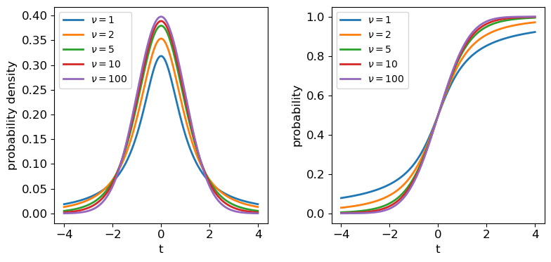
The tails of the \(t\)-distribution are the most prominent for small \(\nu\), but rapidly decrease in strength for larger \(\nu\) as the distribution approaches a standard normal in the limit \(\nu \rightarrow \infty\).
The one-sample \(t\)-test
Finally we are ready to use the \(t\)-statistic to calculate the significance of the difference of our speed-of-light sample mean from the known value, using a test called the one-sample \(t\)-test, or often Students one-sample \(t\)-test, after the pseudonym of the test’s inventor, William Sealy Gossett (Gossett worked as a statistician for the Guiness brewery, who required their employees to publish their research under a pseudonym).
Let’s write down our null hypothesis, again highlighting the statistical (red) and physical (blue) model components:
The samples of speed-of-light measurements are independent variates drawn from a distribution with (population) mean equal to the known value of the speed of light in air and (population) standard deviation given by the (unknown) statistical error of the experiment.
Here the physical part is very simple, we just assume that since the mean is an unbiased estimator, it must be equal to the ‘true’ value of the speed of light in air (\(c_{\rm air}=703\) km/s). We are also implicitly assuming that there is no systematic error, but that is something our test will check. We put ‘(population)’ in brackets to remind you that these are the distribution values, not the sample statistics, although normally that is a given.
Having defined our hypothesis, we also need to make the assumption that the sample mean is normally distributed (this is likely to be the case for 100 samples - the histograms plotted in Episode 1 do not suggest that the distributions are especially skewed and so their sums should converge quickly to being normal distributed). To fully trust the \(t\)-statistic we also need to assume that our sample variance is distributed as a scaled chi-squared variable (or ideally that the data itself is normally distributed). We cannot be sure of this but must make clear it is one of our assumptions anyway, or we can make no further progress!
Finally, with these assumptions, we can carry out a one-sample \(t\)-test on our complete data set. To do so we could calculate \(T\) for the sample ourselves and use the \(t\) distribution for \(\nu=99\) to determine the two-sided significance (since we don’t expect any bias on either side of the true valur from statistical error). But scipy.stats also has a handy function scipy.stats.ttest_1samp which we can use to quickly get a \(p\)-value. We will use both for demonstration purposes:
# First load in the data again (if you need to)
michelson = np.genfromtxt("michelson.txt",names=True)
run = michelson['Run']
speed = michelson['Speed']
experiment = michelson['Expt']

# Define c_air (remember speed has 299000 km/s subtracted from it!)
c_air = 703

# First calculate T explicitly:
T = (np.mean(speed)-c_air)/sps.sem(speed)
# The degrees of freedom to be used for the t-distribution is n-1
dof = len(speed)-1
# Applying a 2-tailed significance test, the p-value is twice the survival function for the given T:
pval = 2*sps.t.sf(T,df=dof)
print("T is:",T,"giving p =",pval,"for",dof,"degrees of freedom")

# And now the easy way - the ttest_1samp function outputs T and the p-value but not the dof:
T, pval = sps.ttest_1samp(speed,popmean=c_air)
print("T is:",T,"giving p =",pval,"for",len(speed)-1,"degrees of freedom")
T is: 18.908867755499248 giving p = 1.2428269455699714e-34 for 99 degrees of freedom
T is: 18.90886775549925 giving p = 1.2428269455699538e-34 for 99 degrees of freedom
The numbers are identical after some rounding at the highest precisions.
Looking deeper at Michelson’s data
Clearly \(\lvert T \rvert\) is so large that our \(p\)-value is extremely small, and our null hypothesis is falsified, whatever reasonable \(\alpha\) we choose for the required significance!
In practice this means that we should first look again at our secondary assumptions about the distribution of sample mean and variance - is there a problem with using the \(t\)-test itself? We know from our earlier simulations that for large samples (e.g. \(n=64\)) the \(t\)-statistic is distributed close to a \(t\)-distribution even for uniformly distributed data. Our data look closer to being normally distributed than that, so we can be quite confident that there is nothing very unusual about our data that would violate those assumptions.
That leaves us with the remaining possibility that the difference is real and systematic, i.e. the sample is not drawn from a distribution with mean equal to the known value of \(c_{\rm air}\). Intuitively we know it is much more likely that there is a systematic error in the experimental measurements than a change in the speed of light itself! (We can put this on firmer footing when we discuss Bayesian methods later on).
However, we know that Michelson’s data was obtained in 5 separate experiments - if there is a systematic error, it could change between experiments. So let’s now pose a further question: are any of Michelson’s 5 individual experiments consistent with the known value of \(c_{\rm air}\)?
We can first carry out a simple visual check by plotting the mean and standard error for each of Michelson’s 5 experiments:
plt.figure()
for i in range(1,6):
    dspeed = speed[experiment == i]
    plt.errorbar(i,np.mean(dspeed),yerr=sps.sem(dspeed),marker='o',color='blue')
# Plot a horizontal line for the known speed:
plt.axhline(703,linestyle='dotted')
plt.xlabel('Experiment',fontsize=14)
plt.ylabel('Speed - 299000 (km/s)',fontsize=14)
# Specify tickmark locations to restrict to experiment ID
plt.xticks(range(1,6))
# The tick marks are small compared to the plot size, we can change that with this command:
plt.tick_params(axis="both", labelsize=12)
plt.show()
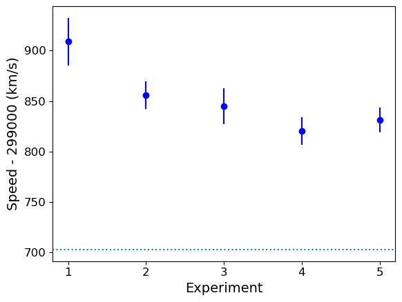
The mean speed for all the experiments are clearly systematically offset w.r.t. the known value of \(c_{\rm air}\) (shown by the dotted line). Given the standard errors for each mean, the offsets appear highly significant in all cases (we could do more one-sample \(t\)-tests but it would be a waste of time, the results are clear enough!). So we can conclude that Michelson’s experiments are all affected by a systematic error that leads the measured speeds to be too high, by between \(\sim 120\) and 200 km/s.
The two-sample \(t\)-test
We could also ask, is there evidence that the systematic error changes between experiments?
To frame this test as a formal null hypothesis we could say:
Two samples (experiments) of speed-of-light measurements are independent variates drawn from the same distribution with (population) mean equal to the known value of the speed of light in air plus an unknown systematic error which is common to both samples and (population) standard deviation given by the (unknown) statistical error of the experiments.
Now things get a little more complicated, because our physical model incorporates the systematic error which is unknown. So to compare the results from two experiments we must deal with unknown mean and variance! Fortunately there are variants of the \(t\)-test which can deal with this situation, called independent two-sample t-tests.
Challenge: comparing Michelson’s experiment means
The independent two-sample t-test uses similar assumptions as the one-sample test to compare the means of two independent samples and determine whether they are drawn from populations with the same mean:
- Both sample means are assumed to be normally distributed.
- Both sample variances are assumed to be drawn from scaled chi-squared distributions. The standard two-sample test further assumes that the two populations being compared have the same population variance, but this assumption is relaxed in Welch’s t-test which allows for comparison of samples drawn from populations with different variance (this situation is expected when comparing measurements of the same physical quantity from experiments with different precisions).
The calculated \(T\)-statistic and degrees of freedom used for the \(t\)-distribution significance test are complicated for these two-sample tests, but we can use
scipy.stats.ttest_indto do the calculation for us.Experiment 1 shows the largest deviation from the known \(c_{\rm air}\), so we will test whether the data from this experiment is consistent with being drawn from a population with the same mean (i.e. same systematic error) as the other four experiments. Do the following:
- Look up and read the online documentation for
scipy.stats.ttest_ind.- Calculate the \(p-value\) for comparing the mean of experiment 1 with those of experiments 2-5 by using both variance assumptions: i.e. first that variances are equal, and then that variances do not have to be equal (Welch’s \(t\)-test).
- What do you conclude from these significance tests?
Solution
dspeed1 = speed[experiment == 1]
print("Assuming equal population variances:")
for i in range(2,6):
    dspeed0 = speed[experiment == i]
    tstat, pval = sps.ttest_ind(dspeed1,dspeed0,equal_var=True)
    print("Exp. 1 vs. Exp.",i)
    print("T = ",tstat,"and p-value =",pval)
print("\nAllowing different population variances:")
for i in range(2,6):
    dspeed0 = speed[experiment == i]
    tstat, pval = sps.ttest_ind(dspeed1,dspeed0,equal_var=False)
    print("Exp. 1 vs. Exp.",i)
    print("T = ",tstat,"and p-value =",pval)
Assuming equal population variances: Exp. 1 vs. Exp. 2 T = 1.9515833716400273 and p-value = 0.05838720267301064 Exp. 1 vs. Exp. 3 T = 2.1781204580045963 and p-value = 0.035671254712023606 Exp. 1 vs. Exp. 4 T = 3.2739095648811736 and p-value = 0.0022652870881169095 Exp. 1 vs. Exp. 5 T = 2.9345525158236394 and p-value = 0.005638691935846029 Allowing different population variances: Exp. 1 vs. Exp. 2 T = 1.9515833716400273 and p-value = 0.06020049646207564 Exp. 1 vs. Exp. 3 T = 2.1781204580045963 and p-value = 0.03615741764675092 Exp. 1 vs. Exp. 4 T = 3.2739095648811736 and p-value = 0.0026588535542915533 Exp. 1 vs. Exp. 5 T = 2.9345525158236394 and p-value = 0.006537756688652282Relaxing the equal-variance assumption marginally increases the p-values. We can conclude in both cases that the systematic error for Experiment 1 is significantly different to the systematic errors in Experiments 3, 4 and 5 at significances of between 2-3 \(\sigma\).
We need to be cautious however, since we have selected Experiment 1 as being different from the others by using the same data that we are using to compare them, i.e. the result that Experiment 1 is different from the others could be biased by our pre-selection, so that our a posteriori sample selection is not strictly independent of the other experiments!
Furthermore, we have compared this particular extremum in sample mean with multiple other experiments - we might expect some significant differences by chance. So the evidence hints at the possibility that the systematic error changes between experiments, but we should return to these issues later on to be sure.
Challenge: comparing the class height subsamples
Use the two-sample \(t\)-test to compare the means of the two subsamples (denoted 1 and 0) of heights drawn from previous versions of this statistics class (data file
class_heights.dat), also clearly stating your null hypothesis and any assumptions, and give your conclusions about the test result.Solution
Our null hypothesis is that both subsamples are drawn from populations with the same mean (but not necessarily the same variance as this is not specified by the question). To use the two-sample \(t\)-test we must further assume that the sample means are normally distributed and the sample variances are drawn from chi-squared distributions. Since the population distributions for heights are typically normal, both requirements should be satisfied.
# Load the class heights data
class_heights = np.genfromtxt("class_heights.dat")

# Create arrays of the two gender subsamples:
heights0 = class_heights[class_heights[:,1] == 0]
heights1 = class_heights[class_heights[:,1] == 1]

# We need the independent two-sample test allowing for different variances:
tstat, pval = sps.ttest_ind(heights1[:,0],heights0[:,0],equal_var=False)
print("T = ",tstat,"and p-value =",pval)
T = -4.745757286152359 and p-value = 0.00021922627382520773The \(p\)-value of 0.0002 gives the probability that if the null hypothesis is true, we would obtain such a large \(\lvert T \rvert\) by chance. We can therefore conclude that the null hypothesis is ruled out, i.e. the subsamples are drawn from populations with different means at more than 3-sigma significance.
Key Points
A t-statistic can be defined from the sample mean and its standard error, which is distributed following a t-distribution, If the sample mean is normally distributed and sample variance is distributed as a scaled chi-squared distribution.
The one-sample t-test can be used to compare a sample mean with a population mean when the population variance is unknown, as is often the case with experimental statistical errors.
The two-sample t-test can be used to compare two sample means, to see if they could be drawn from distributions with the same population mean and either the same or different variances (e.g. to compare measurements of the same quantity obtained with different experiments).
Caution must be applied when interpreting t-test significances of more than 2 to 3 sigma unless the sample is large or the measurements themselves are known to be normally distributed.
Discrete random variables and their probability distributions
Overview
Teaching: 40 min
Exercises: 10 minQuestions
How do we describe discrete random variables and what are their common probability distributions?
Objectives
Learn how discrete random variables are defined and how the Bernoulli, binomial and Poisson distributions are derived from them.
Plot, and carry out probability calculations with the binomial and Poisson distributions.
In this episode we will be using numpy, as well as matplotlib’s plotting library. Scipy contains an extensive range of distributions in its ‘scipy.stats’ module, so we will also need to import it. Remember: scipy modules should be installed separately as required - they cannot be called if only scipy is imported.
import numpy as np
import matplotlib.pyplot as plt
import scipy.stats as sps
So far we have only considered random variables that are drawn from continuous distributions, such as the important uniform and normal distributions. However, random variables can also be discrete, drawn from (finite or infinite) sets of discrete values and including some of the most important probability distributions in statistics, such as the binomial and Poisson distributions. We will spend some time considering discrete random variables and their distributions here.
Sample space
Discrete probability distributions map a sample space \(\Omega\) (denoted with curly brackets) of possible outcomes on to a set of corresponding probabilities. Unlike continuous distributions, the sample space may consist of non-numerical elements or numerical elements, but in all cases the elements of the sample space represent possible outcomes of a random ‘draw’ from the distribution.
For example, when flipping an ideal coin (which cannot land on its edge!) there are two outcomes, heads (\(H\)) or tails (\(T\)) so we have the sample space \(\Omega = \{H, T\}\). We can also represent the possible outcomes of 2 successive coin flips as the sample space \(\Omega = \{HH, HT, TH, TT\}\). A roll of a 6-sided dice would give \(\Omega = \{1, 2, 3, 4, 5, 6\}\). However, a Poisson process corresponds to the sample space \(\Omega = \mathbb{Z}^{0+}\), i.e. the set of all positive and integers and zero, even if the probability for most elements of that sample space is infinitesimal (it is still \(> 0\)!).
Probability distributions of discrete random variables
In the case of a Poisson process or the roll of a dice, our sample space already consists of a set of contiguous (i.e. next to one another in sequence) numbers which correspond to discrete random variables. Where the sample space is categorical, such as heads or tails on a coin, or perhaps a set of discrete but non-integer values (e.g. a pre-defined set of measurements to be randomly drawn from), it is useful to map the elements of the sample space on to a set of integers which then become our discrete random variables \(X\). For example, when flipping a coin, define a variable \(X\):
[X=
\begin{cases}
0 \quad \mbox{if tails}
1 \quad \mbox{if heads}
\end{cases}]
We can write the probability that \(X\) has a value \(x\) as \(p(x) = P(X=x)\), so that assuming the coin is fair, we have \(p(0) = p(1) = 0.5\). Our definition therefore allows us to map discrete but non-integer outcomes on to numerically ordered integer random variables \(X\) for which we can construct a probability distribution. Using this approach we can define the cdf for discrete random variables as:
[F(x) = P(X\leq x) = \sum\limits_{x_{i}\leq x} p(x_{i})]
where the subscript \(i\) corresponds to the numerical ordering of a given outcome, i.e. of an element in the sample space. The survival function is equal to \(P(X\gt x)\).
It should be clear that for discrete random variables there is no direct equivalent of the pdf for probability distributions of discrete random variables, but the function \(p(x)\) is generally specified for a given distribution instead and is known as the probability mass function or pmf.
Random sampling of items in a list or array
If you want to simulate random sampling of elements in a sample space, a simple way to do this is to set up a list or array containing the elements and then use the numpy function
numpy.random.choiceto select from the list. As a default, sampling probabilities are assumed to be \(1/n\) for a list with \(n\) items, but they may be set using thepargument to give an array of p-values for each element in the sample space. Thereplaceargument sets whether the sampling should be done with or without replacement.For example, to set up 10 repeated flips of a coin, for an unbiased and a biased coin:
coin = ['h','t']
# Uses the defaults (uniform probability, replacement=True)
print("Unbiased coin: ",np.random.choice(coin, size=10))
# Now specify probabilities to strongly weight towards heads:
prob = [0.9,0.1]
print("Biased coin: ",np.random.choice(coin, size=10, p=prob))
Unbiased coin: ['h' 'h' 't' 'h' 'h' 't' 'h' 't' 't' 'h'] Biased coin: ['h' 'h' 't' 'h' 'h' 't' 'h' 'h' 'h' 'h']
Properties of discrete random variables
Similar to the calculations for continuous random variables, expectation values of discrete random variables (or functions of them) are given by the probability-weighted values of the variables or their functions:
[E[X] = \mu = \sum\limits_{i=1}^{n} x_{i}p(x_{i})]
[E[f(X)] = \sum\limits_{i=1}^{n} f(x_{i})p(x_{i})]
[V[X] = \sigma^{2} = \sum\limits_{i=1}^{n} (x_{i}-\mu)^{2} p(x_{i})]
Probability distributions: Bernoulli and Binomial
A Bernoulli trial is a draw from a sample with only two possibilities (e.g. the colour of sweets drawn, with replacement, from a bag of red and green sweets). The outcomes are mapped on to integer variates \(X=1\) or \(0\), assuming probability of one of the outcomes \(\theta\), so the probability \(p(x)=P(X=x)\) is:
[p(x)=
\begin{cases}
\theta & \mbox{for }x=1
1-\theta & \mbox{for }x=0
\end{cases}]
and the corresponding Bernoulli distribution function (the pmf) can be written as:
[p(x\vert \theta) = \theta^{x}(1-\theta)^{1-x} \quad \mbox{for }x=0,1]
A variate drawn from this distribution is denoted as \(X\sim \mathrm{Bern}(\theta)\) and has \(E[X]=\theta\) and \(V[X]=\theta(1-\theta)\) (which can be calculated using the equations for discrete random variables above).
We can go on to consider what happens if we have repeated Bernoulli trials. For example, if we draw sweets with replacement (i.e. we put the drawn sweet back before drawing again, so as not to change \(\theta\)), and denote a ‘success’ (with \(X=1\)) as drawing a red sweet, we expect the probability of drawing \(red, red, green\) (in that order) to be \(\theta^{2}(1-\theta)\).
However, what if we don’t care about the order and would just like to know the probability of getting a certain number of successes from \(n\) draws or trials (since we count each draw as a sampling of a single variate)? The resulting distribution for the number of successes (\(x\)) as a function of \(n\) and \(\theta\) is called the binomial distribution:
[p(x\vert n,\theta) = \begin{pmatrix} n \ x \end{pmatrix} \theta^{x}(1-\theta)^{n-x} = \frac{n!}{(n-x)!x!} \theta^{x}(1-\theta)^{n-x} \quad \mbox{for }x=0,1,2,…,n.]
Note that the matrix term in brackets is the binomial coefficient to account for the permutations of the ordering of the \(x\) successes. For variates distributed as \(X\sim \mathrm{Binom}(n,\theta)\), we have \(E[X]=n\theta\) and \(V[X]=n\theta(1-\theta)\).
Naturally, scipy has a binomial distribution in its stats module, with the usual functionality, although note that the pmf method replaces the pdf method for discrete distributions. Below we plot the pmf and cdf of the distribution for different numbers of trials \(n\). It is formally correct to plot discrete distributions using separated bars, to indicate single discrete values, rather than bins over multiple or continuous values, but sometimes stepped line plots (or even histograms) can be clearer, provided you explain what they show.
## Define theta
theta = 0.6
## Plot as a bar plot
fig, (ax1, ax2) = plt.subplots(1,2, figsize=(9,4))
fig.subplots_adjust(wspace=0.3)
for n in [2,4,8,16]:
    x = np.arange(0,n+1)
    ## Plot the pmf
    ax1.bar(x, sps.binom.pmf(x,n,p=theta), width=0.3, alpha=0.4, label='n = '+str(n))
    ## and the cumulative distribution function:
    ax2.bar(x, sps.binom.cdf(x,n,p=theta), width=0.3, alpha=0.4, label='n = '+str(n))
for ax in (ax1,ax2):
    ax.tick_params(labelsize=12)
    ax.set_xlabel("x", fontsize=12)
    ax.tick_params(axis='x', labelsize=12)
    ax.tick_params(axis='y', labelsize=12)
ax1.set_ylabel("pmf", fontsize=12)
ax2.set_ylabel("cdf", fontsize=12)
ax1.legend(fontsize=14)
plt.show()
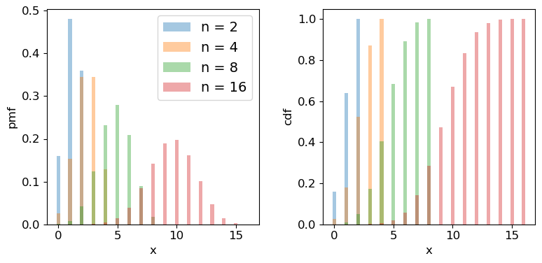
Challenge: how many observations do I need?
Imagine that you are developing a research project to study the radio-emitting counterparts of binary neutron star mergers that are detected by a gravitational wave detector. Due to relativistic beaming effects however, radio counterparts are not always detectable (they may be beamed away from us). You know from previous observations and theory that the probability of detecting a radio counterpart from a binary neutron star merger detected by gravitational waves is 0.72. For simplicity you can assume that you know from the gravitational wave signal whether the merger is a binary neutron star system or not, with no false positives.
You need to request a set of observations in advance from a sensitive radio telescope to try to detect the counterparts for each binary merger detected in gravitational waves. You need 10 successful detections of radio emission in different mergers, in order to test a hypothesis about the origin of the radio emission. Observing time is expensive however, so you need to minimise the number of observations of different binary neutron star mergers requested, while maintaining a good chance of success. What is the minimum number of observations of different mergers that you need to request, in order to have a better than 95% chance of being able to test your hypothesis?
(Note: all the numbers here are hypothetical, and are intended just to make an interesting problem!)
Solution
We want to know the number of trials \(n\) for which we have a 95% probability of getting at least 10 detections. Remember that the cdf is defined as \(F(x) = P(X\leq x)\), so we need to use the survival function (1-cdf) but for \(x=9\), so that we calculate what we need, which is \(P(X\geq 10)\). We also need to step over increasing values of \(n\) to find the smallest value for which our survival function exceeds 0.95. We will look at the range \(n=\)10-25 (there is no point in going below 10!).
theta = 0.72
for n in range(10,26):
    print("For",n,"observations, chance of 10 or more detections =",sps.binom.sf(9,n,p=theta))
For 10 observations, chance of 10 or more detections = 0.03743906242624486 For 11 observations, chance of 10 or more detections = 0.14226843721973037 For 12 observations, chance of 10 or more detections = 0.3037056744016985 For 13 observations, chance of 10 or more detections = 0.48451538004550243 For 14 observations, chance of 10 or more detections = 0.649052212181364 For 15 observations, chance of 10 or more detections = 0.7780490885758796 For 16 observations, chance of 10 or more detections = 0.8683469020520406 For 17 observations, chance of 10 or more detections = 0.9261375026767835 For 18 observations, chance of 10 or more detections = 0.9605229100485057 For 19 observations, chance of 10 or more detections = 0.9797787381766699 For 20 observations, chance of 10 or more detections = 0.9900228387408534 For 21 observations, chance of 10 or more detections = 0.9952380172098922 For 22 observations, chance of 10 or more detections = 0.9977934546597212 For 23 observations, chance of 10 or more detections = 0.9990043388667172 For 24 observations, chance of 10 or more detections = 0.9995613456019353 For 25 observations, chance of 10 or more detections = 0.999810884619313So we conclude that we need 18 observations of different binary neutron star mergers, to get a better than 95% chance of obtaining 10 radio detections.
Probability distributions: Poisson
Imagine that we are running a particle detection experiment, e.g. to detect radioactive decays. The particles are detected with a fixed mean rate per time interval \(\lambda\). To work out the distribution of the number of particles \(x\) detected in the time interval, we can imagine splitting the interval into \(n\) equal sub-intervals. Then, if the mean rate \(\lambda\) is constant and the detections are independent of one another, the probability of a detection in any given time interval is the same: \(\lambda/n\). We can think of the sub-intervals as a set of \(n\) repeated Bernoulli trials, so that the number of particles detected in the overall time-interval follows a binomial distribution with \(\theta = \lambda/n\):
[p(x \vert \, n,\lambda/n) = \frac{n!}{(n-x)!x!} \frac{\lambda^{x}}{n^{x}} \left(1-\frac{\lambda}{n}\right)^{n-x}.]
In reality the distribution of possible arrival times in an interval is continuous and so we should make the sub-intervals infinitesimally small, otherwise the number of possible detections would be artificially limited to the finite and arbitrary number of sub-intervals. If we take the limit \(n\rightarrow \infty\) we obtain the follow useful results:
\(\frac{n!}{(n-x)!} = \prod\limits_{i=0}^{x-1} (n-i) \rightarrow n^{x}\) and \(\lim\limits_{n\rightarrow \infty} (1-\lambda/n)^{n-x} = e^{-\lambda}\)
where the second limit arises from the result that \(e^{x} = \lim\limits_{n\rightarrow \infty} (1+x/n)^{n}\). Substituting these terms into the expression from the binomial distribution we obtain:
[p(x \vert \lambda) = \frac{\lambda^{x}e^{-\lambda}}{x!}]
This is the Poisson distribution, one of the most important distributions in observational science, because it describes counting statistics, i.e. the distribution of the numbers of counts in bins. For example, although we formally derived it here as being the distribution of the number of counts in a fixed interval with mean rate \(\lambda\) (known as a rate parameter), the interval can refer to any kind of binning of counts where individual counts are independent and \(\lambda\) gives the expected number of counts in the bin.
For a random variate distributed as a Poisson distribution, \(X\sim \mathrm{Pois}(\lambda)\), \(E[X] = \lambda\) and \(V[X] = \lambda\). The expected variance leads to the expression that the standard deviation of the counts in a bin is equal to \(\sqrt{\lambda}\), i.e. the square root of the expected value. We will see later on that for a Poisson distributed likelihood, the observed number of counts is an estimator for the expected value. From this, we obtain the famous \(\sqrt{counts}\) error due to counting statistics.
We can plot the Poisson pmf and cdf in a similar way to how we plotted the binomial distribution functions. An important point to bear in mind is that the rate parameter \(\lambda\) does not itself have to be an integer: the underlying rate is likely to be real-valued, but the Poisson distribution produces integer variates drawn from the distribution that is unique to \(\lambda\).
## Plot as a bar plot
fig, (ax1, ax2) = plt.subplots(1,2, figsize=(9,4))
fig.subplots_adjust(wspace=0.3)
## Step through lambda, note that to avoid Python confusion with lambda functions, we make sure we choose
## a different variable name!
for lam in [0.7,2.8,9.0,17.5]:
    x = np.arange(0,30)
    ## Plot the pmf, note that perhaps confusingly, the rate parameter is defined as mu
    ax1.bar(x, sps.poisson.pmf(x,mu=lam), width=0.3, alpha=0.4, label='$\lambda =$ '+str(lam))
    ## and the cumulative distribution function:
    ax2.bar(x, sps.poisson.cdf(x,mu=lam), width=0.3, alpha=0.4, label='$\lambda =$ '+str(lam))
for ax in (ax1,ax2):
    ax.tick_params(labelsize=12)
    ax.set_xlabel("x", fontsize=12)
    ax.tick_params(axis='x', labelsize=12)
    ax.tick_params(axis='y', labelsize=12)
ax1.set_ylabel("pmf", fontsize=12)
ax2.set_ylabel("cdf", fontsize=12)
ax1.legend(fontsize=14)
plt.show()
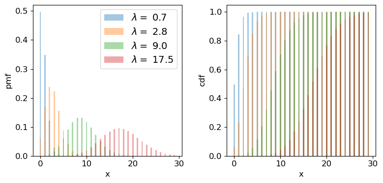
Challenge: how long until the data are complete?
Following your successful proposal for observing time, you’ve been awarded 18 radio observations of neutron star binary mergers (detected via gravitational wave emission) in order to search for radio emitting counterparts. The expected detection rate for gravitational wave events from binary neutron star mergers is 9.5 per year. Assume that you require all 18 observations to complete your proposed research. You will need to resubmit your proposal if it isn’t completed within 3 years. What is the probability that you will need to resubmit your proposal?
Solution
Since binary mergers are independent random events and their mean detection rate (at least for a fixed detector sensitivity and on the time-scale of the experiment!) should be constant in time, the number of merger events in a fixed time interval should follow a Poisson distribution.
Given that we require the full 18 observations, the proposal will need to be resubmitted if there are fewer than 18 gravitational wave events (from binary neutron stars) in 3 years. For this we can use the cdf, remember again that for the cdf \(F(x) = P(X\leq x)\), so we need the cdf for 17 events. The interval we are considering is 3 years not 1 year, so we should multiply the annual detection rate by 3 to get the correct \(\lambda\):
lam = 9.5*3
print("Probability that < 18 observations have been carried out in 3 years =",sps.poisson.cdf(17,lam))
Probability that < 18 observations have been carried out in 3 years = 0.014388006538141204So there is only a 1.4% chance that we will need to resubmit our proposal.
Challenge: is this a significant detection?
Meanwhile, one of your colleagues is part of a team using a sensitive neutrino detector to search for bursts of neutrinos associated with neutron star mergers detected from gravitational wave events. The detector has a constant background rate of 0.03 count/s. In a 1 s window following a gravitational wave event, the detector detects a single neutrino. Calculate the \(p\)-value of this detection, for the null hypothesis that it is just produced by the background and state the corresponding significance level in \(\sigma\). What would the significance levels be (in \(\sigma\)) for 2, and 3 detected neutrinos?
Discrete random variables and the central limit theorem
Finally, we should bear in mind that, as with other distributions, in the large sample limit the binomial and Poisson distributions both approach the normal distribution, with mean and standard deviation given by the expected values for the discrete distributions (i.e. \(\mu=n\theta\) and \(\sigma=\sqrt{n\theta(1-\theta)}\) for the binomial distribution and \(\mu = \lambda\) and \(\sigma = \sqrt{\lambda}\) for the Poisson distribution). It’s easy to do a simple comparison yourself, by overplotting the Poisson or binomial pdfs on those for the normal distribution.
Key Points
Discrete probability distributions map a sample space of discrete outcomes (categorical or numerical) on to their probabilities.
By assigning an outcome to an ordered sequence of integers corresponding to the discrete variates, functional forms for probability distributions (the pmf or probability mass function) can be defined.
Bernoulli trials correspond to a single binary outcome (success/fail) while the number of successes in repeated Bernoulli trials is given by the binomial distribution.
The Poisson distribution can be derived as a limiting case of the binomial distribution and corresponds to the probability of obtaining a certain number of counts in a fixed interval, from a random process with a constant rate.
Counts in fixed histogram bins follow Poisson statistics.
In the limit of large numbers of successes/counts, the binomial and Poisson distributions approach the normal distribution.
Probability calculus and conditional probability
Overview
Teaching: 40 min
Exercises: 10 minQuestions
How do we calculate with probabilities, taking account of whether some event is dependent on the occurrence of another?
Objectives
Learn how to use the probability calculus to calculate the probabilities of events or combinations of events, which may be conditional on each other.
Learn how conditional probability and the probability calculus can be used to understand multivariate probability distributions.
Sample space and conditional events
Imagine a sample space, \(\Omega\) which contains the set of all possible and mutially exclusive outcomes of some random process (also known as elements or elementary outcomes of the set). In statistical terminology, an event is a set containing one or more outcomes. The event occurs if the outcome of a draw (or sample) of that process is in that set. Events do not have to be mutually exclusive and may also share outcomes, so that events may also be considered as combinations or subsets of other events.
For example, we can denote the sample space of the results (Heads, Tails) of two successive coin flips as \(\Omega = \{HH, HT, TH, TT\}\). Each of the four outcomes of coin flips can be seen as a separate event, but we can also can also consider new events, such as, for example, the event where the first flip is heads \(\{HH, HT\}\), or the event where both flips are the same \(\{HH, TT\}\).
Now consider two events \(A\) and \(B\), whose probability is conditional on one another. I.e. the chance of one event occurring is dependent on whether the other event also occurs. The occurrence of conditional events can be represented by Venn diagrams where the entire area of the diagram represents the sample space of all possible events (i.e. probability \(P(\Omega)=1\)) and the probability of a given event or combination of events is represented by its area on the diagram. The diagram below shows four of the possible combinations of events, where the area highlighted in orange shows the event (or combination) being described in the notation below.
We’ll now decribe these combinations and do the equivalent calculation for the coin flip case where event \(A=\{HH, HT\}\) and event \(B=\{HH, TT\}\) (the probabilities are equal to 0.5 for these two events, so the example diagram is not to scale).
- Event \(A\) occurs (regardless of whether \(B\) also occurs), with probability \(P(A)\) given by the area of the enclosed shape relative to the total area.
- Event \((A \mbox{ or } B)\) occurs (in set notation this is the union of sets, \(A \cup B\)). Note that the formal ‘\(\mbox{or}\)’ here is the same as in programming logic, i.e. it corresponds to ‘either or both’ events occurring. The total probability is not \(P(A)+P(B)\) however, because that would double-count the intersecting region. In fact you can see from the diagram that \(P(A \mbox{ or } B) = P(A)+P(B)-P(A \mbox{ and } B)\). Note that if \(P(A \mbox{ or } B) = P(A)+P(B)\) we say that the two events are mutually exclusive (since \(P(A \mbox{ and } B)=0\)).
- Event \((A \mbox{ or } B)^{C}\) occurs and is the complement of \((A \mbox{ or } B)\) which is everything excluding \((A \mbox{ or } B)\), i.e. \(\mbox{not }(A \mbox{ or } B)\).
- Event \((A \mbox{ and } B)\) occurs (in set notation this is the intersection of sets, \(A\cap B\)). The probability of \((A \mbox{ and } B)\) corresponds to the area of the overlapping region.
Now in our coin flip example, we know the total sample space is \(\Omega = \{HH, HT, TH, TT\}\) and for a fair coin each of the four outcomes \(X\), has a probability \(P(X)=0.25\). Therefore:
- \(A\) consists of 2 outcomes, so \(P(A) = 0.5\)
- \((A \mbox{ or } B)\) consists of 3 outcomes (since \(TH\) is not included), \(P(A \mbox{ or } B) = 0.75\)
- \((A \mbox{ or } B)^{C}\) corresponds to \(\{TH\}\) only, so \(P(A \mbox{ or } B)^{C}=0.25\)
- \((A \mbox{ and } B)\) corresponds to the overlap of the two sets, i.e. \(HH\), so \(P(A \mbox{ and } B)=0.25\).
Conditional probability
We can also ask the question, what is the probability that an event \(A\) occurs if we know that the other event \(B\) occurs? We write this as the probability of \(A\) conditional on \(B\), i.e. \(P(A\vert B)\). We often also state this is the ‘probability of A given B’.
To calculate this, we can see from the Venn diagram that if \(B\) occurs (i.e. we now have \(P(B)=1\)), the probability of \(A\) also occurring is equal to the fraction of the area of \(B\) covered by \(A\). I.e. in the case where outcomes have equal probability, it is the fraction of outcomes in set \(B\) which are also contained in set \(A\).
This gives us the equation for conditional probability:
[P(A\vert B) = \frac{P(A \mbox{ and } B)}{P(B)}]
So, for our coin flip example, \(P(A\vert B) = 0.25/0.5 = 0.5\). This makes sense because only one of the two outcomes in \(B\) (\(HH\)) is contained in \(A\).
In our simple coin flip example, the sets \(A\) and \(B\) contain an equal number of equal-probability outcomes, and the symmetry of the situation means that \(P(B\vert A)=P(A\vert B)\). However, this is not normally the case.
For example, consider the set \(A\) of people taking this class, and the set of all students \(B\). Clearly the probability of someone being a student, given that they are taking this class, is very high, but the probability of someone taking this class, given that they are a student, is not. In general \(P(B\vert A)\neq P(A\vert B)\).
Rules of probability calculus
We can now write down the rules of probability calculus and their extensions:
- The convexity rule sets some defining limits: \(0 \leq P(A\vert B) \leq 1 \mbox{ and } P(A\vert A)=1\)
- The addition rule: \(P(A \mbox{ or } B) = P(A)+P(B)-P(A \mbox{ and } B)\)
- The multiplication rule is derived from the equation for conditional probability: \(P(A \mbox{ and } B) = P(A\vert B) P(B)\)
Note that events \(A\) and \(B\) are independent if \(P(A\vert B) = P(A) \Rightarrow P(A \mbox{ and } B) = P(A)P(B)\). The latter equation is the one for calculating combined probabilities of events that many people are familiar with, but it only holds if the events are independent!
We can also ‘extend the conversation’ to consider the probability of \(B\) in terms of probabilities with \(A\):
\[\begin{align} P(B) & = P\left((B \mbox{ and } A) \mbox{ or } (B \mbox{ and } A^{C})\right) \\ & = P(B \mbox{ and } A) + P(B \mbox{ and } A^{C}) \\ & = P(B\vert A)P(A)+P(B\vert A^{C})P(A^{C}) \end{align}\]The 2nd line comes from applying the addition rule and because the events \((B \mbox{ and } A)\) and \((B \mbox{ and } A^{C})\) are mutually exclusive. The final result then follows from applying the multiplication rule.
Finally we can use the ‘extension of the conversation’ rule to derive the law of total probability. Consider a set of all possible mutually exclusive events \(\Omega = \{A_{1},A_{2},...A_{n}\}\), we can start with the first two steps of the extension to the conversion, then express the results using sums of probabilities:
\[P(B) = P(B \mbox{ and } \Omega) = P(B \mbox{ and } A_{1}) + P(B \mbox{ and } A_{2})+...P(B \mbox{ and } A_{n})\] \[= \sum\limits_{i=1}^{n} P(B \mbox{ and } A_{i})\] \[= \sum\limits_{i=1}^{n} P(B\vert A_{i}) P(A_{i})\]This summation to eliminate the conditional terms is called marginalisation. We can say that we obtain the marginal distribution of \(B\) by marginalising over \(A\) (\(A\) is ‘marginalised out’).
Challenge
We previously discussed the hypothetical detection problem of looking for radio counterparts of binary neutron star mergers that are detected via gravitational wave events. Assume that there are three types of binary merger: binary neutron stars (\(NN\)), binary black holes (\(BB\)) and neutron-star-black-hole binaries (\(NB\)). For a hypothetical gravitational wave detector, the probabilities for a detected event to correspond to \(NN\), \(BB\), \(NB\) are 0.05, 0.75, 0.2 respectively. Radio emission is detected only from mergers involving a neutron star, with probabilities 0.72 and 0.2 respectively.
Assume that you follow up a gravitational wave event with a radio observation, without knowing what type of event you are looking at. Using \(D\) to denote radio detection, express each probability given above as a conditional probability (e.g. \(P(D\vert NN)\)), or otherwise (e.g. \(P(BB)\)). Then use the rules of probability calculus (or their extensions) to calculate the probability that you will detect a radio counterpart.
Solution
We first write down all the probabilities and the terms they correspond to. First the radio detections, which we denote using \(D\):
\(P(D\vert NN) = 0.72\), \(P(D\vert NB) = 0.2\), \(P(D\vert BB) = 0\)
and: \(P(NN)=0.05\), \(P(NB) = 0.2\), \(P(BB)=0.75\)
We need to obtain the probability of a detection, regardless of the type of merger, i.e. we need \(P(D)\). However, since the probabilities of a radio detection are conditional on the merger type, we need to marginalise over the different merger types, i.e.:
\(P(D) = P(D\vert NN)P(NN) + P(D\vert NB)P(NB) + P(D\vert BB)P(BB)\) \(= (0.72\times 0.05) + (0.2\times 0.2) + 0 = 0.076\)
You may be able to do this simple calculation without explicitly using the law of total probability, by using the ‘intuitive’ probability calculation approach that you may have learned in the past. However, learning to write down the probability terms, and use the probability calculus, will help you to think systematically about these kinds of problems, and solve more difficult ones (e.g. using Bayes theorem, which we will come to later).
Multivariate probability distributions
So far we have considered only univariate probability distributions, but now that we have looked at conditional probability we can begin to study multivariate probability distributions. For simplicity we will focus on the bivariate case, with only two variables \(X\) and \(Y\). The joint probability density function of these two variables is defined as:
[p(x,y) = \lim\limits_{\delta x, \delta y\rightarrow 0} \frac{P(x \leq X \leq x+\delta x \mbox{ and } y \leq Y \leq y+\delta y)}{\delta x \delta y}]
This function gives the probability density for any given pair of values for \(x\) and \(y\). In general the probability of variates from the distribution \(X\) and \(Y\) having values in some region \(R\) is:
[P(X \mbox{ and } Y \mbox{ in }R) = \int \int_{R} p(x,y)\mathrm{d}x\mathrm{d}y]
The probability for a given pair of \(x\) and \(y\) is the same whether we consider \(x\) or \(y\) as the conditional variable. We can then write the multiplication rule as:
[p(x,y)=p(y,x) = p(x\vert y)p(y) = p(y\vert x)p(x)]
From this we have the law of total probability:
[p(x) = \int_{-\infty}^{+\infty} p(x,y)dy = \int_{-\infty}^{+\infty} p(x\vert y)p(y)\mathrm{d}y]
i.e. we marginalise over \(y\) to find the marginal pdf of \(x\), giving the distribution of \(x\) only.
We can also use the equation for conditional probability to obtain the probability for \(x\) conditional on the variable \(y\) taking on a fixed value (e.g. a drawn variate \(Y\)) equal to \(y_{0}\):
[p(x\vert y_{0}) = \frac{p(x,y=y_{0})}{p(y_{0})} = \frac{p(x,y=y_{0})}{\int_{-\infty}^{+\infty} p(x,y=y_{0})\mathrm{d}x}]
i.e. we can obtain the probability density \(p(y_{0})\) by integrating the joint probability over \(x\).
Key Points
A sample space contains all possible mutually exclusive outcomes of an experiment or trial.
Events consist of sets of outcomes which may overlap, leading to conditional dependence of the occurrence of one event on another. The conditional dependence of events can be described graphically using Venn diagrams.
Two events are independent if their probability does not depend on the occurrence (or not) of the other event. Events are mutually exclusive if the probability of one event is zero given that the other event occurs.
The probability of an event A occurring, given that B occurs, is in general not equal to the probability of B occurring, given that A occurs.
Calculations with conditional probabilities can be made using the probability calculus, including the addition rule, multiplication rule and extensions such as the law of total probability.
Multivariate probability distributions can be understood using the mathematics of conditional probability.
Reading, working with and plotting multivariate data
Overview
Teaching: 30 min
Exercises: 20 minQuestions
How can I easily read in, clean and plot multivariate data?
Objectives
Learn how to use Pandas to be able to easily read in, clean and work with data.
Use scatter plot matrices and 3-D scatter plots, to display complex multivariate data.
In this episode we will be using numpy, as well as matplotlib’s plotting library. Scipy contains an extensive range of distributions in its ‘scipy.stats’ module, so we will also need to import it. Remember: scipy modules should be imported separately as required - they cannot be called if only scipy is imported. We will also need to use the Pandas library, which contains extensive functionality for handling complex multivariate data sets. You should install it if you don’t have it.
import numpy as np
import matplotlib.pyplot as plt
import scipy.stats as sps
import pandas as pd
Now, will look at some approaches to data handling and plotting for multivariate data sets. Multivariate data is complex and generally has a high information content, and more specialised python modules as well as plotting functions exist to explore the data as well as plotting it, while preserving as much of the information contained as possible.
Reading in, cleaning and transforming data with Pandas
Hipparcos, operating from 1989-1993 was the first scientific satellite devoted to precision astrometry, to accurately measure the positions of stars. By measuring the parallax motion of stars on the sky as the Earth (and the satellite) moves in its orbit around the sun, Hipparcos could obtain accurate measures of distance to stars up to a few hundred pc. We will use some data from the Hipparcos mission as our example data set, in order to plot a ‘colour-magnitude’ diagram of the general population of stars. We will see how to read the data into a Pandas dataframe, clean it of bad and low-precision data, and transform the data into useful values which we can plot.
The file hipparcos.txt is a multivariate data-set containing a lot of information. To start with you should look at the raw data file using your favourite text editor or the more command in linux. The file is formatted in a complex way, so that we need to skip the first 53 lines in order to get to the data. We will also need to skip the final couple of lines. Using the pandas.read_csv command to read in the file, we specify delim_whitespace=True since the values are separated by spaces not commas in this file, and we use the skiprows and skipfooter commands to skip the lines that do not correspond to data at the start and end of the file. We specify engine=Python to avoid a warning message, and index_col=False ensures that Pandas does not automatically assume that the integer ID values that are in the first column correspond to the indices in the array (this way we ensure direct correspondence of our index with our position in the array, so it is easier to diagnose problems with the data if we encounter any).
Note also that here we specify the names of our columns - we could also use names given in a specific header row in the file if one exists. Here, the header row is not formatted in a way that the names are easy to use, so we give our own names for the columns.
Finally, we need to account for the fact that some of our values are not defined (in the parallax and its error, Plx and ePlx columns) and are denoted with -. This is done by setting - to count as a NaN value to Pandas, using na_values='-'. If we don’t include this instruction in the command, those columns will appear as strings (object) according to the dtypes list.
hipparcos = pd.read_csv('hipparcos.txt', delim_whitespace=True, skiprows=53, skipfooter=2, engine='python',
names=['ID','Rah','Ram','Ras','DECd','DECm','DECs','Vmag','Plx','ePlx','BV','eBV'],
  index_col=False, na_values='-')
Note that Pandas automatically assigns a datatype (dtype) to each column based on the type of values it contains. It is always good to check that this is working to assign the correct types (here using the pandas.DataFrame.dtypes command), or errors may arise. If needed, you can also assign a dtype to each column using that variable in the pandas.read_csv command.
print(hipparcos.dtypes,hipparcos.shape)
ID        int64
Rah       int64
Ram       int64
Ras     float64
DECd      int64
DECm      int64
DECs    float64
Vmag    float64
Plx     float64
ePlx    float64
BV      float64
eBV     float64
dtype: object (85509, 12)
Once we have read the data in, we should also clean it to remove NaN values (use the Pandas .dropna function). We add a print statement to see how many rows of data are left. We should then also remove parallax values (\(p\)) with large error bars \(\Delta p\) (use a conditional statement to select only items in the pandas array which satisfy \(\Delta p/p < 0.05\). Then, let’s calculate the distance (distance in parsecs is \(d=1/p\) where \(p\) is the parallax in arcsec) and the absolute V-band magnitude (\(V_{\rm abs} = V_{\rm mag} - 5\left[\log_{10}(d) -1\right]\)), which is needed for the colour-magnitude diagram.
hnew = hipparcos[:].dropna(how="any") # get rid of NaNs if present
print(len(hnew),"rows remaining")

# get rid of data with parallax error > 5 per cent
hclean = hnew[hnew.ePlx/np.abs(hnew.Plx) < 0.05]

hclean[['Rah','Ram','Ras','DECd','DECm','DECs','Vmag','Plx','ePlx','BV','eBV']] # Just use the values
# we are going to need - avoids warning message

hclean['dist'] = 1.e3/hclean["Plx"] # Convert parallax to distance in pc
# Convert to absolute magnitude using distance modulus
hclean['Vabs'] = hclean.Vmag - 5.*(np.log10(hclean.dist) - 1.) # Note: larger magnitudes are fainter!
Challenge: colour-luminosity scatter plot
For a basic scatter plot, we can use
plt.scatter()on the Hipparcos data. This function has a lot of options to make it look nicer, so you should have a closer look at the documentation to find out about these possibilities.plt.scattercommand. The value given represents the area of the data-point in plot pixels.Now let’s look at the colour-magnitude diagram. We will also swap from magnitude to \(\mathrm{log}_{10}\) of luminosity in units of the solar luminosity, which is easier to interpret \(\left[\log_{10}(L_{\rm sol}) = -0.4(V_{\rm abs} -4.83)\right]\). Make a plot using \(B-V\) (colour) on the \(x\)-axis and luminosity on the \(y\)-axis.
Solution
loglum_sol = np.multiply(-0.4,(hclean.Vabs - 4.83)) # The calculation uses the fact that solar V-band absolute
# magnitude is 4.83, and the magnitude scale is in base 10^0.4

plt.figure()
plt.scatter(hclean.BV, loglum_sol, c="red", s=1)
plt.xlabel("B-V (mag)", fontsize=14)
plt.ylabel("V band log-$L_{\odot}$", fontsize=14)
plt.tick_params(axis='x', labelsize=12)
plt.tick_params(axis='y', labelsize=12)
plt.show()
Plotting multivariate data with a scatter-plot matrix
Multivariate data can be shown by plotting each variable against each other variable (with histograms plotted along the diagonal). This is quite difficult to do in matplotlib. It is possible by plotting on a grid and making sure to keep the indices right, but doing so can be quite instructive. We will first demonstrate this (before you try it yourself using the Hipparcos data) using some multi-dimensional fake data drawn from normal distributions, using numpy’s random.multivariate_normal function. Note that besides the size of the random data set to be generated, the variable takes two arrays as input, a 1-d array of mean values and a 2-d matrix of covariances, which defines the correlation of each axis value with the others. To see the effect of the covariance matrix, you can experiment with changing it in the cell below.
Note that the random.multivariate.normal function may (depending on the choice of parameter values)throw up a warning covariance is not positive-semidefinite. For our simple simulation to look at how to plot multi-variate data, this is not a problem. However, such warnings should be taken seriously if you are using the simulated data or covariance to do a statistical test (e.g. Monte Carlo simulation to fit a model where different observables are random but correlated as defined by a covariance matrix). As usual, more information can be found via an online search.
When plotting scatter-plot matrices, you should be sure to make sure that the indices and grid are set up so that the \(x\) and \(y\) axes are shared across columns and rows of the matrix respectively. This way it is easy to compare the relation of one variable with the others, by reading either across a row or down a column. You can also share the axes (using arguments sharex=True and sharey=True of the subplots function) and remove tickmark labels from the plots that are not on the edges of the grid, if you want to put the plots closer together (the subplots_adjust function can be used to adjust the spacing between plots.
rand_data = np.random.multivariate_normal([1,20,60,40], np.array([[3,2,1,3],
[2,2,1,4], [1,1,3,2], [3,4,2,1]]), size=100) # The second array is the assumed covariance matrix
ndims = rand_data.shape[1]
labels = ['x1','x2','x3','x4']
fig, axes = plt.subplots(4,4,figsize=(10,10))
fig.subplots_adjust(wspace=0.3,hspace=0.3)
for i in range(ndims): ## y dimension of grid
    for j in range(ndims): ## x dimension of grid
        if i == j:
            axes[i,j].hist(rand_data[:,i], bins=20)
        elif i > j:
            axes[i,j].scatter(rand_data[:,j], rand_data[:,i])
        else:
            axes[i,j].axis('off')
        if j == 0:
            if i == j:
                axes[i,j].set_ylabel('counts',fontsize=12)
            else:
                axes[i,j].set_ylabel(labels[i],fontsize=12)
        if i == 3:
            axes[i,j].set_xlabel(labels[j],fontsize=12)
plt.show()
Challenge: plotting the Hipparcos data with a scatter-plot matrix
Now plot the Hipparcos data as a scatter-plot matrix. To use the same approach as for the scatter-plot matrix shown above, you can first stack the columns in the dataframe into a single array using the function
numpy.column_stack.Solution
h_array = np.column_stack((hclean.BV,hclean.dist,loglum_sol))

ndims=3
labels = ['B-V (mag)','Distance (pc)','V band log-$L_{\odot}$']
fig, axes = plt.subplots(ndims,ndims,figsize=(8,8))
fig.subplots_adjust(wspace=0.27,hspace=0.2)
for i in range(ndims): ## y dimension
    for j in range(ndims): ## x dimension
        if i == j:
            axes[i,j].hist(h_array[:,i], bins=20)
        elif i > j:
            axes[i,j].scatter(h_array[:,j],h_array[:,i],s=1)
        else:
            axes[i,j].axis('off')
        if j == 0:
            if i == j:
                axes[i,j].set_ylabel('counts',fontsize=12)
            else:
                axes[i,j].set_ylabel(labels[i],fontsize=12)
        if i == 2:
            axes[i,j].set_xlabel(labels[j],fontsize=12)
plt.show()
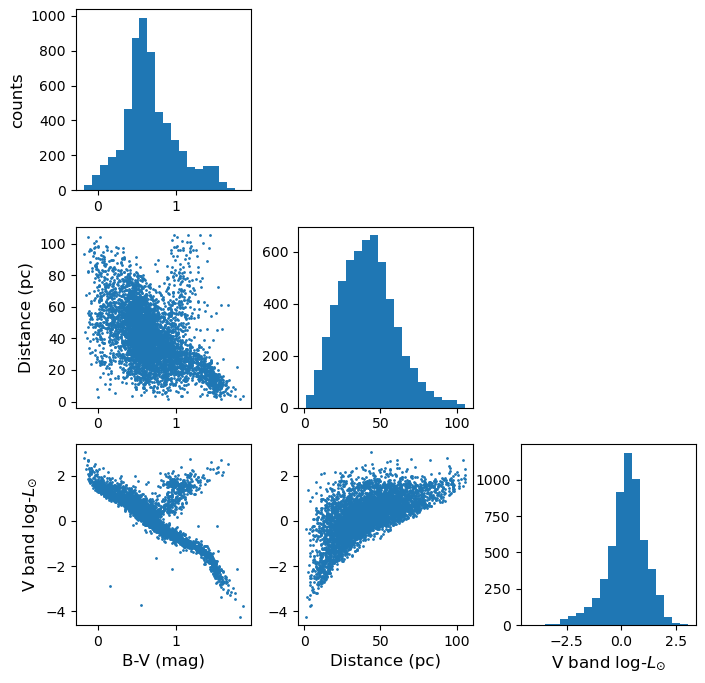
Exploring data with a 3-D plot
We can also use matplotlib’s 3-D plotting capability (after importing from mpl_toolkits.mplot3d import Axes3D) to plot and explore data in 3 dimensions (provided that you set up interactive plotting using %matplotlib notebook, the plot can be rotated using the mouse).
from mpl_toolkits.mplot3d import Axes3D
%matplotlib notebook

fig = plt.figure() # This refreshes the plot to ensure you can rotate it
ax = fig.add_subplot(111, projection='3d')
ax.scatter(rand_data[:,0], rand_data[:,1], rand_data[:,2], c="red", marker='+')
ax.set_xlabel('x')
ax.set_ylabel('y')
ax.set_zlabel('z')
plt.show()
Challenge: 3-D plot of the Hipparcos data
Now make a 3-D plot of the Hipparcos data.
Solution
%matplotlib notebook
fig = plt.figure()
ax = fig.add_subplot(111, projection='3d')
ax.scatter(hclean.BV, loglum_sol, hclean.dist, c="red", s=1)
ax.set_xlabel('B-V (mag)', fontsize=12)
ax.set_ylabel('V band log-$L_{\odot}$', fontsize=12)
ax.set_zlabel('Distance (pc)', fontsize=12)
plt.show()
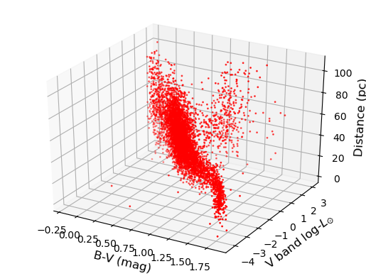
Key Points
The Pandas module is an efficient way to work with complex multivariate data, by reading in and writing the data to a dataframe, which is easier to work with than a numpy structured array.
Pandas functionality can be used to clean dataframes of bad or missing data, while scipy and numpy functions can be applied to columns of the dataframe, in order to modify or transform the data.
Scatter plot matrices and 3-D plots offer powerful ways to plot and explore multi-dimensional data.
Correlation tests and least-squares fitting
Overview
Teaching: 40 min
Exercises: 10 minQuestions
How do we determine if two measured variables are significantly correlated?
How do we carry out simple linear fits to data?
Objectives
Learn the basis for and application of correlation tests, including what their assumptions are and how significances are determined.
Discover several python approaches to simple linear regression.
Learn how to use bootstrapping to estimate errors on model parameters or other quantities measured from data.
In this episode we will be using numpy, as well as matplotlib’s plotting library. Scipy contains an extensive range of distributions in its ‘scipy.stats’ module, so we will also need to import it. Remember: scipy modules should be installed separately as required - they cannot be called if only scipy is imported.
import numpy as np
import matplotlib.pyplot as plt
import scipy.stats as sps
Sample covariance and correlation coefficient
When we are studying multivariate data we can determine sample statistics for each variable separately, but these do not tell us how the variables are related. For this purpose, we can calculate the sample covariance for two measured variables \(x\) and \(y\).:
[s_{xy}=\frac{1}{n-1}\sum\limits_{i=1}^{n} (x_{i}-\bar{x})(y_{i}-\bar{y})]
where \(n\) is the number of pairs of measured data points \(x_{i}\), \(y_{i}\). The covariance is closely related to the variance (note the same Bessel’s correction), and when covariance is discussed you will sometimes see sample variance denoted as \(s_{xx}\). In fact, the covariance tells us the variance of the part of the variations which is linearly correlated between the two variables (see the Cauchy-Schwarz inequality discussed earlier for multivariate distributions).
The sample covariance is an unbiased estimator of the population covariance of the distribution which the measurements are sampled from. Therefore, if the two variables are independent, the expectation of the sample covariance is zero and the variables are also said to be uncorrelated. Positive and negative covariances, if they are statistically significant, correspond to correlated and anticorrelated data respectively. However, the strength of a correlation is hard to determine from covariance alone, since the amplitude of the covariance depends on the sample variance of the two variables, as well as the degree of linear correlation between them.
Therefore, we can also normalise by the sample standard deviations of each variable to obtain the correlation coefficient, \(r\), also known as Pearson’s \(r\), after its developer:
[r = \frac{s_{xy}}{s_{x}s_{y}} = \frac{1}{n-1} \sum\limits_{i=1}^{n} \frac{(x_{i}-\bar{x})(y_{i}-\bar{y})}{s_{x}s_{y}}]
The correlation coefficient gives us a way to compare the correlations for variables which have very different magnitudes. It is also an example of a test statistic, which can be used to test the hypothesis that the variables are uncorrelated, under certain assumptions.
Correlation tests: Pearson’s r and Spearman’s rho
Besides Pearson’s \(r\), another commonly used correlation coefficient and test statistic for correlation tests is Spearman’s \(\rho\), which is determined using the following algorithm:
- Rank the data values \(x_{i}\), \(y_{i}\) separately in numerical order. Equal values in the sequence are assigned a rank equal to their average position, e.g. the 4th and 5th highest positions of the \(x_{i}\) have equal values and are given a rank 4.5 each. Note that the values are not reordered in \(i\) by this step, only ranks are assigned based on their numerical ordering.
- For each pair of \(x_{i}\) and \(y_{i}\) a difference \(d_{i}=\mathrm{rank}(x_{i})-\mathrm{rank}(y_{i})\) is calculated.
-
Spearman’s \(\rho\) is calculated from the resulting rank differences:
\[\rho = 1-\frac{6\sum^{n}_{i=1} d_{i}^{2}}{n(n^{2}-1)}\]
To assess the statistical significance of a correlation, \(r\) can be transformed to a new statistic \(t\):
[t = r\sqrt{\frac{n-2}{1-r^{2}}}]
or \(\rho\) can be transformed in a similar way:
[t = \rho\sqrt{\frac{n-2}{1-\rho^{2}}}]
Under the assumption that the data are i.i.d., meaning independent (i.e. no correlation) and identically distributed (i.e. for a given variable, all the data are drawn from the same distribution, although note that both variables do not have to follow this distribution), then provided the data set is large (approximately \(n> 500\)), \(t\) is distributed following a \(t\)-distribution with \(n-2\) degrees of freedom. This result follows from the central limit theorem, since the correlation coefficients are calculated from sums of random variates. As one might expect, the same distribution also applies for small (\(n<500\)) samples, if the data are themselves normally distributed, as well as being i.i.d..
The concept of being identically distributed means that each data point in one variable is drawn from the same population. This requires that, for example, if there is a bias in the sampling it is the same for all data points, i.e. the data are not made up of multiple samples with different biases.
Measurement of either correlation coefficient enables a comparison with the \(t\)-distribution and a \(p\)-value for the correlation coefficient to be calculated. When used in this way, the correlation coefficient can be used as significance test for whether the data are consistent with following the assumptions (and therefore being uncorrelated) or not. Note that the significance depends on both the measured coefficient and the sample size, so for small samples even large \(r\) or \(\rho\) may not be significant, while for very large samples, even \(r\) or \(\rho\) which are close to zero could still indicate a significant correlation.
A very low \(p\)-value will imply either that there is a real correlation, or that the other assumptions underlying the test are not valid. The validity of these other assumptions, such as i.i.d., and normally distributed data for small sample sizes, can generally be assessed visually from the data distribution. However, sometimes data sets can be so large that even small deviations from these assumptions can produce spuriously significant correlations. In these cases, when the data set is very large, the correlation is (sometimes highly) significant, but \(r\) or \(\rho\) are themselves close to zero, great care must be taken to assess whether the assumptions underlying the test are valid or not.
Pearson or Spearman?
When deciding which correlation coefficient to use, Pearson’s \(r\) is designed to search for linear correlations in the data themselves, while Spearman’s \(\rho\) is suited to monotonically related data, even if the data are not linearly correlated. Spearman’s \(\rho\) is also better able to deal with large outliers in the tails of the data samples, since the contribution of these values to the correlation is limited by their ranks (i.e. irrespective of any large values the outlying data points may have).
Correlation tests with scipy
We can compute Pearson’s correlation coefficient \(r\) and Spearman’s correlation coefficient, \(\rho\), for bivariate data using the functions in scipy.stats. For both outputs, the first value is the correlation coefficient, the second the p-value. To start with, we will test this approach using randomly generated data (which we also plot on a scatter-plot).
First, we generate a set of \(x\)-values using normally distributed data. Next, we generate corresponding \(y\)-values by taking the \(x\)-values and adding another set of random normal variates of the same size (number of values). You can apply a scaling factor to the new set of random normal variates to change the scatter in the correlation. We will plot the simulated data as a scatter plot.
x = sps.norm.rvs(size=50)
y = x + 1.0*sps.norm.rvs(size=50)

plt.figure()
plt.scatter(x, y, c="red")
plt.xlabel("x", fontsize=14)
plt.ylabel("y", fontsize=14)
plt.tick_params(axis='x', labelsize=12)
plt.tick_params(axis='y', labelsize=12)
plt.show()
Finally, use the scipy.stats functions pearsonr and spearmanr to calculate and print the correlation coefficients and corresponding \(p\)-value of the correlation for both tests of the correlation. Since we know the data are normally distributed in both variables, the \(p\)-values should be reliable, even for \(n=50\). Try changing the relative scaling of the \(x\) and \(y\) random variates to make the scatter larger or smaller in your plot and see what happens to the correlation coefficients and \(p\)-values.
## Calculate Pearson's r and Spearman's rho for the data (x,y) and print them out, also plot the data.
(rcor, rpval) = sps.pearsonr(x,y)
(rhocor, rhopval) = sps.spearmanr(x,y)

print("Pearson's r and p-value:",rcor, rpval)
print("Spearman's rho and p-value:",rhocor, rhopval)
For the example data plotted above, this gives:
Pearson's r and p-value: 0.5358536492516484 6.062792564158924e-05
Spearman's rho and p-value: 0.5417046818727491 4.851710819096097e-05
Note that the two methods give different values (including for the \(p\)-value). How can this be? Surely the data are correlated or they are not, with a certain probability? It is important to bear in mind that (as in all statistical tests) we are not really asking the question “Are the data correlated?” rather we are asking: assuming that the data are really uncorrelated, independent and identically distributed, what is the probability that we would see such a non-zero absolute value of this particular test-statistic by chance. \(r\) and \(\rho\) are different test-statistics: they are optimised in different ways to spot deviations from random uncorrelated data.
Intuition builder: comparing the effects of outliers on Pearson’s \(r\) and Spearman’s \(\rho\)
Let’s look at this difference between the two methods in more detail. What happens when our data has certain properties, which might favour or disfavour one of the methods?
Let us consider the case where there is a cloud of data points with no underlying correlation, plus an extreme outlier (as might be expected from some error in the experiment or data recording). You may remember something like this as one of the four cases from ‘Anscombe’s quartet’.
First generate the random data: use the normal distribution to generate 50 data points which are uncorrelated between x and y and then replace one with an outlier which implies a correlation, similar to that seen in Anscombe’s quartet. Plot the data, and measure Pearson’s \(r\) and Spearman’s \(\rho\) coefficients and \(p\)-values, and compare them - how are the results of the two methods different in this case? Why do you think this is?
Solution
x = sps.norm.rvs(size=50)
y = sps.norm.rvs(size=50)
x[49] = 10.0
y[49] = 10.0

## Now plot the data and compare Pearson's r and Spearman's rho and the associated p-values

plt.figure()
plt.scatter(x, y, c="red",s=10)
plt.xlabel("x", fontsize=20)
plt.ylabel("y", fontsize=20)
plt.tick_params(axis='x', labelsize=20)
plt.tick_params(axis='y', labelsize=20)
plt.show()

(rcor, rpval) = sps.pearsonr(x,y)
(rhocor, rhopval) = sps.spearmanr(x,y)

print("Pearson's r and p-value:",rcor, rpval)
print("Spearman's rho and p-value:",rhocor, rhopval)
Simple fits to bivariate data: linear regression
In case our data are linearly correlated, we can try to parameterise the linear function describing the relationship using a simple fitting approach called linear regression. The approach is to minimise the scatter (so called residuals) around a linear model. For data \(x_{i}\), \(y_{i}\), and a linear model with coefficients \(\alpha\) and \(\beta\), the residuals \(e_{i}\) are given by data\(-\)model, i.e:
[e_{i} = y_{i}-(\alpha + \beta x_{i})]
Since the residuals themselves can be positive or negative, their sum does not tell us how small the residuals are on average, so the best approach to minimising the residuals is to minimise the sum of squared errors (\(SSE\)):
[SSE = \sum\limits_{i=1}^{n} e_{i}^{2} = \sum\limits_{i=1}^{n} \left[y_{i} - (\alpha + \beta x_{i})\right]^{2}]
To minimise the \(SSE\) we can take partial derivatives w.r.t. \(\alpha\) and \(\beta\) to find the minimum for each at the corresponding best-fitting values for the fit parameters \(a\) (the intercept) and \(b\) (the gradient). These best-fitting parameter values can be expressed as functions of the means or squared-means of the sample:
[b = \frac{\overline{xy}-\bar{x}\bar{y}}{\overline{x^{2}}-\bar{x}^{2}},\quad a=\bar{y}-b\bar{x}]
where the bars indicate sample means of the quantity covered by the bar (e.g. \(\overline{xy}\) is \(\frac{1}{n}\sum_{i=1}^{n} x_{i}y_{i}\)) and the best-fitting model is:
[y_{i,\mathrm{mod}} = a + b x_{i}]
It’s important to bear in mind some of the limitations and assumptions of linear regression. Specifically it takes no account of uncertainty on the x-axis values and further assumes that the data points are equally-weighted, i.e. the ‘error bars’ on every data point are assumed to be the same. The approach also assumes that experimental errors are uncorrelated. The model which is fitted is necessarily linear – this is often not the case for real physical situations, but many models may be linearised with a suitable mathematical transformation. The same approach of minimising \(SSE\) can also be applied to non-linear models, but this must often be done numerically via computation.
Linear regression in numpy, scipy and seaborn
Here we just make and plot some fake data (with no randomisation). First use the following sequences to produce a set of correlated \(x\), \(y\) data:
x = np.array([10.0, 12.2, 14.4, 16.7, 18.9, 21.1, 23.3, 25.6, 27.8, 30.0])
y = np.array([12.6, 17.5, 19.8, 17.0, 19.7, 20.6, 23.9, 28.9, 26.0, 30.6])
There are various methods which you can use to carry out linear regression on your data:
- use
np.polyfit() - use
scipy.optimize.curve_fit() - If you have it installed, use seaborn’s
regplot()orlmplot. Note that this will automatically also draw 68% confidence contours.
Below we use all three methods to fit and then plot the data with the resulting linear regression model. For the curve_fit approach we will need to define a linear function (either with a separate function definition or by using a Python lambda function, which you can look up online). For the seaborn version you will need to install seaborn if you don’t already have it in your Python distribution, and must put x and y into a Panda’s dataframe in order to use the seaborn function.
fig, (ax1, ax2) = plt.subplots(1, 2, figsize=(10,5)) # Put first two plots side by side to save space

## first attempt: numpy.polyfit
r = np.polyfit(x, y, 1)
ax1.plot(x,y, "o");
ax1.plot(x, r[0]*x+r[1], lw=2)
ax1.text(11,27,"polyfit",fontsize=20)
ax1.set_xlabel("x", fontsize=14)
ax1.set_ylabel("y", fontsize=14)
ax1.tick_params(axis='x', labelsize=12)
ax1.tick_params(axis='y', labelsize=12)

## second attempt: scipy.optimize.curve_fit
func = lambda x, a, b: x*a+b # Here we use a Python lambda function to define our function in a single line.
r2, pcov = spopt.curve_fit(func, x,y, p0=(1,1))
ax2.plot(x,y, "o");
ax2.plot(x, r2[0]*x+r2[1], lw=2)
ax2.text(11,27,"curve_fit",fontsize=20)
ax2.set_xlabel("x", fontsize=14)
ax2.set_ylabel("y", fontsize=14)
ax2.tick_params(axis='x', labelsize=12)
ax2.tick_params(axis='y', labelsize=12)

import seaborn as sns

## fancy version with pandas and seaborn
df = pd.DataFrame(np.transpose([x,y]), index=np.arange(len(x)), columns=["x", "y"])
fig = plt.figure()
sns.regplot("x", "y", df)
plt.text(11,27,"seaborn regplot",fontsize=20)
plt.show()
Linear regression using Reynold’s fluid flow data
This uses the data in reynolds.txt. We can load this into Python very simply using numpy.genfromtxt (use the names ["dP", "v"] for the pressure gradient and velocity columns. Then change the pressure gradient units to p.p.m. by multiplying the pressure gradient by \(9.80665\times 10^{3}\).
Now fit the data with a linear model using curve_fit (assume \(v\) as the explanatory variable, i.e. on the x-axis).
Finally, plot the data and linear model, and also the data-model residuals as a pair of panels one on top of the other (you can use plt.subplots and share the x-axis values using the appropriate function argument). You may need to play with the scaling of the two plot windows, generally it is better to show the residuals with a more compressed vertical size than the data and model, since the former should be a fairly flat function if the fit converges). To set up the subplots with the right ratio of sizes, shared x-axes and no vertical space between them, you can use a sequence of commands like this:
fig, (ax1, ax2) = plt.subplots(2,1, figsize=(8,6),sharex=True,gridspec_kw={'height_ratios':[2,1]})
fig.subplots_adjust(hspace=0)
and then use ax1, ax2 to add labels or modify tick parameters (note that the commands for these may be different for subplots than for a usual single-panel figure). You can highlight the residuals better by adding a horizontal dotted line at \(y=0\) in the residual plot, using the axhline command.
reynolds = np.genfromtxt ("reynolds.txt", dtype=np.float, names=["dP", "v"], skip_header=1, autostrip=True)

## change units
ppm = 9.80665e3
dp = reynolds["dP"]*ppm
v = reynolds["v"]

popt, pcov = spopt.curve_fit(func,dp, v)
fig, (ax1, ax2) = plt.subplots(2,1, figsize=(8,6),sharex=True,gridspec_kw={'height_ratios':[2,1]})
fig.subplots_adjust(hspace=0)
ax1.plot(dp, v, "o")
ax1.plot(dp, popt[0]*dp+popt[1], lw=2)
ax1.set_ylabel("Velocity (m/s)", fontsize=14)
ax1.tick_params(axis="x",direction="in",labelsize=12) # Use this to include visible tick-marks inside the plot
ax2.plot(dp, v-(popt[0]*dp+popt[1]), "o")
ax2.set_xlabel("Pressure gradient (Pa/m)",fontsize=14)
ax2.set_ylabel("Residuals (m/s)", fontsize=14)
# The next two commands can be used to align the y-axis labels
ax1.get_yaxis().set_label_coords(-0.1,0.5)
ax2.get_yaxis().set_label_coords(-0.1,0.5)
ax2.axhline(0.0,ls=':') # plot a horizontal dotted line to better show the deviations from zero
ax2.tick_params(labelsize=12)
plt.show()
The fit doesn’t quite work at high values of the pressure gradient. We can exclude those data points for now. Create new pressure gradient and velocity arrays which only use the first 8 data points. Then repeat the fitting and plotting procedure used above. You should see that the residuals are now more randomly scattered around the model, with no systematic curvature or trend.
dp_red = dp[:8]
v_red = v[:8]

popt, pcov = spopt.curve_fit(func, dp_red, v_red)
fig, (ax1, ax2) = plt.subplots(2,1, figsize=(8,6),sharex=True,gridspec_kw={'height_ratios':[2,1]})
fig.subplots_adjust(hspace=0)
ax1.plot(dp_red, v_red, "o")
ax1.plot(dp_red, popt[0]*dp_red+popt[1], lw=2)
ax1.set_ylabel("Velocity (m/s)", fontsize=14)
ax1.tick_params(axis="x",direction="in",labelsize=12) # Use this to include visible tick-marks inside the plot
ax2.plot(dp_red, v_red-(popt[0]*dp_red+popt[1]), "o")
ax2.set_xlabel("Pressure gradient (Pa/m)",fontsize=14)
ax2.set_ylabel("Residuals (m/s)", fontsize=14)
# The next two commands can be used to align the y-axis labels
ax1.get_yaxis().set_label_coords(-0.1,0.5)
ax2.get_yaxis().set_label_coords(-0.1,0.5)
ax2.axhline(0.0,ls=':') # plot a horizontal dotted line to better show the deviations from zero
ax2.tick_params(labelsize=12)
plt.show()
Bootstrapping to obtain error estimates
Now let’s generate some fake correlated data, and then use the numpy.random.choice function to randomly select samples of the data (with replacement) for a bootstrap analysis of the variation in linear fit parameters \(a\) and \(b\). First use numpy.random.normal to generate fake sets of correlated \(x\) and \(y\) values as in the earlier example for exploring the correlation coefficient. Use 100 data points for \(x\) and \(y\) to start with and plot your data to check that the correlation is clear.
x = np.random.normal(size=100)
y = x + 0.5*np.random.normal(size=100)

fig, ax = plt.subplots(1,1,figsize=(6,6))
ax.plot(x, y, "o")
ax.set_xlabel("x", fontsize=20)
ax.set_ylabel("y", fontsize=20)
ax.tick_params(axis='x', labelsize=20)
ax.tick_params(axis='y', labelsize=20)
plt.show()
First use curve_fit to obtain the \(a\) and \(b\) coefficients for the simulated, ‘observed’ data set and print your results.
When making our new samples, we need to make sure we sample the same indices of the array for all variables being sampled, otherwise we will destroy any correlations that are present. Here you can do that by setting up an array of indices matching that of your data (e.g. with numpy.arange(len(x))), randomly sampling from that using numpy.random.choice, and then using the numpy.take function to select the values of x and y which correspond to those indices of the arrays. Then use curve_fit to obtain the coefficients \(a\) and \(b\) of the linear correlation and record these values to arrays. Use a loop to repeat the process a large number of times (e.g. 1000 or greater) and finally make a scatter plot of your values of \(a\) and \(b\), which shows the bivariate distribution expected for these variables, given the scatter in your data.
Now find the mean and standard deviations for your bootstrapped distributions of \(a\) and \(b\), print them and compare with the expected errors on these values given in the lecture slides. These estimates correspond to the errors of each, marginalised over the other variable. Your distribution could also be used to find the covariance between the two variables.
Note that the standard error on the mean of \(a\) or \(b\) is not relevant for estimating the errors here because you are trying to find the scatter in the values expected from your observed number of data points, not the uncertainty on the many repeated ‘bootstrap’ versions of the data.
Try repeating for repeated random samples of your original \(x\) and \(y\) values to see the change in position of the distribution as your sample changes. Try changing the number of data points in the simulated data set, to see how the scatter in the distributions change. How does the simulated distribution compare to the ‘true’ model values for the gradient and intercept, that you used to generate the data?
Note that if you want to do bootstrapping using a larger set of variables, you can do this more easily by using a Pandas dataframe and using the pandas.DataFrame.sample function. By setting the number of data points in the sample to be equal to the number of rows in the dataframe, you can make a resampled dataframe of the same size as the original (replacement is the default of the sample function, but be sure to check this in case the default changes!).
nsims = 1000
indices = np.arange(len(x))
func = lambda x, a, b: x*a+b
r2, pcov = spopt.curve_fit(func, x,y, p0=(1,1))
a_obs = r2[0]
b_obs = r2[1]

print("The obtained a and b coefficients are ",a_obs,"and",b_obs,"respectively.")

a_arr = np.zeros(nsims)
b_arr = np.zeros(nsims)
for i in range(nsims):
    new_indices = np.random.choice(indices, size=len(x), replace=True)
    new_x = np.take(x,new_indices)
    new_y = np.take(y,new_indices)
    r2, pcov = spopt.curve_fit(func, new_x,new_y, p0=(1,1))
    a_arr[i] = r2[0]
    b_arr[i] = r2[1]

plt.figure()
plt.plot(a_arr, b_arr, "o")
plt.xlabel("a", fontsize=14)
plt.ylabel("b", fontsize=14)
plt.tick_params(axis='x', labelsize=12)
plt.tick_params(axis='y', labelsize=12)
plt.show()

print("The mean and standard deviations of the bootstrapped samples of $a$ are:",
      np.mean(a_arr),"and",np.std(a_arr,ddof=1),"respectively")
print("The mean and standard deviations of the bootstrapped samples of $b$ are:",
      np.mean(b_arr),"and",np.std(b_arr,ddof=1),"respectively")
Key Points
The sample covariance between two variables is an unbiased estimator for population covariance and shows the part of variance that is produced by linearly related variations in both variables.
Normalising the sample covariance by the sample standard deviations in both bands yields Pearson’s correlation coefficient, r.
Spearman’s rho correlation coefficient is based on the correlation in the ranking of variables, not their absolute values, so is more robust to outliers than Pearson’s coefficient.
By assuming that the data are independent (and thus uncorrelated) and identically distributed, significance tests can be carried out on the hypothesis of no correlation, provided the sample is large (\(n>500\)) and/or is normally distributed.
By minimising the squared differences between the data and a linear model, linear regression can be used to obtain the model parameters.
Bootstrapping uses resampling (with replacement) of the data to estimate the standard deviation of any model parameters or other quantities calculated from the data.
Bayes' Theorem
Overview
Teaching: 30 min
Exercises: 30 minQuestions
What is Bayes’ theorem and how can we use it to answer scientific questions?
Objectives
Learn how Bayes’ theorem is derived and how it applies to simple probability problems.
Learn how to derive posterior probability distributions for simple hypotheses, both analytically and using a Monte Carlo approach.
In this episode we will be using numpy, as well as matplotlib’s plotting library. Scipy contains an extensive range of distributions in its ‘scipy.stats’ module, so we will also need to import it. Remember: scipy modules should be installed separately as required - they cannot be called if only scipy is imported.
import numpy as np
import matplotlib.pyplot as plt
import scipy.stats as sps
When considering two events \(A\) and \(B\), we have previously seen how the equation for conditional probability gives us the multiplication rule:
[P(A \mbox{ and } B) = P(A\vert B) P(B)]
It should be clear that we can invert the ordering of \(A\) and \(B\) here and the probability of both happening should still be the same, i.e.:
[P(A\vert B) P(B) = P(B\vert A) P(A)]
This simple extension of probability calculus leads us to Bayes’ theorem, one of the most important results in statistics and probability theory:
[P(A\vert B) = \frac{P(B\vert A) P(A)}{P(B)}]
Bayes’ theorem, named after clergyman Rev. Thomas Bayes who proposed it in the middle of the 18th century, is in its simplest form, a method to swap the conditional dependence of two events, i.e. to obtain the probability of \(A\) conditional on \(B\), when you only know the probability of \(B\) conditional on \(A\), and the probabilities of \(A\) and \(B\) (i.e. each marginalised over the conditional term).
To show the inclusion of marginalisation, we can generalise from two events to a set of mutually exclusive exhaustive events \(\{A_{1},A_{2},...,A_{n}\}\):
[P(A_{i}\vert B) = \frac{P(B\vert A_{i}) P(A_{i})}{P(B)} = \frac{P(B\vert A_{i}) P(A_{i})}{\sum^{n}{i=1} P(B\vert A{i}) P(A_{i})}]
Challenge: what kind of binary merger is it?
Returning to our hypothetical problem of detecting radio counterparts from gravitational wave events corresponding to binary mergers of binary neutron stars (NN), binary black holes (BB) and neutron star-black hole binaries (NB), recall that the probabilities of radio detection (event denoted with \(D\)) are:
\(P(D\vert NN) = 0.72\), \(P(D\vert NB) = 0.2\), \(P(D\vert BB) = 0\)
and for any given merger event the probability of being a particular type of binary is:
\(P(NN)=0.05\), \(P(NB) = 0.2\), \(P(BB)=0.75\)
Calculate the following:
- Assuming that you detect a radio counterpart, what is the probability that the event is a binary neutron star (\(NN\))?
- Assuming that you \(don't\) detect a radio counterpart, what is the probability that the merger includes a black hole (either \(BB\) or \(NB\))?
Hint
Remember that if you need a total probability for an event for which you only have the conditional probabilities, you can use the law of total probability and marginalise over the conditional terms.
Solution
We require \(P(NN\vert D)\). Using Bayes’ theorem: \(P(NN\vert D) = \frac{P(D\vert NN)P(NN)}{P(D)}\) We must marginalise over the conditionals to obtain \(P(D)\), so that:
\(P(NN\vert D) = \frac{P(D\vert NN)P(NN)}{(P(D\vert NN)P(NN)+P(D\vert NB)P(NB)} = \frac{0.72\times 0.05}{(0.72\times 0.05)+(0.2\times 0.2)}\) \(= \frac{0.036}{0.076} = 0.474 \mbox{ (to 3 s.f.)}\)
We require \(P(BB \vert D^{C}) + P(NB \vert D^{C})\), since radio non-detection is the complement of \(D\) and the \(BB\) and \(NB\) events are mutually exclusive. Therefore, using Bayes’ theorem we should calculate:
\[P(BB \vert D^{C}) = \frac{P(D^{C} \vert BB)P(BB)}{P(D^{C})} = \frac{1\times 0.75}{0.924} = 0.81169\] \[P(NB \vert D^{C}) = \frac{P(D^{C} \vert NB)P(NB)}{P(D^{C})} = \frac{0.8\times 0.2}{0.924} = 0.17316\]So our final result is: \(P(BB \vert D^{C}) + P(NB \vert D^{C}) = 0.985 \mbox{ (to 3 s.f.)}\)
Here we used the fact that \(P(D^{C})=1-P(D)\), along with the value of \(P(D)\) that we already calculated in part 1.
There are a few interesting points to note about the calculations:
- Firstly, in the absence of any information from the radio data, our prior expectation was that a merger would most likely be a black hole binary (with 75% chance). As soon as we obtained a radio detection, this chance went down to zero.
- Then, although the prior expectation that the merger would be of a binary neutron star system was 4 times smaller than that for a neutron star-black hole binary, the fact that a binary neutron star was almost 4 times more likely to be detected in radio almost balanced the difference, so that we had a slightly less than 50/50 chance that the system would be a binary neutron star.
- Finally, it’s worth noting that the non-detection case weighted the probability that the source would be a black hole binary to slightly more than the prior expectation of \(P(BB)=0.75\), and correspondingly reduced the expectation that the system would be a neutron star-black hole system, because there is a moderate chance that such a system would produce radio emission, which we did not see.
Bayes’ theorem for continuous probability distributions
From the multiplication rule for continuous probability distributions, we can obtain the continuous equivalent of Bayes’ theorem:
[p(y\vert x) = \frac{p(x\vert y)p(y)}{p(x)} = \frac{p(x\vert y)p(y)}{\int^{\infty}_{-\infty} p(x\vert y)p(y)\mathrm{d}y}]
Bayes’ billiards game
This problem is taken from the useful article Frequentism and Bayesianism: A Python-driven Primer by Jake VanderPlas, and is there adapted from a problem discussed by Sean J. Eddy.
Carol rolls a billiard ball down the table, marking where it stops. Then she starts rolling balls down the table. If the ball lands to the left of the mark, Alice gets a point, to the right and Bob gets a point. First to 6 points wins. After some time, Alice has 5 points and Bob has 3. What is the probability that Bob wins the game (\(P(B)\))?
Defining a success as a roll for Alice (so that she scores a point) and assuming the probability \(p\) of success does not change with each roll, the relevant distribution is binomial. For Bob to win, he needs the next three rolls to fail (i.e. the points go to him). A simple approach is to estimate \(p\) using the number of rolls and successes, since the expectation for \(X\sim \mathrm{Binom}(n,p)\) is \(E[X]=np\), so taking the number of successes as an unbiased estimator, our estimate for \(p\), \(\hat{p}=5/8\). Then the probability of failing for three successive rolls is:
\[(1-\hat{p})^{3} \simeq 0.053\]However, this approach does not take into account our uncertainty about Alice’s true success rate!
Let’s use Bayes’ theorem. We want the probability that Bob wins given the data already in hand (\(D\)), i.e. the \((5,3)\) scoring. We don’t know the value of \(p\), so we need to consider the marginal probability of \(B\) with respect to \(p\):
\[P(B\vert D) \equiv \int P(B,p \vert D) \mathrm{d}p\]We can use the multiplication rule \(P(A \mbox{ and } B) = P(A\vert B) P(B)\), since \(P(B,p \vert D) \equiv P(B \mbox{ and } p \vert D)\):
\[P(B\vert D) = \int P(B\vert p, D) P(p\vert D) \mathrm{d}p\]Now we can calculate \(P(D\vert p)\) from the binomial distribution, so to get there we use Bayes’ theorem:
\[P(B\vert D) = \int P(B\vert p, D) \frac{P(D\vert p)P(p)}{P(D)} \mathrm{d}p\] \[= \frac{\int P(B\vert p, D) P(D\vert p)P(p) \mathrm{d}p}{\int P(D\vert p)P(p)\mathrm{d}p}\]where we first take \(P(D)\) outside the integral (since it has no explicit \(p\) dependence) and then express it as the marginal probability over \(p\). Now:
- The term \(P(B\vert p,D)\) is just the binomial probability of 3 failures for a given \(p\), i.e. \(P(B\vert p,D) = (1-p)^{3}\) (conditionality on \(D\) is implicit, since we know the number of consecutive failures required).
- \(P(D\vert p)\) is just the binomial probability from 5 successes and 3 failures, \(P(D\vert p) \propto p^{5}(1-p)^{3}\). We ignore the term accounting for permutations and combinations since it is constant for a fixed number of trials and successes, and cancels from the numerator and denominator.
- Finally we need to consider the distribution of the chance of a success, \(P(p)\). This is presumably based on Carol’s initial roll and success rate, which we have no prior expectation of, so the simplest assumption is to assume a uniform distribution (i.e. a uniform prior): \(P(p)= constant\), which also cancels from the numerator and denominator.
Finally, we solve:
\[P(B\vert D) = \frac{\int_{0}^{1} (1-p)^{6}p^{5}}{\int_{0}^{1} (1-p)^{3}p^{5}} \simeq 0.091\]The probability of success for Bob is still low, but has increased compared to our initial, simple estimate. The reason for this is that our choice of prior suggests the possibility that \(\hat{p}\) overestimated the success rate for Alice, since the median \(\hat{p}\) suggested by the prior is 0.5, which weights the success rate for Alice down, increasing the chances for Bob.
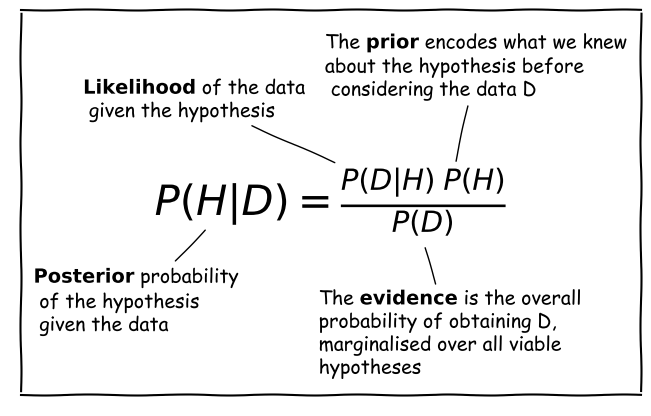
Bayes’ Anatomy
Consider a hypothesis \(H\) that we want to test with some data \(D\). The hypothesis may, for example be about the true value of a model parameter or its distribution.
Scientific questions usually revolve around whether we should favour a particular hypothesis, given the data we have in hand. In probabilistic terms we want to know \(P(H\vert D)\), which is known as the posterior probability or sometimes just ‘the posterior’.
However, you have already seen that the statistical tests we can apply to assess probability work the other way around. We know how to calculate how likely a particular set of data is to occur (e.g. using a test statistic), given a particular hypothesis (e.g. the value of a population mean) and associated assumptions (e.g. that the data are normally distributed).
Therefore we usually know \(P(D\vert H)\), a term which is called the likelihood since it refers to the likelihood of obtaining the data (or some statistic calculated from it), given our hypothesis. Note that there is a subtle but important difference between the likelihood and the pdf. The pdf gives the probability distribution of the variate(s) (the data or test statistic) for a given hypothesis and its (fixed) parameters. The likelihood gives the probability for fixed variate(s) as a function of the hypothesis parameters.
We also need the prior probability or just ‘the prior’, \(P(H)\) which represents our prior knowledge or belief about whether the given hypothesis is likely or not, or what we consider plausible parameter values. The prior is one of the most famous aspects of Bayes’ theorem and explicit use of prior probabilities is a key difference between Bayesian or Frequentist approaches to statistics.
Finally, we need to normalise our prior-weighted likelihood by the so-called evidence, \(P(D)\), a term corresponding to the probability of obtaining the given data, regardless of the hypothesis or its parameters. This term can be calculated by marginalising over the possible parameter values and (in principle) whatever viable, alternate hypotheses can account for the data. In practice, unless the situation is simple or very well constrained, this term is the hardest to calculate. For this reason, many calculations of the posterior probability make use of Monte Carlo methods (i.e. simulations with random variates), or assume simplifications that allow \(P(D)\) to be simplified or cancelled in some way (e.g. uniform priors). The evidence is the same for different hypotheses that explain the same data, so it can also be ignored when comparing the relative probabilities of different hypotheses.
Challenge: what is the true GW event rate?
In 1 year of monitoring with a hypothetical gravitational wave (GW) detector, you observe 4 GW events from binary neutron stars. Based on this information, you want to calculate the probability distribution of the annual rate of detectable binary neutron star mergers \(\lambda\).
From the Poisson distribution, you can write down the equation for the probability that you detect 4 GW in 1 year given a value for \(\lambda\). Use this equation with Bayes’ theorem to write an equation for the posterior probability distribution of \(\lambda\) given the observed rate, \(x\) and assuming a prior distribution for \(\lambda\), \(p(\lambda)\). Then, assuming that the prior distribution is uniform over the interval \([0,\infty]\) (since the rate cannot be negative), derive the posterior probability distribution for the observed \(x=4\). Calculate the expectation for your distribution (i.e. the distribution mean).
Hint
You will find this function useful for generating the indefinite integrals you need: \(\int x^{n} e^{-x}\mathrm{d}x = -e^{-x}\left(\sum\limits_{k=0}^{n} \frac{n!}{k!} x^{k}\right) + \mathrm{constant}\)
Solution
The posterior probability is \(p(\lambda \vert x)\) - we know \(p(x \vert \lambda)\) (the Poisson distribution, in this case) and we assume a prior \(p(\lambda)\), so we can write down Bayes’ theorem to find \(p(\lambda \vert x)\) as follows:
\(p(\lambda \vert x) = \frac{p(x \vert \lambda) p(\lambda)}{p(x)} = \frac{p(x \vert \lambda) p(\lambda)}{\int_{0}^{\infty} p(x \vert \lambda) p(\lambda) \mathrm{d}\lambda}\)Where we use the law of total probability we can write \(p(x)\) in terms of the conditional probability and prior (i.e. we integrate the numerator in the equation). For a uniform prior, \(p(\lambda)\) is a constant, so it can be taken out of the integral and cancels from the top and bottom of the equation: \(p(\lambda \vert x) = \frac{p(x \vert \lambda)}{\int_{0}^{\infty} p(x \vert \lambda)\mathrm{d}\lambda}\)
From the Poisson distribution \(p(x \vert \lambda) = \lambda^{x} \frac{e^{-\lambda}}{x!}\), so for \(x=4\) we have \(p(x \vert \lambda) = \lambda^{4} \frac{e^{-\lambda}}{4!}\). We usually use the Poisson distribution to calculate the pmf for variable integer counts \(x\) (this is also forced on us by the function’s use of the factorial of \(x\)) and fixed \(\lambda\). But here we are fixing \(x\) and looking at the dependence of \(p(x\vert \lambda)\) on \(\lambda\), which is a continuous function. In this form, where we fix the random variable, i.e. the data (the value of \(x\) in this case) and consider instead the distribution parameter(s) as the variable, the distribution is known as a likelihood function.
So we now have:
\(p(\lambda \vert x) = \frac{\lambda^{4} \exp(-\lambda)/4!}{\int_{0}^{\infty} \left(\lambda^{4} \exp(-\lambda)/4!\right) \mathrm{d}\lambda} = \lambda^{4} \exp(-\lambda)/4!\)since (e.g. using the hint above), \(\int_{0}^{\infty} \left(\lambda^{4} \exp(-\lambda)/4!\right) \mathrm{d}\lambda=4!/4!=1\). This latter result is not surprising, because it corresponds to the integrated probability over all possible values of \(\lambda\), but bear in mind that we can only integrate over the likelihood because we were able to divide out the prior probability distribution.
The mean is given by \(\int_{0}^{\infty} \left(\lambda^{5} \exp(-\lambda)/4!\right) \mathrm{d}\lambda = 5!/4! =5\).
Intuition builder: simulating the true event rate distribution
Now we have seen how to calculate the posterior probability for \(\lambda\) analytically, let’s see how this can be done computationally via the use of scipy’s random number generators. Such an approach is known as a Monte Carlo integration of the posterior probability distribution. Besides obtaining the mean, we can also use this approach to obtain the confidence interval on the distribution, that is the range of values of \(\lambda\) which contain a given amount of the probability. The method is also generally applicable to different, non-uniform priors, for which the analytic calculation approach may not be straightforward, or even possible.
The starting point here is the equation for posterior probability:
\[p(\lambda \vert x) = \frac{p(x \vert \lambda) p(\lambda)}{p(x)}\]The right hand side contains two probability distributions. By generating random variates from these distributions, we can simulate the posterior distribution simply by counting the values which satisfy our data, i.e. for which \(x=4\). Here is the procedure:
- Simulate a large number (\(\geq 10^{6}\)) of possible values of \(\lambda\), by drawing them from the uniform prior distribution. You don’t need to extend the distribution to \(\infty\), just to large enough \(\lambda\) that the observed \(x=4\) becomes extremely unlikely. You should simulate them quickly by generating one large numpy array using the
sizeargument of thervsmethod for thescipy.statsdistribution.- Now use your sample of draws from the prior as input to generate the same number of draws from the
scipy.statsPoisson probability distribution. I.e. use your array of \(\lambda\) values drawn from the prior as the input to the argumentmu, and be sure to setsizeto be equal to the size of your array of \(\lambda\). This will generate a single Poisson variate for each draw of \(\lambda\).- Now make a new array, selecting only the elements from the \(\lambda\) array for which the corresponding Poisson variate is equal to 4 (our observed value).
- The histogram of the new array of \(\lambda\) values follows the posterior probability distribution for \(\lambda\). The normalising ‘evidence’ term \(p(x)\) is automatically accounted for by plotting the histogram as a density distribution (so the histogram is normalised by the number of \(x=4\) values). You can also use this array to calculate the mean of the distribution and other statistical quantities, e.g. the standard deviation and the 95% confidence interval (which is centred on the median and contains 0.95 total probability).
Now carry out this procedure to obtain a histogram of the posterior probability distribution for \(\lambda\), the mean of this distribution and the 95% confidence interval.
Solution
# Set the number of draws to be very large
ntrials = 10000000
# Set the upper boundary of the uniform prior (lower boundary is zero)
uniform_upper = 20
# Now draw our set of lambda values from the prior
lam_draws = sps.uniform.rvs(loc=0,scale=uniform_upper,size=ntrials)

# And use as input to generate Poisson variates each drawn from a distribution with
# one of the drawn lambda values:
poissvars = sps.poisson.rvs(mu=lam_draws, size=ntrials)

## Plot the distribution of Poisson variates drawn for the prior-distributed lambdas
plt.figure()
# These are integers, so use bins in steps of 1 or it may look strange
plt.hist(poissvars,bins=np.arange(0,2*uniform_upper,1.0),density=True,histtype='step')
plt.xlabel('$x$',fontsize=14)
plt.ylabel('Probability density',fontsize=14)
plt.show()
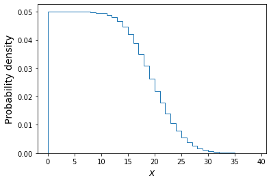
The above plot shows the distribution of the \(x\) values each corresponding to one draw of a Poisson variate with rate \(\lambda\) drawn from a uniform distribution \(U(0,20)\). Of these we will only choose those with \(x=4\) and plot their \(\lambda\) distribution below.
plt.figure()
## Here we use the condition poissvars==4 to select only values of lambda which
## generated the observed value of x. Then we plot the resulting distribution
plt.hist(lam_draws[poissvars==4],bins=100, density=True,histtype='step')
plt.xlabel('$\lambda$',fontsize=14)
plt.ylabel('Probability density',fontsize=14)
plt.show()
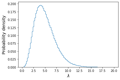
We also calculate the mean, standard deviation and the median and 95% confidence interval around it:
print("Mean of lambda = ",np.mean(lam_draws[poissvars==4]))
print("Standard deviation of lambda = ",np.std(lam_draws[poissvars==4],ddof=1))
lower95, median, upper95 = np.percentile(lam_draws[poissvars==4],q=[2.5,50,97.5])
print("The median, and 95% confidence interval is:",median,lower95,"-",upper95)
Mean of lambda = 5.00107665467192 Standard deviation of lambda = 2.2392759435694183 The median, and 95% confidence interval is: 4.667471008241424 1.622514190062071 - 10.252730578626686We can see that the mean is very close to the distribution mean calculated with the analytical approach. The confidence interval tells us that, based on our data and assumed prior, we expect the true value of lambda to lie in the range \(1.62-10.25\) with 95% confidence, i.e. there is only a 5% probability that the true value lies outside this range.
For additional challenges:
- You could define a Python function for the cdf of the analytical function for the posterior distribution of \(\lambda\), for \(x=4\) and then use it to plot on your simulated distribution the analytical posterior distribution, plotted for comparison as a histogram with the same binning as the simulated version.
- You can also plot the ratio of the simulated histogram to the analytical version, to check it is close to 1 over a broad range of values.
- Finally, see what happens to the posterior distribution of \(\lambda\) when you change the prior distribution, e.g. to a lognormal distribution with default
locandscaleands=1. (Note that you must choose a prior which does not generate negative values for \(\lambda\), otherwise the Poisson variates cannot be generated for those values).
Key Points
For conditional probabilities, Bayes’ theorem tells us how to swap the conditionals around.
In statistical terminology, the probability distribution of the hypothesis given the data is the posterior and is given by the likelihood multiplied by the prior probability, divided by the evidence.
The likelihood is the probability to obtained fixed data as a function of the distribution parameters, in contrast to the pdf which obtains the distribution of data for fixed parameters.
The prior probability represents our prior belief that the hypothesis is correct, before collecting the data
The evidence is the total probability of obtaining the data, marginalising over viable hypotheses. It is usually the most difficult quantity to calculate unless simplifying assumptions are made.
Maximum likelihood estimation
Overview
Teaching: 20 min
Exercises: 10 minQuestions
What is the best way to estimate parameters of hypotheses?
Objectives
In this episode we will be using numpy, as well as matplotlib’s plotting library. Scipy contains an extensive range of distributions in its ‘scipy.stats’ module, so we will also need to import it and we will also make use of scipy’s scipy.optimize module. Remember: scipy modules should be installed separately as required - they cannot be called if only scipy is imported.
import numpy as np
import matplotlib.pyplot as plt
import scipy.stats as sps
import scipy.optimize as spopt
Maximum likelihood estimation
Consider a hypothesis which is specified by a single parameter \(\theta\). We would like to know the probability distribution for that parameter, given the data we have in hand \(D\). To do so, we can use Bayes’ theorem:
[P(\theta\vert D) = \frac{P(D\vert \theta)P(\theta)}{P(D)},]
to obtain the posterior probability distribution for \(\theta\), in terms of the likelihood \(P(D\vert \theta)\), which gives the probability distribution of the parameter to produce the observed data \(D\) and the prior \(P(\theta)\), which shows what values of \(\theta\) we consider reasonable or unlikely, based on the knowledge we have before collecting the data. The normalising evidence can be obtained by marginalising over \(\theta\), i.e. integrating the product of likelihood and the prior over \(\theta\).
What would be a good estimate for \(\theta\)? We could consider obtaining the mean of \(P(\theta\vert D)\), but this may often be skewed if the distribution has asymmetric tails, and is also difficult to calculate in many cases. A better estimate would involve finding the value of \(\theta\) which maximises the posterior probability. I.e. we must find the peak of the probability distribution, \(P=P(\theta\vert D)\). Therefore we require:
[\frac{\mathrm{d}P}{\mathrm{d}\theta}\bigg\rvert_{\hat{\theta}} = 0 \quad \mbox{and} \quad \frac{\mathrm{d}^{2}P}{\mathrm{d}\theta^{2}}\bigg\rvert_{\hat{\theta}} < 0]
where \(\hat{\theta}\) is the value of the parameter corresponding to the maximum probability.
However, remember that \(P(D)\) does not explicitly depend on \(\theta\) so therefore the maximum corresponds only to \(\mathrm{max}[P(D\vert \theta)P(\theta)]\). This also a form of likelihood, since it is a probability distribution in terms of the distribution parameter \(\theta\), so we refer to this quantity as the maximum likelihood. The parameter value \(\hat{\theta}\) corresponding to the maximum likelihood is the best estimator for \(\theta\) and is known as the [maximum likelihood estimate] of \(\theta\) or MLE. The process of maximising the likelihood to obtain MLEs is known as maximum likelihood estimation.
Log-likelihood and MLEs
Many posterior probability distributions \(P(\theta)\) are quite ‘peaky’ and it is often easier to work with the smoother transformation \(L(\theta)=\ln[P(\theta)]\). This is a monotonic function of \(P(\theta)\) so it must also satisfy the relations for a maximum to occur for the same MLE value, i.e:
[\frac{\mathrm{d}L}{\mathrm{d}\theta}\bigg\rvert_{\hat{\theta}} = 0 \quad \mbox{and} \quad \frac{\mathrm{d}^{2}L}{\mathrm{d}\theta^{2}}\bigg\rvert_{\hat{\theta}} < 0]
Furthermore, the log probability also has the advantages that products become sums, and powers become multiplying constants. We will use this property to calculate the MLEs for some well-known distributions (i.e. we assume a uniform prior so we only consider the likelihood function of the distribution) and demonstrate that they are the best estimators of the parameter:
Firstly, consider a binomial distribution:
[P(\theta\vert D) \propto \theta^{x} (1-\theta)^{n-x}]
where \(x\) is now the observed number of successes in \(n\) trials and $\theta$ is a parameter which is the variable of the function. We can neglect the binomial constant since we will take the logarithm and then differentiate, to obtain the maximum log-likelihood:
[L(\theta) = x\ln(\theta) + (n-x)\ln(1-\theta) + \mathrm{constant}]
[\frac{\mathrm{d}L}{\mathrm{d}\theta}\bigg\rvert_{\hat{\theta}} = \frac{x}{\hat{\theta}} - \frac{n-x}{(1-\hat{\theta})} = 0 \quad \rightarrow \quad \hat{\theta} = \frac{x}{n}]
Further differentiation will show that the second derivative is negative, i.e. this is indeed the MLE. If we consider repeating our experiment many times, the expectation of our data \(E[x]\) is equal to that of variates drawn from a binomial distribution with \(\theta\) fixed at the true value, i.e. \(E[x]=E[X]\). We therefore obtain \(E[X] = nE[\hat{\theta}]\) and comparison with the expectation value for binomially distributed variates confirms that \(\hat{\theta}\) is an unbiased estimator of the true value of \(\theta\).
Challenge: MLE for a Poisson distribution
Determine the MLE of the rate parameter \(\lambda\) for a Poisson distribution and show that it is an unbiased estimator of the true rate parameter.
Solution
For fixed observed counts \(x\) and a uniform prior on \(\lambda\), the Poisson distribution \(P(\lambda \vert x) \propto \lambda^{x} e^{-\lambda}\). Therefore the log-likelihood is: \(L(\lambda) = x\ln(\lambda) -\lambda\) \(\quad \rightarrow \quad \frac{\mathrm{d}L}{\mathrm{d}\lambda}\bigg\rvert_{\hat{\lambda}} = \frac{x}{\hat{\lambda}} - 1 = 0 \quad \rightarrow \quad \hat{\lambda} = x\)
\(\frac{\mathrm{d}^{2}L}{\mathrm{d}\lambda^{2}}\bigg\rvert_{\hat{\lambda}} = - \frac{x}{\hat{\lambda}^{2}}\), i.e. negative, so we are considering the MLE.
Therefore, the observed rate \(x\) is the MLE for \(\lambda\).
For the Poisson distribution, \(E[X]=\lambda\), therefore since \(E[x]=E[X] = E[\hat{\lambda}]\), the MLE is an unbiased estimator of the true \(\lambda\). You might wonder why we get this result when in the challenge in the previous episode we showed that the mean of the prior probability distribution for the Poisson rate parameter and observed rate \(x=4\) was 5!
The mean of the posterior distribution \(\langle \lambda \rangle\) is larger than the MLE (which is equivalent to the mode of the distribution, because the distribution is positively skewed (i.e. skewed to the right). However, over many repeated experiments with the same rate parameter \(\lambda_{\mathrm{true}}\), \(E[\langle \lambda \rangle]=\lambda_{\mathrm{true}}+1\), while \(E[\hat{\lambda}]=\lambda_{\mathrm{true}}\). I.e. the mean of the posterior distribution is a biased estimator in this case, while the MLE is not.
Errors on MLEs
It’s important to remember that the MLE \(\hat{\theta}\) is only an estimator for the true parameter value \(\theta_{\mathrm{true}}\), which is contained somewhere in the posterior probability distribution for \(\theta\), with probability of it occuring in a certain range, given by integrating the distribution over that range, as is the case for the pdf of a random variable. We will look at this approach of using the distribution to define confidence intervals in a later episode, but for now we will examine a simpler approach to estimating the error on an MLE.
Consider a log-likelihood \(L(\theta)\) with maximum at the MLE, at \(L(\hat{\theta})\). We can examine the shape of the probability distribution of \(\theta\) around \(\hat{\theta}\) by expanding \(L(\theta)\) about the maximum:
[L(\theta) = L(\hat{\theta}) + \frac{1}{2} \frac{\mathrm{d}^{2}L}{\mathrm{d}\theta^{2}}\bigg\rvert_{\hat{\theta}}(\theta-\hat{\theta})^{2} + \cdots]
where the 1st order term is zero because \(\frac{\mathrm{d}L}{\mathrm{d}\theta}\bigg\rvert_{\hat{\theta}} = 0\) at \(\theta=\hat{\theta}\), by definition.
For smooth log-likelihoods, where we can neglect the higher order terms, the distribution around the MLE can be approximated by a parabola with width dependent on the 2nd derivative of the log-likelihood. To see what this means, lets transform back to the probability, \(P(\theta)=\exp\left(L(\theta)\right)\):
[L(\theta) = L(\hat{\theta}) + \frac{1}{2} \frac{\mathrm{d}^{2}L}{\mathrm{d}\theta^{2}}\bigg\rvert_{\hat{\theta}}(\theta-\hat{\theta})^{2} \quad \Rightarrow \quad P(\theta) = P(\hat{\theta})\exp\left[\frac{1}{2} \frac{\mathrm{d}^{2}L}{\mathrm{d}\theta^{2}}\bigg\rvert_{\hat{\theta}}(\theta-\hat{\theta})^{2}\right]]
The equation on the right hand side should be familiar to us: it is the normal distribution!
[p(x\vert \mu,\sigma)=\frac{1}{\sigma \sqrt{2\pi}} e^{-(x-\mu)^{2}/(2\sigma^{2})}]
i.e. for smooth log-likelihood functions, the posterior probability distribution of the parameter \(\theta\) can be approximated with a normal distribution about the MLE \(\hat{\theta}\), i.e. with mean \(\mu=\hat{\theta}\) and variance \(\sigma^{2}=-\left(\frac{\mathrm{d}^{2}L}{\mathrm{d}\theta^{2}}\bigg\rvert_{\hat{\theta}}\right)^{-1}\). Thus, assuming this Gaussian or normal approximation, we can estimate a 1-\(\sigma\) uncertainty or error on \(\theta\) which corresponds to a range about the MLE value where the true value should be \(\simeq\)68.2% of the time:
[\sigma = \left(-\frac{\mathrm{d}^{2}L}{\mathrm{d}\theta^{2}}\bigg\rvert_{\hat{\theta}}\right)^{-1/2}]
How accurate this estimate for \(\sigma\) is will depend on how closely the posterior distribution approximates a normal distribution, at least in the region of parameter values that contains most of the probability. The estimate will become exact in the case where the posterior is normally distributed.
Challenge
Use the normal approximation to estimate the variance on the MLE for binomial and Poisson distributed likelihood functions, in terms of the observed data (\(x\) successes in \(n\) trials, or \(x\) counts).
Solution
For the binomial distribution we have already shown that: \(\frac{\mathrm{d}L}{\mathrm{d}\theta} = \frac{x}{\theta} - \frac{n-x}{(1-\theta)} \quad \rightarrow \quad \frac{\mathrm{d}^{2}L}{\mathrm{d}\theta^{2}}\bigg\rvert_{\hat{\theta}} = -\frac{x}{\hat{\theta}^{2}} - \frac{n-x}{(1-\hat{\theta})^{2}} = -\frac{n}{\hat{\theta}(1-\hat{\theta})}\)
So we obtain: \(\sigma = \sqrt{\frac{\hat{\theta}(1-\hat{\theta})}{n}}\) and since \(\hat{\theta}=x/n\) our final result is: \(\sigma = \sqrt{\frac{x(1-x/n)}{n^2}}\)
For the Poisson distributed likelihood we already showed in a previous challenge that \(\frac{\mathrm{d}^{2}L}{\mathrm{d}\lambda^{2}}\bigg\rvert_{\hat{\lambda}} = - \frac{x}{\hat{\lambda}^{2}}\) and \(\hat{\lambda}=x\)
So, \(\sigma = \sqrt{x}\).
Using optimisers to obtain MLEs
For the distributions discussed so far, the MLEs could be obtained analytically from the derivatives of the likelihood function. However, in most practical examples, the data are complex (i.e. multiple measurements) and the model distribution may include multiple parameters, making an analytical solution impossible. In this cases we need to obtain the MLEs numerically, via a numerical approach called optimisation.
Optimisation methods use algorithmic approaches to obtain either the minimum or maximum of a function of one or more adjustable parameters. These approaches are implemented in software using optimisers. For the case of obtaining MLEs, the function to be optimised is the likelihood function or some variant of it such as the log-likelihood or, as we will see later weighted least squares, colloquially known as chi-squared fitting.
Optimisation methods and the
scipy.optimizemodule.There are a variety of optimisation methods which are available in Python’s
scipy.optimizemodule. Many of these approaches are discussed in some detail in Chapter 10 of the book ‘Numerical Recipes’, available online here. Here we will give a brief summary of some of the main methods and their pros and cons for maximum likelihood estimation. An important aspect of most numerical optimisation methods, including the ones in scipy, is that they are minimisers, i.e. they operate to minimise the given function rather than maximise it. This works equally well for maximising the likelihood function, since we can simply multiply the function by -1 and minimise it to achieve our maximisation result.
- Scalar minimisation: the function
scipy.optimize.minimize_scalarhas several methods for minimising functions of only one variable. The methods can be specified as arguments, e.g.method='brent'uses Brent’s method of parabolic interpolation: find a parabola between three points on the function, find the position of its minimum and use the minimum to replace the highest point on the original parabola before evaluating again, repeating until the minimum is found to the required tolerance. The method is fast and robust but can only be used for functions of 1 parameter and as no gradients are used, it does not return the useful 2nd derivative of the function.- Downhill simplex (Nelder-Mead):
scipy.optimize.minimizeoffers the methodnelder-meadfor rapid and robust minimisation of multi-parameter functions using the ‘downhill simplex’ approach. The approach assumes a simplex, an object of \(n+1\) points or vertices in the \(n\)-dimensional parameter space. The function to be minimised is evaluated at all the vertices. Then, depending on where the lowest-valued vertex is and how steep the surrounding ‘landscape’ mapped by the other vertices is, a set of rules are applied to move one or more points of the simplex to a new location. E.g. via reflection, expansion or contraction of the simplex or some combination of these. In this way the simplex ‘explores’ the \(n\)-dimensional landscape of function values to find the minimum. Also known as the ‘amoeba’ method because the simplex ‘oozes’ through the landscape like an amoeba!- Gradient methods: a large set of methods calculate the gradients or even second derivatives of the function (hyper)surface in order to quickly converge on the minimum. A commonly used example is the Broyden-Fletcher-Goldfarb-Shanno (BFGS) method (
method=BFGSinscipy.optimize.minimizeor the legacy functionscipy.optimize.fmin_bfgs). A more specialised function using a variant of this approach which is optimised for fitting functions to data with normally distributed errors (‘weighted non-linear least squares’) isscipy.optimize.curve_fit. The advantage of these functions is that they usually return either a matrix of second derivatives (the ‘Hessian’) or its inverse, which is the covariance matrix of the fitted parameters. These can be used to obtain estimates of the errors on the MLEs, following the normal approximation approach described in this episode.An important caveat to bear in mind with all optimisation methods is that for finding minima in complicated hypersurfaces, there is always a risk that the optimiser returns only a local minimum, end hence incorrect MLEs, instead of those at the true minimum for the function. Most optimisers have built-in methods to try and mitigate this problem, e.g. allowing sudden switches to completely different parts of the surface to check that no deeper minimum can be found there. It may be that a hypersurface is too complicated for any of the optimisers available. In this case, you should consider looking at Markov Chain Monte Carlo methods to fit your data.
Key Points
Fitting models to data
Overview
Teaching: 40 min
Exercises: 20 minQuestions
How do we fit multi-parameter models to data?
Objectives
In this episode we will be using numpy, as well as matplotlib’s plotting library. Scipy contains an extensive range of distributions in its ‘scipy.stats’ module, so we will also need to import it and we will also make use of scipy’s scipy.optimize module. Remember: scipy modules should be installed separately as required - they cannot be called if only scipy is imported.
import numpy as np
import matplotlib.pyplot as plt
import scipy.stats as sps
import scipy.optimize as spopt
General maximum likelihood estimation
So far we have only considered maximum likelihood estimation applied to simple univariate models and data. It’s much more common in the physical sciences that our data is (at least) bivariate i.e. \((x,y)\) and that we want to fit the data with multi-parameter models. We’ll look at this problem in this episode.
First consider our hypothesis, consisting of a physical model relating a response variable \(y\) to some explanatory variable \(x\). There are \(n\) pairs of measurements, with a value \(y_{i}\) corresponding to each \(x_{i}\) value, \(x_{i}=x_{1},x_{2},...,x_{n}\). We can write both sets of values as vectors, denoted by bold fonts: \(\mathbf{x}\), \(\mathbf{y}\).
Our model is not completely specified, some parameters are unknown and must be obtained from fitting the model to the data. The \(M\) model parameters can also be described by a vector \(\pmb{\theta}=[\theta_{1},\theta_{2},...,\theta_{M}]\).
Now we bring in our statistical model. Assuming that the data are unbiased, the model gives the expectation value of \(y\) for a given \(x\) value and model parameters, i.e. it gives \(E[y]=f(x,\pmb{\theta})\). The data are drawn from a probability distribution with that expectation value, and which can be used to calculate the probability of obtaining a data \(y\) value given the corresponding \(x\) value and model parameters: \(y_{i}\) \(p(y_{i}\vert x_{i}, \pmb{\theta})\).
Since the data are independent, their probabilities are multiplied together to obtain a total probability for a given set of data, under the assumed hypothesis. The likelihood function is:
[l(\pmb{\theta}) = p(\mathbf{y}\vert \mathbf{x},\pmb{\theta}) = p(y_{1}\vert x_{1},\pmb{\theta})\times … \times p(y_{n}\vert x_{n},\pmb{\theta}) = \prod\limits_{i=1}^{n} p(y_{i}\vert x_{i},\pmb{\theta})]
So that the log-likelihood is:
[L(\pmb{\theta}) = \ln[l(\pmb{\theta})] = \ln\left(\prod\limits_{i=1}^{n} p(y_{i}\vert x_{i},\pmb{\theta}) \right) = \sum\limits_{i=1}^{n} \ln\left(p(y_{i}\vert x_{i},\pmb{\theta})\right)]
and to obtain the MLEs for the model parameters, we should maximise the value of his log-likelihood function. This procedure of finding the MLEs of model parameters via maximising the likelihood is often known more colloquially as model fitting (i.e. you ‘fit’ the model to the data).
Maximum likelihood model fitting with Python
To see how model fitting via maximum likelihood works in Python, we will fit the Reynolds’ fluid flow data which we previously carried out linear regression on. For this exercise we will assume some errors for the Reynold’s data and that the errors are normally distributed. We should therefore also define our function for the log-likelihood, assuming normally distributed errors. Note that we could in principle assume a normal pdf with mean and standard deviation set to the model values and data errors. However, here we subtract the model from the data and normalise by the error so that we can use a standard normal distribution.
def LogLikelihood(parm, model, xval, yval, dy):
    '''Calculates the -ve log-likelihood for input data and model, assuming
    normally distributed errors.
    Inputs: input parameters, model function name, x and y values and y-errors
    Outputs: -ve log-likelihood'''

    # We define our 'physical model' separately:
    ymod = model(xval, parm)
    #we define our distribution as a standard normal
    nd = sps.norm()
    # The nd.logpdf may be more accurate than log(nd.pdf) for v. small values
    return -1.*np.sum(nd.logpdf((yval-ymod)/dy))
Next we’ll load in our data and include some errors:
reynolds = np.genfromtxt ("reynolds.txt", dtype=np.float, names=["dP", "v"], skip_header=1, autostrip=True)
## change units
ppm = 9.80665e3
dp = reynolds["dP"]*ppm
v = reynolds["v"]
## Now select the first 8 pairs of values, where the flow is laminar,
## and assign to x and y
xval = dp[0:8]
yval = v[0:8]
## We will assume a constant error for the purposes of this exercise:
dy = np.full(8,6.3e-3)
Next we should define our physical model. To start we will only fit the linear part of the data corresponding to laminar flow, so we will begin with a simple linear model:
def lin_model(value, parm):
    return parm[0] + parm[1]*value
We’ll now proceed to fit the data, starting with the minimize function using the Nelder-Mead method, since it is robust and we do not yet require the gradient information for error estimation which other methods provide. The output of the minimize function is assigned to result, and different output variables can be provided depending on what is called, with further information provided under the scipy.optimize.OptimizeResult class description. x provides the MLEs of the model parameters, while fun provides the minimum value of the negative log-likelihood function, obtained by the minimisation.
We will first set the starting values of model parameters. We should make sure these aren’t hugely different from the expected values or the optimisation may get stuck - this doesn’t mean you need to know the values already, we can just choose something that seems plausible given the data.
# First set the starting values of model parameters.
parm = [0.01, 0.003]
# Now the optimisation function: we can also change the function called to ChiSq
# without changing anything else, since the parameters are the same.
result = spopt.minimize(LogLikelihood, parm, args=(lin_model, xval, yval, dy), method="Nelder-Mead")
a_mle, b_mle = result["x"]
mlval = -1.*result["fun"]

# Output the results
dof = len(xval)-len(parm)
print("Weighted least-squares fit results:")
print("Best-fitting intercept = " + str(a_mle) + " and gradient " + str(b_mle) +
      " with log-likelihood = " + str(mlval))
Weighted least-squares fit results:
Best-fitting intercept = 0.007469258416444 and gradient 0.0034717440349981334 with log-likelihood = -10.349435677802877
It’s worth bearing in mind that the likelihood is expected to be very small because it results from many modest probability densities being multiplied together. The absolute value of log-likelihood cannot be used to infer how good the fit is without knowing how it should be distributed. The model parameters will be more useful once we have an idea of their errors.
It’s important to always check the quality of your fit by plotting the data and best-fitting model together with the fit residuals. These plots are useful to check that the model fit looks reasonable and allow us to check for any systematic structure in the residuals - this is especially important when we have no objective measure for how good the fit is (since we cannot determine this easily from the log-likelihood).
# This set-up of subplots is useful to plot the residuals underneath the data and model plot:
fig, (ax1, ax2) = plt.subplots(2,1, figsize=(8,6),sharex=True,gridspec_kw={'height_ratios':[2,1]})
fig.subplots_adjust(hspace=0)

# Plot the data:
ax1.errorbar(xval, yval, yerr=dy, marker="o", linestyle="")

# Plot the model:
ax1.plot(xval, lin_model(xval,[a_mle, b_mle]), lw=2)

# Plot the residuals:
ax2.errorbar(xval, yval-lin_model(xval,[a_mle, b_mle]), yerr=dy, marker="o", linestyle="")

ax1.set_ylabel("velocity (m/s)", fontsize=16)
ax1.tick_params(labelsize=14)
ax2.set_xlabel("pressure gradient (Pa/m)",fontsize=16)
ax2.set_ylabel("residuals (m/s)", fontsize=16)
## when showing residuals it is useful to also show the 0 line
ax2.axhline(0.0, color='r', linestyle='dotted', lw=2)
ax2.tick_params(labelsize=14)
ax1.tick_params(axis="x",direction="in",labelsize=14)
ax1.get_yaxis().set_label_coords(-0.12,0.5)
ax2.get_yaxis().set_label_coords(-0.12,0.5)
plt.show()
There is no obvious systematic structure in the residuals and the fits look reasonable.
MLEs and errors from multi-parameter model fitting
When using maximum likelihood to fit a model with multiple (\(M\)) parameters \(\pmb{\theta}\), we obtain a vector of 1st order partial derivatives, known as scores:
[U(\pmb{\theta}) = \left( \frac{\partial L(\pmb{\theta})}{\partial \theta_{1}}, \cdots, \frac{\partial L(\pmb{\theta})}{\partial \theta_{M}}\right)]
i.e. \(U(\pmb{\theta})=\nabla L\). In vector calculus we call this vector of 1st order partial derivatives the Jacobian. The MLEs correspond to the vector of parameter values where the scores for each parameter are zero, i.e. \(U(\hat{\pmb{\theta}})= (0,...,0) = \mathbf{0}\).
We saw in the previous episode that the variances of these parameters can be derived from the 2nd order partial derivatives of the log-likelihood. Now let’s look at the case for a function of two parameters, \(\theta\) and \(\phi\). The MLEs are found where:
[\frac{\partial L}{\partial \theta}\bigg\rvert_{\hat{\theta},\hat{\phi}} = 0 \quad , \quad \frac{\partial L}{\partial \phi}\bigg\rvert_{\hat{\theta},\hat{\phi}} = 0]
where we use \(L=L(\phi,\theta)\) for convenience. Note that the maximum corresponds to the same location for both MLEs, so is evaluated at \(\hat{\theta}\) and \(\hat{\phi}\), regardless of which parameter is used for the derivative. Now we expand the log-likelihood function to 2nd order about the maximum (so the first order term vanishes):
[L = L(\hat{\theta},\hat{\phi}) + \frac{1}{2}\left[\frac{\partial^{2}L}{\partial\theta^{2}}\bigg\rvert_{\hat{\theta},\hat{\phi}}(\theta-\hat{\theta})^{2} + \frac{\partial^{2}L}{\partial\phi^{2}}\bigg\rvert_{\hat{\theta},\hat{\phi}}(\phi-\hat{\phi})^{2}] + 2\frac{\partial^{2}L}{\partial\theta \partial\phi}\bigg\rvert_{\hat{\theta},\hat{\phi}}(\theta-\hat{\theta})(\phi-\hat{\phi})\right] + \cdots]
The ‘error’ term in the square brackets is the equivalent for 2-parameters to the 2nd order term for one parameter which we saw in the previous episode. This term may be re-written using a matrix equation:
[Q =
\begin{pmatrix}
\theta-\hat{\theta} & \phi-\hat{\phi}
\end{pmatrix}
\begin{pmatrix}
A & C
C & B
\end{pmatrix}
\begin{pmatrix}
\theta-\hat{\theta}\
\phi-\hat{\phi}
\end{pmatrix}]
where \(A = \frac{\partial^{2}L}{\partial\theta^{2}}\bigg\rvert_{\hat{\theta},\hat{\phi}}\), \(B = \frac{\partial^{2}L}{\partial\phi^{2}}\bigg\rvert_{\hat{\theta},\hat{\phi}}\) and \(C=\frac{\partial^{2}L}{\partial\theta \partial\phi}\bigg\rvert_{\hat{\theta},\hat{\phi}}\). Since \(L(\hat{\theta},\hat{\phi})\) is a maximum, we require that \(A<0\), \(B<0\) and \(AB>C^{2}\).
This approach can also be applied to models with \(M\) parameters, in which case the resulting matrix of 2nd order partial derivatives is \(M\times M\). In vector calculus terms, this matrix of 2nd order partial derivatives is known as the Hessian. As could be guessed by analogy with the result for a single parameter in the previous episode, we can directly obtain estimates of the variance of the MLEs by taking the negative inverse matrix of the Hessian of our log-likelihood evaluated at the MLEs. In fact, this procedure gives us the covariance matrix for the MLEs. For our 2-parameter case this is:
[-\begin{pmatrix}
A & C
C & B
\end{pmatrix}^{-1} = -\frac{1}{AB-C^{2}}
\begin{pmatrix}
B & -C
-C & A
\end{pmatrix} =
\begin{pmatrix}
\sigma^{2}{\theta} & \sigma^{2}{\theta \phi}
\sigma^{2}{\theta \phi} & \sigma^{2}{\phi}
\end{pmatrix}]
The diagonal terms of the covariance matrix give the marginalised variances of the parameters, so that in the 2-parameter case, the 1-\(\sigma\) errors on the parameters (assuming the normal approximation, i.e. normally distributed likelihood about the maximum) are given by:
[\sigma_{\theta}=\sqrt{\frac{-B}{AB-C^{2}}} \quad , \quad \sigma_{\phi}=\sqrt{\frac{-A}{AB-C^{2}}}.]
The off-diagonal term is the covariance of the errors between the two parameters. If it is non-zero, then the errors are correlated, e.g. a deviation of the MLE from the true value of one parameter causes a correlated deviation of the MLE of the other parameter from its true value. If the covariance is zero (or negligible compared to the product of the parameter errors), the errors on each parameter reduce to the same form as the single-parameter errors described in the previous episode, i.e.:
[\sigma_{\theta} = \left(-\frac{\mathrm{d}^{2}L}{\mathrm{d}\theta^{2}}\bigg\rvert_{\hat{\theta}}\right)^{-1/2} \quad , \quad \sigma_{\phi}=\left(-\frac{\mathrm{d}^{2}L}{\mathrm{d}\phi^{2}}\bigg\rvert_{\hat{\phi}}\right)^{-1/2}]
Errors from the BFGS optimisation method
The BFGS optimisation method returns the covariance matrix as one of its outputs, so that error estimates on the MLEs can be obtained directly. We currently recommend using the legacy function fmin_bfgs for this approach, because the covariance output from the minimize function’s BFGS method produces results that are at times inconsistent with other, reliable methods to estimate errors. The functionality of fmin_bfgs is somewhat different from minimize as the outputs should be defined separately, rather than as columns in a single structured array.
# Define starting values
p0 = [0.01, 0.003]

# Call fmin_bfgs. To access anything other than the MLEs we need to set full_output=True and
# read to a large set of output variables. The documentation explains what these are.
ml_pars, ml_funcval, ml_grad, ml_covar, func_calls, grad_calls, warnflag = \
spopt.fmin_bfgs(LogLikelihood, parm, args=(lin_model, xval, yval, dy), full_output=True)

# The MLE variances are given by the diagonals of the covariance matrix:
err = np.sqrt(np.diag(ml_covar))
print("The covariance matrix is:",ml_covar)
print("a = " + str(ml_pars[0]) + " +/- " + str(err[0]))
print("b = " + str(ml_pars[1]) + " +/- " + str(err[1]))
print("Maximum log-likelihood = " + str(-1.0*ml_funcval))
Warning: Desired error not necessarily achieved due to precision loss.
         Current function value: 10.349380
         Iterations: 2
         Function evaluations: 92
         Gradient evaluations: 27
The covariance matrix is: [[ 2.40822114e-05 -5.43686422e-07]
 [-5.43686422e-07  1.54592084e-08]]
a = 0.00752124471628861 +/- 0.004907362976432289
b = 0.0034704797356526714 +/- 0.0001243350648658209
Maximum log-likelihood = -10.349380065702023
We get a warning here but the fit results are consistent with our earlier Nelder-Mead fit, so we are not concerned about the loss of precision. Now that we have the parameters and estimates of their errors, we can report them. A good rule of thumb is to report values to whatever precision gives the errors to two significant figures. For example, here we would state:
\(a = 0.0075 \pm 0.0049\) and \(b = 0.00347 \pm 0.00012\)
or, using scientific notation and correct units:
\(a = (7.5 \pm 4.9)\times 10^{-3}\) m/s and \(b = (3.47\pm 0.12)\times 10^{-3}\) m\(^{2}\)/s/Pa
Weighted least squares
Let’s consider the case where the data values \(y_{i}\) are drawn from a normal distribution about the expectation value given by the model, i.e. we can define the mean and variance of the distribution for a particular measurement as:
[\mu_{i} = E[y_{i}] = f(x_{i},\pmb{\theta})]
and the standard deviation \(\sigma_{i}\) is given by the error on the data value. Note that this situation is not the same as in the normal approximation discussed above, since here it is the data which are normally distributed, not the likelihood function.
The likelihood function for the data points is:
[p(\mathbf{y}\vert \pmb{\mu},\pmb{\sigma}) = \prod\limits_{i=1}^{n} \frac{1}{\sqrt{2\pi\sigma_{i}^{2}}} \exp\left[-\frac{(y_{i}-\mu_{i})^{2}}{2\sigma_{i}^{2}}\right]]
and the log-likelihood is:
[L(\pmb{\theta}) = \ln[p(\mathbf{y}\vert \pmb{\mu},\pmb{\sigma})] = -\frac{1}{2} \sum\limits_{i=1}^{n} \ln(2\pi\sigma_{i}^{2}) - \frac{1}{2} \sum\limits_{i=1}^{n} \frac{(y_{i}-\mu_{i})^{2}}{\sigma_{i}^{2}}]
Note that the first term on the RHS is a constant defined only by the errors on the data, while the second term is the sum of squared residuals of the data relative to the model, normalised by the squared error of the data. This is something we can easily calculate without reference to probability distributions! We therefore define a new statistic \(X^{2}(\pmb{\theta})\):
[X^{2}(\pmb{\theta}) = -2L(\pmb{\theta}) + \mathrm{constant} = \sum\limits_{i=1}^{n} \frac{(y_{i}-\mu_{i})^{2}}{\sigma_{i}^{2}}]
This statistic is often called the chi-squared (\(\chi^{2}\)) statistic, and the method of maximum likelihood fitting which uses it is formally called weighted least squares but informally known as ‘chi-squared fitting’ or ‘chi-squared minimisation’. The name comes from the fact that, where the model is a correct description of the data, the observed \(X^{2}\) is drawn from a chi-squared distribution. Minimising \(X^{2}\) is equivalent to maximising \(L(\pmb{\theta})\) or \(l(\pmb{\theta})\). In the case where the error is identical for all data points, minimising \(X^{2}\) is equivalent to minimising the sum of squared residuals in linear regression.
The chi-squared distribution
Consider a set of independent variates drawn from a standard normal distribution, \(Z\sim N(0,1)\): \(Z_{1}, Z_{2},...,Z_{n}\).
We can form a new variate by squaring and summing these variates: \(X=\sum\limits_{i=1}^{n} Z_{i}^{2}\)
The resulting variate \(X\) is drawn from a \(\chi^{2}\) (chi-squared) distribution:
\[p(x\vert \nu) = \frac{(1/2)^{\nu/2}}{\Gamma(\nu/2)}x^{\frac{\nu}{2}-1}e^{-x/2}\]where \(\nu\) is the distribution shape parameter known as the degrees of freedom, as it corresponds to the number of standard normal variates which are squared and summed to produce the distribution. \(\Gamma\) is the Gamma function. Note that for integers \(\Gamma(n)=(n-1)!\) and for half integers \(\Gamma(n+\frac{1}{2})=\frac{(2n)!}{4^{n}n!} \sqrt{\pi}\). Therefore, for \(\nu=1\), \(p(x)=\frac{1}{\sqrt{2\pi}}x^{-1/2}e^{-x/2}\). For \(\nu=2\) the distribution is a simple exponential: \(p(x)=\frac{1}{2} e^{-x/2}\). Since the chi-squared distribution is produced by sums of \(\nu\) random variates, the central limit theorem applies and for large \(\nu\), the distribution approaches a normal distribution.
A variate \(X\) which is drawn from chi-squared distribution, is denoted \(X\sim \chi^{2}_{\nu}\) where the subscript \(\nu\) is given as an integer denoting the degrees of freedom. Variates distributed as \(\chi^{2}_{\nu}\) have expectation \(E[X]=\nu\) and variance \(V[X]=2\nu\).
Chi-squared distributions for different degrees of freedom.
Weighted least squares in Python with curve_fit
For completeness, and because it will be useful later on, we will first define a function for calculating the chi-squared statistic:
def ChiSq(parm, model, xval, yval, dy):
    '''Calculates the chi-squared statistic for the input data and model
    Inputs: input parameters, model function name, x and y values and y-errors
    Outputs: chi-squared statistic'''

    ymod = model(xval, parm)
    return np.sum(((yval-ymod)/dy)**2)
We already saw how to use Scipy’s curve_fit function to carry out a linear regression fit with error bars on \(y\) values not included. The curve_fit routine uses non-linear least-squares to fit a function to data (i.e. it is not restricted to linear least-square fitting) and if the error bars are provided it will carry out a weighted-least-squares fit, which is what we need to obtain a goodness-of-fit (see below). As well as returning the MLEs, curve_fit also returns the covariance matrix evaluated at the minimum chi-squared, which allows errors on the MLEs to be estimated.
An important difference between curve_fit and the other minimisation approaches discussed above, is that curve_fit implicitly calculates the weighted-least squares from the given model, data and errors. I.e. we do not provide our ChiSq function given above, only our model function (which also needs a subtle change in inputs, see below). Note that the model parameters need to be unpacked for curve_fit to work (input parameters given by *parm instead of parm in the function definition arguments). The curve_fit function does not return the function value (i.e. the minimum chi-squared) as a default, so we need to use our own function to calculate this.
## We define a new model function here since curve_fit requires parameters to be unpacked
## (* prefix in front of parm to unpack the values in the list)
def lin_cfmodel(value, *parm):
    '''Linear model suitable for input into curve_fit'''
    return parm[0] + parm[1]*value

p0 = [0.01, 0.003]  # Define starting values
ml_cfpars, ml_cfcovar = spopt.curve_fit(lin_cfmodel, xval, yval, p0, sigma=dy, bounds=([0.0,0.0],[np.inf,np.inf]))
err = np.sqrt(np.diag(ml_cfcovar))
print("The covariance matrix is:",ml_cfcovar)
print("a = " + str(ml_cfpars[0]) + " +/- " + str(err[0]))
print("b = " + str(ml_cfpars[1]) + " +/- " + str(err[1]))

## curve_fit does not return the minimum chi-squared so we must calculate that ourselves for the MLEs
## obtained by the fit, e.g. using our original ChiSq function
minchisq = ChiSq(ml_cfpars,lin_model,xval,yval,dy)
print("Minimum Chi-squared = " + str(minchisq) + " for " + str(len(xval)-len(p0)) + " d.o.f.")
The covariance matrix is: [[ 2.40651273e-05 -5.43300727e-07]
 [-5.43300727e-07  1.54482415e-08]]
a = 0.0075205140571564764 +/- 0.004905622007734697
b = 0.0034705036788374023 +/- 0.00012429095494525993
Minimum Chi-squared = 5.995743560544769 for 6 d.o.f.
Comparison with our earlier fit using a normal likelihood function and fmin_bfgs shows that the MLEs, covariance and error values are very similar. This is not surprising since chi-squared minimisation and maximum likelihood for normal likelihood functions are mathematically equivalent.
Goodness of fit
An important aspect of weighted least squares fitting is that a significance test, the chi-squared test can be applied to check whether the minimum \(X^{2}\) statistic obtained from the fit is consistent with the model being a good fit to the data. In this context, the test is often called a goodness of fit test and the \(p\)-value which results is called the goodness of fit. The goodness of fit test checks the hypothesis that the model can explain the data. If it can, the data should be normally distributed around the model and the sum of squared, weighted data\(-\)model residuals should follow a \(\chi^{2}\) distribution with \(\nu\) degrees of freedom. Here \(\nu=n-m\), where \(n\) is the number of data points and \(m\) is the number of free parameters in the model (i.e. the parameters left free to vary so that MLEs were determined).
It’s important to remember that the chi-squared statistic can only be positive-valued, and the chi-squared test is single-tailed, i.e. we are only looking for deviations with large chi-squared compared to what we expect, since that corresponds to large residuals, i.e. a bad fit. Small chi-squared statistics can arise by chance, but if it is so small that it is unlikely to happen by chance (i.e. the corresponding cdf value is very small), it suggests that the error bars used to weight the squared residuals are too large, i.e. the errors on the data are overestimated. Alternatively a small chi-squared compared to the degrees of freedom could indicate that the model is being ‘over-fitted’, e.g. it is more complex than is required by the data, so that the model is effectively fitting the noise in the data rather than real features.
Sometimes you will see the ‘reduced chi-squared’ discussed. This is the ratio \(X^2/\nu\), written as \(\chi^{2}/\nu\) and also (confusingly) as \(\chi^{2}_{\nu}\). Since the expectation of the chi-squared distribution is \(E[X]=\nu\), a rule of thumb is that \(\chi^{2}/\nu \simeq 1\) corresponds to a good fit, while \(\chi^{2}/\nu\) greater than 1 are bad fits and values significantly smaller than 1 correspond to over-fitting or overestimated errors on data. It’s important to always bear in mind however that the width of the \(\chi^{2}\) distribution scales as \(\sim 1/\sqrt{\nu}\), so even small deviations from \(\chi^{2}/\nu = 1\) can be significant for larger numbers of data-points being fitted, while large \(\chi^{2}/\nu\) may arise by chance for small numbers of data-points. For a formal estimate of goodness of fit, you should determine a \(p\)-value calculated from the \(\chi^{2}\) distribution corresponding to \(\nu\).
As an example, let’s calculate the goodness of fit for our fit to the Reynolds data:
# The chisq distribution in scipy.stats is chi2
print("The goodness of fit of the linear model is: " + str(sps.chi2.sf(minchisq, df=dof)))
The goodness of fit of the linear model is: 0.4236670604077928
Our \(p\)-value (goodness of fit) is 0.42, indicating that the data are consistent with being normally distributed around the model, according to the size of the data errors. I.e., the fit is good.
Key Points