The Central Limit Theorem
Overview
Teaching: 30 min
Exercises: 0 minQuestions
What happens to the distributions of sums or means of random data?
Objectives
Discover the wide range of numerical methods that are available in Scipy sub-packages
See how some of the subpackages can be used for interpolation, integration, model fitting and Fourier analysis of time-series.
In this episode we will be using numpy, as well as matplotlib’s plotting library. Scipy contains an extensive range of distributions in its ‘scipy.stats’ module, so we will also need to import it. Remember: scipy modules should be installed separately as required - they cannot be called if only scipy is imported.
import numpy as np
import matplotlib.pyplot as plt
import scipy.stats as sps
So far we have learned about probability distributions and the idea that sample statistics such as the mean should be drawn from a distribution with a modified variance (with standard deviation given by the standard error), due to the summing of independent random variables. An important question is what happens to the distribution of summed variables?
The distributions of random numbers
In the previous episode we saw how to use Python to generate random numbers and calculate statistics or do simple statistical experiments with them (e.g. looking at the covariance as a function of sample size). We can also generate a larger number of random variates and compare the resulting sample distribution with the pdf of the distribution which generated them. We show this for the uniform and normal distributions below:
mu = 1
sigma = 2
## freeze the distribution for the given mean and standard deviation
nd = sps.norm(mu, sigma)

## Generate a large and a small sample
sizes=[100,10000]
x = np.arange(-5.0, 8.0, 0.01)
fig, (ax1, ax2) = plt.subplots(1,2, figsize=(9,4))
fig.subplots_adjust(wspace=0.3)
for i, ax in enumerate([ax1,ax2]):
    nd_rand = nd.rvs(size=sizes[i])
    # Make the histogram semi-transparent
    ax.hist(nd_rand, bins=20, density=True, alpha=0.5)
    ax.plot(x,nd.pdf(x))
    ax.tick_params(labelsize=12)
    ax.set_xlabel("x", fontsize=12)
    ax.tick_params(axis='x', labelsize=12)
    ax.tick_params(axis='y', labelsize=12)
    ax.set_ylabel("probability density", fontsize=12)
    ax.set_xlim(-5,7.5)
    ax.set_ylim(0,0.3)
    ax.text(2.5,0.25,
            "$\mu=$"+str(mu)+", $\sigma=$"+str(sigma)+"\n n = "+str(sizes[i]),fontsize=14)
plt.show()

## Repeat for the uniform distribution
a = 1
b = 4
## freeze the distribution for given a and b
ud = sps.uniform(loc=a, scale=b-a)
sizes=[100,10000]
x = np.arange(0.0, 5.0, 0.01)
fig, (ax1, ax2) = plt.subplots(1,2, figsize=(9,4))
fig.subplots_adjust(wspace=0.3)
for i, ax in enumerate([ax1,ax2]):
    ud_rand = ud.rvs(size=sizes[i])
    ax.hist(ud_rand, bins=20, density=True, alpha=0.5)
    ax.plot(x,ud.pdf(x))
    ax.tick_params(labelsize=12)
    ax.set_xlabel("x", fontsize=12)
    ax.tick_params(axis='x', labelsize=12)
    ax.tick_params(axis='y', labelsize=12)
    ax.set_ylabel("probability density", fontsize=12)
    ax.set_xlim(0,5)
    ax.set_ylim(0,0.8)
    ax.text(3.0,0.65,
            "$a=$"+str(a)+", $b=$"+str(b)+"\n n = "+str(sizes[i]),fontsize=14)
plt.show()
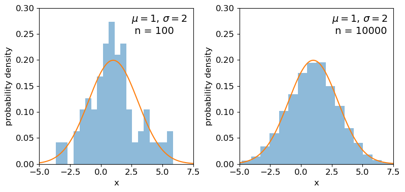
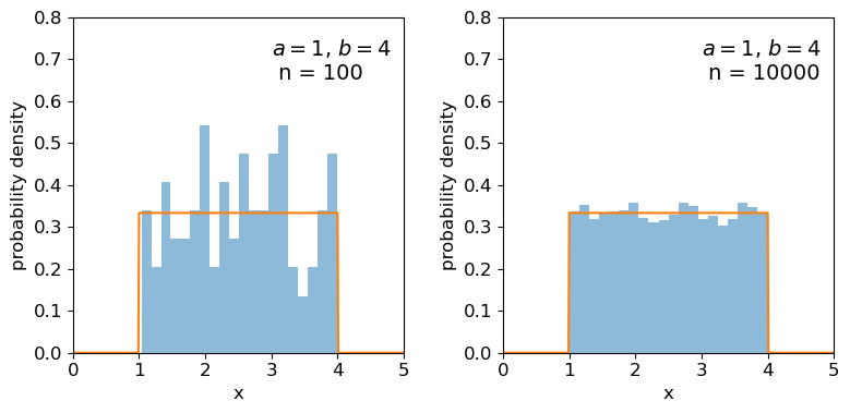
Clearly the sample distributions for 100 random variates are much more scattered compared to the 10000 random variates case (and the ‘true’ distribution).
The distributions of sums of uniform random numbers
Now we will go a step further and run a similar experiment but plot the histograms of sums of random numbers instead of the random numbers themselves. We will start with sums of uniform random numbers which are all drawn from the same, uniform distribution. To plot the histogram we need to generate a large number (ntrials) of samples of size given by nsamp, and step through a range of nsamp to make a histogram of the distribution of summed sample variates. Since we know the mean and variance of the distribution our variates are drawn from, we can calculate the expected variance and mean of our sum using the approach for sums of random variables described in the previous episode.
# Set ntrials to be large to keep the histogram from being noisy
ntrials = 100000
# Set the list of sample sizes for the sets of variates generated and summed
nsamp = [2,4,8,16,32,64,128,256,512]
# Set the parameters for the uniform distribution and freeze it
a = 0.5
b = 1.5
ud = sps.uniform(loc=a,scale=b-a)
# Calculate variance and mean of our uniform distribution
ud_var = ud.var()
ud_mean = ud.mean()
# Now set up and plot our figure, looping through each nsamp to produce a grid of subplots
n = 0  # Keeps track of where we are in our list of nsamp
fig, ax = plt.subplots(3,3, figsize=(9,4))
fig.subplots_adjust(wspace=0.3,hspace=0.3) # Include some spacing between subplots
# Subplots ax have indices i,j to specify location on the grid
for i in range(3):
    for j in range(3):
        # Generate an array of ntrials samples with size nsamp[n]
        ud_rand = ud.rvs(size=(ntrials,nsamp[n]))
        # Calculate expected mean and variance for our sum of variates
        exp_var = nsamp[n]*ud_var
        exp_mean = nsamp[n]*ud_mean
        # Define a plot range to cover adequately the range of values around the mean
        plot_range = (exp_mean-4*np.sqrt(exp_var),exp_mean+4*np.sqrt(exp_var))
        # Define xvalues to calculate normal pdf over
        xvals = np.linspace(plot_range[0],plot_range[1],200)
        # Calculate histogram of our sums
        ax[i,j].hist(np.sum(ud_rand,axis=1), bins=50, range=plot_range,
                                              density=True, alpha=0.5)
        # Also plot the normal distribution pdf for the calculated sum mean and variance
        ax[i,j].plot(xvals,sps.norm.pdf(xvals,loc=exp_mean,scale=np.sqrt(exp_var)))
        # The 'transform' argument allows us to locate the text in relative plot coordinates
        ax[i,j].text(0.1,0.8,"$n=$"+str(nsamp[n]),transform=ax[i,j].transAxes)
        n = n + 1
        # Only include axis labels at the left and lower edges of the grid:
        if j == 0:
            ax[i,j].set_ylabel('prob. density')
        if i == 2:
            ax[i,j].set_xlabel("sum of $n$ $U($"+str(a)+","+str(b)+"$)$ variates")
plt.show()
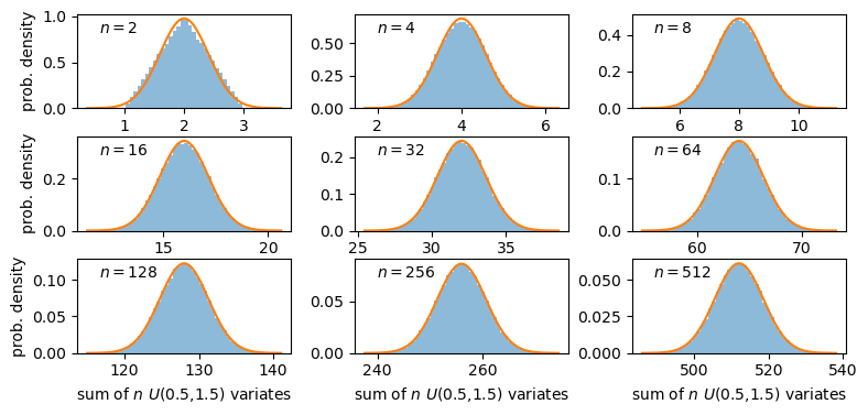
A sum of two uniform variates follows a triangular probability distribution, but as we add more variates we see that the distribution starts to approach the shape of the normal distribution for the same (calculated) mean and variance! Let’s show this explicitly by calculating the ratio of the ‘observed’ histograms for our sums to the values from the corresponding normal distribution.
To do this correctly we should calculate the average probability density of the normal pdf in bins which are the same as in the histogram. We can calculate this by integrating the pdf over each bin, using the difference in cdfs at the upper and lower bin edge (which corresponds to the integrated probability in the normal pdf over the bin). Then if we normalise by the bin width, we get the probability density expected from a normal distribution with the same mean and variance as the expected values for our sums of variates.
# For better precision we will make ntrials 10 times larger than before, but you
# can reduce this if it takes longer than a minute or two to run.
ntrials = 1000000
nsamp = [2,4,8,16,32,64,128,256,512]
a = 0.5
b = 1.5
ud = sps.uniform(loc=a,scale=b-a)
ud_var = ud.var()
ud_mean = ud.mean()
n = 0
fig, ax = plt.subplots(3,3, figsize=(9,4))
fig.subplots_adjust(wspace=0.3,hspace=0.3)
for i in range(3):
    for j in range(3):
        ud_rand = ud.rvs(size=(ntrials,nsamp[n]))
        exp_var = nsamp[n]*ud_var
        exp_mean = nsamp[n]*ud_mean
        nd = sps.norm(loc=exp_mean,scale=np.sqrt(exp_var))
        plot_range = (exp_mean-4*np.sqrt(exp_var),exp_mean+4*np.sqrt(exp_var))
        # Since we no longer want to plot the histogram itself, we will use the numpy function instead
        dens, edges = np.histogram(np.sum(ud_rand,axis=1), bins=50, range=plot_range,
                                              density=True)
        # To get the pdf in the same bins as the histogram, we calculate the differences in cdfs at the bin
        # edges and normalise them by the bin widths.
        norm_pdf = (nd.cdf(edges[1:])-nd.cdf(edges[:-1]))/np.diff(edges)
        # We can now plot the ratio as a pre-calculated histogram using the trick we learned in Episode 1
        ax[i,j].hist((edges[1:]+edges[:-1])/2,bins=edges,weights=dens/norm_pdf,density=False,
                     histtype='step')
        ax[i,j].text(0.05,0.8,"$n=$"+str(nsamp[n]),transform=ax[i,j].transAxes)
        n = n + 1
        ax[i,j].set_ylim(0.5,1.5)
        if j == 0:
            ax[i,j].set_ylabel('ratio')
        if i == 2:
            ax[i,j].set_xlabel("sum of $n$ $U($"+str(a)+","+str(b)+"$)$ variates")
plt.show()
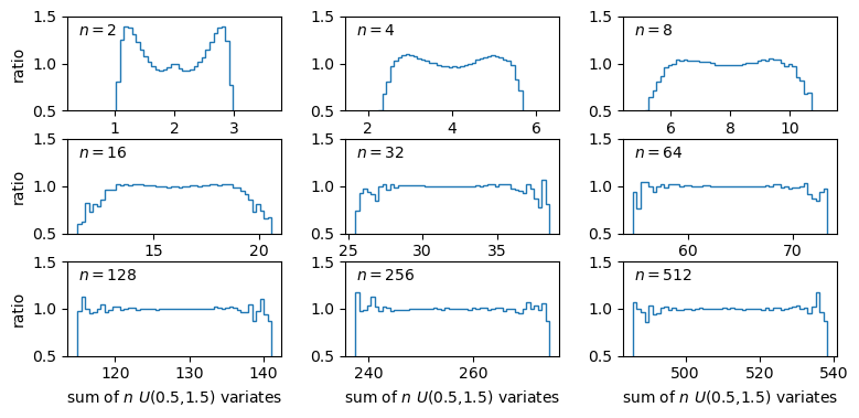
The plots show the ratio between the distributions of our sums of \(n\) uniform variates, and the normal distribution with the same mean and variance expected from the distribution of summed variates. There is still some scatter at the edges of the distributions, where there are only relatively few counts in the histograms of sums, but the ratio plots still demonstrate a couple of important points:
- As the number of summed uniform variates increases, the distribution of the sums gets closer to a normal distribution (with mean and variance the same as the values expected for the summed variable).
- The distribution of summed variates is closer to normal in the centre, and deviates more strongly in the ‘wings’ of the distribution.
The Central Limit Theorem
The Central Limit Theorem (CLT) states that under certain general conditions (e.g. distributions with finite mean and variance), a sum of \(n\) random variates drawn from distributions with mean \(\mu_{i}\) and variance \(\sigma_{i}^{2}\) will tend towards being normally distributed for large \(n\), with the distribution having mean \(\mu = \sum\limits_{i=1}^{n} \mu_{i}\) and variance \(\sigma^{2} = \sum\limits_{i=1}^{n} \sigma_{i}^{2}\).
It is important to note that the limit is approached asymptotically with increasing \(n\), and the rate at which it is approached depends on the shape of the distribution(s) of variates being summed, with more asymmetric distributions requiring larger \(n\) to approach the normal distribution to a given accuracy. The CLT also applies to mixtures of variates drawn from different types of distribution or variates drawn from the same type of distribution but with different parameters. Note also that summed normally distributed variables are always distributed normally, whatever the combination of normal distribution parameters.
The Central Limit Theorem tells us that when we calculate a sum (or equivalently a mean) of a sample of \(n\) randomly distributed measurements, for increasing \(n\) the resulting quantity will tend towards being normally distributed around the true mean of the measured quantity (assuming no systematic error), with standard deviation equal to the standard error.
Key Points
Sums of samples of random variates from non-normal distributions with finite mean and variance, become asymptotically normally distributed as their sample size increases.
The theorem holds for sums of differently distributed variates, but the speed at which a normal distribution is approached depends on the shape of the variate’s distribution, with symmetric distributions approaching the normal limit faster than asymmetric distributions.
Means of large numbers (e.g. 100 or more) of non-normally distributed measurements are distributed close to normal, with distribution mean equal to the population mean that the measurements are drawn from and standard deviation given by the standard error on the mean.
Distributions of means (or other types of sum) of non-normal random data are closer to normal in their centres than in the tails of the distribution, so the normal assumption is most reliable for smaller deviations of sample mean from the population mean.